
Order Cancellation
The order drop-in component enables both logged-in users and guest users to cancel an order.
Big picture
Section titled “Big picture”The order cancellation workflow is as follows:
-
The shopper selects an order to cancel. Guest users must use the order search form to locate the order. Logged-in customers can select an order from their order history or use the search form.
-
The shopper submits the cancellation form after selecting a cancellation reason.
-
If the shopper is a logged-in customer, the order is
Canceledimmediately. Otherwise, the order status remainsPendinguntil the guest clicks a link in a confirmation email.
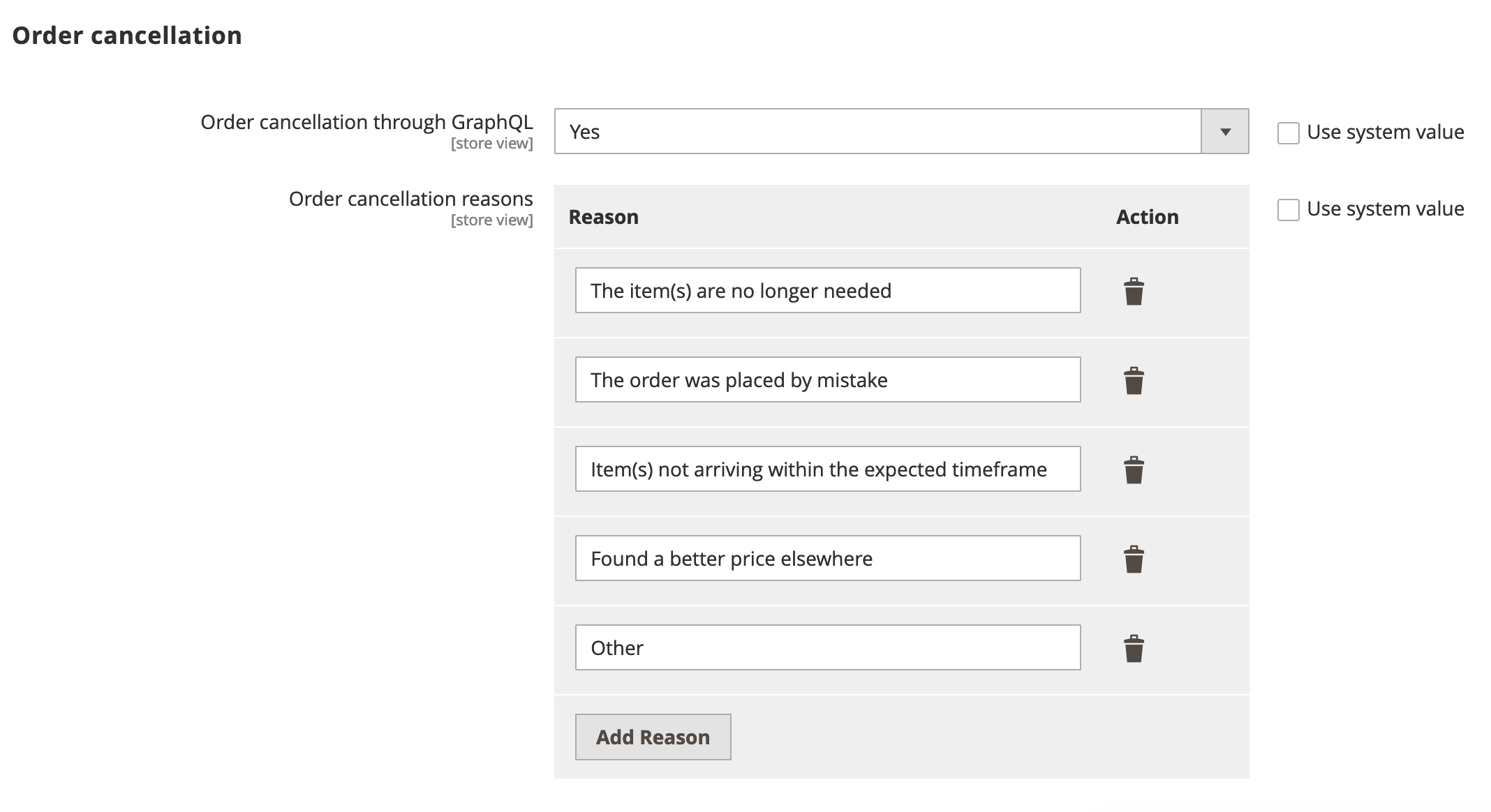
Prerequisites
Section titled “Prerequisites”Adobe Commerce must be configured to allow order cancellations. In the Admin, go to Stores > Configuration > Sales > Sales > Order Cancellation and set the following options:
Step-by-step
Section titled “Step-by-step”The following steps describe how to implement the order cancellation workflow for both logged in customers and guests.
Display the order history (logged-in customers only)
Section titled “Display the order history (logged-in customers only)”The workflow for logged-in customers is straightforward. An order can be canceled only if it has a status of Received, Pending, or Processing.
The customer selects an active order from their order history to cancel.
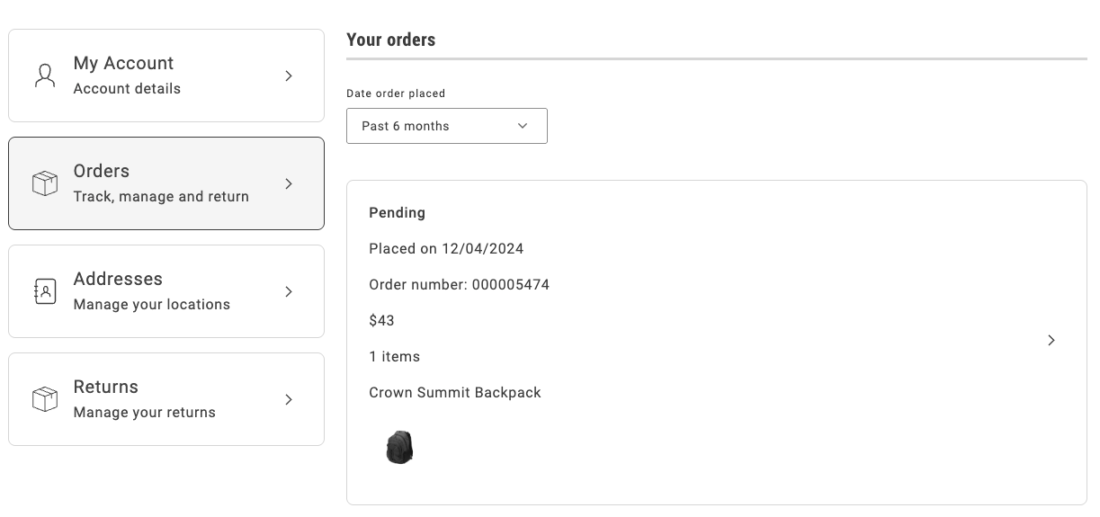
The order history page uses the OrderProductListContent component to render the list of orders that the customer previously placed. It iterates over the list of orders and uses the CartSummaryItem component to render each order item. The order item is an instance of the OrderItemModel, which contains all the necessary properties of an order item.
The following example shows an implementation of the OrderProductListContent component:
...<ul className="order-order-product-list-content__items"> {item.list?.map((product: OrderItemModel) => ( <li data-testid="order-product-list-content-item" key={product.id} > <CartSummaryItem loading={loading} product={product} itemType={item.type} taxConfig={taxConfig} translations={translations} showConfigurableOptions={showConfigurableOptions} routeProductDetails={routeProductDetails} /> </li> ))}</ul>...Search for the order
Section titled “Search for the order”A guest user does not have access to the order history page. Therefore, the only way to access an order is by using the Order Search form. The search order form retrieves the order that matches the specified email address, last name, and order name, as shown below:
The OrderSearchForm component is responsible for rendering the form to search for an order.
It receives the following parameters:
See the following code for an example of the implementation:
...{inLineAlert.text ? ( <InLineAlert data-testid="orderAlert" className={'order-order-search-form__alert'} type={inLineAlert.type} variant="secondary" heading={inLineAlert.text} icon={<Icon source={WarningFilled} />} />) : null}
<Form className={'order-order-search-form__wrapper'} name="orderSearchForm" loading={loading} fieldsConfig={fieldsConfig} onSubmit={onSubmit}> <div className="order-order-search-form__button-container"> <Button className={'order-order-search-form__button'} size={'medium'} variant={'primary'} key={'logIn'} type={'submit'} disabled={loading} > <Text id={'Order.OrderSearchForm.button'} /> </Button> </div></Form>...Render and submit the cancellation form
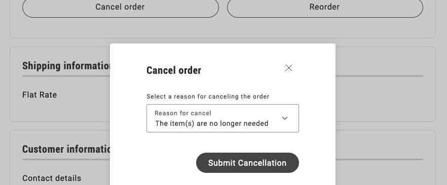
Section titled “Render and submit the cancellation form”The cancellation form allows the customer to select a cancellation reason and submit the form.
The OrderCancel component renders the OrderCancelForm container inside a modal.
This modal receives two parameters:
For example:
...<Modal centered={true} size="medium" onClose={handleClose} className={'order-order-cancel__modal'} title={ <h2 className={'order-order-cancel__title'}> <Text id={'Order.OrderCancelForm.title'} /> </h2> } data-testid="order-cancellation-reasons-modal"><OrderCancelForm orderRef={orderRef} cancelReasons={transformCancelReasons(orderCancellationReasons)} /></Modal>...The OrderCancelForm component is responsible for:
- Rendering the form with multiple cancellation reasons and a submission button.
- Handling the form submission.
- Showing the appropriate error messages if a failure occurs after submitting the form.
...{isErrorVisible && ( <InLineAlert heading={translations.ErrorHeading} description={translations.ErrorDescription} />)}<div className="order-order-cancel-reasons-form__text"> <Text id={'Order.OrderCancelForm.description'} /></div><Picker name="cancellationReasons" floatingLabel={translations.orderCancellationLabel} defaultOption={cancelReasons[0]} variant="primary" options={cancelReasons} value={String(selectedReason)} handleSelect={handleReasonSelect} required={true} data-testid="order-cancellation-reasons-selector" {...pickerProps}/><div className="order-order-cancel-reasons-form__button-container"> <Button variant="primary" data-testid="order-cancel-submit-button" {...submitButtonProps} > <Text id={'Order.OrderCancelForm.button'} /> </Button></div>...Display the confirmation notice
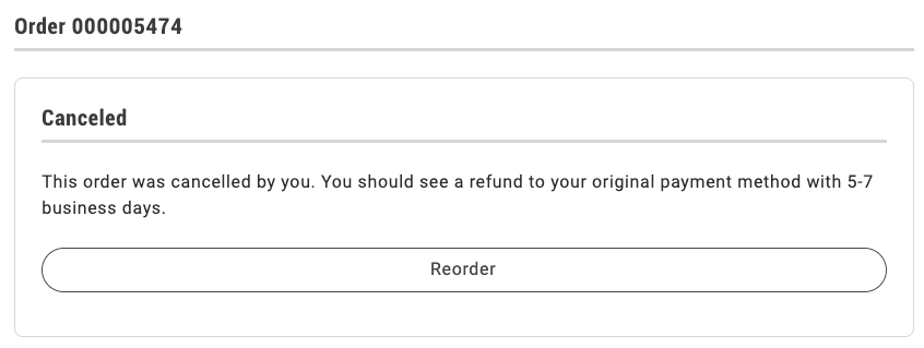
Section titled “Display the confirmation notice”When a logged-in customer submits the cancellation form, Commerce immediately sets the status of the order to Canceled and the drop-in displays a confirmation notice.
If the shopper is a guest user, the drop-in displays the following dialog:
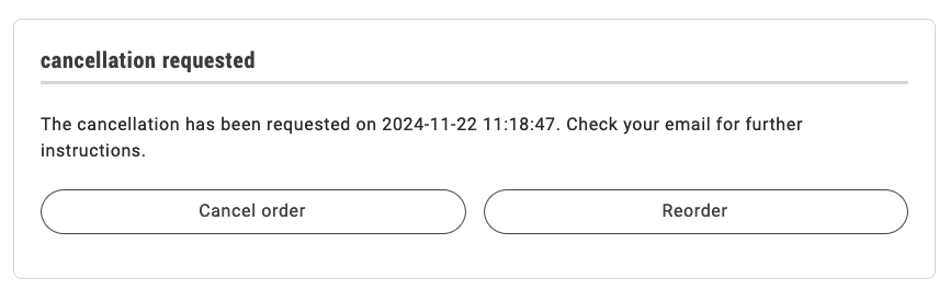
The order status remains Pending until the shopper clicks the link in an email similar to the following to confirm the cancellation.
Once clicked, the order becomes Canceled and the order status page is updated accordingly.
The order status page uses the OrderStatusContent component to render the order with all its properties and the available actions.
See the following code for an example of the OrderStatusContent implementation below:
...<Card className="order-order-status-content" variant="secondary"> <Header title={headerTitle} /> <div className="order-order-status-content__wrapper"> <div className={classes([ 'order-order-status-content__wrapper-description', [ 'order-order-status-content__wrapper-description--actions-slot', !!slots?.OrderActions, ], ])} > <p>{isReturnPage ? returnMessage : orderMessage}</p> </div> <OrderActions orderData={orderData} slots={slots} routeCreateReturn={routeCreateReturn} routeOnSuccess={routeOnSuccess} onError={onError} /> </div></Card>...After performing any action, the order status page is re-rendered, so that it reflects the new status and the available actions. The appropriate message is shown to the user, depending on the action performed.