
Product details page overview
The product details page (PDP) drop-in renders the full product page from a set of composable containers — gallery, header, price, options, quantity, and more. Each container is independently customizable through props, slots, and CSS, and you can rearrange, replace, or remove any container without touching the others.
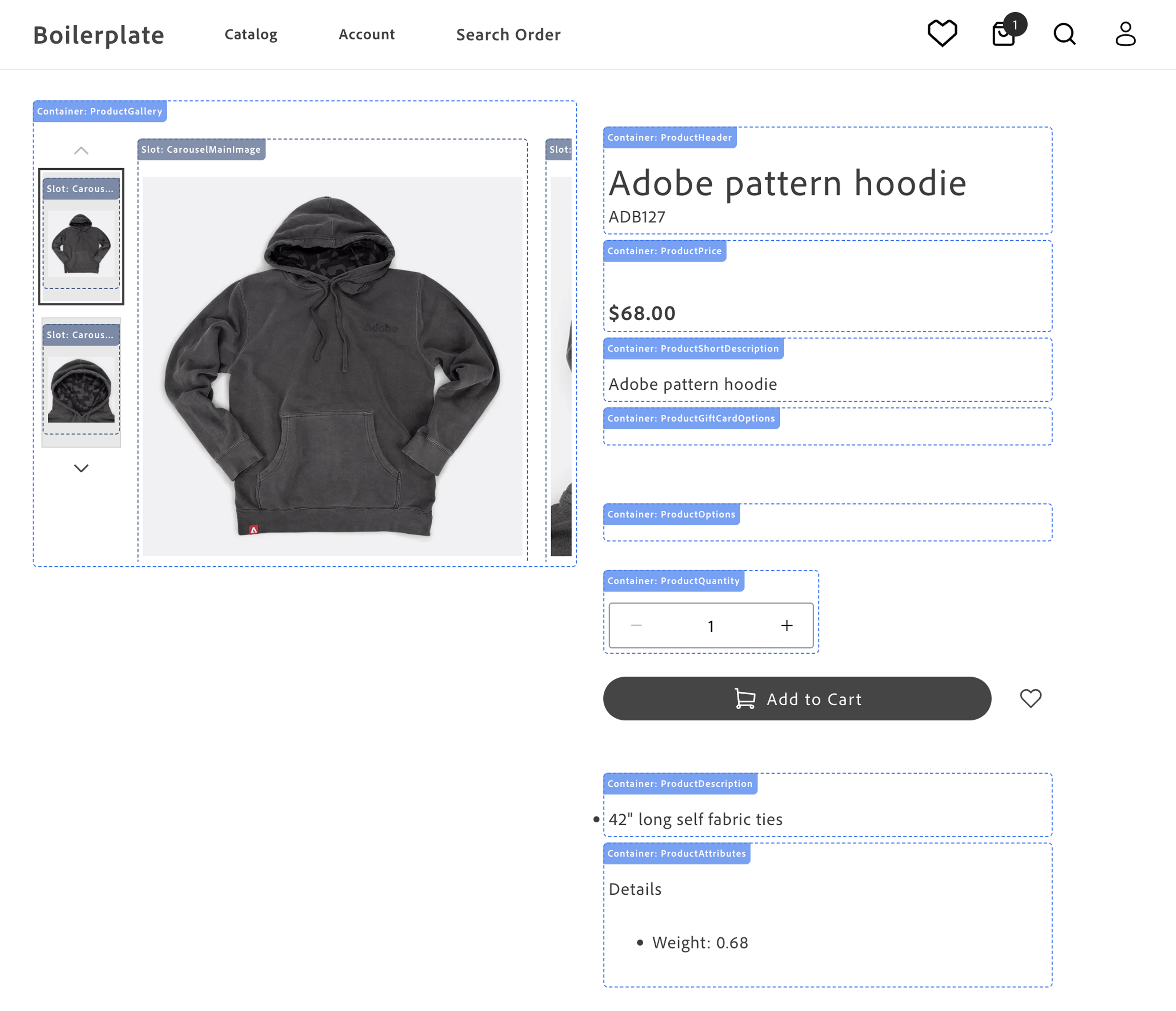
The image below shows the different containers that make up the product details page.
-
Product Gallery - displays the product images and videos. See
ProductGallery. -
Product Header - displays the product name and SKU. See
ProductHeader. -
Product Price - displays the product price and special price. See
ProductPrice. -
Product Gift Card Options - displays the product gift card options. See
ProductGiftCardOptions. -
Product Short Description - displays the product short description. See
ProductShortDescription. -
Product Options - displays the product options (size, color, and so on). See
ProductOptions. -
Product Downloadable Options - displays the downloadable link selection UI so shoppers can choose which files to include in their purchase. Not shown in image — renders only for downloadable product types. See
ProductDownloadableOptions. -
Product Quantity - displays the product quantity selector. See
ProductQuantity. -
Add to Cart and Wishlist Buttons - rendered by the block, not the drop-in, so they can be rearranged or restyled in the block code.
-
Product Description - displays the product description. See
ProductDescription. -
Product Attributes - displays the product attributes. See
ProductAttributes.
The practical application of rendering different product types is to provide a consistent user experience across different products. For example, a simple product can be rendered with a single price and quantity, while a complex product can be rendered with multiple options that combine into product variants. This flexibility allows you to showcase a wide range of products in a consistent and user-friendly manner. These product types allow you to cater to diverse customer needs, streamline operations, and enhance the shopping experience.
All containers in the product-details drop-in support scoped contexts, allowing multiple independent PDP instances to run on the same page and enabling features like product comparison, related products, and quick product previews without conflicts.
Use cases
Section titled “Use cases”The PDP component provides a variety of fully-customizable controls to showcase your products according to your brand’s aesthetics and build interactive experiences that engage customers. Use cases include:
- Image Carousel: Display multiple product images and videos in a carousel format, allowing users to browse product images, videos, and other details.
- Product Information: Showcase detailed product information, including pricing, descriptions, and specifications.
- Product Variants: Display different product variants, such as colors, sizes, and styles, allowing users to select the option that best fits their needs.
- Product Reviews: Include user reviews and ratings to provide social proof and help users make informed purchasing decisions.
- Customization Options: Customize the appearance and behavior of the drop-in component to align with your brand’s design aesthetic and user experience goals.
Supported Commerce features
Section titled “Supported Commerce features”The following table provides an overview of the Adobe Commerce features that the PDP drop-in component supports:
| Feature | Status |
|---|---|
| Bundle product type | Supported |
| Configurable product type | Supported |
| Image gallery | Supported |
| Grouped products | Roadmap |
| Product details | Supported |
| Simple product type | Supported |
| Virtual product type | Roadmap |
| Zoom | Supported |
Render product types
Section titled “Render product types”The PDP component supports rendering different product types configured in your Adobe Commerce instance by default using data provided by the Catalog Service GraphQL API . Adobe Commerce supports seven product types, but the Catalog Service GraphQL API schema maps these to two types:
-
Simple products are products that are defined with a single price and quantity. Catalog Service maps the simple, virtual, downloadable, and gift card product types to simpleProductViews .
-
Complex products comprise multiple simple products. The component simple products can have different prices. A complex product can also be defined so that the shopper can specify the quantity of component simple products. Catalog Service maps the configurable, bundle, and grouped product types to complexProductViews .
Product metadata and SEO
Section titled “Product metadata and SEO”Generating product metadata is crucial for optimizing search engine visibility, enhancing user experience, integrating with social media, supporting ecommerce functionality, ensuring compliance, and enabling data-driven decision-making.
The Commerce boilerplate provides a metadata generation script that fetches product data from the Catalog Service GraphQL API and generates meta tags and structured data in JSON-LD format. The script writes the metadata to an Excel file, which you can upload to Edge Delivery Services.