
TextArea
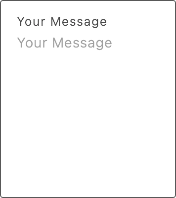
Use TextArea to collect long-form text, such as a gift message or delivery instructions. The field grows to fit its content, shows a floating label, and displays an error message when you provide one.
Import
Section titled “Import”import { TextArea } from '/@dropins/tools/components.js';| Prop | Type | Req? | Description |
|---|---|---|---|
id | string | No | ID for the textarea field. TextArea generates its own internal ID for the floating label’s for attribute regardless of this prop, so setting a custom id breaks the label-to-field association. If you need a custom id, also pass aria-label so the field still has an accessible name. |
name | string | No | Name attribute for the input, used in form submissions. Defaults to an empty string. |
disabled | boolean | No | Disable the textarea field. |
errorMessage | string | No | Error message shown below the field. |
TextArea also accepts standard textarea HTML attributes (for example, value, label, onChange, and onBlur). The label value doubles as the field’s floating label and placeholder.
Example
Section titled “Example”import { TextArea, provider } from '/@dropins/tools/components.js';
await provider.render(TextArea, { name: 'message', label: 'Your Message',})(document.querySelector('.textarea'));Related
Section titled “Related”- Radio Button — another form input in the SDK.
- Design tokens — the colors, spacing, and typography the field uses.