
Product Item Card
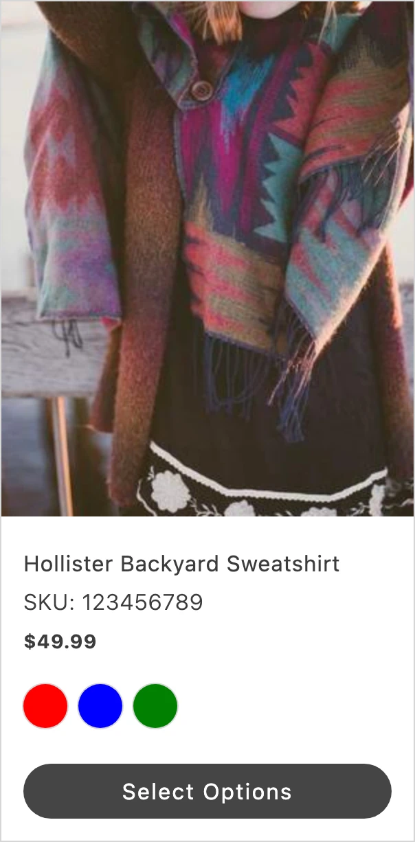
Use ProductItemCard to display a product recommendation with an image, title, price, SKU, swatches, and an action button. Each region is a node you pass in, so you control what renders in every slot. Until you set initialized to true, the card renders a loading skeleton.
Import
Section titled “Import”import { ProductItemCard } from '/@dropins/tools/components.js';| Prop | Type | Req? | Description |
|---|---|---|---|
image | VNode | No | Product image node. |
titleNode | VNode | No | Product title node. |
price | VNode | No | Product price node. |
sku | VNode | No | Product SKU node. |
swatches | VNode | No | Product swatches node. |
actionButton | VNode | No | Action button node. |
initialized | boolean | No | Render the card content when true; otherwise render a loading skeleton. Defaults to false. |
ProductItemCard also accepts standard HTML attributes (for example, onClick, className), except loading.
Example
Section titled “Example”Build each region with h, then pass the nodes as props. Image, Price, and Button are exported from the same package.
import { ProductItemCard, Image, Price, Button, provider } from '/@dropins/tools/components.js';import { h } from '/@dropins/tools/preact.js';
await provider.render(ProductItemCard, { initialized: true, image: h(Image, { src: '/media/sweatshirt.jpg', alt: 'Backyard Sweatshirt', width: '300', height: '375' }), titleNode: h('div', {}, 'Hollister Backyard Sweatshirt'), sku: h('div', {}, 'SKU: 123456789'), price: h(Price, { amount: 49.99 }), actionButton: h(Button, { children: 'Add to Cart' }),})(document.querySelector('.product-item-card'));