
Input
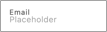
Use Input to let shoppers enter and edit text. It supports a floating label, a leading icon, and error and success states, and it reports value changes through the onValue callback.
Import
Section titled “Import”import { Input } from '/@dropins/tools/components.js';| Prop | Type | Req? | Description |
|---|---|---|---|
id | string | No | The field id. Falls back to name, then to a generated id. |
name | string | No | The field name, used to map the value in a form. |
variant | 'primary' | 'secondary' | No | Change the input style. Defaults to primary. |
disabled | boolean | No | Disable the input field. |
error | boolean | No | Show the error state and warning icon. |
floatingLabel | string | No | Label text that floats above the field. |
onUpdateError | (error: Error) => void | No | Called when an onValue callback throws an error. |
onValue | (value: any) => void | No | Called with the trimmed value when it changes (debounced). |
size | 'medium' | 'large' | No | Change the input size. Defaults to medium. |
success | boolean | No | Show the success state and check icon. |
icon | VNode<HTMLAttributes<SVGSVGElement>> | No | A leading ornamental icon. |
maxLength | number | No | Maximum number of characters allowed in the field. |
Input also accepts standard input HTML attributes (for example, value, placeholder, and onChange), except size and icon.
Example
Section titled “Example”Render an input with a floating label and a value handler.
import { Input, provider } from '/@dropins/tools/components.js';
await provider.render(Input, { name: 'email', floatingLabel: 'Email', onValue: (value) => yourSaveEmail(value),})(document.querySelector('.email-input'));Related
Section titled “Related”- InputPassword — a password field with a show/hide toggle built on
Input. - InputFile — a file upload field for forms.