
Text Swatch
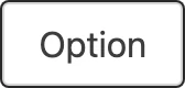
Use TextSwatch to display a selectable text option, such as a size or category. Set multi to allow multiple selections in a group; otherwise each swatch behaves as a single-select radio option.
Import
Section titled “Import”import { TextSwatch } from '/@dropins/tools/components.js';| Prop | Type | Req? | Description |
|---|---|---|---|
label | string | Yes | Field label. |
id | string | Yes | Field ID. |
name | string | No | Field name, used for mapping the value in a form. |
groupAriaLabel | string | No | Accessible label for the swatch group. |
value | string | No | Field value. |
disabled | boolean | No | Whether the swatch is disabled. Defaults to false. |
selected | boolean | No | Whether the swatch is selected. Defaults to false. |
outOfStock | boolean | No | Whether the swatch is out of stock. Defaults to false. |
multi | boolean | No | Whether the swatch allows multiple selection. Defaults to false. |
onValue | (value: any) => void | No | Function to handle value changes. |
onUpdateError | (error: Error) => void | No | Function to handle errors thrown by onValue. |
TextSwatch also accepts standard HTML attributes (for example, className), except label.
Example
Section titled “Example”import { TextSwatch, provider } from '/@dropins/tools/components.js';
await provider.render(TextSwatch, { name: 'size', id: 'size-m', label: 'M', value: 'M', groupAriaLabel: 'Size', onValue: (value) => yourSelectText(value),})(document.querySelector('.text-swatch'));Related
Section titled “Related”- Radio Button — a single-select control with a similar API.
- Design tokens — the colors, spacing, and typography the swatch uses.