
Progress Spinner
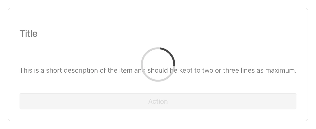
Use ProgressSpinner to indicate ongoing activity or a loading state. Render it on its own, or wrap other content as children to overlay the spinner on a dimmed background while that content updates.
Import
Section titled “Import”import { ProgressSpinner } from '/@dropins/tools/components.js';| Prop | Type | Req? | Description |
|---|---|---|---|
size | 'small' | 'medium' | 'big' | 'large' | No | Size of the spinner. Defaults to small. |
stroke | '1' | '2' | '3' | '4' | No | Stroke width of the spinner. Defaults to 4. |
ariaLabel | string | No | Accessible label for the spinner. |
ProgressSpinner also accepts standard HTML attributes (for example, className, style), except size. Pass children to render the spinner as an overlay on top of that content.
Example
Section titled “Example”import { ProgressSpinner, provider } from '/@dropins/tools/components.js';
await provider.render(ProgressSpinner, { size: 'medium', stroke: '4', ariaLabel: 'Updating',})(document.querySelector('.progress-spinner'));Related
Section titled “Related”- Button — often renders a spinner while an action is in progress.
- Design tokens — the colors and sizing the spinner uses.