
Modal
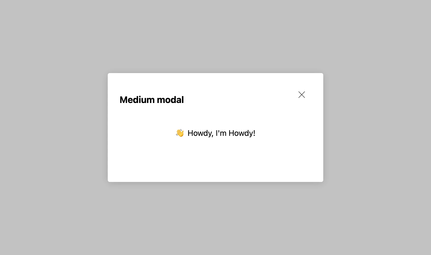
Use Modal to present content in an accessible dialog. It traps focus while open, restores focus to the trigger when it closes, and can dismiss on a background click, the Escape key, or a close button.
Import
Section titled “Import”import { Modal } from '/@dropins/tools/components.js';| Prop | Type | Req? | Description |
|---|---|---|---|
children | ComponentChildren | No | Content rendered inside the modal. |
size | 'small' | 'medium' | 'full' | No | Modal size. Defaults to small. |
title | VNode | No | Title element shown in the modal header. |
centered | boolean | No | Center the content inside the modal. Defaults to false. |
onClose | () => void | No | Callback fired when the modal closes. |
backgroundDim | boolean | No | Dim the background behind the modal. Defaults to true. |
clickToDismiss | boolean | No | Dismiss the modal when the background is clicked. Defaults to true. |
escapeToDismiss | boolean | No | Dismiss the modal when the Escape key is pressed. Defaults to true. |
showCloseButton | boolean | No | Show the close button. Defaults to true. |
Modal also accepts standard HTML attributes (for example, className), except size and title.
Example
Section titled “Example”The Cart drop-in opens Modal for its gift-wrapping picker: a centered, medium dialog with a titled header that dismisses through onClose. Because a drop-in composes components as JSX, the picker returns a Modal element instead of mounting one with provider.render, and renders nothing until you open it.
import { Modal, Button } from '/@dropins/tools/components.js';
function GiftWrapDialog({ open, onClose, onConfirm }) { // Modal renders nothing until you choose to open it. if (!open) return null;
return ( <Modal size="medium" centered title={<h2>Choose a gift wrap</h2>} onClose={onClose} > <p>Pick a wrap for your order, then confirm.</p>
<Button onClick={onConfirm}>Add gift wrap</Button> <Button variant="secondary" onClick={onClose}>Cancel</Button> </Modal> );}Related
Section titled “Related”- Button — commonly opens a modal.
- IllustratedMessage — pairs well inside a modal for status or empty states.