
Customize AddressForm layout
The AddressForm container provides a highly configurable and customizable layout for seamless integration. The sorting of address attributes is managed through the Adobe Commerce Admin settings, giving flexibility in how data fields are displayed.
What you’ll edit or create
Section titled “What you’ll edit or create”- Edit the address styles —
blocks/commerce-addresses/commerce-addresses.css - Edit the
.account-address-formgrid rules - Edit the
grid-template-columnsproperty
Layout Customization Example
Section titled “Layout Customization Example”The following examples show how to adjust the storefront-addresses block CSS in a boilerplate environment to customize the address form layout.
In the default layout, some fields are half width, while others take up the whole width.
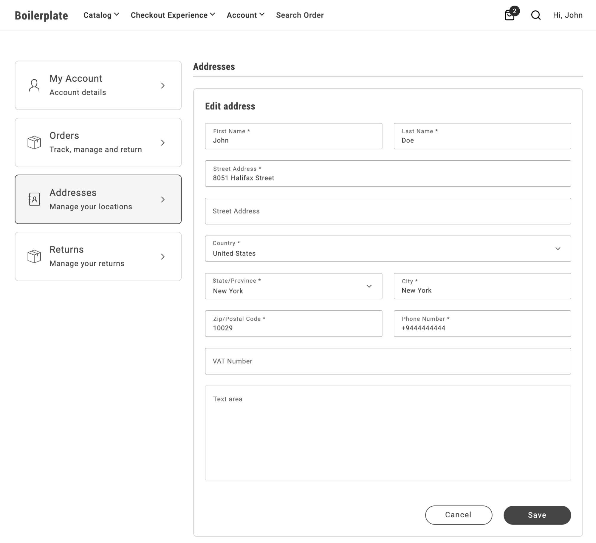
To set all fields to half width, add the following CSS rule to the storefront-addresses block:
.commerce-addresses .account-address-form { grid-template-columns: repeat(2,1fr);}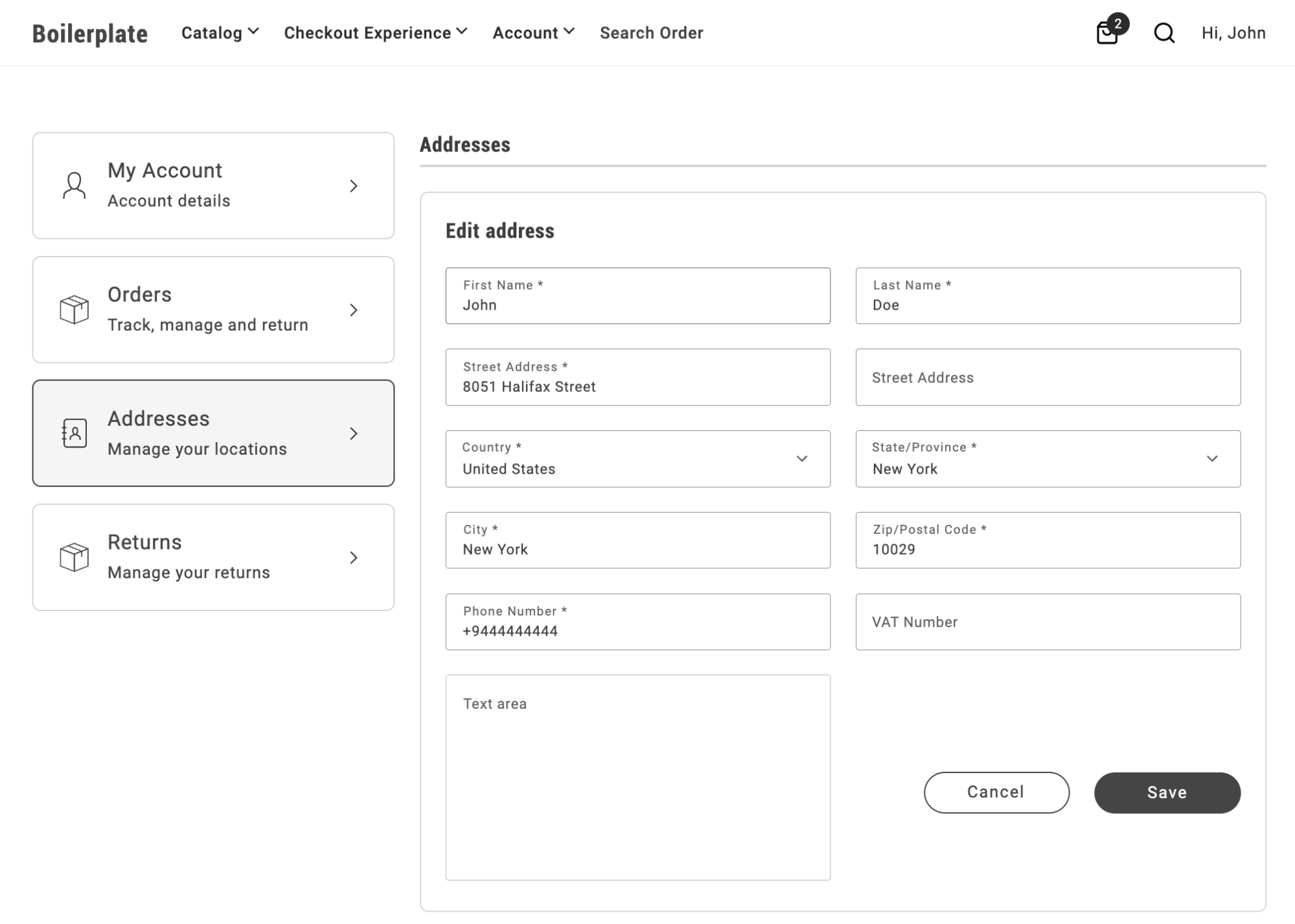
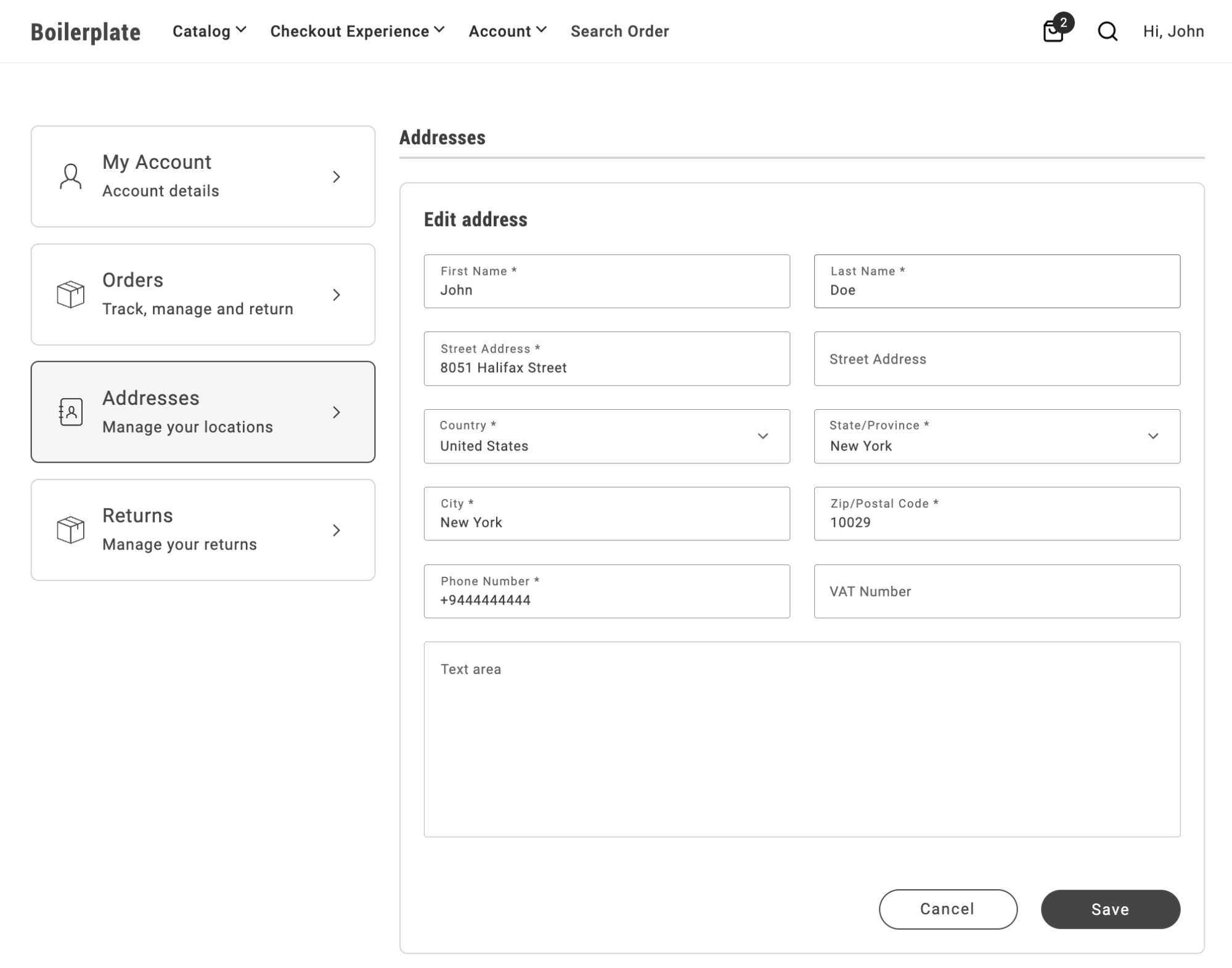
To set the text area and button group to 100% width while keeping the other fields at half width:
.commerce-addresses .account-address-form div.account-address-form__field--test_text_area,.commerce-addresses .account-address-form div.account-address-form-wrapper__buttons { grid-column: span 2;}Notice that the CSS selector includes the modifier --test_text_area, allowing you to target a specific field by attribute code.
To create a three-column layout with a full-size text area and button area, set the grid template columns to repeat(3,1fr):
.commerce-addresses .account-address-form { grid-template-columns: repeat(3,1fr);}
.commerce-addresses .account-address-form div.dropin-field { grid-column: span 1;}
.commerce-addresses .account-address-form div.account-address-form__field--test_text_area,.commerce-addresses .account-address-form div.account-address-form-wrapper__buttons { grid-column: span 3;}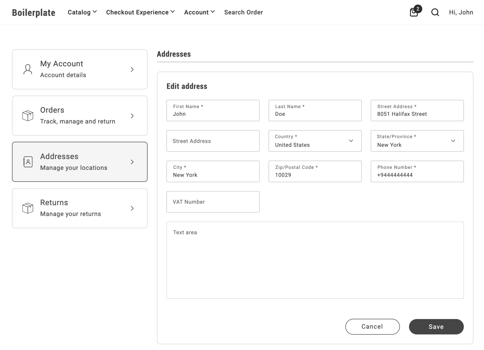
What you’ll build
Section titled “What you’ll build”By the end of this tutorial, you’ll have:
- A one-column AddressForm layout for the fields that default to 50% width, using a CSS override you add to the
commerce-addressesblock. - A two-column AddressForm layout with the text area and button row spanning the full width, using
grid-template-columnsand theaccount-address-form-wrapper__buttonsclass. - A three-column AddressForm layout using the same technique, for storefronts that want more fields per row.
The visual layout of the form, including input widths (such as 50% or 100% to position multiple inputs on the same line), is controlled by CSS. This enables integrators to tailor the form’s appearance by applying custom CSS rules.
By default, the first name and last name fields in the address form are set to 50% width. The display is controlled through CSS, as the form is implemented using a grid layout:
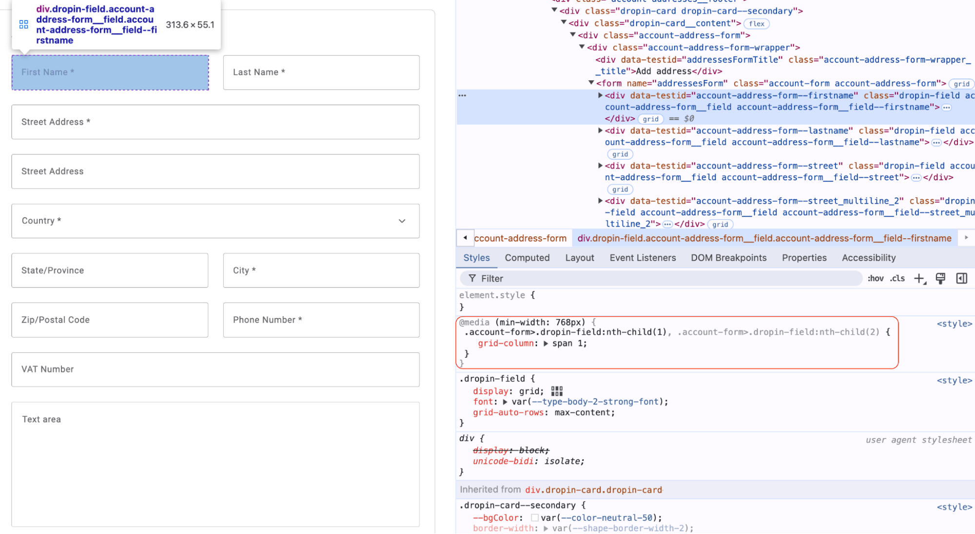
To modify the layout and render these fields as full-width, create custom CSS rules at the boilerplate level and use them to override default container CSS:
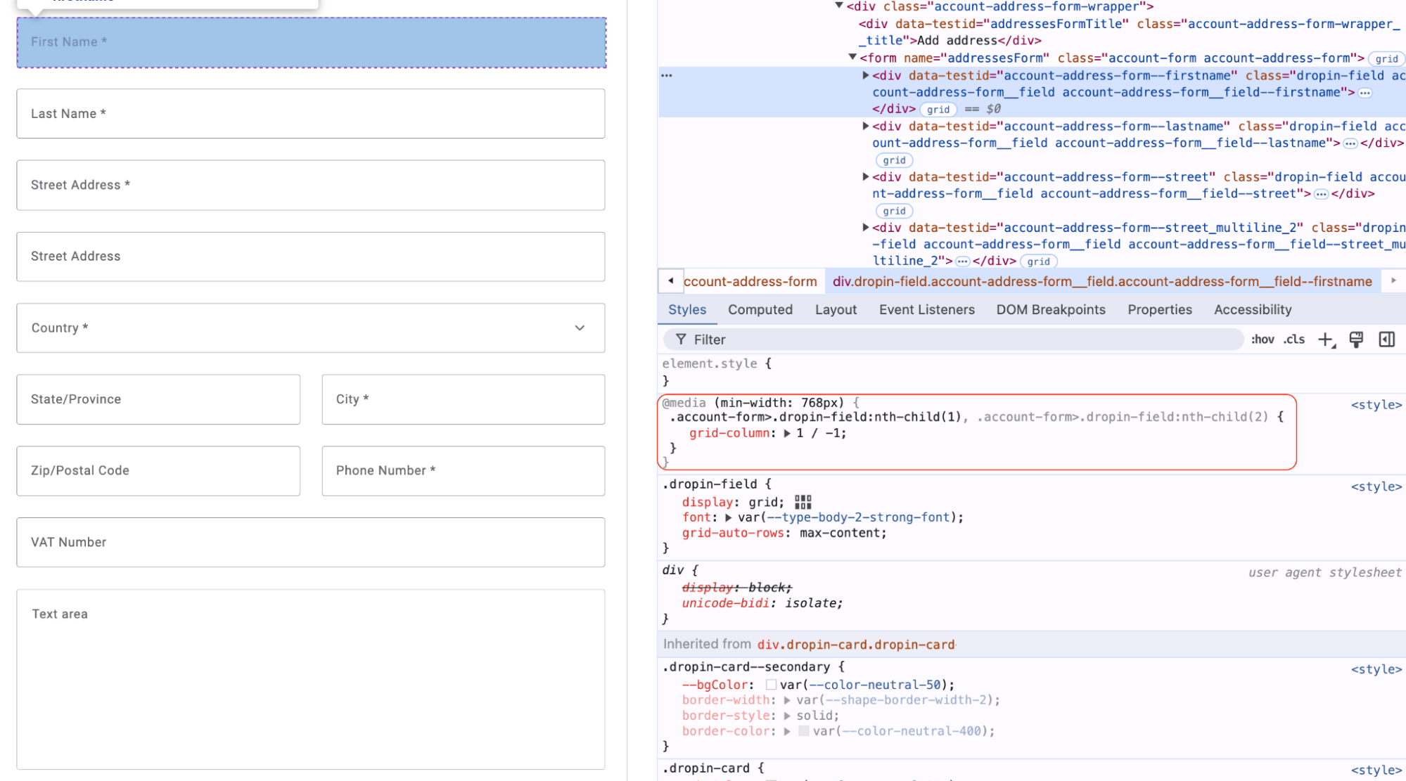
Using this approach, you can easily customize the address form layout during the integration process, such as implementing a three-column layout to display three fields in a row. These adjustments require only basic CSS knowledge for effective customization.
This approach is fully applicable to address forms in all views of the Addresses container, as it utilizes the AddressForm container internally.
Related
Section titled “Related”- AddressForm container — reference for the form you customized.
- Slots — the slot system used for layout changes.