
Build custom features
You don’t have to wait for Adobe to ship a feature you need, and you don’t have to build a new drop-in to get it. When no existing drop-in container covers a feature, compose that drop-in’s data and components directly inside a custom commerce block instead.
The drop-in is your starting point
Section titled “The drop-in is your starting point”A drop-in is more than a pre-built container. It’s an installed package that bundles the parts you build features from: containers, slots, API functions, and events. Its containers render with shared SDK components from @dropins/tools, the same components you can render in your own block. Pull only the parts you need into a custom commerce block, and ship the block as a new storefront feature.
Get data, render UI, and coordinate blocks
Section titled “Get data, render UI, and coordinate blocks”A custom commerce block is built from three parts: the data it gets, the UI it renders, and the events it uses to coordinate with other blocks. For both the data and the UI, lean on what the drop-in provides and write your own code only when it doesn’t cover your case, so you own and maintain less.
Those two choices form a spectrum of ownership, from leaning on the drop-in for both down to writing everything yourself:
| Ownership (effort) | Get data | Render UI |
|---|---|---|
| Least | Drop-in API function | SDK component |
| Some | Drop-in API function | Your own markup |
| Most | Your own GraphQL query | Your own markup |
Walkthrough: Product comparison
Section titled “Walkthrough: Product comparison”The product comparison feature shows up to three products side by side, plus a persistent tray that collects the products a shopper picks while browsing. No drop-in container covers it, so you build it with the drop-in for both data and UI: the Product Discovery drop-in’s search for data and SDK components for UI, leaving you just the feature-specific logic.
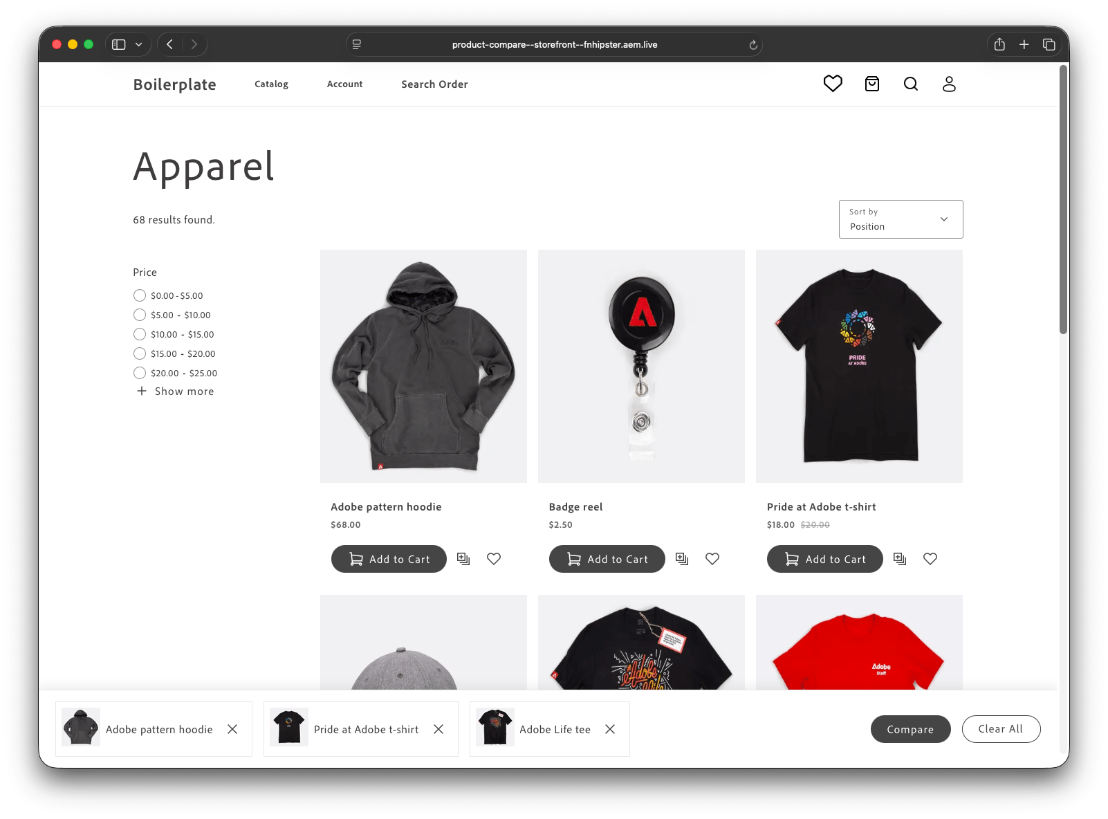
The steps below build it as two custom commerce blocks that coordinate only through the event bus, product-compare for the table and product-compare-bar for the tray:
blocks/ product-compare/ product-compare.js product-compare.css README.md product-compare-bar/ product-compare-bar.js product-compare-bar.css README.mdThose two blocks produce the comparison table this walkthrough builds toward:
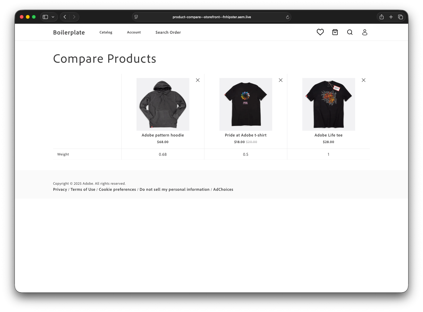
Each step maps to one reusable pattern:
| Step | Pattern to reuse | Uses |
|---|---|---|
| 1. Fetch data | Call a drop-in API with a filter | search() |
| 2. Render columns | Mount SDK components into your markup | Image, PriceRange, Button |
| 3. Build rows | Hand-build what no component covers | your own DOM |
| 4. Coordinate | Signal other blocks through an event | compare/products |
| 5. Store state | Keep shareable state in the URL | ?compare= |
| 6. Wire it up | Parse config, orchestrate in decorate() | readBlockConfig() |
Fetch data using a drop-in API function
Section titled “Fetch data using a drop-in API function”To look up the exact products a shopper picked, call search() with a sku filter:
import { search } from '/@dropins/storefront-product-discovery/api.js';
async function fetchProductsBySkus(skus, searchFilters = []) { const result = await search( { filter: [{ attribute: 'sku', in: skus }, ...searchFilters], pageSize: skus.length }, { scope: 'product-compare-lookup' }, ); return result?.items ?? [];}The searchFilters argument carries the block’s author-configured filter option into this same query, so the SKU lookup enforces the same eligibility rule as the rest of the block, even when a shopper edits the ?compare= URL directly.
Render the UI with SDK components
Section titled “Render the UI with SDK components”For each product column, mount Image and PriceRange, plus a Button for the remove action:
import { Button, Icon, Image, PriceRange, provider as UI,} from '/@dropins/tools/components.js';import { h } from '/@dropins/tools/preact.js';
const image = product.images[0];await UI.render(Image, { src: image.url, alt: image.label || product.name, loading: 'lazy', params: { width: 400, height: 400 },})(imgWrap);await UI.render(PriceRange, { display: 'from to', minimumAmount, maximumAmount, currency })(priceWrap);await UI.render(Button, { icon: h(Icon, { source: 'Close' }), variant: 'tertiary', 'aria-label': `Remove ${product.name}`, onClick: () => removeProductColumn(block, product.sku),})(removeWrap);Write your block’s own CSS against the same shared design tokens the SDK components use, such as --spacing-big and --spacing-medium, so the table and tray appear integrated with the rest of the page.
Build the comparison rows
Section titled “Build the comparison rows”Those columns are the table header, one per product. The comparison itself is the table body: one row per attribute, with the attribute’s label first, then each product’s value. Use the author-configured attributes option to choose and order the rows, or fall back to every attribute the products expose:
// allowedAttrs comes from the author's `attributes` option, or null to show all.const attributeNames = allowedAttrs ?? [...new Set(products.flatMap((p) => (p.attributes ?? []).map((a) => a.name)))];
attributeNames.forEach((name) => { const cells = products.map((p) => p.attributes?.find((a) => a.name === name)); if (cells.every((attr) => !attr?.value)) return; // skip rows no product fills
const row = document.createElement('tr'); const th = document.createElement('th'); th.scope = 'row'; th.textContent = cells.find(Boolean)?.label ?? name; row.append(th); cells.forEach((attr) => { const td = document.createElement('td'); td.textContent = attr?.value || '--'; row.append(td); }); tbody.append(row);});If the SKU lookup returns no products, render a short empty-state message instead of an empty table.
Coordinate blocks with the event bus
Section titled “Coordinate blocks with the event bus”The Compare button is often added through a slot on an existing drop-in container, such as the ProductActions slot on the product-discovery SearchResults container, rather than in a custom commerce block. See Slots for slot mechanics. Either way, the product list page and the tray only agree on an event name and a payload shape:
import SearchResults from '@dropins/storefront-product-discovery/containers/SearchResults.js';import { render as provider } from '@dropins/storefront-product-discovery/render.js';import { Button, Icon, provider as UI } from '@dropins/tools/components.js';import { events } from '@dropins/tools/event-bus.js';
const getCompareButton = (product) => { const productName = product.name || product.sku; const wrap = document.createElement('div'); wrap.className = 'product-discovery-product-actions__compare'; // The entire integration: emit the event, let product-compare-bar react. UI.render(Button, { icon: Icon({ source: 'Bulk' }), 'aria-label': `${labels.Global?.Compare ?? 'Compare'} ${productName}`, variant: 'tertiary', onClick: () => events.emit('compare/products', { sku: product.sku, img: product.images?.[0]?.url ?? '', name: productName, }), })(wrap); return wrap;};
// Render the drop-in's SearchResults container and hook the button into its// ProductActions slot. Containers render through the drop-in's own `provider`;// shared components like Button render through the tools `UI` provider.provider.render(SearchResults, { slots: { ProductActions: (ctx) => { const actionsWrapper = document.createElement('div'); // getAddToCartButton is the block's existing helper; keep it so Compare // sits alongside Add to Cart instead of replacing it. actionsWrapper.appendChild(getAddToCartButton(ctx.product)); actionsWrapper.appendChild(getCompareButton(ctx.product)); ctx.replaceWith(actionsWrapper); }, },})($productList);import { events } from '@dropins/tools/event-bus.js';
events.on('compare/products', ({ sku, img, name } = {}) => { if (!sku) return; const idx = products.findIndex((p) => p.sku === sku); if (idx !== -1) { products.splice(idx, 1); } else if (products.length < MAX_PRODUCTS) { products.push({ sku, img, name }); } render();});Emitting compare/products again for a SKU already in the tray removes it, so the same Compare button can add or remove a product without tracking its own state.
The tray’s own Compare button is a link to the comparison page, carrying the collected SKUs in the ?compare= parameter that the product-compare block reads in the next step:
// blocks/product-compare-bar/product-compare-bar.js — inside render()const skus = products.map((p) => p.sku).join(',');await UI.render(Button, { children: 'Compare', href: skus ? `${comparePage}?compare=${skus}` : undefined, variant: 'primary', disabled: !skus,})(compareBtnWrap);comparePage comes from the tray block’s author-configured page option.
Store state in the URL
Section titled “Store state in the URL”The comparison table’s state is the list of SKUs to compare, so it needs no drop-in or localStorage. Reading and writing that state to a URL query parameter means shoppers can share or bookmark the comparison page:
const skus = (new URLSearchParams(window.location.search).get('compare') ?? '') .split(',') .map((s) => s.trim()) .filter(Boolean) .slice(0, MAX_PRODUCTS);
// After adding or removing a product:const url = new URL(window.location.href);url.searchParams.set('compare', updatedSkus.join(','));window.history.replaceState({}, '', url);Reloading the page, sharing its URL, or bookmarking it now reproduces the same comparison, since every selection lives in the ?compare= parameter.
Wire it together
Section titled “Wire it together”decorate() is the entry point Edge Delivery Services calls for each block. For product-compare, it reads the author options and the SKUs from the URL, fetches the products, then renders the table from the pieces above:
import { readBlockConfig } from '/scripts/aem.js';
export default async function decorate(block) { const config = readBlockConfig(block); // author options, as text
// readBlockConfig returns each option as a string, so parse them into the // shapes the block uses: an attribute-name list, and search-clause objects. const allowedAttrs = config.attributes ? config.attributes.split(',').map((s) => s.trim()).filter(Boolean) : null; const searchFilters = config.filter // each entry is "attribute:value" ? config.filter.split(',').flatMap((pair) => { const i = pair.indexOf(':'); if (i === -1) return []; const attribute = pair.slice(0, i).trim(); const value = pair.slice(i + 1).trim(); return attribute && value ? [{ attribute, in: [value] }] : []; }) : [];
const skus = readSkusFromUrl(); // from the ?compare= parameter const products = await fetchProductsBySkus(skus, searchFilters);
if (!products.length) { block.textContent = 'No products to compare.'; return; }
renderColumns(block, products); // Render the UI with SDK components renderComparisonRows(block, products, allowedAttrs); // Build the comparison rows}Because readBlockConfig() returns each option as text, decorate() first parses attributes into a list and filter into search clauses before passing them on. The helpers map to the tasks above: fetchProductsBySkus fetches data, renderColumns renders the product columns, renderComparisonRows builds the comparison rows, and readSkusFromUrl reads the ?compare= parameter.
Author-facing configuration
Section titled “Author-facing configuration”Both blocks in this example use readBlockConfig() for author-facing options:
- An
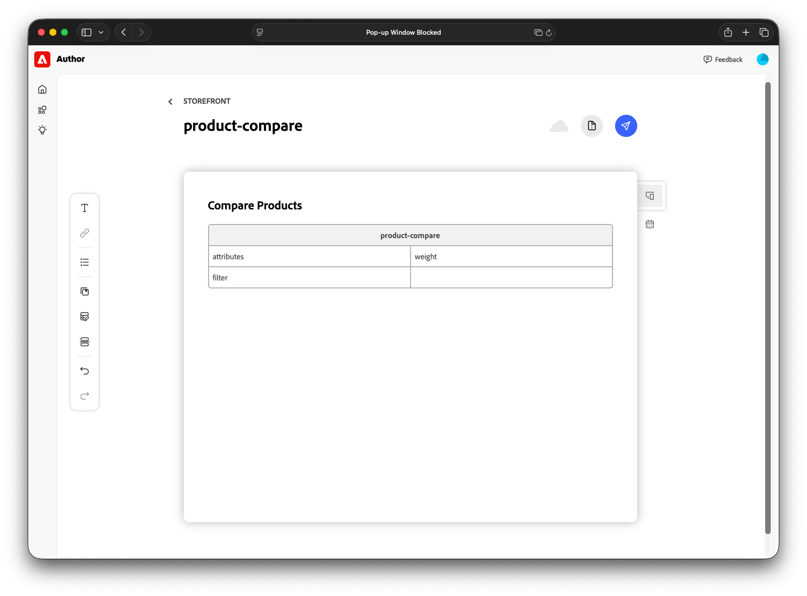
attributeskey listing which product attributes appear as comparison rows, as comma-separated names. - A
filterkey restricting which products are eligible for comparison, as comma-separatedattribute:valuepairs. - A
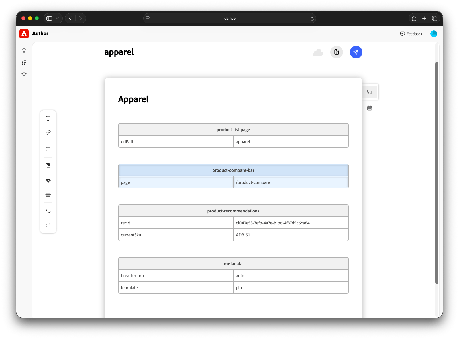
pagekey on the tray block pointing to the comparison page.
For the configuration patterns behind these options, see Customize blocks. A content author places each block by adding a table with its name to a document, so placing or moving a block never requires a code change. See Block tables for how those tables work.
Best practices
Section titled “Best practices”- Name events
noun/verb. Follow the convention drop-in events already use, such ascart/updatedandsearch/result, so another developer can tell what your custom event does without reading its source. - Make events shareable. Design the event so any block with a matching trigger can emit it, not just the one you’re building. A comparison tray listening for
compare/productscan respond to that same event from a product list page, search results, or a carousel, without a separate integration for each. - Reuse existing state. Before adding
localStorageor a new global variable, check whether the URL or an event’s last payload (events.lastPayload()) already has what you need. - Handle loading and errors. A drop-in container already renders a fallback when its data fetch fails, but your block calls the same API function directly, so it needs its own
catchand an empty-results message. - Enforce eligibility server-side. When an author option restricts which products qualify, carry that filter into every query the block runs, including direct SKU lookups. A shopper can edit values in the URL, so a rule enforced only in the UI is no rule at all.
- Track the drop-in’s releases. You depend on functions the drop-in owns, so watch its release notes for changes to the signatures and payloads you call.