
ActionButtonGroup
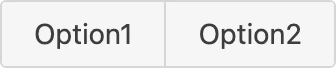
Use ActionButtonGroup to group related actions into a single control where a shopper selects one option at a time. Pass ActionButton elements as children, each with a value, and the group tracks which one is active.
Import
Section titled “Import”import { ActionButtonGroup } from '/@dropins/tools/components.js';| Prop | Type | Req? | Description |
|---|---|---|---|
variant | 'primary' | 'secondary' | No | Change the group style. Defaults to primary. |
activeOption | string | No | The value of the option that starts selected. |
disabled | boolean | No | Disable the whole group. Defaults to false. |
dividers | boolean | No | Show dividers between options. Defaults to true. |
children | VNode<ActionButtonProps>[] | VNode<ActionButtonProps> | Yes | The ActionButton options in the group, each with a value. |
handleSelect | (value: string) => void | No | Callback for when an option is selected. |
ActionButtonGroup also accepts standard <div> HTML attributes (for example, className and aria-label).
Example
Section titled “Example”Render a group of two options and handle the selection.
import { ActionButtonGroup, ActionButton, provider } from '/@dropins/tools/components.js';import { h } from '/@dropins/tools/preact.js';
await provider.render(ActionButtonGroup, { variant: 'primary', activeOption: 'grid', handleSelect: (value) => yourApplyLayout(value), children: [ h(ActionButton, { key: 'grid', value: 'grid' }, 'Grid'), h(ActionButton, { key: 'list', value: 'list' }, 'List'), ],})(document.querySelector('.action-button-group'));Related
Section titled “Related”- ActionButton — the option elements you pass as children.
- Button — for standalone primary and secondary actions.