
Incrementer
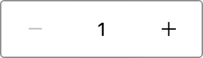
Use Incrementer to let shoppers increase or decrease a numeric value, such as a cart quantity. It enforces min and max, shows a validation message when the value is out of range, and can hide its buttons for a compact layout.
Import
Section titled “Import”import { Incrementer } from '/@dropins/tools/components.js';| Prop | Type | Req? | Description |
|---|---|---|---|
name | string | No | Field name, used to map the value in a form. |
size | 'medium' | 'large' | No | Change the incrementer size. Defaults to medium. |
min | number | No | Minimum allowed value. |
max | number | No | Maximum allowed value. |
showButtons | boolean | No | Show the increase and decrease buttons. Defaults to true. |
disabled | boolean | No | Whether the field is disabled. Defaults to false. |
error | boolean | No | Whether the field shows an error state. |
success | boolean | No | Whether the field value updated successfully. |
maxLength | number | No | Maximum length of the input field. |
onValue | (value: any) => void | No | Callback to handle value changes. |
onUpdateError | (error: Error) => void | No | Callback to handle errors thrown by onValue. |
Incrementer also accepts standard input HTML attributes (for example, value, which defaults to 1, and aria-label), except size.
Example
Section titled “Example”Render a quantity incrementer bounded between 1 and 100:
import { Incrementer, provider } from '/@dropins/tools/components.js';
await provider.render(Incrementer, { name: 'quantity', value: '1', min: 1, max: 100, 'aria-label': 'Quantity', onValue: (value) => yourUpdateQuantity(value),})(document.querySelector('.incrementer'));