
Inline Alert
Use InLineAlert to display a message or warning to the shopper, with a heading, an optional description, action buttons, and an optional dismiss button. The type prop sets the alert’s semantics and border color.
Import
Section titled “Import”import { InLineAlert } from '/@dropins/tools/components.js';| Prop | Type | Req? | Description |
|---|---|---|---|
heading | string | Yes | The alert heading message. |
variant | 'primary' | 'secondary' | No | Change the appearance of the alert. The secondary variant disables the border and adds a background. Defaults to primary. |
description | string | No | The alert description text. |
type | 'error' | 'warning' | 'success' | No | The alert type, which determines the border color and accessibility role. Defaults to warning. |
icon | VNode<HTMLAttributes<SVGSVGElement>> | No | An Icon component to display next to the heading. |
additionalActions | Array<{ label: string; onClick: (event: Event) => void; 'aria-label'?: string }> | No | One or more action buttons. Each action needs a label and onClick, and may include an aria-label to give the button a unique accessible name (falls back to label when omitted). |
onDismiss | (event: Event) => void | No | When set, renders a dismiss button and calls this function when the shopper clicks it. |
itemList | VNode | No | A list of items to display inside the alert. |
actionButtonPosition | 'top' | 'bottom' | No | Position of the action buttons. top renders only the first action next to the heading; bottom renders all actions below the alert. When omitted, a single action renders at the top and two or more render at the bottom. |
InLineAlert also accepts standard HTML attributes (for example, onClick, className), except icon.
Example
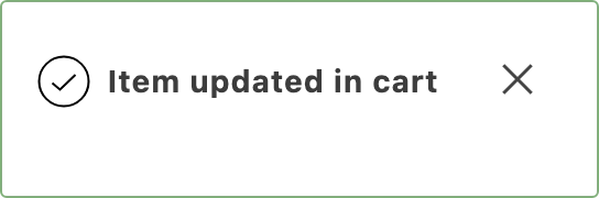
Section titled “Example”The cart shows InLineAlert as a transient success notification after a shopper updates a cart item’s quantity or options through the mini PDP, with an Icon next to the heading and a dismiss button that clears it.
import { InLineAlert, Icon, provider } from '/@dropins/tools/components.js';import { h } from '/@dropins/tools/preact.js';
const notification = await provider.render(InLineAlert, { heading: 'Item updated in cart', type: 'success', variant: 'primary', icon: h(Icon, { source: 'CheckWithCircle' }), // Announce the notification to screen readers as soon as it appears. 'aria-live': 'assertive', role: 'alert', onDismiss: () => notification.remove(),})(yourCartNotificationElement);
// Auto-dismiss after 5 seconds, the way the cart does.setTimeout(() => notification.remove(), 5000);