在此页面上:了解如何在电子邮件设计器中设计电子邮件内容,从头开始、通过代码或导入的 HTML 构建内容的关键步骤,以及使电子邮件在客户端之间呈现良好渲染效果的最佳实践。
要访问电子邮件设计器并开始设计电子邮件内容,您必须先在历程或营销活动中创建电子邮件。
然后,您可以使用Journey Optimizer 电子邮件设计功能 导入现有内容或从头开始构建响应式电子邮件。 了解详情
通过电子邮件设计器,您还可以:
➡️ 通过观看视频了解此功能
创建电子邮件内容的关键步骤 key-steps
创建电子邮件后,即可开始设计电子邮件内容。
-
在历程或营销活动配置屏幕中,浏览 编辑内容 屏幕,访问“电子邮件设计器”。 了解详情
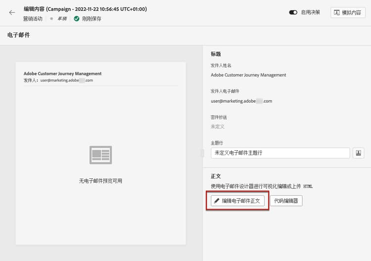
-
在“电子邮件设计器”主页上,从以下选项中选择设计电子邮件的方式:
-
通过电子邮件设计器的界面,并利用 Adobe Experience Manager Assets Essentials 中的图像,从头开始设计电子邮件。 要了解如何设计电子邮件内容,请参阅此部分。
-
直接在电子邮件设计器中编写或粘贴原始 HTML。 要了解如何编码自己的内容,请参阅此部分。
note NOTE 在营销活动中,您还可以选择 编辑内容 屏幕中的 代码编辑器 按钮。 了解详情 -
从文件或 .zip 文件夹导入现有 HTML 内容。 要了解如何导入电子邮件内容,请参阅此部分。
-
使用 AI 驱动的图像到 HTML 转换器,将图像设计转换为 HTML 模板。 在本节中了解如何将静态图像转换为可编辑的电子邮件模板。
-
从内置或自定义模板列表中选择现有内容。 通过本节了解如何使用电子邮件模板。

-
-
定义电子邮件内容并进行个性化后,您便可以通过 自动内容检查 来验证电子邮件内容,以便在发送之前直接在创作面板中捕获 HTML 和 CSS 问题,例如不支持的标记、空 div 和大小限制违规。 了解详情
note NOTE 系统还会在您设计时检查关键设置并显示警告(建议和最佳实践)和错误(阻止测试或激活的阻止问题)警报。 详细了解电子邮件警报 
-
您还可以验证内容质量,以确定可读性、内容一致性和有效性方面的潜在问题。 详细了解内容质量验证

-
最后,您可以导出内容以供验证或稍后使用。 单击导出 HTML 以在计算机上保存一个 zip 文件,其中将包含您的 HTML 和资源。

电子邮件设计最佳实践 best-practices
在发送电子邮件时,请务必考虑到收件人可能会转发它们,而这有时会导致电子邮件的呈现出现问题。 当用于转发的电子邮件提供商无法支持所使用的 CSS 类时尤为如此,例如,如果您使用“is-desktop-hidden”CSS 类来隐藏移动设备上的图像。
为了最大限度地减少这些呈现问题,我们建议尽可能简化电子邮件设计结构。 请尝试使用适用于桌面和移动设备的单个设计,并避免使用复杂的 CSS 类或其他设计元素,可能并非所有电子邮件客户端都完全支持这些元素。
遵循这些最佳实践有助于您确保电子邮件均能始终如一地正确呈现,无论收件人如何查看或转发电子邮件。
有关电子邮件设计的最佳实践,请参阅下表:
- 用于结构的基于表的静态布局
- 用于保持布局一致性的 HTML 表和嵌套表
- 介于 600px 和 800px 之间的模板宽度
- 用于设置样式的简单内联 CSS
- 用于实现通用兼容性的 Web 安全字体
- 某些电子邮件平台可能不显示背景图像。
- 自定义 Web 字体缺少通用支持。
- 宽布局在较小的屏幕上显示效果不佳。
- 图像映射提供有限的功能。
- 嵌入式 CSS 在电子邮件投放期间有时会被删除。
- 电子邮件环境中通常不支持 JavaScript。
- 大多数平台会阻止
<iframe>标记。 - Flash 已过期,不再受支持。
- 嵌入式音频经常无法播放。
- 嵌入式视频与许多电子邮件平台不兼容。
- 表单无法在电子邮件中运行。
<div>分层可能会导致渲染问题。
特定护栏和限制 email-guardrails
即使是结构良好的电子邮件,其呈现方式也可能因客户端或打开所在环境的不同而有所不同。 以下部分记录了在设计电子邮件时要牢记的已知限制和客户端特定行为。
移动 Web 浏览器限制 mobile-web-limitations
当收件人通过移动 Web 浏览器(例如,手机上的 Chrome)打开 Gmail 或 Outlook,而不是使用原生移动应用程序或桌面客户端时,电子邮件的呈现效果可能会有所不同。 这是移动 Web 邮件环境的已知限制,并非特定于 Journey Optimizer。
这种渲染差异源于 Web 邮件客户端在移动浏览器中的行为。 浏览器首先渲染完整的桌面 Web 邮件 UI,将电子邮件置于两层深处 — 超出任何响应式 CSS 或媒体查询的覆盖范围。 Gmail Web 还会剥离 CSS <style> 块,并将电子邮件内容包装在其自己的 <div> 中,这会覆盖您的样式并导致对齐冲突。
典型问题包括文本对齐偏移(左对齐文本居中显示居中)、内容部分之间的额外白色分隔行,以及整体布局与模板设计不符。
仅当通过移动浏览器访问时,Gmail Web 和 Outlook Web 中才会出现这些问题。 Outlook 和 Gmail 本机移动应用程序以及所有桌面客户端都不会受到影响。
-
使用基于表格的简单布局和完全内联 CSS。
-
避免依赖媒体查询或
<style>块获取重要布局属性,如文本对齐方式。
Outlook 渲染注意事项 outlook-tips
Outlook 有许多渲染异常,如果在设计期间未考虑这些异常,则可能会影响电子邮件布局。 要帮助确保电子邮件在 Outlook 中正确渲染,请遵循以下最佳实践:
- 内边距、字号和宽度使用偶数。 Outlook 会在内部将像素转换为磅值,当使用奇数时,这可能会导致间距不均或出现多余的白色线条。
- 设置表格宽度(以像素为单位,而非百分比)。 基于百分比的宽度可能会破坏 Outlook 中的布局。 直接在每个表格的样式属性中应用宽度值。
- 始终使用
width属性设置图像宽度。 Outlook 会忽略图像上的 CSSwidth和height属性,如果未设置 HTML 属性,则会回退到文件的原始尺寸。 - 在所有图像上包含替换文本。 这样可以防止在图像被阻止时出现显示和安全问题。
- 将边框应用于表格单元格,而不是应用于表格元素本身。 如果边框未按预期渲染,请将其从
<table>移至<td>。 - 避免使用圆角。 Outlook 对 CSS
border-radius的支持不可靠 — 方角是安全的默认选择。
有关深色模式的设计注意事项,包括如何使用媒体查询和特定于 Outlook.com 的图像交换技术,请参阅此页面。
操作说明视频 video
了解如何使用消息编辑器创建电子邮件内容。
了解如何配置内容试验以进行 A/B 测试,并探索电子邮件内容以最有效地推动业务目标的实现。
This section contains structured knowledge intended to support interpretation, retrieval, and question answering related to this topic.
For complete understanding, this information should be combined with the documentation on this page. Neither source is intended to stand alone; the page describes the feature, while this section provides additional context that helps disambiguate terminology, intent, applicability, and constraints.
- TL;DR: This page explains how to design email content in the Email Designer — building from scratch, code, or imported HTML — verify it with automated content checks and content quality validation, export it, and follow rendering best practices and client-specific limitations.
Intents:
- Choose how to design an email: from scratch, code/paste raw HTML, import existing HTML, convert image designs to HTML, or select an existing content template
- Verify email content with automated content checks before sending
- Validate content quality for readability, cohesiveness, and effectiveness
- Export email content as a zip file containing HTML and assets
- Apply email design best practices to keep emails rendering well across clients
- Account for mobile web browser and Outlook rendering limitations
Glossary:
- Email Designer: The Journey Optimizer interface used to import content or build responsive emails from scratch, code, or imported HTML (product-specific)
- Automated content checks: A check that catches HTML and CSS issues — such as unsupported tags, empty divs, and size limit violations — directly in the authoring panel, before sending (product-specific)
- Content quality validation: A validation that identifies potential issues with readability, content cohesiveness, and effectiveness (product-specific)
- Image to HTML converter: An AI-powered converter that transforms static image designs into editable email templates (product-specific)
- Export HTML: An action that saves a zip file to your computer including your HTML and assets (product-specific)
Guardrails:
- Recommended template widths are between 600px and 800px (recommended).
- Recommended practices: static, table-based layouts; HTML tables and nested tables; simple, inline CSS; web-safe fonts.
- Use with care (may not render everywhere): background images, custom web fonts, wide layouts, image maps, and embedded CSS (embedded CSS is sometimes removed during email delivery).
- Not recommended (generally unsupported in email): JavaScript,
<iframe>tags, Flash, embedded audio, embedded video, forms, and<div>layering. - Alerts distinguish warnings (recommendations and best practices) from errors (blocking issues that prevent testing or activation).
- Mobile web rendering differences occur only in Gmail Web and Outlook Web when accessed via a mobile browser; Gmail/Outlook native mobile apps and all desktop clients are not affected.
- Outlook rendering: use even numbers for padding, font sizes, and widths; set table widths in pixels not percentages; set image widths using the
widthattribute; include Alt text on all images; apply borders to<td>not<table>; avoidborder-radius(rounded corners).
Terminology:
- Canonical name: Email Designer — Acronym: n/a — variants: message editor, email design capabilities
- Synonyms: “automated content checks” = “content check”
- Do not confuse: “automated content checks” (HTML/CSS issue detection) ≠ “content quality validation” (readability, cohesiveness, effectiveness)
- Do not confuse: “warnings” (recommendations and best practices) ≠ “errors” (blocking issues that prevent testing or activation)
FAQ:
- Q: What options are available for designing an email? — Design from scratch, code or paste raw HTML, import existing HTML from a file or .zip, convert image designs to HTML templates, or select an existing built-in or custom template.
- Q: How can I catch HTML and CSS issues before sending? — Use automated content checks, which flag unsupported tags, empty divs, and size limit violations in the authoring panel.
- Q: What template width is recommended? — Between 600px and 800px.
- Q: Why does my email look different in Gmail or Outlook on a phone browser? — This is a known limitation of Gmail Web and Outlook Web via a mobile browser; use simple table-based layouts with fully inlined CSS and avoid relying on media queries or
<style>blocks for critical layout. - Q: How do I export my content? — Click Export HTML to save a zip file containing your HTML and assets to your computer.