在此页面上:了解在Adobe Journey Optimizer中设计无障碍电子邮件和登陆页的最佳实践,包括文本可读性、替换文本、深色模式、辅助功能属性,以及根据WCAG 2.1级别AA进行测试。
欧洲无障碍法是一项指令,旨在通过消除因成员国之间国家规则不同而造成的障碍,增强无障碍产品和服务的内部市场。
此法规规定,所有数字通信(包括电子邮件、新闻稿、PDF和可下载内容)都应可供访问。 因此,在为收件人创建内容时,您需要遵循特定准则,例如使用无障碍字体、可读格式以及为图像提供替换文本。
Journey Optimizer 电子邮件Designer允许营销人员为 电子邮件 和 登陆页面 生成内容,并允许您根据Web内容无障碍准则(WCAG) 2.1和AA级轻松遵守此指令。
因此,下面列出了使用Journey Optimizer设计无障碍内容的最佳实践。
确保文本可读性 text-readability
利用 文本 组件的 样式 选项卡确保文本可读,例如使用适当的颜色对比度和简单字体。 了解详情
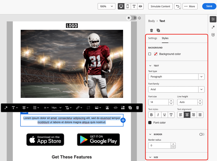
对于字体和文本,请确保遵循以下准则:
字体选择
- 使用Arial、Verdana、Tahoma、Helvetica或Open Sans等无衬线字体。
- 避免在正文内容中使用衬线、草稿或装饰性字体。
- 为了一致性和回退,请粘贴到有限的字体集(例如:
font-family: Arial, Helvetica, sans-serif;)。
字体大小
- 确保正文的最小字体大小为16px。
- 为标题使用正确的层次结构。
颜色对比度
- 保持文本与背景之间的对比度至少为4.5:1。
- 对于大文本(≥24px或粗体18px),请确保对比度至少为3:1。
- 避免在白色背景上使用浅灰色或淡色文本。
- 不要只依靠颜色来传达含义,而是要使用下划线、图标等。
文本辅助功能
- 避免在图像中使用文本。
- 请勿在正文中使用所有大写字母。
- 确保文本可以缩放到200%而不破坏布局。
确保可视辅助功能 visual-accessibility
要确保您的内容能够以可视方式访问,请遵循以下最佳实践:
- 避免使用仅用于颜色指示器的重要信息。
- 请使用文本标签或图标以确保清晰明了。
- 针对移动和响应式布局优化您的设计,确保按钮较大且间距适当。
- 定期跨设备和屏幕大小测试以保持可访问性。
在Journey Optimizer中,可以使用Email Designer 样式窗格中的样式参数和属性进一步细化内容中不同元素的大小和间距。 了解如何操作
例如,您可以更新背景,或者更改边距、填充和对齐方式,以改善内容的可视访问性。 了解详情
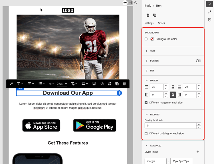
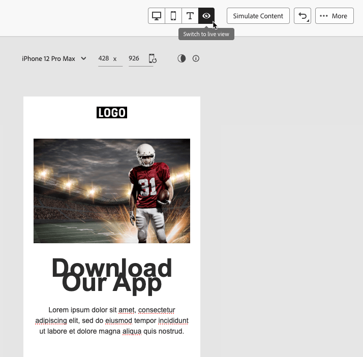
此外,Journey Optimizer电子邮件Designer允许您预览和优化不同设备和屏幕大小的设计。 您随时可以切换到实时视图,以便检查您的内容在各种设备大小上呈现的方式。
对图像使用替换文本 alt-text
使用 图像 组件为图像提供替换文本。 了解如何操作

要在数字产品中使用有效的替换文本,请遵循以下准则:
- 简洁而符合情境地描述图像的用途。
- 避免使用冗余短语,如“图像……” 并将空替换文本用于装饰性图像。
- 对于具有意义的图标,提供有意义的标签;对于复杂的图像,使用简短的替换文本以及在其他位置使用更长的描述。
使用可读格式 readable-format
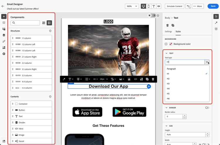
使用Email Designer相关结构和内容组件,以及 样式 窗格中的选项,以清晰、逻辑和简洁的方式整理您的内容,使所有人都可以访问。
- 使用结构化、语义化的HTML,并带有适当的标题、段落、列表和表。
- 确保内容遵循从左至右、从上至下的逻辑流程。
- 使用简洁明了的语言。
- 为PDF和信息图形提供替代格式。
- 允许调整文本大小和重排,并确保在所有格式下,使用足够的颜色对比度可读取排版规则。
确保内容可读性 readability
要阅读,您的内容必须清晰、结构合理,并且可供所有人使用,包括患有视觉、认知或阅读障碍的人以及使用辅助技术的人。 创建无障碍内容时要考虑的一些要点包括:
- 保持句子不超过20个词。
- 将副本编辑为直接指向点。
- 使用主动语态使句子结构更简单。
- 避免使用某些人可能不熟悉的俚语、行话或地区性用语。
为了评估您的电子邮件可读性,您可以使用常用的Flesch Reading Ease测试,该测试可在Microsoft Word中找到,并以0至100的级数计算内容的阅读方便程度。
测试您的内容 test
要验证内容的辅助功能,您可以使用Journey Optimizer提供的测试功能。 它们并非专门用于检查您的内容是否完全可访问,但它们可以提供第一级别的验证。
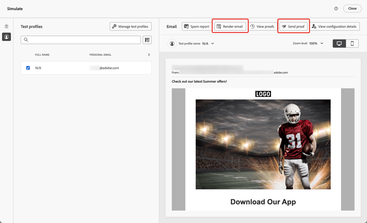
如果内容可可靠访问,要以更一致的方式签入,请访问特定的外部工具,例如:
-
WebAim对比度检查器和WAVE Web辅助功能评估工具用于评估对比度和符合性;
使用深色模式 dark-mode
深色模式增强了对光线敏感或视觉障碍的用户的可视访问性,从而改善了观看体验。
电子邮件Designer允许您切换到 深色模式 视图,并定义由支持电子邮件的客户端显示的特定自定义设置。 了解如何操作
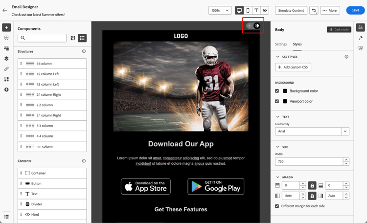
在深色模式下设计内容的最佳实践中,使用透明PNG或SVG,设置适当的元标记和CSS,并在不支持深色模式时提供可访问的回退样式。 最后,通过在浅色和深色模式下测试所有电子邮件内容和UI元素,确保电子邮件在深色模式下正确呈现。
此部分中列出了特定于深色模式的详细最佳实践,包括确保无障碍的准则。
使用特定属性进行辅助功能 attributes
语言属性 language
创建设计时,请在内容正文中包含lang(语言)和dir(文本方向)属性。 这些属性可帮助辅助技术(如屏幕阅读器)以适当的方式解释和展示您的内容。
-
lang属性指示发送给辅助技术的电子邮件的语言,确保单词的发音正确。accordion 示例 英语示例:
code language-none <body lang="en">法语示例:
code language-none <body lang="fr"> -
dir属性指定文本方向。 大多数语言,包括英语和法语,从左至右(ltr)阅读,而阿拉伯语和希伯来语等语言从右至左(rtl)阅读。accordion 示例 英语示例(从左至右):
code language-none <body lang="en" dir="ltr">阿拉伯语示例(从右至左):
code language-none <body lang="ar" dir="rtl">
屏幕阅读器依赖于lang属性来应用正确的发音规则,而文本方向可确保从左到右或从右到左语言的内容自然流动。 如果没有这些属性,用户可能会遇到阅读顺序混乱或发音错误的情况。 因此,请始终使用适当的lang和dir属性来封装电子邮件正文。
<table>或<td>块),以确保每个部分均可正确读取。表格 tables
在HTML内容中,表格通常用于布局。 默认情况下,屏幕阅读器将每<table>视为数据表,声明行、列和结构。 如果表仅用于格式化,这可能会造成混淆。
将role="presentation"(或role="none")添加到布局表,以确保辅助型技术跳过其结构并仅关注实际内容。
role="presentation")| code language-none |
|---|
|
屏幕阅读器显示:
“你好,世界。 欢迎收看我们的新闻稿。” (未提及行、列或表)
role="presentation")| code language-none |
|---|
|
屏幕阅读器显示:
“带2列3行的表。”
“姓名,爱丽丝。 分数,95。”
“姓名,鲍勃。 分数,88。”
role="presentation"用于布局表。 对于数据表,请保留语义<table>结构,以便屏幕阅读器可以正确声明标题和关系。链接文本 links
屏幕阅读器使用文本阅读链接。 如果链接仅标记为“单击此处”或“了解更多”,则使用辅助技术的用户将无法知道目标。 为确保辅助功能,他们需要清晰地指示目标或操作的描述性文本。
使用电子邮件Designer向内容添加链接并编辑标签以使其可见(可见)并具有描述性(清除目的)。 避免使用模糊的标签,如“此处”或“更多”。
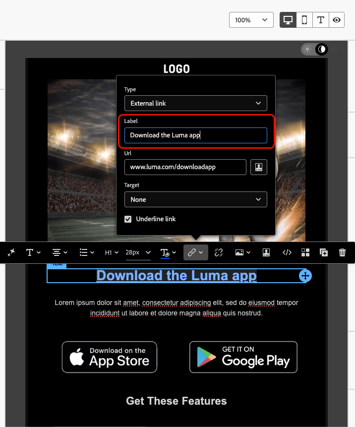
| code language-none |
|---|
|
屏幕阅读器显示:
“Link, 8月发行说明。”
| code language-none |
|---|
|
屏幕阅读器显示:
“链接,单击此处。” (未提供顺序不正确的上下文)
提供键盘导航和焦点支持 keyboard
提供键盘导航和焦点支持使无法使用鼠标的用户能够完全访问内容并与之交互。 它还通过为所有用户提供清晰、一致的信息浏览方式,提高了总体可用性。
-
通过键盘聚焦
-
确保所有交互式元素(如按钮、复选框、链接)均具有
tabindex="0",以便它们按自然选项卡顺序包含。 -
允许使用Tab键和箭头键(↑ ↓ ← →)进行导航,此时应会突出显示重点显示的元素。
-
-
自定义焦点样式
-
应用清晰且可区分的样式来关注可操作元素:
accordion 示例(CSS) code language-none [tabindex="0"] : focus { outline: 2px solid #00AEEF; /* Cyan border */ background-color: #20CEFF; /* Optional background */ } -
确保焦点指标符合WCAG 2.2的焦点外观标准,包括:
-
最小区域:2 CSS像素粗轮廓。
-
对比度:聚焦状态与未聚焦状态之间的对比度。
-
-
-
键盘激活支持
-
确保复选框和按钮与Enter和Space键相对应。
-
仅使用键盘验证交互:
-
Enter或Space应该切换复选框。
-
Enter或Space应该触发按钮。
-
-
This section contains structured knowledge intended to support interpretation, retrieval, and question answering related to this topic.
For complete understanding, this information should be combined with the documentation on this page. Neither source is intended to stand alone; the page describes the feature, while this section provides additional context that helps disambiguate terminology, intent, applicability, and constraints.
- TL;DR: This page lists best practices for designing accessible emails and landing pages in the Journey Optimizer Email Designer, in line with WCAG 2.1 level AA, covering text readability, alternative text, readable format, dark mode, accessibility attributes, and testing.
Intents:
- Ensure text readability using accessible fonts, font sizing, and color contrast in the Text component Styles tab
- Provide alternative text for images with the Image component
- Use the lang and dir attributes and layout-table roles to support assistive technologies
- Design content for dark mode using the Dark mode view
- Test content accessibility using preview, Email rendering, proofs, and content quality validation
- Provide keyboard navigation and focus support for interactive elements
Glossary:
- Live view: A generic preview in the Email Designer, accessed via Switch to live view, to compare how rendering might look across various device sizes; the final rendering may vary by email client (product-specific)
- Dark mode: An Email Designer view you can switch to and define custom settings for, displayed by supporting email clients (product-specific)
- Email rendering: A testing option that leverages Litmus to simulate designs across major email clients (Apple Mail, Gmail, Outlook) (product-specific)
- Send proofs: Sending proofs to test the rendering of content before sending it to the real audience (product-specific)
role="presentation": An attribute (orrole="none") added to layout tables so assistive technologies skip their structure and focus only on the content
Guardrails:
- Minimum font size of 16px for body text.
- Maintain a contrast ratio of at least 4.5:1 between text and background; for large text (≥24px or bold 18px), at least 3:1 contrast.
- Ensure text can be zoomed up to 200% without breaking layout.
- WCAG 2.2 focus appearance standards for focus indicators: minimum 2 CSS pixel thick outline, and contrast ratio ≥ 3:1 between focused and unfocused state.
- Interactive elements should have
tabindex="0"to be included in the natural tab order. - Keep sentences to around 20 words or less.
- Journey Optimizer testing capabilities are not specifically designed to check full accessibility; they provide a first level of verification, and specific external tools are recommended for consistent checking.
- Use
role="presentation"exclusively for layout tables; retain the semantic<table>structure for data tables.
Terminology:
- Canonical name: Accessible content — Acronym: WCAG (Web Content Accessibility Guidelines) — variants: accessible emails, accessible landing pages
- Synonyms: “alternative text” = “alt text”
- Do not confuse: “accessibility of your content” (this page) ≠ “accessibility of the Journey Optimizer interface itself” (separate section)
- Do not confuse: “Live view” (device-size rendering preview) ≠ “Email rendering” (Litmus simulation across email clients) ≠ “Send proofs” (test before sending to real audience)
FAQ:
- Q: What accessibility standard does the Email Designer align with? — Web Content Accessibility Guidelines (WCAG) 2.1, level AA.
- Q: What is the minimum recommended body text size and contrast ratio? — 16px for body text, with a contrast ratio of at least 4.5:1 between text and background (3:1 for large text).
- Q: Can Journey Optimizer confirm my content is fully accessible? — No; its testing capabilities provide a first level of verification only, so use specific external tools such as the WebAIM contrast checker, WAVE, and screen readers for consistent checking.
- Q: How do I make layout tables accessible to screen readers? — Add
role="presentation"(orrole="none") to layout tables so assistive technologies skip their structure and focus on the content. - Q: Which attributes help screen readers interpret content? — The
lang(language) anddir(text direction) attributes in the content body.