在此页面上:了解如何添加和配置电子邮件Designer内容组件(如按钮、文本、图像、分隔条、HTML、社交链接、优惠决策、网格和表)以构建电子邮件内容。
在创建电子邮件内容时,内容组件允许您使用原始组件进一步个性化电子邮件,这些组件一旦放入电子邮件中即可编辑。
您可以根据需要在一个或多个结构组件中添加任意数量的内容组件,这些组件定义电子邮件的布局。
添加内容组件 add-content-components
要将内容组件添加到您的电子邮件中,并根据您的需要调整这些内容组件,请执行以下步骤。
-
在电子邮件设计器中,使用现有内容或将 结构组件 拖放到空白内容中以定义电子邮件版面。 了解如何操作
-
要访问 内容组件 部分,请从电子邮件设计器左窗格中选择相应的按钮。
电子邮件Designer中的

-
将所选内容组件拖放到相关的结构组件中。

note NOTE 您可以将多个组件添加到单个结构组件中,也可以将它们添加到结构组件的每一列中。 -
选择新添加的组件。
-
使用右侧的 设置 和 样式 选项卡调整每个组件的属性和样式。 例如,您可以更改每个组件的文本样式、内边距或边距。 了解有关对齐方式和内边距的更多信息

-
通过 内容组件 的高级菜单,您可以根据需要轻松删除或复制任何内容组件。
内容组件操作的

容器 container
要将特定样式应用于一组内容组件,您可以添加 Container 组件,然后在其中添加所需的内容组件。 这允许您向容器应用不同的样式,这与应用于内部内容组件的样式不同。
例如,添加一个 容器 组件,然后在该容器中添加一个按钮组件。 可以为该容器使用一个特定背景,并为按钮使用另一个背景。

按钮 button
使用 按钮 组件可将一个或多个按钮插入电子邮件中,并将电子邮件受众重定向到另一个页面。
-
单击新添加的按钮以个性化文本,并访问“电子邮件Designer”右窗格中的 设置 和 样式 选项卡。
在Email Designer

-
从 链接 菜单中,添加单击该按钮时要重定向到的URL。
-
使用 Target 下拉列表选择如何重定向受众:
- 无:单击时在同一框架中打开链接(默认)。
- 空白:在新窗口或标签页中打开链接。
- 自身:单击时在同一框架中打开链接。
- 父:在父框架中打开链接。
- 顶部:在窗口的整个正文中打开链接。
Button组件的

-
您可以通过从 组件设置 窗格中更改边框、大小、边距等样式属性来进一步个性化按钮。
文本 text
使用 文本 组件将文本插入到您的电子邮件中,并调整样式(边框、大小、填充等) 使用 样式 选项卡。

-
单击新添加的组件以个性化文本,并访问Email Designer右侧窗格中的 设置 和 样式 选项卡。
-
使用工具栏中的以下可用选项更改文本:
电子邮件Designer中的

- 更改文本样式:对文本应用粗体、斜体、下划线或删除线。
- 更改对齐方式:为文本选择左对齐、右对齐、居中对齐或两端对齐。
- 创建列表:将项目符号或编号列表添加到文本中。
- 设置标题:向文本添加最多六个标题级别。
- 字体大小:选择文本的字体大小(以像素为单位)。
- 更改字体颜色:选择字体颜色。
- 插入链接:向内容添加任何类型的链接。
- 编辑图像:将图像或资产添加到文本组件。 了解有关资产管理的更多信息
- 更改字体颜色:选择字体颜色。
- 添加个性化:添加个性化字段以自定义轮廓数据中的内容。 详细了解内容个性化
- 显示源代码:显示文本的源代码。 不能修改。
- 启用条件内容:添加条件内容以将组件的内容调整到目标配置文件。 了解有关动态内容的更多信息
- 复制:添加文本组件的副本。
- 删除:从电子邮件中删除选定的文本组件。
-
从 样式 选项卡中调整其他样式属性,如文本颜色、字体系列、边框、填充、边距等。

分隔条 divider
使用 分隔条 组件可插入分隔线来整理电子邮件的版面和内容。
可从 设置 和 样式 选项卡调整线条颜色、样式和高度等样式属性。
在Email Designer

Html Html
使用 Html 组件复制并粘贴现有HTML的各个部分。 这使您能够创建免费的模块化 HTML 组件以重用某些外部内容。
-
单击新添加的组件,然后从上下文工具栏中选择 显示源代码 以添加 HTML。
使用“显示源代码”选项选择的

-
复制并粘贴要添加到电子邮件中的HTML代码,然后单击保存。

Dynamic Media模板 dynamic-media-template
使用 Dynamic Media模板 组件在电子邮件中利用个性化的交互式Dynamic Media。
使用此组件将Adobe Experience Manager中的Dynamic Media模板插入到您的电子邮件内容中,并直接在Dynamic Media模板编辑器中编辑该模板,而无需离开电子邮件Designer。 您还可以上传PSD (Photoshop)文件并以类似于Dynamic Media模板的方式对其进行编辑。 了解详情
电子邮件Designer中的

图像 image
使用 Image 组件将图像文件从您的计算机插入电子邮件内容。
在Email Designer中添加了

-
选择新添加的组件。
-
在 设置 选项卡中,单击 浏览 以从资源中选择图像文件,或单击 导入媒体 以将资源上传到Adobe Experience Manager Assets。
要了解有关Adobe Experience Manager Assets的更多信息,请参阅Adobe Experience Manager Assets文档。
note NOTE 为了确保您的链接保持活动状态并避免任何过期问题,我们建议使用Adobe Assets而不是依赖图像的源URL。 -
您还可以使用 查找Adobe Stock照片 选项直接在Adobe Stock中搜索。
-
单击新添加的组件并设置图像属性:
- 使用 图像标题 可以定义图像的标题。
- 使用 替代文字 可以定义链接到图像的题注。 这对应于 alt HTML 属性。 了解详情

-
您还可以选择查找类似的Stock照片。 了解详情
-
在 样式 选项卡中,调整其他样式属性,如边距、边框等,或添加链接以将受众重定向到 组件设置 窗格中的其他内容。
社交 social
使用 社交 组件可将指向社交媒体页面的链接插入到电子邮件内容中。
-
选择新添加的组件。 在 设置 选项卡的 社交 字段中,选择要添加或删除的社交媒体。
社交组件的

-
通过专用字段选择图标的大小。
-
单击每个社交媒体图标可配置受众将被重定向到的URL。
社交组件中社交媒体图标的

-
如果需要,您还可以从Assets中更改每个社交媒体的图标。
-
从 样式 选项卡中调整其他样式属性,如样式、边距、边框等。
优惠决策 offer-decision
使用 优惠决策 组件将优惠插入到消息中。 决策管理引擎将选取要提供给客户的最佳优惠。
-
选择新添加的组件并单击 添加 以选择您的优惠决策。
在电子邮件Designer中使用“添加”按钮的

-
从下拉列表中,选择您的投放位置。
-
然后,选择要添加到内容中的优惠决策,然后单击添加。

-
从 优惠决策 选项卡中,您可以预览或更改插入的优惠。
在本节中了解如何将个性化优惠添加到电子邮件中。
网格 grid
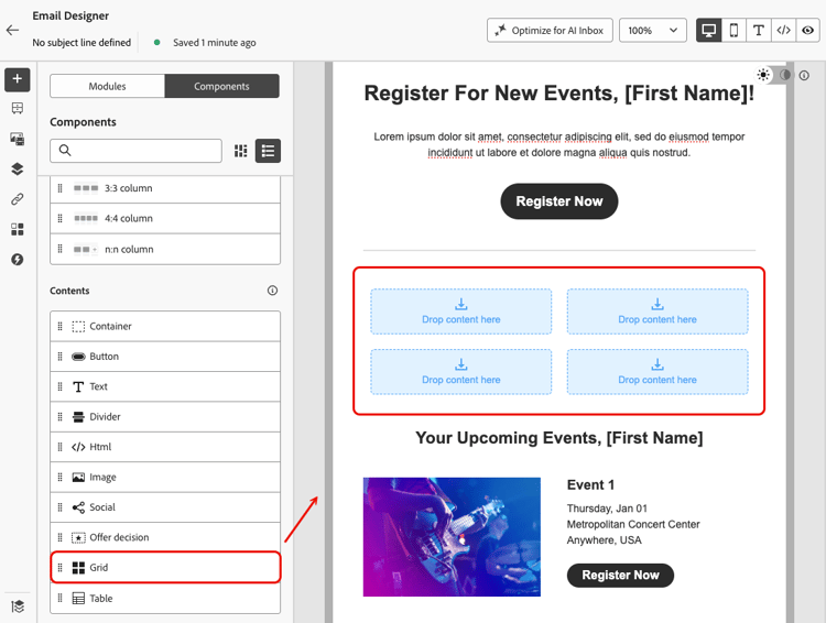
使用 网格 组件将内容组织成由行和列组成的结构,其中每个单元格可以包含其他内容组件。
-
与Container组件一样,将其他内容组件拖放到网格的每个单元格中。
例如,您可以添加 Text 组件、Image组件和两个 Button 组件。 然后,您可以添加图像并单独编辑每个组件的内容。

-
要调整网格的结构,请选择网格,然后转到Email Designer右窗格的 设置 选项卡。

-
您可以定义网格包含多少列和行,编辑列和行之间的间距,并以百分比更改每个列的宽度。
note NOTE 使用 请勿在移动设备上栈叠列 选项可在移动设备上保留网格布局,而不是垂直栈叠列。 -
根据需要将其他内容组件拖放到每个单元格中,并从每个组件的 样式 选项卡中调整样式。
表 table
使用 Table 组件可直接在电子邮件中构建行和列中的内容,从而创建清晰、有序的布局,而无需依赖自定义HTML。

-
添加后,单击该组件并选择Email Designer右窗格的 设置 选项卡。
-
从那里,您可以调整表的行数和列数。
-
使用 包含标题行 选项(默认启用)可向表中添加标题行,并切换 Stripe行 选项以应用交替的行颜色以提高可读性。
-
也可以直接在表中单击与列或行对应的箭头,然后使用上下文菜单添加或删除行或列。

-
从 样式 选项卡中调整其他样式属性,例如单元格颜色、字体大小、文本对齐或字体颜色。