
Integrate with a third-party address verification API
You might want to enhance the shopper experience by streamlining the process of populating and verifying the shipping address, thereby reducing the risk of user error. You can achieve this by implementing a third-party address lookup and autocomplete APIs, such as those provided by Google Places.
This tutorial describes how to override any field in a checkout address form and extend it to integrate with this service. The implementation supports backend-configurable validation and full form submission integration.
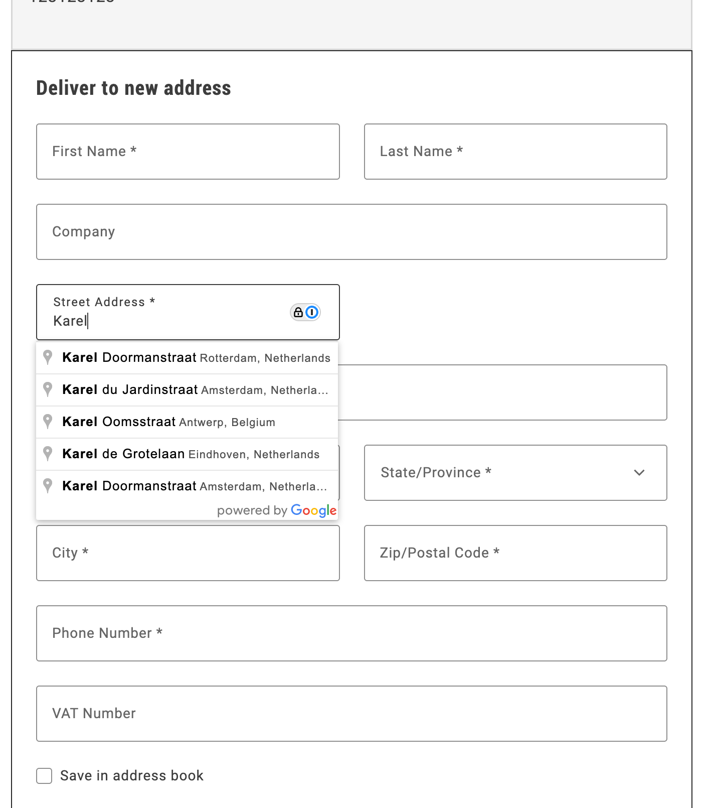
Upon successful completion of this tutorial, a form similar to the following will be displayed:
Step-by-step
Section titled “Step-by-step”The following steps describe how to integrate the Google Address Validation API with the Commerce boilerplate template using the provided address autocomplete implementation.
Prerequisites
Section titled “Prerequisites”For this tutorial, you must have a valid Google API key. Use API keys describes the process to obtain and set up this key.
Download and configure the address autocomplete implementation
Section titled “Download and configure the address autocomplete implementation”-
Download the implementation:
Copy the
address-autocomplete.jsfile from/public/samples/address-autocomplete.jsin this documentation repository to your project directory. -
Replace the API key placeholder:
Open the
address-autocomplete.jsfile and replaceADD-YOUR-GOOGLE-API-KEY-HEREwith your actual Google API key:const CONFIG = {googleApiKey: 'YOUR_ACTUAL_GOOGLE_API_KEY',// ... rest of configuration};
Import and initialize the autocomplete service
Section titled “Import and initialize the autocomplete service”In your commerce-checkout.js file, make the following changes to enable address autocomplete:
-
Import the autocomplete service:
import { initializeAutocompleteWhenReady } from './address-autocomplete.js'; -
Initialize the autocomplete in the
initializeCheckoutfunction:const initializeCheckout = async () => {// ... existing checkout initialization code ...// Initialize address autocomplete for shipping formconst shippingContainer = document.querySelector('[data-commerce-checkout-shipping]');if (shippingContainer) {initializeAutocompleteWhenReady(shippingContainer, 'input[name="street"]');}// ... rest of initialization code ...};
The initializeAutocompleteWhenReady function automatically:
- Waits for the address form to be rendered
- Attaches autocomplete functionality to the street input field
- Handles form field population when an address is selected
- Manages Google Maps API loading and initialization
Example
Section titled “Example”The complete address autocomplete implementation is available in /public/samples/address-autocomplete.js. This implementation includes:
- AddressAutocompleteService class: Handles Google Places API integration
- initializeAutocompleteWhenReady function: Utility function for easy integration
- Automatic form field population: Populates street, city, country, and postal code fields
- Keyboard navigation: Arrow keys, Enter, and Escape support
- Error handling: Graceful fallback when Google Maps API is unavailable
For additional customization options and advanced usage, see the implementation comments in the sample file.