Commerce block layouts
A drop-in component’s layout is defined by an HTML fragment that controls where the drop-in’s containers appear on the page. You can customize the layout as you would with any HTML, by using CSS and adding, removing, or rearranging the elements in the HTML. In this topic, we’ll customize the product details layout by adding the Product Recommendations block.
Big picture
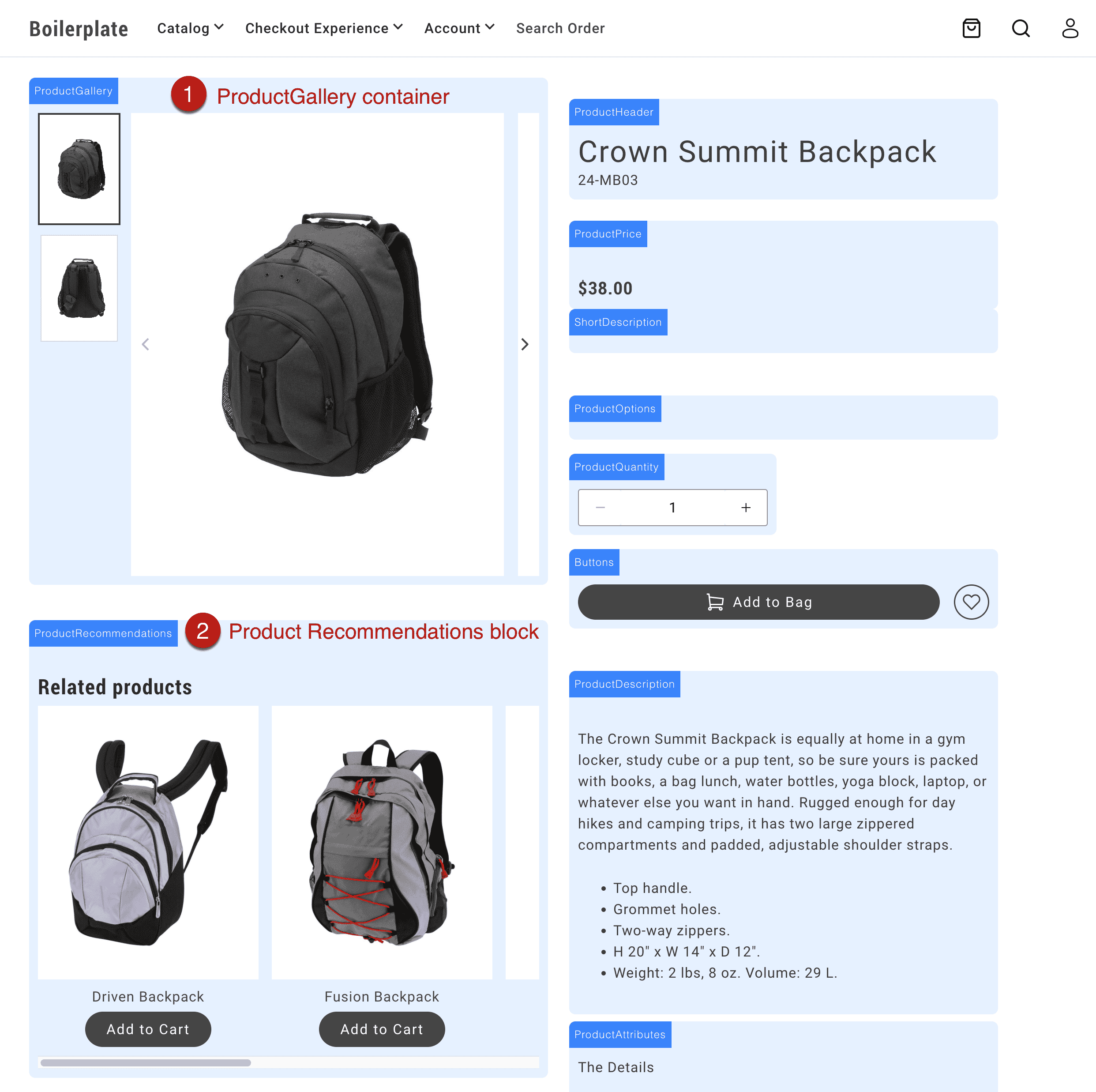
Section titled “Big picture”This screenshot shows the product details page with the Product Recommendations block below the product gallery container.

Customize commerce block layouts
Section titled “Customize commerce block layouts”For this use case, we’ll customize the product details layout by adding the Product Recommendations block inside the product details block, instead of below it.
Add an Edge Delivery block to a commerce page
Section titled “Add an Edge Delivery block to a commerce page”For example, add a Product Recommendations block to the product details page so that it can be rendered on the page, then referenced and moved to the layout (in code):

Add an element to the layout and reference it
Section titled “Add an element to the layout and reference it”Add an HTML element to the commerce block’s layout where you want the Edge Delivery block (or other content) to appear. In this example, we want the Product Recommendations block to appear in the left column of the product-details layout, below the product gallery. So we add a div element to the left column with a class of product-details__prex.
export default async function decorate(block) { // eslint-disable-next-line no-underscore-dangle const product = events._lastEvent?.['pdp/data']?.payload ?? null; const labels = await fetchPlaceholders();
// Layout const fragment = document.createRange().createContextualFragment(` <div class="product-details__wrapper"> <div class="product-details__alert"></div> <div class="product-details__left-column"> <div class="product-details__gallery"></div> <div class="product-details__prex"></div> </div> <div class="product-details__right-column"> <div class="product-details__header"></div> <div class="product-details__price"></div> <div class="product-details__gallery"></div> <div class="product-details__short-description"></div> <div class="product-details__configuration"> <div class="product-details__options"></div> <div class="product-details__quantity"></div> <div class="product-details__buttons"> <div class="product-details__buttons__add-to-cart"></div> <div class="product-details__buttons__add-to-wishlist"></div> </div> </div> <div class="product-details__description"></div> <div class="product-details__attributes"></div> </div> </div> `);Then, we reference the div element in the layout as follows:
// Reference the element const $prex = fragment.querySelector('.product-details__prex');Move the Edge Delivery block to the layout
Section titled “Move the Edge Delivery block to the layout”Within the eds/lcp lifecycle event, query the Edge Delivery block’s class selector from the rendered block and append it to right element in the layout. In this example, we select the Product Recommendations block using the .product-recommendations class, then move it to the element you want in the layout ($prex).
events.on( 'eds/lcp', () => { if (product) { setJsonLdProduct(product); setMetaTags(product); document.title = product.name; } const $productRecommendations = document.querySelector('.product-recommendations'); if ($productRecommendations) { $prex.appendChild($productRecommendations); } }, { eager: true }, );