在此頁面上:瞭解如何在電子郵件設計工具中設計您的電子郵件內容、從頭開始建立電子郵件的關鍵步驟、程式碼或匯入的 HTML,以及讓您的電子郵件在不同用戶端間正常轉譯的最佳做法。
若要存取電子郵件設計工具並開始設計您的電子郵件內容,您必須先在歷程或行銷活動中建立電子郵件。
然後您可以使用 Journey Optimizer 電子郵件設計功能來匯入現有內容或從頭開始建立回應式電子郵件。 了解更多
電子郵件設計工具也可讓您:
➡️ 在影片中探索此功能
建立電子郵件內容的關鍵步驟 key-steps
建立電子郵件後,您就可以開始設計電子郵件內容。
-
在歷程或行銷活動設定畫面,透過 編輯內容 畫面存取電子郵件設計工具。 了解更多
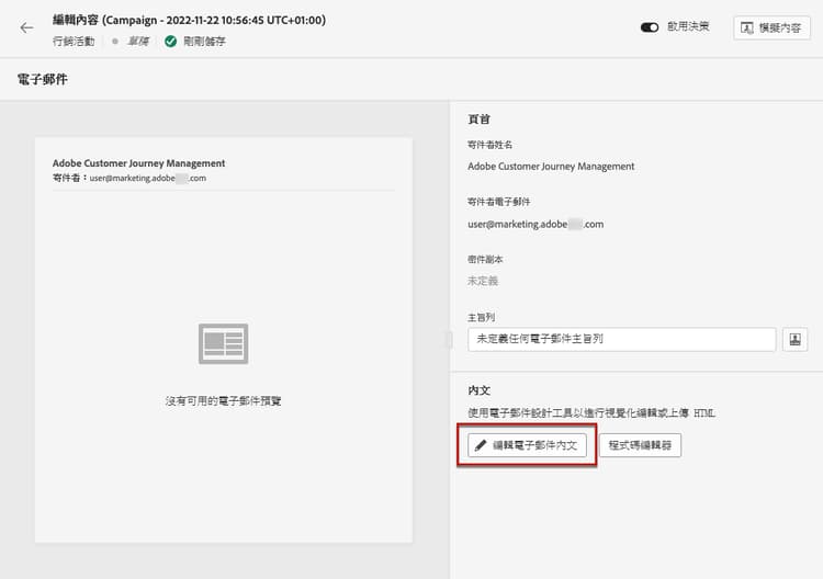
-
在電子郵件設計工具首頁,從下列選項選取您希望如何設計電子郵件:
-
透過電子郵件設計工具介面並善用 Adobe Experience Manager Assets 的影像從頭開始設計電子郵件。 在本節了解如何設計您的電子郵件內容。
-
請直接在電子郵件設計工具中,編寫程式碼或貼上原始 HTML。 在本節了解如何撰寫您自己的內容。
note NOTE 在行銷活動中,您還可以從 編輯內容 畫面選取 程式碼編輯器 按鈕。 了解更多 -
從檔案或 .zip 資料夾匯入現有 HTML 內容。 在本節了解如何匯入電子郵件內容。
-
使用 AI 支援的影像至 HTML 轉換工具,將影像設計轉換為 HTML 範本。 在本節中了解如何將靜態影像轉換為可編輯的電子郵件範本。
-
從內建或自訂範本的清單選取現有內容。 若要了解如何使用電子郵件範本,請參閱此區段。

-
-
定義並個人化您的電子郵件內容後,您就可以使用 自動化內容檢查 來驗證您的電子郵件內容,以便在傳送之前直接在編寫面板中偵測 HTML 和 CSS 問題,例如不支援的標籤、空白 div 和大小限制違規。 了解更多
note NOTE 在設計電子郵件訊息時,系統會檢查關鍵設定並顯示警告 (建議和最佳做法) 和錯誤 (封鎖會阻礙測試或啟用的問題) 的警示。 進一步瞭解電子郵件警示 
-
您也可以驗證內容品質,找出可讀性、內容一致性和有效性方面的潛在問題。 了解更多關於內容品質驗證的資訊

-
最後,您可以匯出內容以供驗證或稍後使用。 按一下匯出 HTML 以在您的電腦儲存包含您的 HTML 及資產的 zip 檔。

電子郵件設計最佳實務 best-practices
傳送電子郵件時,務必考慮到收件者有可能轉寄郵件,這有時可能會導致電子郵件呈現的問題。 使用用於轉寄的電子郵件提供商可能不支援的 CSS 類別時尤其如此,例如,如果您使用「is-desktop-hidden」CSS 類別來隱藏行動裝置上的影像。
若要將這些呈現問題降至最低,建議您盡可能讓電子郵件設計結構保持簡單。 請嘗試使用單一設計以便同時適用於桌面與行動裝置,並避免使用複雜 CSS 類別或其他設計元素,因為可能並非所有電子郵件用戶端均可完全支援。
無論收件者如何檢視或轉寄電子郵件,您都可遵循這些最佳實務來確保其均能以一致的方式正確呈現電子郵件。
請參閱下方表格,即可瞭解電子郵件設計的最佳實務:
- 結構為以靜態表格為基礎的版面
- HTML 表格和巢狀表格,維持版面一致性
- 範本寬度介於 600px 到 800px 之間
- 樣式的簡單、內嵌 CSS
- 網頁安全字型兼具通用相容性
- 背景圖片可能不會出現在某些電子郵件平台上。
- 自訂網頁字型缺少通用支援。
- 寬版面可能無法在較小的螢幕上正常顯示。
- 影像圖片只提供有限功能。
- 有時會在電子郵件傳送期間,將嵌入 CSS 移除。
- 電子郵件環境中,通常不會支援 JavaScript。
- 大多數的平台上,都已封鎖
<iframe>個標籤。 - Flash 已過時,系統不再提供支援。
- 嵌入音訊通常無法正常播放。
- 嵌入影片和許多電子郵件平台並不相容。
- 表單無法在電子郵件中正常運作。
<div>分層可能會導致轉譯問題。
特定護欄與限制 email-guardrails
即使結構良好的電子郵件,也可能會因開啟時使用的用戶端或環境而轉譯為不同效果。 下列章節記錄了設計電子郵件時應注意的已知限制和用戶端特定行為。
行動網頁瀏覽器限制 mobile-web-limitations
當收件者不是使用原生行動應用程式或桌面用戶端,而是透過行動網頁瀏覽器 (例如手機上的 Chrome) 開啟 Gmail 或 Outlook 時,電子郵件轉譯方式可能會有所不同。 這是行動 Webmail 環境的已知限制,並非 Journey Optimizer 特有。
這種轉譯差異源自 Webmail 用戶端在行動瀏覽器中的行為。 瀏覽器會先轉譯完整的桌面 Webmail UI,將電子郵件放在兩層深的位置,超出任何回應式 CSS 或媒體查詢能觸及的範圍。 Gmail Web 還會移除 CSS <style> 區塊,並將電子郵件內容包覆在自己的 <div> 中,可能覆寫您的樣式並造成對齊衝突。
典型症狀包括文字對齊偏移 (例如左對齊文字顯示為置中)、內容區段之間出現額外白色分隔線,以及整體版面與範本設計不同。
這些問題只會在透過行動瀏覽器存取 Gmail Web 和 Outlook Web 時發生。 Outlook 和 Gmail 原生行動應用程式,以及所有桌面用戶端都不受影響。
-
使用完全內嵌 CSS 的簡單表格式版面。
-
避免依賴媒體查詢或
<style>區塊來處理文字對齊等關鍵版面屬性。
Outlook 轉譯考量事項 outlook-tips
Outlook 有許多可能影響電子郵件版面的轉譯特性,設計時必須納入考量。 若要協助確保電子郵件能在 Outlook 中正確轉譯,請遵循下列最佳實務:
- 針對內距、字型大小和寬度使用偶數。 Outlook 會在內部將像素轉換為點數,使用奇數時可能會造成間距不均和不必要的白線。
- 以像素而非百分比設定表格寬度。 以百分比為基礎的寬度可能會破壞 Outlook 中的版面。 直接在每個表格的樣式屬性中套用寬度值。
- 一律使用
width屬性設定影像寬度。 如果沒有 HTML 屬性,Outlook 會忽略影像上的 CSSwidth和height屬性,並退回使用檔案的原生尺寸。 - 在所有影像上加入替代文字。 這可以防止在影像遭到封鎖時出現顯示和安全問題。
- 將邊框套用至表格儲存格,而非表格元素本身。 如果邊框未如預期呈現,請將邊框從
<table>移至<td>。 - 請避免使用圓角。 CSS
border-radius在 Outlook 中的支援並不可靠,方角才是安全的預設值。
關於深色模式設計考量,包括如何使用媒體查詢和 Outlook.com 特有的影像交換技巧,請參閱此頁面。
作法影片 video
了解如何使用訊息編輯器建立電子郵件內容。
了解如何設定內容實驗以進行 A/B 測試,並探索哪種電子郵件內容最能推動您的業務目標。
This section contains structured knowledge intended to support interpretation, retrieval, and question answering related to this topic.
For complete understanding, this information should be combined with the documentation on this page. Neither source is intended to stand alone; the page describes the feature, while this section provides additional context that helps disambiguate terminology, intent, applicability, and constraints.
- TL;DR: This page explains how to design email content in the Email Designer — building from scratch, code, or imported HTML — verify it with automated content checks and content quality validation, export it, and follow rendering best practices and client-specific limitations.
Intents:
- Choose how to design an email: from scratch, code/paste raw HTML, import existing HTML, convert image designs to HTML, or select an existing content template
- Verify email content with automated content checks before sending
- Validate content quality for readability, cohesiveness, and effectiveness
- Export email content as a zip file containing HTML and assets
- Apply email design best practices to keep emails rendering well across clients
- Account for mobile web browser and Outlook rendering limitations
Glossary:
- Email Designer: The Journey Optimizer interface used to import content or build responsive emails from scratch, code, or imported HTML (product-specific)
- Automated content checks: A check that catches HTML and CSS issues — such as unsupported tags, empty divs, and size limit violations — directly in the authoring panel, before sending (product-specific)
- Content quality validation: A validation that identifies potential issues with readability, content cohesiveness, and effectiveness (product-specific)
- Image to HTML converter: An AI-powered converter that transforms static image designs into editable email templates (product-specific)
- Export HTML: An action that saves a zip file to your computer including your HTML and assets (product-specific)
Guardrails:
- Recommended template widths are between 600px and 800px (recommended).
- Recommended practices: static, table-based layouts; HTML tables and nested tables; simple, inline CSS; web-safe fonts.
- Use with care (may not render everywhere): background images, custom web fonts, wide layouts, image maps, and embedded CSS (embedded CSS is sometimes removed during email delivery).
- Not recommended (generally unsupported in email): JavaScript,
<iframe>tags, Flash, embedded audio, embedded video, forms, and<div>layering. - Alerts distinguish warnings (recommendations and best practices) from errors (blocking issues that prevent testing or activation).
- Mobile web rendering differences occur only in Gmail Web and Outlook Web when accessed via a mobile browser; Gmail/Outlook native mobile apps and all desktop clients are not affected.
- Outlook rendering: use even numbers for padding, font sizes, and widths; set table widths in pixels not percentages; set image widths using the
widthattribute; include Alt text on all images; apply borders to<td>not<table>; avoidborder-radius(rounded corners).
Terminology:
- Canonical name: Email Designer — Acronym: n/a — variants: message editor, email design capabilities
- Synonyms: “automated content checks” = “content check”
- Do not confuse: “automated content checks” (HTML/CSS issue detection) ≠ “content quality validation” (readability, cohesiveness, effectiveness)
- Do not confuse: “warnings” (recommendations and best practices) ≠ “errors” (blocking issues that prevent testing or activation)
FAQ:
- Q: What options are available for designing an email? — Design from scratch, code or paste raw HTML, import existing HTML from a file or .zip, convert image designs to HTML templates, or select an existing built-in or custom template.
- Q: How can I catch HTML and CSS issues before sending? — Use automated content checks, which flag unsupported tags, empty divs, and size limit violations in the authoring panel.
- Q: What template width is recommended? — Between 600px and 800px.
- Q: Why does my email look different in Gmail or Outlook on a phone browser? — This is a known limitation of Gmail Web and Outlook Web via a mobile browser; use simple table-based layouts with fully inlined CSS and avoid relying on media queries or
<style>blocks for critical layout. - Q: How do I export my content? — Click Export HTML to save a zip file containing your HTML and assets to your computer.