在此頁面上:瞭解在Adobe Journey Optimizer中設計無障礙電子郵件和登入頁面的最佳實務,內容涵蓋文字可讀性、替代文字、深色模式、無障礙屬性,以及符合WCAG 2.1等級AA的測試。
歐洲無障礙法是一項指令,旨在透過消除因各成員國的不同國家規則所造成的障礙,來增強無障礙產品和服務的內部市場。
此法規規定所有數位通訊,包括電子郵件、電子報、PDF和可下載內容,皆應可供存取。 因此,在為收件者建立內容時,您必須遵循特定准則,例如使用無障礙字型、可讀格式以及為影像提供替代文字。
Journey Optimizer 電子郵件Designer可讓行銷人員建立 電子郵件 和 登陸頁面 的內容,讓您根據網頁內容可及性指引(WCAG) 2.1 (Level AA)輕鬆遵循此指示。
因此,以下列出使用Journey Optimizer設計無障礙內容的最佳實務。
確保文字可讀性 text-readability
運用 Text 元件的 樣式 標籤,確保文字可讀,例如使用適當的色彩對比和簡單字型。 了解更多
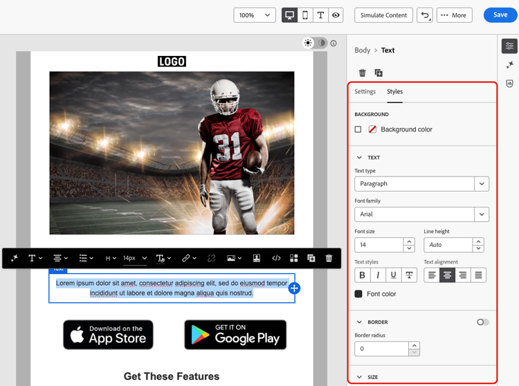
針對字型和文字,請務必遵循下列准則:
字型選擇
- 使用Arial、Verdana、Tahoma、Helvetica或Open Sans等無襯線字型。
- 避免在正文內容中使用襯線、草稿或裝飾字型。
- 保留至有限的字型集以取得一致性和遞補(例如:
font-family: Arial, Helvetica, sans-serif;)。
字型大小
- 確定內文字型大小下限為16px。
- 請使用適當的標題階層。
色彩對比
- 文字和背景之間的對比率至少維持在4.5:1。
- 對於大型文字(≥24px或粗體18px),請確定至少3:1的對比。
- 避免白色背景上的淺灰色或淡色文字。
- 請勿僅仰賴顏色來傳達意義,而是要使用底線、圖示等。
文字協助工具
- 避免影像中的文字。
- 請勿在正文中使用全部大寫字。
- 確保文字可以縮放至200%而不中斷版面。
確保視覺化協助工具 visual-accessibility
若要確保內容可透過視覺化方式存取,請遵循下列最佳實務:
- 避免使用僅限顏色的指標來取得重要資訊。
- 請使用文字標籤或圖示來確保清晰明瞭。
- 針對行動裝置和回應式版面配置最佳化您的設計,確保按鈕較大且間距適當。
- 定期測試裝置和熒幕大小,以維持協助工具。
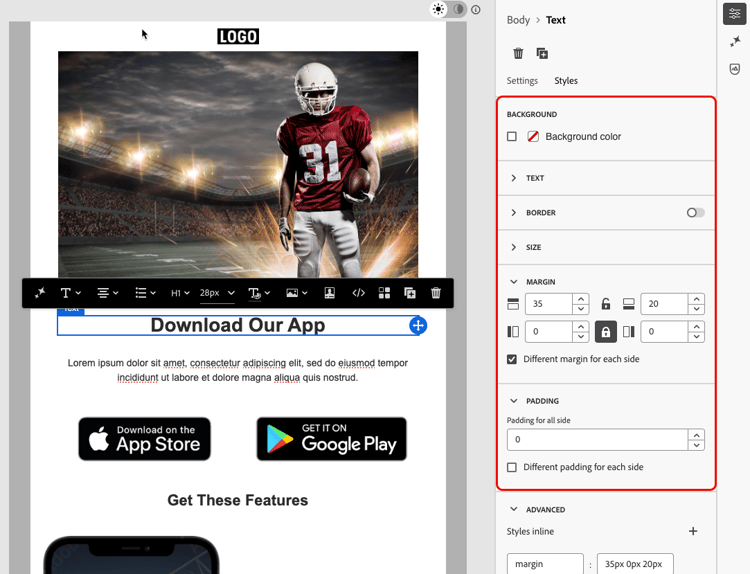
在Journey Optimizer中,您可以使用Email Designer 樣式窗格的樣式引數和屬性,進一步調整內容中不同元素的大小和間距。 了解作法
例如,您可以更新背景,或變更邊界、邊框間距和對齊方式,以改善內容的視覺協助工具。 了解更多
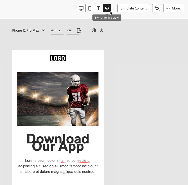
此外,Journey Optimizer電子郵件Designer可讓您預覽和最佳化不同裝置和熒幕大小的設計。 您隨時可以切換到即時檢視,以檢查您的內容在各種裝置大小上可能會如何呈現。
使用影像的替代文字 alt-text
使用 影像 元件提供影像的替代文字。 了解作法
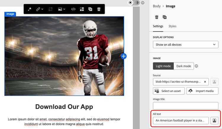
若要在數位產品中使用有效的替代文字,請遵循以下准則:
- 簡潔且情境化地描述影像用途。
- 避免多餘的詞句,例如「影像……」 並將空的替代文字用於裝飾性影像。
- 對於具有意義的圖示,提供有意義的標籤;對於複雜的影像,請使用簡短替代文字,並在其他位置使用較長的說明。
使用可讀格式 readable-format
使用電子郵件Designer相關結構和內容元件,以及 樣式 窗格中的選項,以清晰、邏輯且簡潔的方式組織您的內容,讓所有人都能存取。
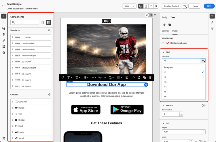
- 使用結構化、語意化的HTML,搭配適當的標題、段落、清單和表格。
- 確保內容遵循由左至右、由上至下的邏輯流程。
- 使用簡潔明瞭的語言。
- 為PDF和Infographics提供替代格式。
- 允許調整文字大小及重排,並確保印刷樣式在所有格式中都能以足夠的色彩對比讀取。
確保內容可讀性 readability
若要閱讀,您的內容必須清晰、結構良好,且可供所有人使用,包括視覺、認知或閱讀困難的人士以及使用輔助技術的人。 建立無障礙內容時,請考量以下幾點:
- 將句子保留在20字或更少之間。
- 編輯您的復本,使其成為直接和指向的復本。
- 使用主動語態讓句子結構更簡單。
- 避免使用某些人可能不熟悉的俚語、行話或地區性用語。
若要評估您的電子郵件可讀性,您可以使用熱門的Flesch Reading Easy測試,此測試可在Microsoft Word中找到,並以0至100的級數計算內容的閱讀容易程度。
測試您的內容 test
若要驗證內容的協助工具,您可以使用Journey Optimizer提供的測試功能。 它們不是特別設計來檢查您的內容是否完全可存取,但是它們可以提供第一級的驗證。
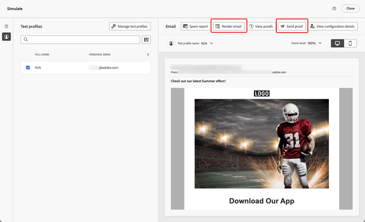
如果能以可靠的方式存取內容,若要以更一致的方式簽入,請前往特定的外部工具,例如:
-
WebAim對比檢查程式和WAVE網頁協助工具評估工具,以評估對比和相容性;
-
熒幕助讀程式之類的輔助技術(例如: NVDA,或iPhone上的VoiceOver),可從視障使用者的角度體驗電子郵件。
使用深色模式 dark-mode
深色模式可增強對光線敏感度或視覺障礙的使用者的視覺協助功能,進而改善觀看體驗。
電子郵件Designer可讓您切換至 深色模式 檢視,並定義支援電子郵件使用者端顯示的特定自訂設定。 了解作法
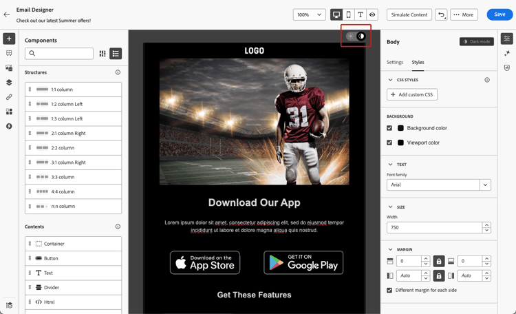
在深色模式中設計內容的最佳實務中,請使用透明的PNG或SVG、設定適當的中繼標籤和CSS,並在不支援深色模式時提供可存取的遞補樣式。 最後,透過在淺色和深色模式下測試所有電子郵件內容和UI元素,確保您的電子郵件在深色模式下正確呈現。
本節中列出了深色模式的詳細最佳實務,包括確保協助工具的准則。
針對協助工具使用特定屬性 attributes
語言屬性 language
建立設計時,請在內容本文中包含lang (語言)和dir (文字方向)屬性。 這些屬性可協助輔助技術(例如熒幕閱讀程式)以適當的方式解譯和呈現您的內容。
-
lang屬性指出輔助技術所使用之電子郵件的語言,確保正確發音單字。accordion 範例 英文範例:
code language-none <body lang="en">法文範例:
code language-none <body lang="fr"> -
dir屬性指定文字方向。 大部分的語言,包括英文和法文,都是由左至右(ltr)閱讀,而阿拉伯文和希伯來文等語言則是由右至左(rtl)閱讀。accordion 範例 英文範例(由左至右):
code language-none <body lang="en" dir="ltr">阿拉伯文範例(由右至左):
code language-none <body lang="ar" dir="rtl">
熒幕朗讀程式依賴lang屬性來套用正確的發音規則,而文字方向可確保內容從左至右或從右至左的語言自然流暢。 如果沒有這些屬性,使用者可能會遇到閱讀順序混亂或發音錯誤的情況。 因此,請一律使用適當的lang和dir屬性包住您的電子郵件內文。
<table>或<td>區塊),以確保每個部分都能正確讀取。表格 tables
在HTML內容中,表格通常用於版面。 依預設,熒幕助讀程式會將每個<table>視為資料表,宣告列、欄和結構。 如果表格僅用於格式設定,這可能會造成混淆。
將role="presentation" (或role="none")新增至配置表格,以確保輔助技術會略過其結構並僅專注於實際內容。
role="presentation")| code language-none |
|---|
|
熒幕助讀程式顯示:
「你好。 歡迎使用我們的電子報。」 (未提及列、欄或資料表)
role="presentation")| code language-none |
|---|
|
熒幕助讀程式顯示:
「2欄3列的表格。」
「姓名,Alice。 分數, 95。」
「姓名,Bob。 分數, 88。」
role="presentation"配置表格。 對於資料表,請保留語意<table>結構,讓熒幕朗讀程式可以正確宣告標題和關聯性。連結文字 links
熒幕助讀程式會使用文字朗讀連結。 如果連結僅標籤為「按一下這裡」或「閱讀更多」,則輔助技術的使用者將無法知道目的地。 為了確保協助工具,這些檔案需要清楚指出目標或動作的描述性文字。
使用電子郵件Designer將連結新增到您的內容並編輯標籤,使其可辨識(可見)並描述性(清除用途)。 避免使用模糊的標籤,如「這裡」或「更多」。
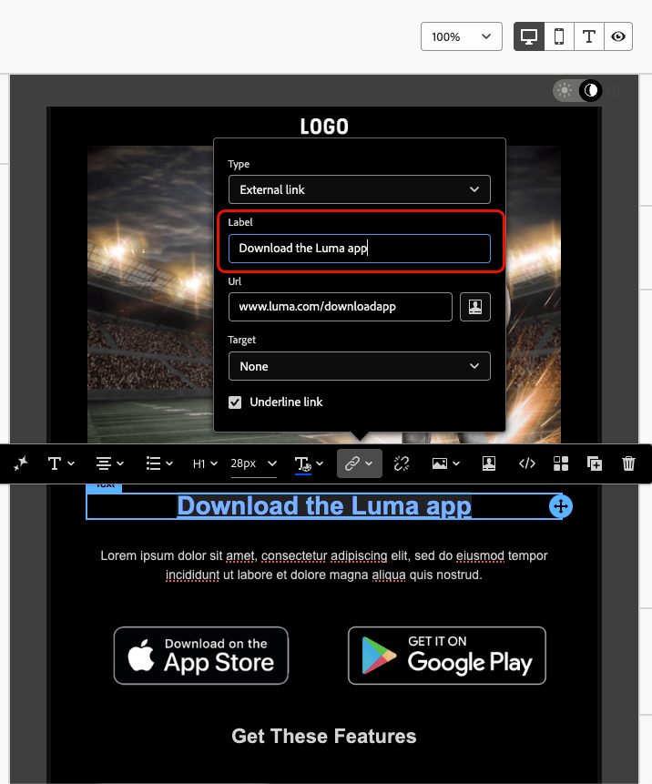
| code language-none |
|---|
|
熒幕助讀程式顯示:
「連結,8月發行說明。」
| code language-none |
|---|
|
熒幕助讀程式顯示:
「連結,按一下這裡。」 (未提供讀取順序錯亂的內容)
提供鍵盤導覽和焦點支援 keyboard
提供鍵盤導覽和焦點支援,讓無法使用滑鼠的人能夠完全存取內容並與內容互動。 它也能讓所有使用者以清晰一致的方式瀏覽資訊,進而改善整體可用性。
-
透過鍵盤聚焦
-
確認所有互動式元素(例如按鈕、核取方塊、連結)皆有
tabindex="0",使其以自然索引標籤順序包含。 -
允許使用Tab鍵和方向鍵(↑ ↓ ← →)導覽,這應該會明顯反白標示重點元素。
-
-
自訂焦點樣式
-
套用清晰且可區分的樣式,以聚焦於可操作的元素:
accordion 範例(CSS) code language-none [tabindex="0"] : focus { outline: 2px solid #00AEEF; /* Cyan border */ background-color: #20CEFF; /* Optional background */ } -
確保焦點指標符合WCAG 2.2焦點外觀標準,包括:
-
最小區域:2個CSS畫素粗輪廓。
-
對比率:焦點狀態與未焦點狀態之間的對比。
-
-
-
鍵盤啟動支援
-
確認核取方塊和按鈕會回應Enter和Space鍵。
-
僅使用鍵盤驗證互動:
-
Enter或Space應該切換核取方塊。
-
輸入或空格應該會觸發按鈕。
-
-
This section contains structured knowledge intended to support interpretation, retrieval, and question answering related to this topic.
For complete understanding, this information should be combined with the documentation on this page. Neither source is intended to stand alone; the page describes the feature, while this section provides additional context that helps disambiguate terminology, intent, applicability, and constraints.
- TL;DR: This page lists best practices for designing accessible emails and landing pages in the Journey Optimizer Email Designer, in line with WCAG 2.1 level AA, covering text readability, alternative text, readable format, dark mode, accessibility attributes, and testing.
Intents:
- Ensure text readability using accessible fonts, font sizing, and color contrast in the Text component Styles tab
- Provide alternative text for images with the Image component
- Use the lang and dir attributes and layout-table roles to support assistive technologies
- Design content for dark mode using the Dark mode view
- Test content accessibility using preview, Email rendering, proofs, and content quality validation
- Provide keyboard navigation and focus support for interactive elements
Glossary:
- Live view: A generic preview in the Email Designer, accessed via Switch to live view, to compare how rendering might look across various device sizes; the final rendering may vary by email client (product-specific)
- Dark mode: An Email Designer view you can switch to and define custom settings for, displayed by supporting email clients (product-specific)
- Email rendering: A testing option that leverages Litmus to simulate designs across major email clients (Apple Mail, Gmail, Outlook) (product-specific)
- Send proofs: Sending proofs to test the rendering of content before sending it to the real audience (product-specific)
role="presentation": An attribute (orrole="none") added to layout tables so assistive technologies skip their structure and focus only on the content
Guardrails:
- Minimum font size of 16px for body text.
- Maintain a contrast ratio of at least 4.5:1 between text and background; for large text (≥24px or bold 18px), at least 3:1 contrast.
- Ensure text can be zoomed up to 200% without breaking layout.
- WCAG 2.2 focus appearance standards for focus indicators: minimum 2 CSS pixel thick outline, and contrast ratio ≥ 3:1 between focused and unfocused state.
- Interactive elements should have
tabindex="0"to be included in the natural tab order. - Keep sentences to around 20 words or less.
- Journey Optimizer testing capabilities are not specifically designed to check full accessibility; they provide a first level of verification, and specific external tools are recommended for consistent checking.
- Use
role="presentation"exclusively for layout tables; retain the semantic<table>structure for data tables.
Terminology:
- Canonical name: Accessible content — Acronym: WCAG (Web Content Accessibility Guidelines) — variants: accessible emails, accessible landing pages
- Synonyms: “alternative text” = “alt text”
- Do not confuse: “accessibility of your content” (this page) ≠ “accessibility of the Journey Optimizer interface itself” (separate section)
- Do not confuse: “Live view” (device-size rendering preview) ≠ “Email rendering” (Litmus simulation across email clients) ≠ “Send proofs” (test before sending to real audience)
FAQ:
- Q: What accessibility standard does the Email Designer align with? — Web Content Accessibility Guidelines (WCAG) 2.1, level AA.
- Q: What is the minimum recommended body text size and contrast ratio? — 16px for body text, with a contrast ratio of at least 4.5:1 between text and background (3:1 for large text).
- Q: Can Journey Optimizer confirm my content is fully accessible? — No; its testing capabilities provide a first level of verification only, so use specific external tools such as the WebAIM contrast checker, WAVE, and screen readers for consistent checking.
- Q: How do I make layout tables accessible to screen readers? — Add
role="presentation"(orrole="none") to layout tables so assistive technologies skip their structure and focus on the content. - Q: Which attributes help screen readers interpret content? — The
lang(language) anddir(text direction) attributes in the content body.