在此頁面上:瞭解如何新增及設定電子郵件Designer內容元件,例如按鈕、文字、影像、分隔線、HTML、社交連結、優惠決定、網格及表格,以建置您的電子郵件內容。
建立電子郵件內容時,內容元件可讓您使用原始元件進一步個人化電子郵件,一旦放入電子郵件中即可編輯原始元件。
您可以視需要在一個或多個結構元件中新增任意數量的內容元件,這些元件定義電子郵件的版面。
新增內容元件 add-content-components
若要將內容元件新增到電子郵件並根據您的需要進行調整,請依照以下步驟進行。
-
在電子郵件設計工具中,使用現有內容或將 結構元件 拖放到您的空白內容以定義電子郵件的版面。 了解作法
-
若要存取「內容元件」區段,從電子郵件設計工具左窗格選取對應的按鈕。
電子郵件Designer中的

-
將您選擇的內容元件拖放到相關結構元件內部。

note NOTE 您可以將多個元件新增到單一結構元件和結構元件的每個欄中。 -
選取新新增的元件。
-
使用右側的 設定 和 樣式 索引標籤,調整每個元件的屬性和樣式。 例如,您可以變更每個元件的文字樣式、內距或邊界。 了解對齊方式和邊框間距的詳細資訊

-
從 內容元件 的進階功能表,您可以視需要輕鬆刪除或複製任何內容元件。

容器 container
若要將特定樣式套用至一組內容元件,您可以新增 Container 元件,然後在其中新增您想要的內容元件。 這可讓您將不同的樣式套用至容器,這會與套用至內部內容元件的樣式不同。
例如,新增 容器 元件,然後在該容器內部新增按鈕元件。 您可以為容器使用特定背景,為按鈕使用另一個背景。

按鈕 button
使用 按鈕 元件將一個或多個按鈕插入您的電子郵件,並將您的電子郵件客群重新導向到另一個頁面。
-
按一下您新新增的按鈕以個人化文字,並存取[電子郵件Designer]右窗格中的 設定 和 樣式 標籤。
在電子郵件Designer

-
從 連結 功能表,新增您要在按一下按鈕時重新導向的URL。
-
透過 Target 下拉式清單,選擇將您的對象重新導向的方式:
- 無:當框架被點按時在相同框架中開啟連結 (預設)。
- 空白:在新的視窗或索引標籤中開啟連結。
- 自我:當框架被點按時在相同框架中開啟連結。
- 父系:在父框架中開啟連結。
- 頂端:在視窗的完整內文中開啟連結。
Button元件的

-
您可以從 元件設定 窗格變更樣式屬性,例如Border、Size、Margin等,以進一步個人化您的按鈕。
文字 text
使用 文字 元件將文字插入您的電子郵件,並調整樣式(邊框、大小、邊框間距等) 使用 樣式 索引標籤。

-
按一下您新新增的元件,以個人化文字,並存取電子郵件Designer右窗格中的 設定 和 樣式 標籤。
-
使用以下工具列的選項變更文字:

- 變更文字樣式:將粗體、斜體、底線或刪除線套用到文字。
- 變更對齊方式:選擇文字靠左對齊、靠右對齊、置中或左右對齊。
- 建立清單:新增項目符號清單或編號清單新增到文字。
- 設定標題:為文字新增標題,最多六層。
- 字型大小:選取文字的字型大小 (以像素為單位)。
- 變更字型顏色:選擇字型的顏色。
- 插入連結:新增任何型別的連結至您的內容。
- 編輯影像:將影像或資產新增到文字元件。 進一步瞭解資產管理
- 變更字型顏色:選擇字型的顏色。
- 新增個人化:新增個人化欄位以從輪廓資料自訂內容。 進一步了解內容個人化
- 顯示原始碼:顯示文字的原始碼。 原始碼無法變更。
- 啟用條件式內容:新增條件式內容,以將元件的內容調整至目標設定檔。 進一步瞭解動態內容
- 複製:新增文字元件的副本。
- 刪除:從電子郵件刪除選取的文字元件。
-
從 樣式 索引標籤調整其他樣式屬性,例如文字顏色、字型系列、邊框、邊框間距、邊界等。

分隔線 divider
使用 分隔線 元件以插入分隔線來組織電子郵件的版面和內容。
您可以從「設定」和「樣式」索引標籤調整樣式屬性,例如線條顏色、樣式和高度。

Html Html
使用 Html 元件來複製貼上現有HTML的不同部分。 這可讓您建立靈活的模組化 HTML 元件,以重複使用一些外部內容。
-
按一下您新增的元件,然後選取「顯示原始碼」從內容關聯式工具列新增至 HTML。
以[顯示原始程式碼]選項選取的

-
複製並貼上您要新增至電子郵件的HTML程式碼,然後按一下[儲存]。

動態媒體範本 dynamic-media-template
使用 Dynamic Media範本 元件,在您的電子郵件中運用個人化和互動式Dynamic Media。
使用此元件可將來自Adobe Experience Manager的動態媒體範本插入您的電子郵件內容,並直接在Dynamic Media範本編輯器中編輯它,而不需離開電子郵件Designer。 您也可以上傳PSD (Photoshop)檔案,並以類似動態媒體範本的方式加以編輯。 了解更多

影像 image
使用 Image 元件,將影像檔案從電腦插入電子郵件內容。

-
選取新新增的元件。
-
在 設定 標籤中,按一下 瀏覽 以從您的資產選擇影像檔案,或按一下 匯入媒體 以將資產上傳到Adobe Experience Manager Assets。
若要深入瞭解Adobe Experience Manager Assets,請參閱Adobe Experience Manager Assets檔案。
note NOTE 為確保您的連結維持作用中狀態並避免任何到期問題,我們建議您使用Adobe Assets,而不是仰賴影像的來源URL。 -
您也可以使用 尋找Adobe Stock像片 選項,直接在Adobe Stock中搜尋。
-
按一下您新增的元件,然後設定影像屬性:
- 影像標題可讓您定義影像的標題。
- 替代文字可讓您定義連結到影像的註解。 這對應於 HTML 的 alt 屬性。 了解更多

-
您也可以選擇尋找類似的像片。 了解更多
-
從 樣式 索引標籤,調整其他樣式屬性,例如邊界、邊框等,或新增連結以將您的對象重新導向至 元件設定 窗格中的其他內容。
社交 social
使用 社交 元件將社交媒體頁面連結插入到電子郵件內容中。
-
選取您新新增的元件。 在「設定」索引標籤的「社交」欄位中,選擇要新增或移除的社交媒體。
社交元件的

-
透過專用欄位選擇圖示的大小。
-
按一下您的每個社群媒體圖示來設定您的對象將重新導向到的URL。
社交元件中社群媒體圖示的

-
如有需要,您也可以從Assets變更每個社群媒體的圖示。
-
從 樣式 索引標籤調整其他樣式屬性,例如樣式、邊界、邊框等。
優惠決定 offer-decision
使用 優惠決定 元件將優惠插入您的訊息。 決定管理引擎會挑選要遞送給客戶的最佳優惠方案。
-
選取新新增的元件,然後按一下 新增 以選取您的優惠決定。

-
從下拉式清單中,選取您的位置。
-
接著,選取您要新增至內容的優惠決定,然後按一下新增。

-
從 優惠決定 索引標籤,您可以預覽或變更插入的優惠。
瞭解如何在本節中將個人化優惠新增至電子郵件。
格線 grid
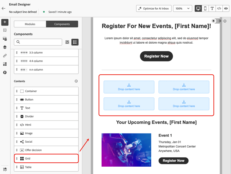
使用 網格 元件將內容組織成由列和欄組成的結構,其中每個儲存格可以包含其他內容元件。
-
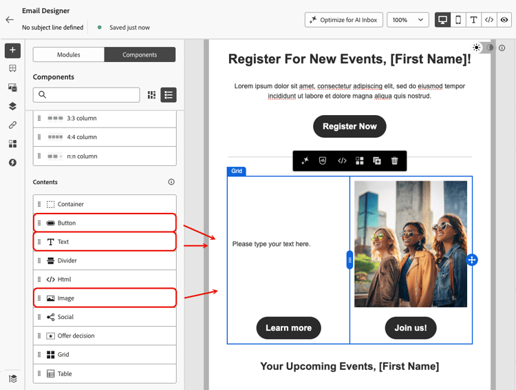
就像Container元件一樣,將其他內容元件拖放至格線的每個儲存格中。
例如,您可以新增 Text 元件、Image元件和兩個 Button 元件。 接著,您可以新增影像並個別編輯每個元件的內容。
-
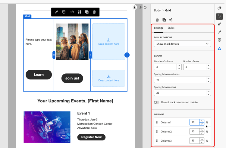
若要調整格線的結構,請選取格線並移至[電子郵件Designer]右窗格的 設定 標籤。
-
您可以定義網格包含多少欄和列、編輯欄和列之間的間距,以及變更每個個別欄的寬度(百分比)。
note NOTE 使用 請勿在行動裝置上棧疊欄 選項可保留行動裝置上的格線配置,而非垂直棧疊欄。 -
視需要將其他內容元件放入每個儲存格,並從每個元件的 樣式 索引標籤調整樣式。
表格 table
使用 Table 元件,直接在電子郵件中建構行和欄的內容,建立清晰、有條理的版面配置,而不需依賴自訂HTML。

-
新增後,按一下元件並選取[電子郵件Designer]右窗格的 設定 標籤。
-
從那裡,您可以調整表格的列數和欄數。

-
使用 包含標題列 選項(預設為啟用)將標題列新增至表格,並切換 Stripe列 選項以套用交替的列色彩,以改善可讀性。
-
您也可以直接在表格中按一下與欄或列對應的箭頭,並使用內容功能表來新增或刪除列或欄。

-
從 樣式 索引標籤調整其他樣式屬性,例如儲存格顏色、字型大小、文字對齊或字型顏色。