이 페이지에서: 구조 및 콘텐츠 구성 요소를 추가한 다음 이메일을 개인화하고 미리 봄으로써 Adobe Journey Optimizer 이메일 Designer에서 이메일 콘텐츠를 처음부터 디자인하는 방법을 알아봅니다.
Adobe Journey Optimizer 전자 메일 Designer을 사용하여 콘텐츠의 구조를 쉽게 정의할 수 있습니다. 간단한 드래그 앤 드롭 작업으로 구조 요소를 추가 및 이동하여 콘텐츠의 형태를 몇 초 이내에 디자인할 수 있습니다.
콘텐츠 작성을 시작하려면 아래 단계를 따르십시오.
-
Designer 홈페이지에서 처음부터 디자인 옵션을 선택합니다.

-
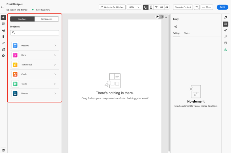
빠르게 시작하려면 모듈(머리글, 영웅 섹션, 바닥글과 같이 미리 디자인된 미리 사용 가능한 콘텐츠 블록)을 사용하여 전자 메일 만들기 속도를 높이고 캠페인을 시각적으로 일관되게 유지하세요. 모듈에 대해 자세히 알아보기
-
그렇지 않으면 구조를 캔버스로 드래그 앤 드롭하여 전자 메일의 레이아웃을 정의하여 콘텐츠를 디자인할 수 있습니다.
note tip TIP 또는 [콘텐츠 생성]을 사용하여 전자 메일 만들기 속도를 높여 AI로 전체 콘텐츠 생성을 사용하여 텍스트 및 이미지를 포함한 전체 전자 메일 콘텐츠를 생성합니다. 그런 다음 콘텐츠 미리보기 및 유효성 검사로 건너뛸 수 있습니다. -
필요에 따라 구조를 추가하고 오른쪽의 전용 창에서 해당 설정을 편집합니다.
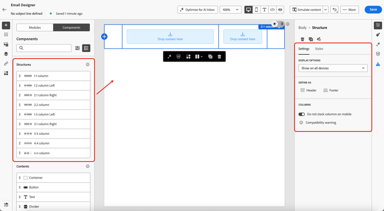
note NOTE 좁은 화면(예: 모바일)에서는 가독성을 위해 기본적으로 열이 세로로 스택됩니다. 일부 이메일 클라이언트는 이 동작을 지원하지 않으며, 이 경우 열은 나란히 유지됩니다. 설정 탭에서 모바일에서 열을 스택하지 않음 토글을 사용하여 이 기능을 끌 수도 있습니다. -
대부분의 구조(1:1 열, 2:2 열, 1:2 열 왼쪽 등)는 고정된 사전 설정입니다. 대신 n:n 열 구성 요소를 선택하여 원하는 열 수(3개에서 10개 사이)를 정의합니다.
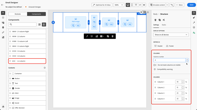
설정 탭에서 언제든지 기존 구조의 열 개수를 늘릴 수 있습니다. 콘텐츠를 추가한 후에도 기존 콘텐츠가 손실되지 않고 유지됩니다.
캔버스에서 직접 각 열의 너비를 조정하거나 설정 탭에서 백분율을 편집할 수도 있습니다.
note NOTE 각 열 크기는 구조 구성 요소 전체 폭의 10% 이상이어야 합니다. 비어 있는 열만 제거할 수 있습니다. -
내용 섹션에서 하나 이상의 구조 구성 요소에 필요한 만큼 요소를 추가합니다. 콘텐츠 구성 요소에 대해 자세히 알아보기
-
오른쪽 메뉴의 설정 또는 스타일 탭을 사용하여 각 구성 요소를 추가로 사용자 지정할 수 있습니다. 예를 들어 각 구성 요소의 텍스트 스타일, 패딩 또는 여백을 변경할 수 있습니다. 정렬 및 패딩에 대해 자세히 알아보기

-
자산 선택기에서 Assets 라이브러리에 저장된 자산을 직접 선택할 수 있습니다. 자산 관리에 대해 자세히 알아보기
에셋이 포함된 폴더를 두 번 클릭합니다. 구조 구성 요소로 끌어다 놓습니다.

-
개인화 필드를 삽입하여 프로필 속성, 대상자 멤버십, 컨텍스트 속성 등에서 콘텐츠를 사용자 지정합니다. 콘텐츠 개인화에 대해 자세히 알아보기

-
조건부 규칙에 따라 다이내믹 콘텐츠를 추가하고 타겟팅된 프로필에 콘텐츠를 적용하려면 조건 콘텐츠 사용을 클릭하십시오. 다이내믹 콘텐츠 시작

-
추적할 콘텐츠의 모든 URL을 표시하려면 왼쪽 창에서 링크 탭을 클릭하십시오. 추적 유형 또는 레이블을 수정하고 필요한 경우 태그를 추가할 수 있습니다. 링크 및 추적에 대해 자세히 알아보기

-
필요한 경우 고급 메뉴에서 코드 편집기로 전환을 클릭하여 이메일을 추가로 개인화할 수 있습니다. 이를 통해 이메일 소스 코드를 편집할 수 있습니다(예: 추적 또는 사용자 정의 HTML 태그 추가). 코드 편집기에 대해 자세히 알아보기
note caution CAUTION 코드 편집기로 전환한 후에는 이 이메일의 비주얼 디자이너로 되돌릴 수 없습니다. -
콘텐츠가 준비되면 두 방법 중 하나를 사용하여 렌더링을 확인합니다. 데스크탑 또는 모바일 보기 중 선택할 수 있습니다. 자세한 정보는 콘텐츠 관리 섹션에서 확인할 수 있습니다.

-
컨텐츠 품질을 확인하여 가독성, 효율성 및 컨텐츠 응집성을 평가할 수도 있습니다. 콘텐츠 품질 확인에 대해 자세히 알아보기
-
콘텐츠가 준비되면 저장을 클릭합니다.
note NOTE 자동 저장을 사용하면 약 10초 동안 활동이 없으면 변경 사항이 이메일 Designer에 자동으로 저장됩니다. 이 기능은 제한된 가용성입니다. 액세스 권한을 얻으려면 Adobe 담당자에게 문의하십시오.
This section contains structured knowledge intended to support interpretation, retrieval, and question answering related to this topic.
For complete understanding, this information should be combined with the documentation on this page. Neither source is intended to stand alone; the page describes the feature, while this section provides additional context that helps disambiguate terminology, intent, applicability, and constraints.
- TL;DR: This page explains how to design email content from scratch in the Email Designer by adding structure and content components, defining columns, personalizing, adding dynamic content and links, and previewing before saving.
Intents:
- Start an email from the Design from scratch option and add structure components
- Define the number and width of columns in a structure component
- Add content components, personalization fields, and dynamic (conditional) content
- Review and configure tracked links from the Links tab
- Preview rendering with a simulation method and validate content quality
- Switch to the code editor for advanced source editing
Glossary:
- Design from scratch: The Designer home page option to start building content by adding structures and components (product-specific)
- Structure components: Elements that define the layout of the email, added by drag and drop into the canvas (product-specific)
- n:n column: A structure component whose number of columns can be defined between 3 and 10 (product-specific)
- Switch to code editor: An advanced-menu option to edit the email source code (for example to add tracking or custom HTML tags) (product-specific)
Guardrails:
- The n:n column component supports between 3 and 10 columns.
- Each column size cannot be under 10% of the total width of the structure component.
- You cannot remove a column that is not empty.
- After switching to the code editor, you cannot revert back to the visual designer for that email.
- Stacking columns is not compatible with all email programs; when not supported, columns will not be stacked.
Terminology:
- Canonical name: Structure components — Acronym: n/a — variants: Structures, structure component
- Synonyms: “Design from scratch” = starting content with no template
- Do not confuse: “Structure components” (define layout) ≠ “Content components” (elements placed inside structures)
- Do not confuse: “Settings tab” ≠ “Style tab” (both used to customize components)
FAQ:
- Q: How many columns can a structure have? — Between 3 and 10, defined with the n:n column component.
- Q: Can I make a column narrower than 10%? — No, each column size cannot be under 10% of the total width of the structure component.
- Q: Can I go back to the visual designer after using the code editor? — No, you cannot revert back to the visual designer for that email after switching to the code editor.
- Q: How do I check rendering before saving? — Use either simulation method to check rendering, choosing the desktop or mobile view.
- Q: Where do I manage tracked links? — In the Links tab from the left pane, where you can modify Tracking Type or Label and add Tags.