이 페이지에서: 올바른 모바일 렌더링을 위해 잔여 조각 패딩을 수정하는 방법을 포함하여 이메일 Designer에서 열 및 구조의 수직 정렬 및 패딩을 조정하는 방법을 알아봅니다.
이 예제에서는 3개의 열로 구성된 구조 구성 요소 내부의 패딩 및 수직 정렬을 조정합니다.
-
이메일에서 구조 구성 요소를 직접 선택하거나 왼쪽 메뉴에서 사용할 수 있는 탐색 트리를 사용합니다.
-
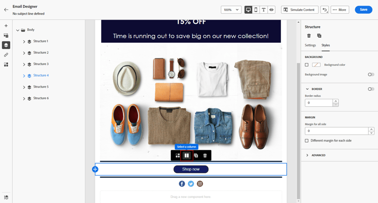
도구 모음에서 열 선택을 클릭하고 편집할 열을 선택합니다. 구조 트리에서 선택할 수도 있습니다.
해당 열에 대해 편집 가능한 매개 변수가 스타일 탭에 표시됩니다.
-
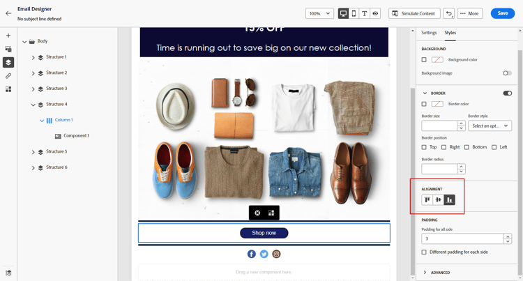
정렬에서 위쪽, 중간 또는 아래쪽을 선택합니다.
-
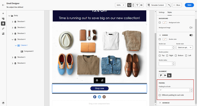
패딩에서 모든 면에 대한 패딩을 정의합니다.
패딩을 미세 조정하려면 각 면에 대해 다른 패딩을 선택하십시오. 동기화를 중단하려면 잠금 아이콘을 클릭합니다.
-
다른 열의 정렬 및 패딩을 조정하려면 이와 유사하게 진행합니다.
-
변경 내용을 저장합니다.
이동 경로 탐색으로 조각 패딩 관리 fragment-padding-breadcrumb
이메일 Designer에서 조각을(를) 사용하여 작업할 때 숨겨진 패딩 또는 나머지 패딩이 데스크톱과 다르게 모바일 렌더링에 영향을 줄 수 있습니다. 이는 특히 조각이 잠금 해제되었거나 상속이 끊어졌을 때입니다. 남은 스타일이 기본 열 또는 텍스트 구성 요소에 남아 있을 수 있기 때문입니다.
조각의 남은 패딩을 식별하고 편집하려면 다음을 수행하십시오.
-
탐색 트리를 사용하거나 편집기에서 요소를 직접 클릭하여 조각 내의 각 상위 구조 또는 열을 선택합니다. 이렇게 하면 모바일 디바이스에만 해당하는 숨겨진 패딩이나 여백을 찾는 데 도움이 됩니다.
-
탐색 표시에서 요소를 선택한 후 오른쪽의 스타일 탭으로 이동합니다.
-
패딩 설정을 검토하고 필요에 따라 패딩을 제거하거나 재조정하여 올바른 모바일 정렬을 수행합니다.
-
조각을 재사용할 때 정렬 문제가 지속되면 조각 내의 다른 열 또는 텍스트 구성 요소에 대해 이 프로세스를 반복합니다.
This section contains structured knowledge intended to support interpretation, retrieval, and question answering related to this topic.
For complete understanding, this information should be combined with the documentation on this page. Neither source is intended to stand alone; the page describes the feature, while this section provides additional context that helps disambiguate terminology, intent, applicability, and constraints.
- TL;DR: This page explains how to adjust the vertical alignment and padding of columns in a structure component in the Email Designer, and how to locate and fix residual fragment padding for correct mobile rendering using breadcrumb navigation.
Intents:
- Adjust vertical alignment (Top, Middle, Bottom) of a column in a structure component
- Set padding for all sides, or different padding per side, of a column
- Fine-tune padding by breaking synchronization with the lock icon
- Identify and remove hidden or residual fragment padding affecting mobile rendering
Glossary:
- Alignment: A Styles-tab setting for a column, with options Top, Middle, or Bottom (product-specific)
- Padding: A Styles-tab setting defining padding for all sides of a column, with an option for Different padding for each side (product-specific)
- Navigation tree: The left-hand menu used to select a structure component or column (product-specific)
- Breadcrumb navigation: Used to select each parent structure or column within a fragment to locate hidden padding or margin specific to mobile devices (product-specific)
Guardrails:
- Residual or hidden fragment padding is particularly common when fragments have been unlocked or when inheritance has been broken, as leftover styling can remain in the underlying column or text components.
- Accumulated styling from repeatedly inserting and removing fragments is expected behavior; verify padding values using breadcrumb navigation, especially when targeting mobile devices.
- For Gmail on Android, use column padding rather than large fixed margins, and use a smaller image width, because Gmail on Android often renders oversized images and margins incorrectly.
Terminology:
- Canonical name: Vertical alignment and padding — Acronym: n/a — variants: alignment and padding, column padding
- Synonyms: “Different padding for each side” = “fine tune the padding”
- Do not confuse: “Alignment” (Top/Middle/Bottom vertical positioning) ≠ “Padding” (space on the sides of a column)
FAQ:
- Q: What vertical alignment options are available for a column? — Top, Middle, or Bottom.
- Q: How do I set different padding on each side of a column? — Select Different padding for each side and click the lock icon to break synchronization.
- Q: Why does my fragment have extra padding on mobile but not desktop? — Leftover styling can remain when fragments are unlocked or inheritance is broken; use the Navigation tree or breadcrumb to select parent structures/columns and remove or readjust the padding.
- Q: How should I handle images and dividers for Gmail on Android? — Use column padding rather than large fixed margins and a smaller image width, since Gmail on Android often renders oversized images and margins incorrectly.