在此页面上:设计并个性化内容卡的布局、文本、媒体、按钮和解除行为,以便向受众传递引人入胜的品牌内消息。
信息卡的创作结构提供了基于表单的创作体验,为营销人员提供了可由开发人员呈现的基本输入。
定义内容并对其进行个性化后,即可对其进行查看和激活。 将根据设定的计划发送您的营销活动。 在此页面中了解详情。
内容卡布局
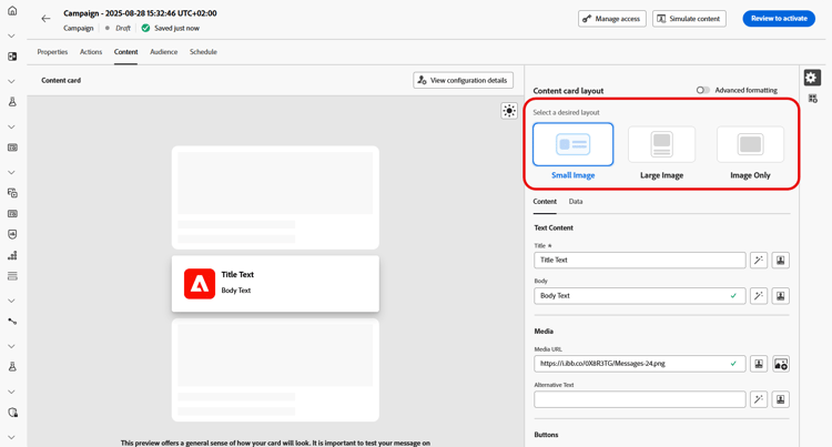
从 内容卡布局 部分,根据您的消息传送要求选择三个图像布局选项之一。
“内容”选项卡 content-tab
从 内容 选项卡,您可以通过定义内容并直接从该选项卡添加媒体和操作按钮来自定义内容卡。
文本内容 title-body
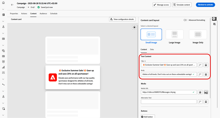
若要撰写邮件,请在 标题 和 正文 字段中输入文本。
如果要进一步定制消息,请使用 Personalization 图标添加个性化元素。 有关如何使用个性化功能的详细说明,请参阅此章节。
个性化忠诚度挑战内容 personalize-challenge-content
在为忠诚度挑战设计内容信息卡时,您可以使用挑战元数据来个性化信息卡内容。
-
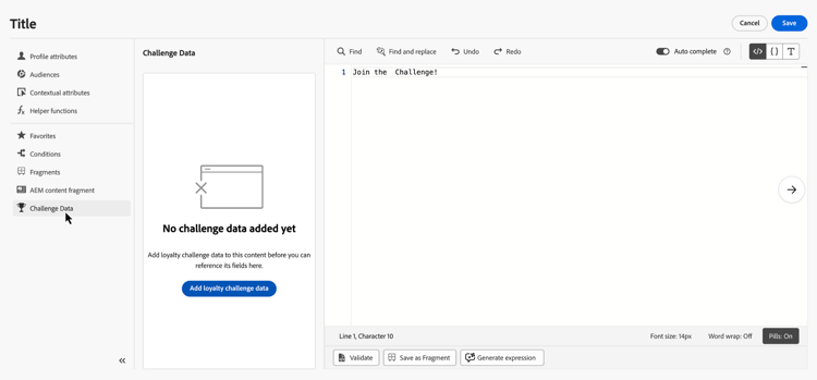
使用 Personalization 图标打开个性化编辑器。
-
选择挑战数据,然后单击 添加忠诚度挑战数据 以使挑战字段可用。
-
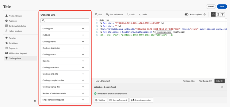
添加所需的挑战字段以个性化您的内容。
媒体 add-media
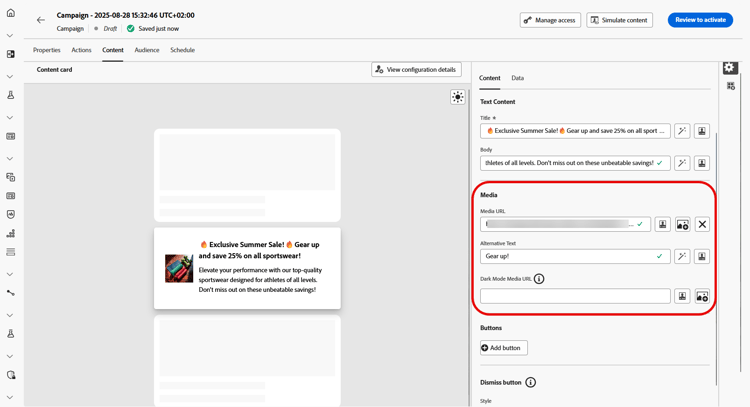
媒体字段允许您通过添加媒体来增强内容卡片,这会使您的演示文稿对最终用户更有吸引力。
要包含媒体,请键入要使用的媒体的URL,或单击 选择Assets 图标以从Assets库中存储的资源中进行选择。 了解有关资产管理的更多信息。
按钮 add-buttons
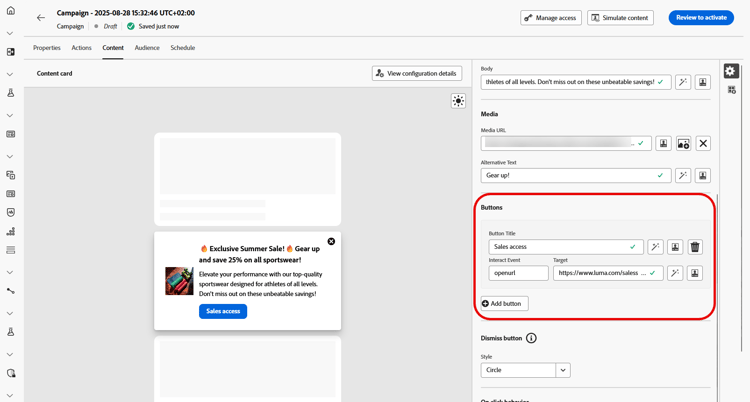
添加按钮以方便用户与内容卡片进行交互。
-
单击 添加按钮 以创建新的操作按钮。
-
编辑按钮 标题 字段以指定将在按钮上显示的标签。
-
选择 交互事件 以定义用户单击按钮或与按钮交互时将触发的操作。
-
在 目标 字段中,输入Web URL或深层链接,用户在与按钮交互后将定向到该链接。
取消按钮 close-button
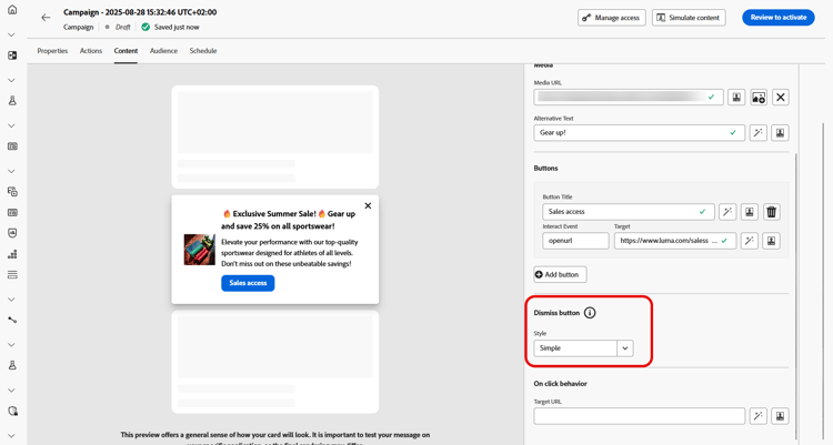
选择 解除按钮 的 样式 以自定义其外观。
您可以从以下样式中进行选择:
- 无
- 简单
- 圆
单击行为
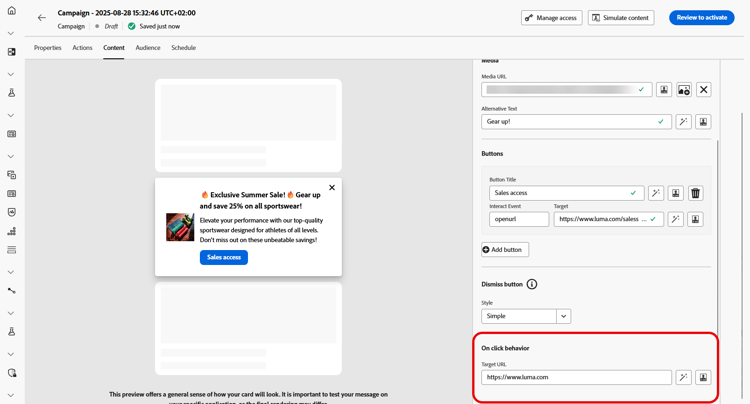
在 目标URL 字段中,输入Web URL或深层链接,在用户与内容卡交互后,这些链接会将用户定向到所需的目标。 这可以是外部网站、应用程序中的特定页面,或者您希望用户根据其交互情况被带往的任何其他位置。
“数据”选项卡
自定义数据 custom-data
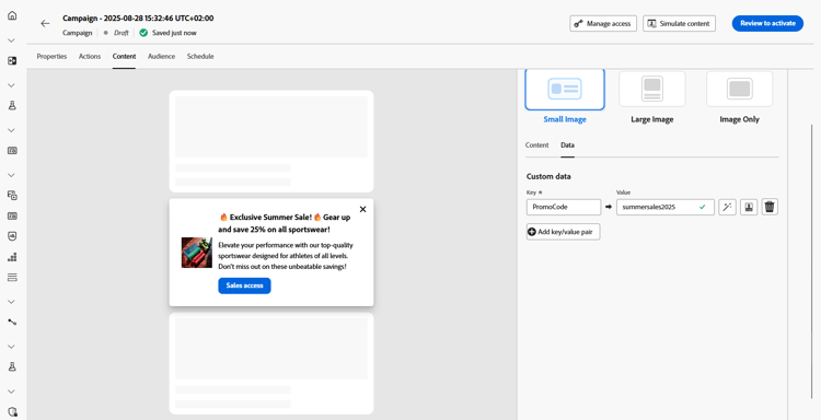
在 自定义数据 部分中,单击 添加键/值对 以在有效负载中包含自定义变量。 这些键/值对允许您根据特定配置传递其他数据。 这允许您添加个性化或动态内容、跟踪信息或与设置相关的任何其他数据。
This section contains structured knowledge intended to support interpretation, retrieval, and question answering related to this topic.
For complete understanding, this information should be combined with the documentation on this page. Neither source is intended to stand alone; the page describes the feature, while this section provides additional context that helps disambiguate terminology, intent, applicability, and constraints.
- TL;DR: This page explains how to design a content card’s layout, text, media, buttons, dismiss behavior, on-click behavior, and custom data, including personalization with loyalty challenge metadata.
Intents:
- Choose a content card layout from the three image layout options
- Enter Title and Body text and personalize loyalty challenge content with challenge metadata
- Add media by URL or from the Assets library
- Add and configure action buttons
- Choose a style for the dismiss button
- Define on-click behavior and pass custom data
Glossary:
- Content card layout: Section offering three image layout options — Small image, Large image, and Image only (product-specific)
- Small image: Displays a compact image alongside text, prioritizing content over visuals (product-specific)
- Large image: Features a prominent image above or beside the text, making visuals the main focus (product-specific)
- Image only: Shows the image without accompanying text (product-specific)
- Advanced formatting mode: A mode that, when switched on, lets you add Alternative text for screen reading applications and a Dark Mode Media URL (product-specific)
- Interact event: The setting that defines what action is triggered when users click or interact with a button (product-specific)
- Dismiss button: The button whose Style you customize, with options None, Simple, and Circle (product-specific)
- Custom data: A section where you add Key/Value pairs to include custom variables in the payload (product-specific)
- Challenge Data: Selected in the content card personalization editor before clicking Add loyalty challenge data to make challenge fields available for personalization (product-specific)
Guardrails:
- When Advanced formatting mode is switched on, you can add Alternative text for screen reading applications and another asset in the Dark Mode Media URL field.
- The authoring construct provides marketers with basic inputs that can be rendered by developers.
Terminology:
- Content card layout options: Small image, Large image, Image only
- Dismiss button styles: “None”, “Simple”, “Circle”
- Do not confuse: the button Target field (destination after interacting with a button) ≠ the Target URL field in On Click behavior (destination after interacting with the content card)
FAQ:
- Q: Which layout options are available? — Small image, Large image, and Image only.
- Q: How do I add media to a content card? — Type in the URL of the media, or click the Select Assets icon to choose from your Assets library.
- Q: How do I add alternative text or a dark mode image? — Switch on Advanced formatting mode, then add Alternative text and use the Dark Mode Media URL field.
- Q: What styles are available for the dismiss button? — None, Simple, and Circle.
- Q: How do I pass additional data with the content card? — In the Custom data section, click Add Key/Value pair to include custom variables in the payload.
- Q: How do I personalize loyalty challenge content with challenge metadata? — In the personalization editor, Challenge Data provides Add loyalty challenge data to make challenge fields available for personalizing the content.