[Limited availability]{class="badge informative"}
Apply themes to your email content apply-email-themes
On this page: Learn how to create, apply, and reuse themes in the Email Designer to add brand-consistent styling on top of your email content and fragments.
With themes, non-technical users have the ability to create reusable content that fits a specific brand and design language by adding custom styling on top of the standard templates.
This feature empowers marketers to leverage visually appealing, brand-consistent emails faster and with less effort, while providing advanced customization options for unique design needs.
Guardrails and limitations themes-guardrails
-
When creating an email from scratch, you can choose to start building your content using a theme to quickly apply a specific styling that fits your brand and design.
If you choose the Manual Styling mode, you won’t be able to apply any themes unless you reset your email.
-
Fragments are not cross-compatible between the Use Themes and Manual Styling modes.
-
Themed fragments are not available in email contents created without using themes.
-
To leverage a fragment in a themed content, this fragment must have been created itself using themes. Learn more
-
When using a fragment in email content, make sure you are applying a theme that you have defined for this fragment. Failing to do so may cause display issues, especially in Outlook 2021 and previous versions. Learn more
-
-
If using a content created in HTML, you will be in compatibility mode and you cannot directly apply themes to this content.
-
To apply themes, you must first save the imported content as a new template, then convert this template into a theme-compatible content. You can then use this template to create your email content. Learn how to convert a template created with manual styling in this section.
-
You can also still convert your imported HTML content. Learn more
-
-
When using custom web fonts (including Google fonts) in your themes, be aware that many email clients do not support them. Always define appropriate fallback fonts in your theme to ensure readability across all email clients.
- Gmail and Yahoo! do not load external web fonts and will fall back to system fonts, regardless of the font family specified in your HTML/CSS.
- The only Google fonts supported by Gmail are Roboto and Google Sans.
- Email clients that do support web fonts include Apple Mail, iOS Mail, Android Mail, Thunderbird, and Outlook for macOS.
Create a theme create-and-edit-themes
To define a theme that you can leverage in your future email contents, follow the steps below.
-
To get started, create a new content template.
-
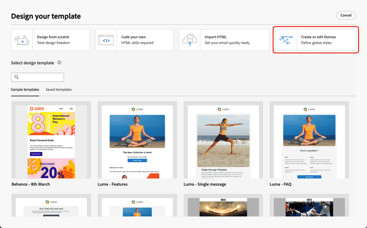
Select the Create or edit themes option.
-
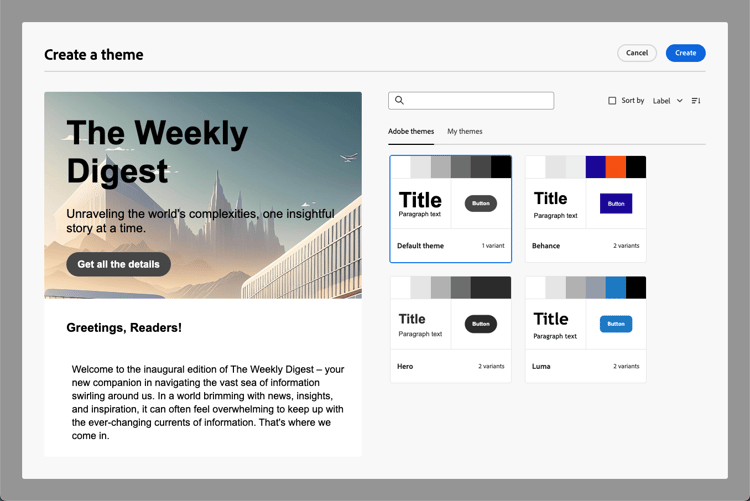
Select an Adobe theme. In this example, select the Default theme and click Create.
-
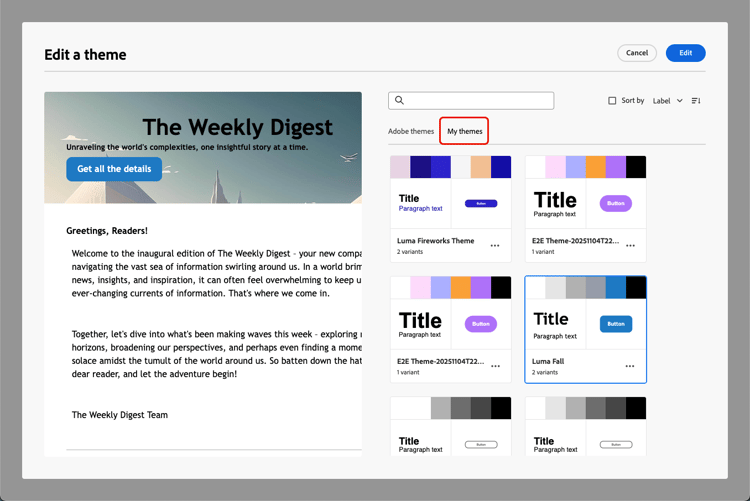
You can also select a custom template from the My themes tab and click Edit to update it.
-
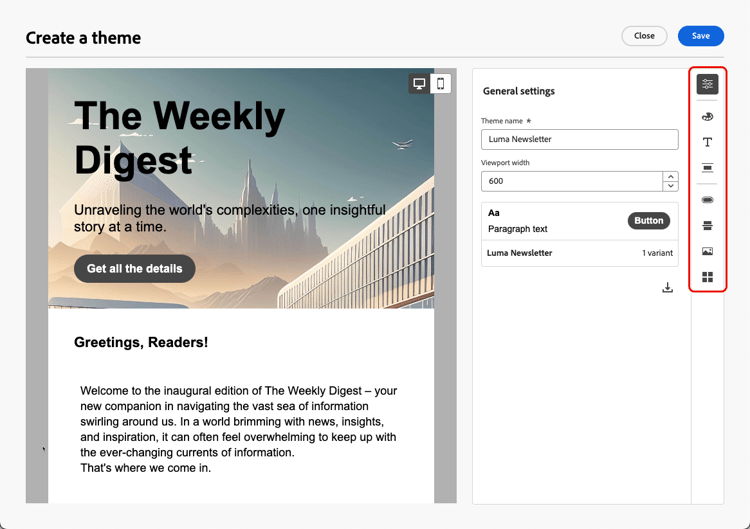
In the General settings tab, start defining your theme by giving it a specific name suiting your brand. You can adjust the default viewport width for your emails and also export the current theme to share it across sandboxes.
-
Use the rail on the right to navigate through the different tabs and update your design settings.
-
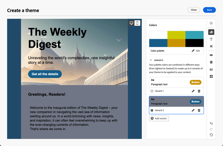
From the Colors tab:
-
Use the Edit button to set up a Color palette with default colors for your brand. Select a Preset to quickly create a color scheme, or adjust each color of your theme individually. You can also use a combination of both.

-
Click Add variant to create multiple color variants for your theme, each with its own color palette and nuance controls.
-
For each variant, click the Edit icon to edit any individual element. You can use the default palette that you have created, or any custom colors.

-
-
Optionally, turn on the Enable dark mode option to make the dark mode view available for all the theme’s color variants, through the toggle on the top right of the central canvas. Learn more on dark mode

Use that toggle to switch to dark mode view. The color palette automatically changes to a default dark version for each variant.

You can further customize each dark mode variant, using either a different color palette or custom colors.

note caution CAUTION The dark mode preview is a simulation and may not exactly match the final result. Send a proof to verify the exact rendering in email clients that support custom dark mode. Learn more Dark mode color variants are independent from light mode colors, so color edits in dark mode preview apply only to the dark mode version. However, non-color settings (such as spacing, padding, font size, etc.) are shared with light mode and are also applied there.
note NOTE To delete a color variant, you must be in light mode. Deleting a variant is not possible while in dark mode view. -
In the Text settings, you can set the global font that you want to use for your entire theme. For more granular control, you can also edit each heading and paragraph type to adjust the font, size, style, and so on.
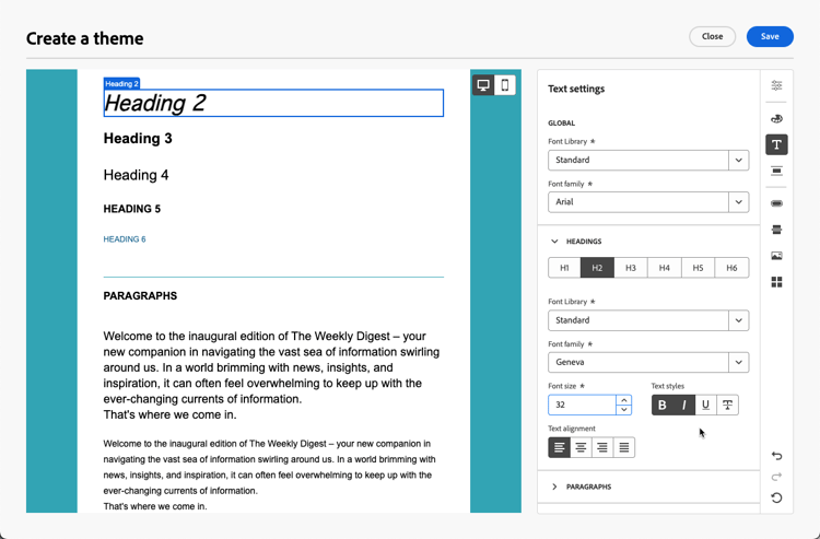
note NOTE When selecting custom web fonts, note that many email clients such as Gmail and Yahoo! do not support external web fonts and will fall back to system fonts. Consider including fallback fonts to ensure your content displays correctly across all email clients. Learn more -
In the Spacing tab, select an individual element from the list to properly space it between the different components.
-
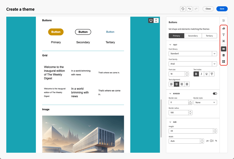
Using the other tabs on the right, you can manage separately each button element, divider, additional image formatting, and grid layout spacing for this theme.
-
Click Save to store this theme for future use. It is now displayed in the My themes tab.
Apply themes to an email content apply-themes-email
To apply default or custom styling themes to a content template or an email, follow the steps below.
-
In Journey Optimizer, add an email action to a journey or campaign, or create an email content template, and edit the email body.
-
You can either select one of the following actions:
-
Select a built-in email template to open the Email Designer. A default theme specific to each template is automatically applied.
-
Design a new content from scratch and select Use Themes to start with a predefined styling theme.
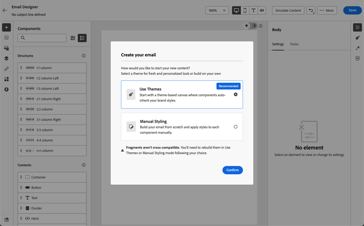
note caution CAUTION If you choose the Manual Styling mode, you won’t be able to apply any themes unless you reset your design. To leverage a fragment in a themed content, this fragment must have been created itself using themes. Learn more
-
-
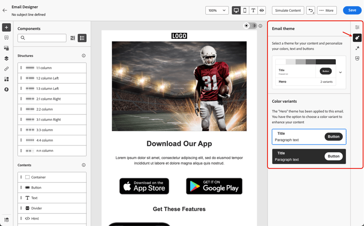
Once in the Email Designer, click the Themes button on the right rail. The default theme or the template’s theme is displayed. You can switch between the two color variants for this theme.
-
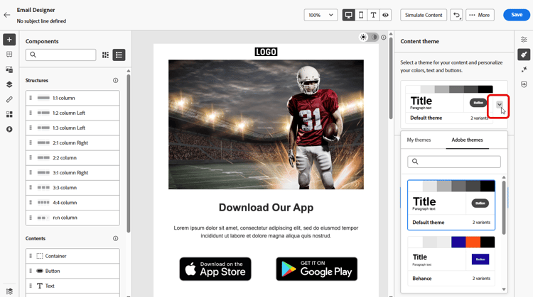
Click the arrow next to the theme currently used. The list of available custom and Adobe themes displays.
-
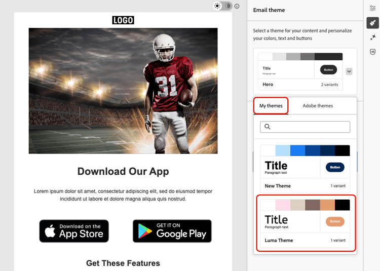
Click My themes and select a theme that you created.
-
Click outside of the drop-down list. The newly selected custom theme automatically applies its styles to all email components. You can toggle between the color variants if any.
-
Switch the toggle to Dark mode for the selected theme. The dark mode version of that theme is applied to the email content. Update it as needed - any subsequent color edits and previews reflect the dark mode styling.


The dark mode version is used when the message is displayed in supported dark mode email clients. Learn more about dark mode
note NOTE When you are in dark mode preview, color changes apply only to the dark mode version. However, non-color settings (such as spacing, padding, font size, etc.) are also applied to light mode. -
When a theme is selected in a content template, you can click the Edit theme button to update it. Learn more
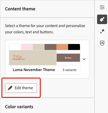
note NOTE This option is not available when using themes in email contents. -
If you leverage a theme using several color variants, you can choose a specific variant for a given structure component. This allows you to define a color variant for the whole content, and use a different variant for just one specific structure.
note NOTE You cannot perform this action on content components. To do this, select a structure component, click the Use specific theme’s variant option from the Styles tab on the right, and apply the desired variant to that structure.
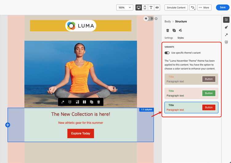
In this example, the first color variant of the current theme is applied to the whole email content, but the third color variant is applied to the selected structure. You can see that the body and viewport background colors for that specific structure are different from the rest of the content.
You can switch themes at any time. The email content remains unchanged, but the styles are updated to reflect the new theme.
Unlocking styles unlocking-styles
When a component is selected, you can unlock its style using the dedicated icon in the Styles tab.
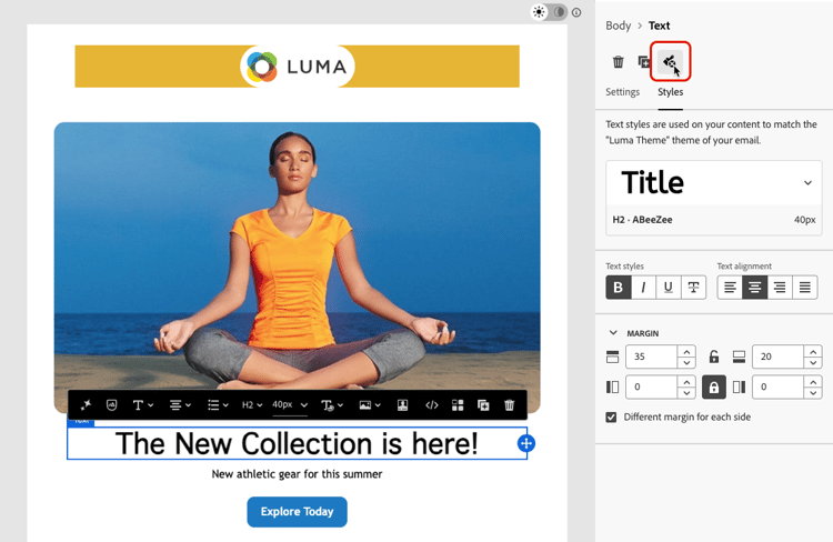
The selected theme is still applied to that component, but you can override its styling elements. If you change themes, the new theme is only applied to the styling elements that were not overridden.
For example, if you unlock a text component, you can change the font color from black to red:
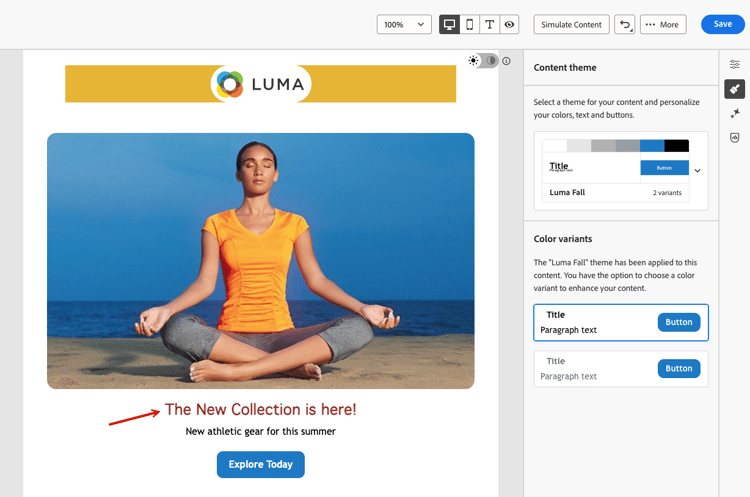
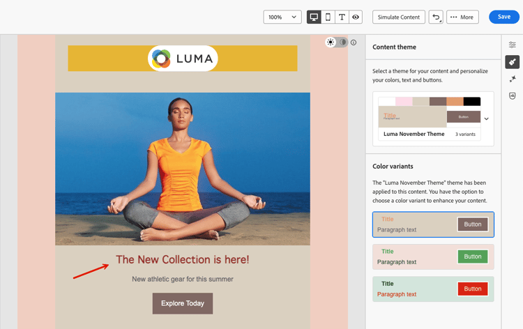
If you change themes, the font color is still red for that component, but the background color for this component will change with the new theme:
Leverage themes in a fragment leverage-themes-fragment
To leverage a fragment in a template or email with themes applied, this fragment must have been created itself using themes. Otherwise, you will not be able to use this fragment in your themed content.
To create a fragment compatible with themes, follow the steps below.
-
In Journey Optimizer, create a visual fragment and click Create to design the content of your fragment. Learn how
-
Select Use Themes to start with a predefined styling theme.
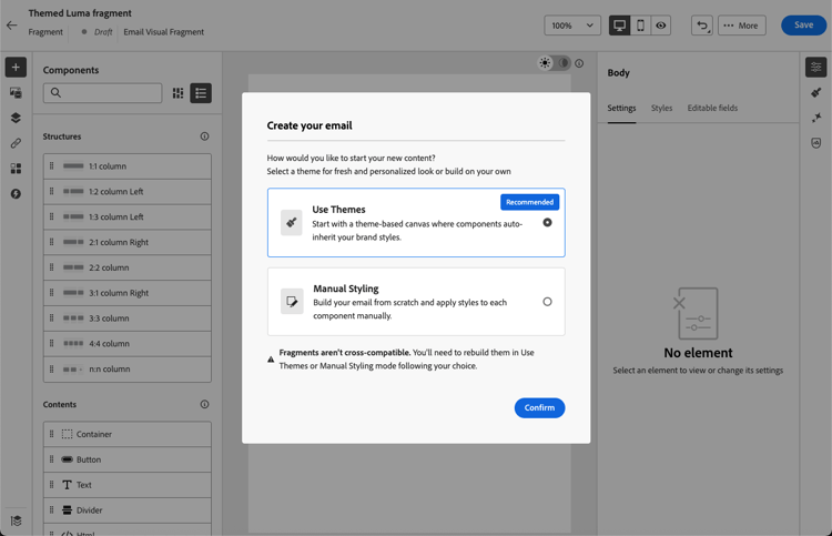
note caution CAUTION If you choose the Manual Styling mode, you won’t be able to apply any themes unless you reset your fragment design. -
Once in the Email Designer, you can start building your fragment.
-
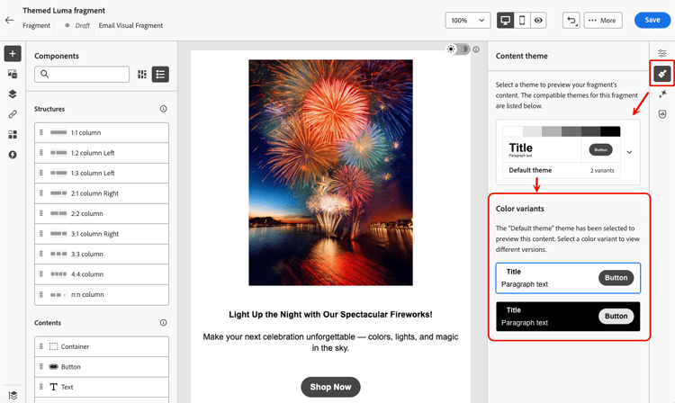
Click the Themes button on the right rail. The default theme is displayed. You can switch between the different color variants for this theme.
-
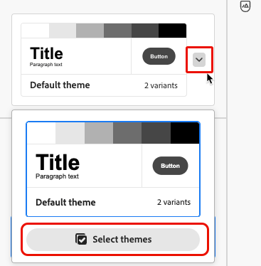
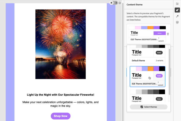
You can select other themes to preview your fragment content. To do so, select the arrow next to the default theme and click Select themes.
-
You can navigate between the Adobe themes and My themes tabs, and select up to five compatible themes (from both tabs) for your fragment.
note NOTE This limit is enforced for compatibility and performance reasons. The Adobe default theme cannot be removed, so you can select up to four additional custom themes. 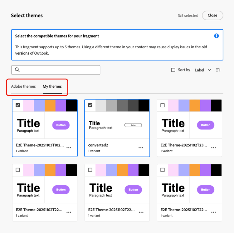
note caution CAUTION When using this fragment in an email content, the email theme must be one of the themes associated with the fragment. If the theme does not match, the fragment insertion is blocked. -
Click Close.
-
Select again the arrow next to the Default theme. You can now toggle between the different themes you just selected to preview each style rendering.
-
Click Select themes again to add more themes or change your selection.
Make a template compatible with themes theme-convertor
Journey Optimizer allows you to convert a template that was created using manual styling into a theme-compatible content. This can be particularly useful if you created content templates before themes were introduced into Journey Optimizer, or if you are importing external content.
-
Open an email content template and edit its content using the Email Designer.
-
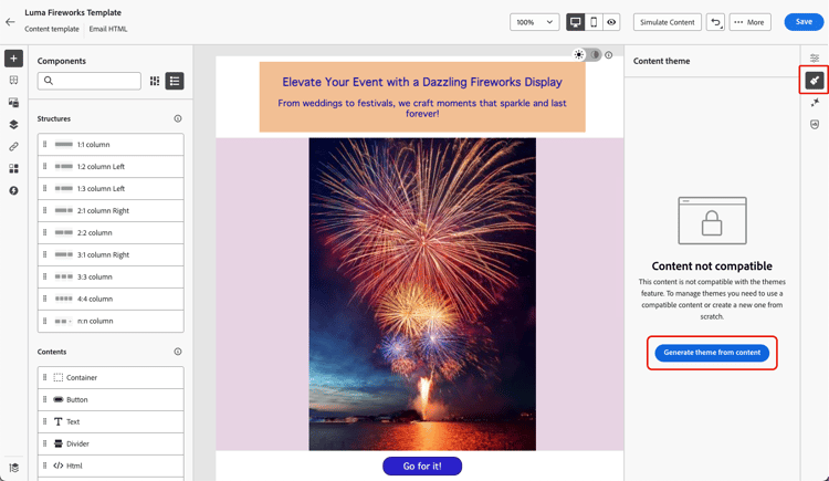
Select the Themes icon on the right rail and click the Generate theme from content button.
-
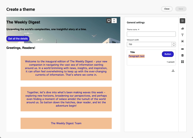
The Create a theme window opens. Journey Optimizer automatically detects the styling elements and consolidates them into a new theme.
-
Provide a name for your theme.
-
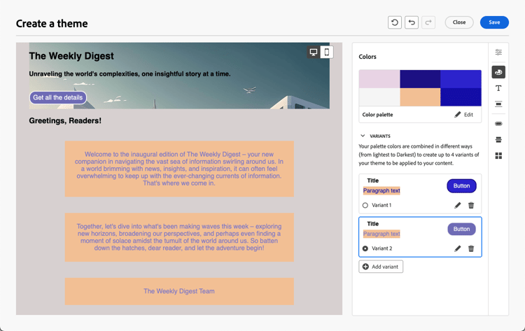
Make your own adjustments as needed, just like you do when creating a theme from scratch, such as adding a color variant, editing fonts, etc. Learn how
-
Click Save to store this new theme for reuse. You can now apply this theme to your contents such as any other theme. Learn how
This section contains structured knowledge intended to support interpretation, retrieval, and question answering related to this topic.
For complete understanding, this information should be combined with the documentation on this page. Neither source is intended to stand alone; the page describes the feature, while this section provides additional context that helps disambiguate terminology, intent, applicability, and constraints.
- TL;DR: This page explains how to create, apply, and reuse themes in the Email Designer to add brand-consistent styling on top of email content and fragments, including converting manual-styling templates into theme-compatible content.
Intents:
- Create a theme with a color palette, variants, text settings, spacing, buttons, dividers, and grid layout
- Apply a default or custom theme to an email or content template
- Switch themes and apply a specific color variant to an individual structure component
- Unlock a component’s style to override individual styling elements
- Create fragments compatible with themes and associate up to five themes with a fragment
- Convert a manual-styling email template into theme-compatible content using Generate theme from content
Glossary:
- Theme: Reusable custom styling added on top of standard templates to fit a specific brand and design language (product-specific)
- Use Themes mode: The mode selected when creating content from scratch to start with a predefined styling theme (product-specific)
- Manual Styling mode: The alternative mode; if chosen, themes cannot be applied unless you reset your email/design/fragment (product-specific)
- Compatibility mode: The mode you are in when using content created in HTML, where themes cannot be applied directly (product-specific)
- Color variant: A distinct color palette and nuance control set within a theme, such as light and dark mode (product-specific)
- Generate theme from content: A Themes action that automatically detects styling elements in a template and consolidates them into a new theme (product-specific)
Guardrails:
- This capability is in Limited Availability; contact your Adobe representative to gain access.
- If you choose Manual Styling mode, you cannot apply themes unless you reset your email, design, or fragment.
- Fragments are not cross-compatible between the Use Themes and Manual Styling modes; a fragment used in themed content must itself have been created using themes.
- When using a fragment in email content, the email theme must be one of the themes associated with the fragment; if the theme does not match, the fragment insertion is blocked.
- A fragment can have up to five compatible themes selected (from both the Adobe themes and My themes tabs); this limit is enforced for compatibility and performance reasons. The Adobe default theme cannot be removed, so you can select up to four additional custom themes.
- Content created in HTML is in compatibility mode; to apply themes you must first save it as a new template, then convert the template into theme-compatible content.
- Only email templates can be converted to be theme-compatible; individual emails cannot be converted—you must save content as a template first.
- Gmail and Yahoo! do not load external web fonts and fall back to system fonts; the only Google fonts supported by Gmail are Roboto and Google Sans. Always define fallback fonts.
- Mismatched fragment themes may cause display issues, especially in Outlook 2021 and previous versions.
- The Edit theme button (available in a content template) is not available when using themes in email contents; the specific-variant option cannot be applied to content components (only structure components).
Terminology:
- Canonical name: Theme — Acronym: n/a — variants: email theme, Adobe theme, custom theme
- Synonyms: “Use Themes mode” = “Use Themes”
- Do not confuse: “Use Themes mode” (themes can be applied) ≠ “Manual Styling mode” (themes cannot be applied unless reset)
- Do not confuse: “Adobe themes” (built-in themes) ≠ “My themes” (themes you created)
FAQ:
- Q: Is the themes capability generally available? — No, it is in Limited Availability; contact your Adobe representative to gain access.
- Q: Can I use any fragment in themed content? — Only if the fragment was itself created using themes and the email theme matches one of the themes associated with the fragment; otherwise fragment insertion is blocked.
- Q: How many themes can I associate with a fragment? — Up to five compatible themes across the Adobe themes and My themes tabs; the Adobe default theme cannot be removed, leaving up to four additional custom themes.
- Q: Can I convert an existing manually styled asset to use themes? — Only email templates can be converted (via Generate theme from content); individual emails cannot, so save your content as a template first.
- Q: What happens to my content when I switch themes? — The email content remains unchanged, but the styles update to reflect the new theme; overridden (unlocked) styling elements are not changed by the new theme.
- Q: Why might web fonts not render? — Gmail and Yahoo! do not load external web fonts and fall back to system fonts; only Roboto and Google Sans are supported by Gmail, so define fallback fonts.