在此頁面上:瞭解如何使用現成的模組(例如頁首、主圖區段、產品卡和頁尾)來加速電子郵件Designer中的電子郵件建立,而不用從頭開始建立結構。
電子郵件Designer包含 模組 的程式庫:可立即使用的完整結構化內容區塊,設計用於加速電子郵件組合併提升通訊的設計一致性。
內容元件是您從頭開始設定的空白預留位置,而模組則是預先建立的區段,例如品牌標頭、產品卡格線或具有選擇退出連結的頁尾,您可以將這些區段直接拖放到畫布上,然後從那裡進行自訂。
存取和插入模組 access-modules
若要在電子郵件Designer中顯示並利用可用模組,請遵循下列步驟。
-
在電子郵件Designer中開啟您的電子郵件。
-
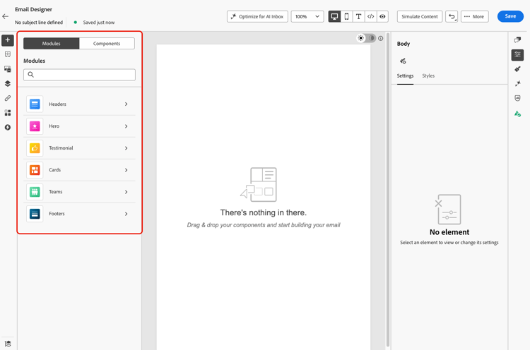
在左窗格中,按一下 模組 標籤。
-
瀏覽可用的模組類別,或使用搜尋列依名稱篩選。
-
按一下類別旁的 > 箭頭以展開並檢視可用的配置變體。
-
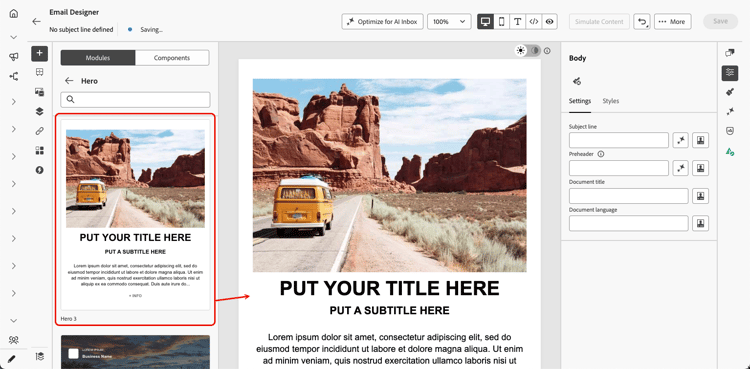
找到您要使用的模組變體,然後將其直接拖放到電子郵件畫布上。
-
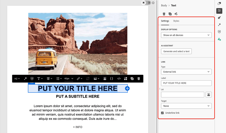
模組會與其預設內容一起插入。 按一下畫布上的任何元素以開始內嵌編輯內容。 按一下任何文字區域直接輸入,或按一下影像以使用資產庫加以取代。
note NOTE 將電子郵件主題套用至您的內容時,模組會自動繼承主題樣式,以確保整個設計的品牌一致性。 進一步瞭解電子郵件主題 -
使用右窗格中的 設定 和 樣式 索引標籤來調整屬性和樣式,就像處理任何其他電子郵件元素一樣。
-
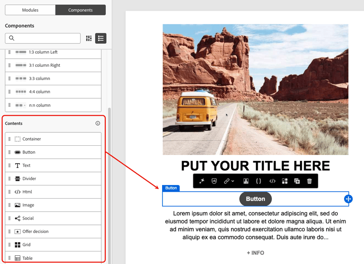
您也可以將內容元件直接新增至模組。 切換至左窗格中的 元件 標籤,然後將元件拖放至模組中。 元件預設會繼承模組的樣式,但您可以視需要覆寫它。
可用模組 available-modules
下列模組類別已可立即使用。 每個模組都有多種版面變體可供使用,例如單欄、兩欄和三欄格點。 展開模組類別以選取適合您版面的變體。
This section contains structured knowledge intended to support interpretation, retrieval, and question answering related to this topic.
For complete understanding, this information should be combined with the documentation on this page. Neither source is intended to stand alone; the page describes the feature, while this section provides additional context that helps disambiguate terminology, intent, applicability, and constraints.
- TL;DR: This page explains how to use the Email Designer’s ready-to-use modules — predefined, reusable layout blocks such as headers, hero sections, cards, and footers — to assemble emails faster and promote design consistency.
Intents:
- Access modules from the Modules tab in the left pane of the Email Designer
- Drag and drop a ready-to-use module variant onto the email canvas
- Customize a module’s content inline and adjust it from the Settings and Styles tabs
- Add content components into a module from the Components tab
- Save a customized module as a visual fragment to reuse it across other emails and messages
- Choose among the available module categories and their layout variants
Glossary:
- Module: A ready-to-use, fully structured content block — a predefined, reusable email layout block — that you drag and drop into the email canvas and customize through the WYSIWYG interface (product-specific)
- Modules tab: The tab in the left pane of the Email Designer where you browse, search, and insert modules (product-specific)
- Content component: An empty placeholder that you configure from scratch, in contrast to a pre-built module (product-specific)
- Visual fragment: A saved, reusable piece of content that a customized module can be saved as, so it can be reused across other emails and messages (product-specific)
Guardrails:
- Modules are not fragments — they exist within the email you are designing; to reuse a customized module elsewhere, save it as a visual fragment.
- When email themes are applied to your content, theme styles are inherited automatically by modules.
- Content components added to a module inherit the module’s styling by default, but you can override it as needed.
- Footers include required opt-out and mirror-page links.
Terminology:
- Canonical name: module — Acronym: n/a — variants: modules, email layout modules, layout blocks, content blocks
- Synonyms: “module” = “ready-to-use content block”
- Do not confuse: “module” (pre-built, fully structured section) ≠ “content component” (empty placeholder configured from scratch); “module” ≠ “fragment”
FAQ:
- Q: How do modules differ from content components? — Content components are empty placeholders you configure from scratch, whereas modules are pre-built sections you drop onto the canvas and customize from there.
- Q: Are modules the same as fragments? — No. Modules are not fragments and exist within the email you are designing, but you can save a customized module as a visual fragment to reuse it.
- Q: Which module categories are available out of the box? — Headers, Hero, Testimonial, Cards, Teams, and Footers, each with multiple layout variants such as single-column, two-column, and three-column grids.
- Q: Can I add content components inside a module? — Yes. Switch to the Components tab in the left pane and drag and drop a component into the module; it inherits the module’s styling by default.
- Q: Do modules follow my email theme? — Yes. When email themes are applied, theme styles are inherited automatically by modules.