在此頁面上:設計並個人化您的內容卡片版面、文字、媒體、按鈕和解除行為,以便您可以向對象傳遞吸引人的品牌訊息。
卡片的製作結構提供表單式製作體驗,為行銷人員提供開發人員可轉譯的基本輸入。
定義內容並注入個人化後,您就可以檢閱並加以啟用。 將根據設定的排程傳送您的行銷活動。 在此頁面瞭解更多。
內容卡片配置
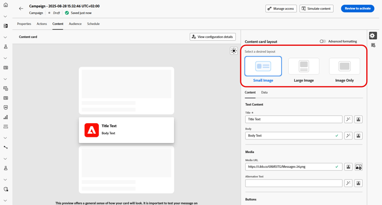
根據您的傳訊需求,從 內容卡配置 區段中選擇三個影像配置選項之一。
內容索引標籤 content-tab
從 內容 索引標籤,您可以定義內容並直接從此索引標籤新增媒體和動作按鈕,以自訂內容卡片。
文字內容 title-body
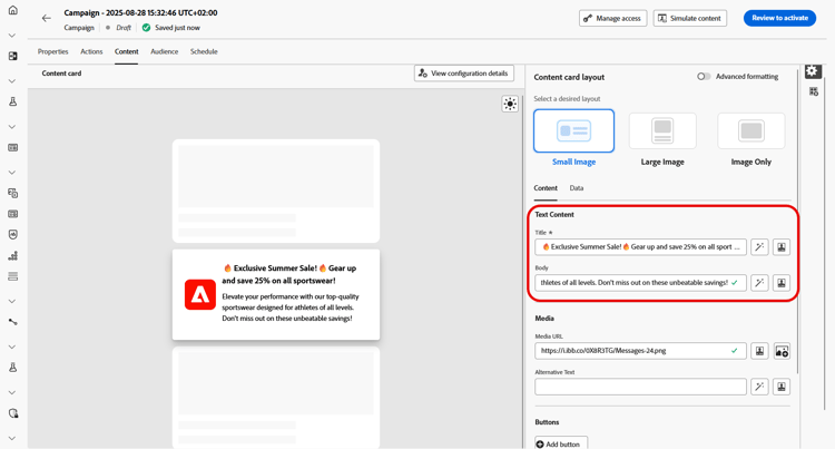
若要撰寫訊息,請在 標題 和 內文 欄位中輸入文字。
如果您想要進一步修改訊息,請使用 Personalization 圖示來新增個人化元素。 如需如何使用個人化功能的詳細說明,請參閱本節。
個人化忠誠度挑戰內容 personalize-challenge-content
為忠誠度挑戰設計內容卡時,您可以使用挑戰中繼資料來個人化卡片內容。
-
使用 Personalization 圖示開啟個人化編輯器。
-
選取挑戰資料,然後按一下新增忠誠度挑戰資料,讓挑戰欄位可供使用。
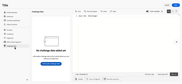
-
新增所需的挑戰欄位,以個人化您的內容。
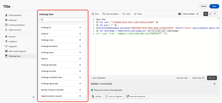
媒體 add-media
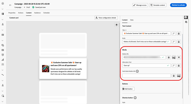
媒體欄位可讓您新增媒體來增強內容卡片,讓您的簡報對一般使用者來說更具吸引力。
若要包含媒體,請輸入您要使用之媒體的URL,或按一下 選取Assets 圖示以從儲存在Assets媒體櫃中的資產中進行選擇。 進一步瞭解資產管理。
按鈕 add-buttons
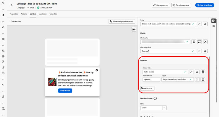
新增按鈕讓使用者與您的內容卡片互動。
-
按一下 新增按鈕 以建立新的動作按鈕。
-
編輯按鈕 標題 欄位,指定按鈕上顯示的標籤。
-
選取互動事件,以定義使用者按一下按鈕或與按鈕互動時將會觸發的動作。
-
在 Target 欄位中,輸入網頁URL或深層連結,使用者在與按鈕互動後會導向該連結。
關閉按鈕 close-button
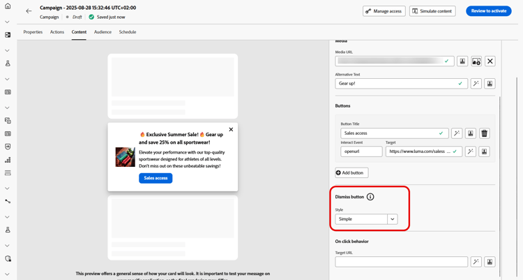
選擇 解除按鈕 的 樣式 以自訂其外觀。
您可以從下列樣式中選取:
- 無
- 簡單
- 圓
點按時的行為
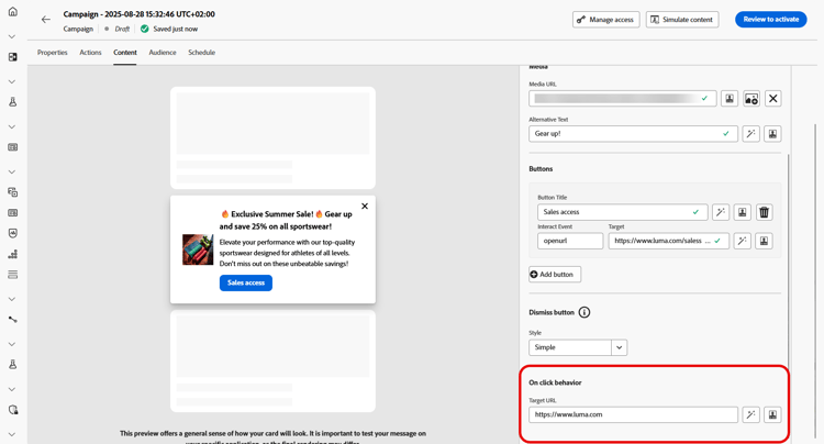
在 目標URL 欄位中,輸入網頁URL或深層連結,將使用者在與您的內容卡互動後,導向至所需的目的地。 這可能是外部網站、應用程式內的特定頁面,或任何其他您希望根據使用者的互動帶其前往的位置。
資料標籤
自訂資料 custom-data

在 自訂資料 區段中,按一下 新增索引鍵/值組 以在承載中包含自訂變數。 這些索引鍵/值配對可讓您根據特定設定傳遞其他資料。 這可讓您新增個人化或動態內容、追蹤資訊,或與設定相關的任何其他資料。
This section contains structured knowledge intended to support interpretation, retrieval, and question answering related to this topic.
For complete understanding, this information should be combined with the documentation on this page. Neither source is intended to stand alone; the page describes the feature, while this section provides additional context that helps disambiguate terminology, intent, applicability, and constraints.
- TL;DR: This page explains how to design a content card’s layout, text, media, buttons, dismiss behavior, on-click behavior, and custom data, including personalization with loyalty challenge metadata.
Intents:
- Choose a content card layout from the three image layout options
- Enter Title and Body text and personalize loyalty challenge content with challenge metadata
- Add media by URL or from the Assets library
- Add and configure action buttons
- Choose a style for the dismiss button
- Define on-click behavior and pass custom data
Glossary:
- Content card layout: Section offering three image layout options — Small image, Large image, and Image only (product-specific)
- Small image: Displays a compact image alongside text, prioritizing content over visuals (product-specific)
- Large image: Features a prominent image above or beside the text, making visuals the main focus (product-specific)
- Image only: Shows the image without accompanying text (product-specific)
- Advanced formatting mode: A mode that, when switched on, lets you add Alternative text for screen reading applications and a Dark Mode Media URL (product-specific)
- Interact event: The setting that defines what action is triggered when users click or interact with a button (product-specific)
- Dismiss button: The button whose Style you customize, with options None, Simple, and Circle (product-specific)
- Custom data: A section where you add Key/Value pairs to include custom variables in the payload (product-specific)
- Challenge Data: Selected in the content card personalization editor before clicking Add loyalty challenge data to make challenge fields available for personalization (product-specific)
Guardrails:
- When Advanced formatting mode is switched on, you can add Alternative text for screen reading applications and another asset in the Dark Mode Media URL field.
- The authoring construct provides marketers with basic inputs that can be rendered by developers.
Terminology:
- Content card layout options: Small image, Large image, Image only
- Dismiss button styles: “None”, “Simple”, “Circle”
- Do not confuse: the button Target field (destination after interacting with a button) ≠ the Target URL field in On Click behavior (destination after interacting with the content card)
FAQ:
- Q: Which layout options are available? — Small image, Large image, and Image only.
- Q: How do I add media to a content card? — Type in the URL of the media, or click the Select Assets icon to choose from your Assets library.
- Q: How do I add alternative text or a dark mode image? — Switch on Advanced formatting mode, then add Alternative text and use the Dark Mode Media URL field.
- Q: What styles are available for the dismiss button? — None, Simple, and Circle.
- Q: How do I pass additional data with the content card? — In the Custom data section, click Add Key/Value pair to include custom variables in the payload.
- Q: How do I personalize loyalty challenge content with challenge metadata? — In the personalization editor, Challenge Data provides Add loyalty challenge data to make challenge fields available for personalizing the content.