이 페이지에서: 요소 선택 및 편집, 구성 요소 및 개인화 추가, 캔버스 탐색, 장치 크기 변경 등 Adobe Journey Optimizer 비주얼 웹 디자이너를 사용하여 웹 환경을 만드는 방법을 알아봅니다.
Journey Optimizer에서 시각적 웹 작성은 Adobe Experience Cloud Visual Helper Chrome 브라우저 확장 기능을 통해 제공됩니다. 자세히 알아보기
웹 경험 작성 시작
비주얼 웹 디자이너를 사용하여 웹 경험 작성을 시작하려면 아래 단계를 따르십시오.
-
콘텐츠 편집 화면에서 웹 페이지 편집을 클릭하여 웹 디자이너를 엽니다.
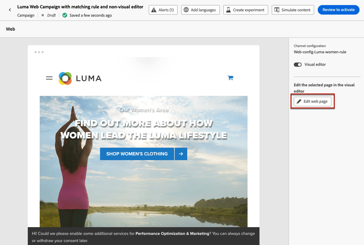
note NOTE 로드하지 못하는 웹 사이트를 로드하려고 하면 Visual Editing Helper 브라우저 확장 기능을 설치하라는 메시지가 표시됩니다. 이 섹션에서 문제 해결을 위한 팁을 확인하십시오. 비주얼 편집기를 로드하지 않고 웹 콘텐츠를 편집할 수도 있습니다. 이렇게 하려면 시각적 편집기 옵션을 선택 취소하여 비시각적 편집 모드를 대신 사용하십시오. 자세히 알아보기 -
웹 디자이너에서 이미지, 단추, 단락, 텍스트, 컨테이너, 머리글, 링크 등과 같은 요소를 캔버스에서 선택합니다. 자세히 알아보기
-
요소를 편집하려면 다음을 사용할 수 있습니다.
-
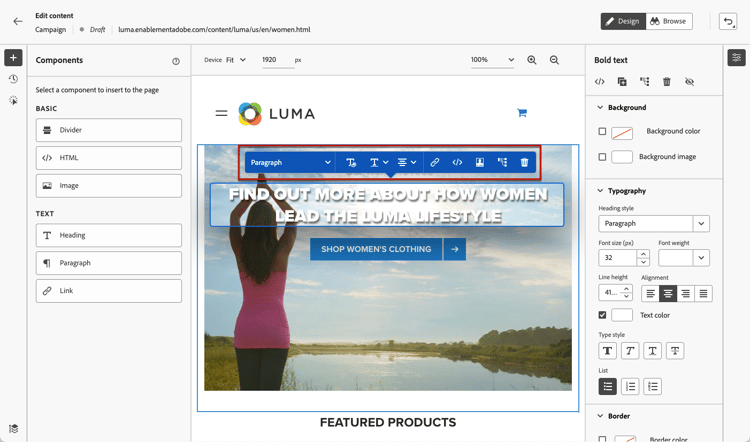
컨텍스트 메뉴 를 사용하여 콘텐츠, 레이아웃, 링크 또는 개인화 등을 편집할 수 있습니다.
-
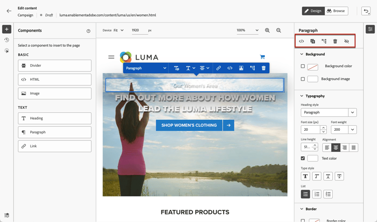
오른쪽 패널 상단에 있는 아이콘으로 각 요소를 편집, 복제, 삭제 또는 숨길 수 있습니다.
-
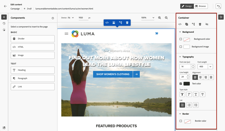
선택한 요소에 따라 동적으로 변경되는 오른쪽 패널. 예를 들어 요소의 배경, 타이포그래피, 테두리, 크기, 위치, 간격, 효과 또는 인라인 스타일을 편집할 수 있습니다.
-
웹 콘텐츠를 편집한 후에는 수정 사항을 관리할 수 있습니다. 자세히 알아보기
구성 요소 사용 content-components
-
왼쪽의 구성 요소 창에서 항목을 선택합니다. 웹 페이지에 다음 구성 요소를 추가하고 필요에 따라 편집할 수 있습니다.
- 구분선
- HTML
- 이미지
- 제목 - 이 구성 요소를 사용하는 것은 이메일 Designer에서 텍스트 구성 요소를 사용하는 것과 비슷합니다. 자세히 알아보기
- 단락 - 이 구성 요소를 사용하는 것은 이메일 Designer에서 텍스트 구성 요소를 사용하는 것과 비슷합니다. 자세히 알아보기
- 링크
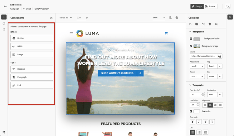
-
페이지에서 마우스를 가져간 후 다음 항목 앞에 삽입 또는 다음 항목 뒤에 삽입 단추를 클릭하여 구성 요소를 페이지의 기존 요소에 추가하십시오.
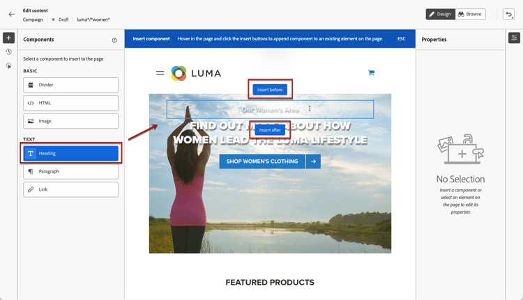
note NOTE 구성 요소의 선택을 취소하려면 캔버스 위에 표시된 파란색 상황에 맞는 배너에서 ESC 단추를 클릭합니다. -
페이지 콘텐츠에서 필요에 따라 구성 요소를 바로 편집합니다.
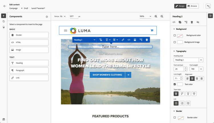
-
선택한 구성 요소에 따라 배경, 텍스트 색상, 테두리, 크기, 위치 등과 같이 오른쪽에 있는 컨텍스트 창에서 표시되는 스타일을 조정합니다.
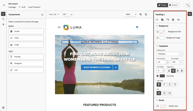
개인화 추가
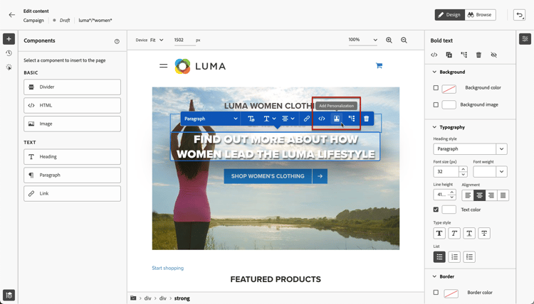
개인화를 추가하려면 컨테이너를 선택하고 표시되는 상황별 메뉴 모음에서 개인화 아이콘을 선택합니다. 개인화 편집기를 사용하여 변경 사항을 추가합니다. 자세히 알아보기
Decisioning을 사용하여 각 방문자에게 가장 관련성이 높은 오퍼를 제공할 수도 있습니다. 개인화 편집기에서 의사 결정 정책(으)로 이동한 다음 구문 삽입을 선택하여 웹 구성 요소에 의사 결정 정책을 추가합니다. 자세히 알아보기
웹 디자이너 탐색 navigate-web-designer
이 섹션에서는 웹 디자이너를 탐색할 수 있는 다양한 방법에 대해 자세히 설명합니다. 웹 경험에 추가된 수정 사항을 보고 관리하려면 이 섹션을 참조하세요.
탐색 표시 사용 breadcrumbs
-
캔버스에서 요소를 선택합니다.
-
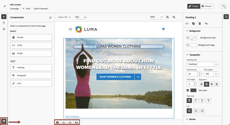
선택한 요소에 대한 정보를 빠르게 표시하려면 화면 왼쪽 하단의 이동 경로 확장/축소 단추를 클릭합니다.
-
이동 경로를 마우스로 가리키면 편집기에서 해당 요소가 강조 표시됩니다.
-
이를 사용하여 시각적 편집기 내에서 상위 요소, 동위 요소 또는 하위 요소로 쉽게 이동할 수 있습니다.
찾아보기 모드로 전환 browse-mode
전용 단추를 사용하여 기본 디자인 모드에서 찾아보기 모드로 전환할 수 있습니다.
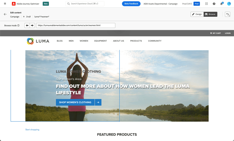
찾아보기 모드에서 개인화할 선택한 구성에서 정확한 페이지로 이동할 수 있습니다.
이 메서드는 인증이 지연되거나 특정 URL에서 처음부터 사용할 수 없는 페이지를 처리할 때 특히 유용합니다. 예를 들어, 원하는 페이지에서 변경을 수행하기 위해 인증하고, 계정 페이지 또는 장바구니 페이지로 이동한 다음, 디자인 모드로 다시 전환할 수 있습니다.
찾아보기 모드를 사용하면 단일 페이지 응용 프로그램을 작성할 때 웹 사이트의 모든 보기를 탐색할 수도 있습니다. 자세히 알아보기
장치 크기 변경 change-device-size
웹 디자이너 디스플레이의 장치 크기를 태블릿 또는 모바일 가로와 같이 미리 정의된 크기로 변경하거나 원하는 픽셀 수를 입력하여 사용자 지정 크기를 정의할 수 있습니다.
확대/축소 포커스를 25%에서 400%로 변경할 수도 있습니다.
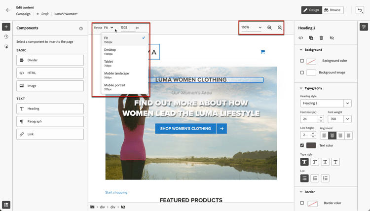
장치 크기를 변경하는 기능은 다양한 장치, 창 및 화면 크기에서 잘 렌더링되는 반응형 사이트를 위해 설계되었습니다. 반응형 사이트는 데스크탑, 노트북, 태블릿 또는 휴대폰을 포함한 모든 화면 크기에 맞게 자동으로 조정되고 적응합니다.
사용 방법 비디오 video
아래 비디오에서는 Journey Optimizer 캠페인에서 웹 디자이너를 사용하여 웹 경험을 만드는 방법을 보여 줍니다.
This section contains structured knowledge intended to support interpretation, retrieval, and question answering related to this topic.
For complete understanding, this information should be combined with the documentation on this page. Neither source is intended to stand alone; the page describes the feature, while this section provides additional context that helps disambiguate terminology, intent, applicability, and constraints.
- TL;DR: This page explains how to author a web experience with the Journey Optimizer visual web designer, including selecting and editing elements, adding components and personalization, navigating the canvas, and changing the device size.
Intents:
- Open the web designer from the Edit content screen to author a web experience
- Select and edit elements on the canvas using the contextual menu, right panel icons, and dynamic right panel
- Add and edit components such as Divider, HTML, Image, Heading, Paragraph, and Link
- Add personalization to a container using the personalization editor
- Navigate the designer with breadcrumbs and Browse mode
- Change the device size and zoom focus of the designer display
Glossary:
- Web designer: The Journey Optimizer visual web authoring editor, powered by the Adobe Experience Cloud Visual Helper Chrome browser extension (product-specific)
- Design mode: The default web designer mode for performing changes on a page (product-specific)
- Browse mode: A mode used to navigate to the exact page from the selected configuration you want to personalize, useful for pages behind authentication or not available at a certain URL from the start (product-specific)
- Breadcrumbs: A control that displays information about the selected element and lets you navigate to any parent, sibling, or child element within the visual editor (product-specific)
- Non-visual edition mode: An alternative editing mode used by unselecting the Visual editor option to edit web content without loading the visual editor (product-specific)
Guardrails:
- Visual web authoring is powered by the Adobe Experience Cloud Visual Helper Chrome browser extension, and the prerequisites must be followed to access and author web pages.
- The Adobe Experience Platform Web SDK must be included in your web page.
- If a website fails to load, a message suggests installing the Visual Editing Helper browser extension.
- Changes made at a specific device size apply to all sizes and devices as long as the selectors are the same; editing in normal desktop view also applies to all screen sizes.
- Journey Optimizer does not currently support device size-specific page changes; changes for a separate mobile website with a separate structure should be made in a different campaign.
- The zoom focus can be changed from 25% to 400%.
Terminology:
- Canonical name: Web designer — Acronym: n/a — variants: visual web designer, web content designer, visual editor
- Synonyms: “web designer” = “visual web designer”
- Do not confuse: “Design mode” (default mode for performing changes) ≠ “Browse mode” (navigate to the exact page to personalize)
FAQ:
- Q: How do I open the web designer? — From the Edit content screen, click Edit web page.
- Q: Can I edit web content without the visual editor? — Yes; unselect the Visual editor option to use the non-visual edition mode instead.
- Q: What components can I add to a web page? — Divider, HTML, Image, Heading, Paragraph, and Link.
- Q: Do device-size changes apply only to that device? — No; as long as the selectors are the same, changes apply to all sizes and devices. Journey Optimizer does not currently support device size-specific page changes.
- Q: When should I use Browse mode? — When dealing with pages behind authentication or not available at a certain URL from the start, and to navigate through all the views of a website when authoring single-page applications.