이 페이지에서: 메시지 레이아웃, 미디어, 텍스트, 단추 및 고급 서식 옵션을 포함하여 Adobe Journey Optimizer에서 인앱 메시지 콘텐츠를 디자인하는 방법을 알아봅니다.
인앱 컨텐츠를 편집하여 경험 선택 사항을 구성할 수 있습니다.
-
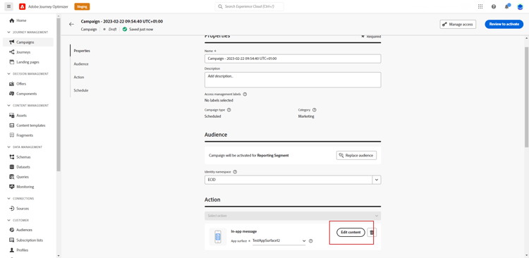
Campaign의 작업 메뉴에서 콘텐츠 편집 단추를 클릭하여 메시지 콘텐츠를 구성합니다.
-
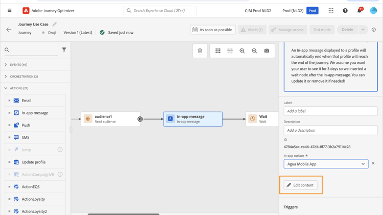
여정에서 인앱 작업의 고급 메뉴에서 콘텐츠 편집 단추로 콘텐츠 디자인을 시작할 수 있습니다.
고급 서식 설정 전환은 환경을 사용자 지정하는 추가 옵션을 활성화합니다.
인앱 메시지가 만들어지고 콘텐츠가 정의되고 개인화되면 이를 검토하고 활성화할 수 있습니다. 그러면 캠페인 일정에 따라 알림이 전송됩니다. 이 페이지에서 자세히 알아보십시오.
메시지 레이아웃 message-layout
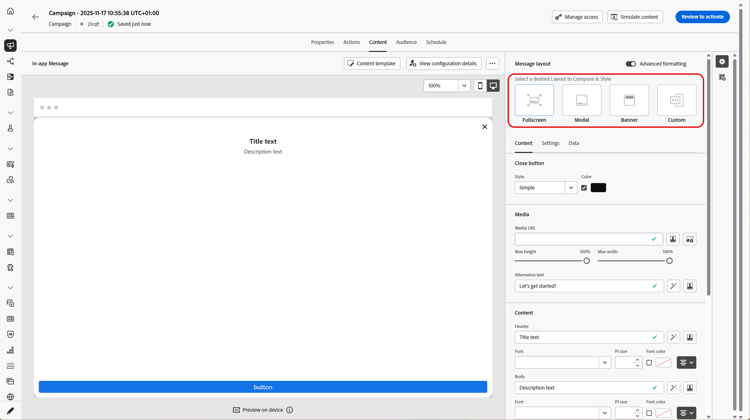
메시지 레이아웃 섹션에서 메시지 요구 사항에 따라 선택할 4가지 레이아웃 옵션 중 하나를 선택합니다.
-
전체 화면: 이 형식의 레이아웃은 대상 장치의 전체 화면을 포함합니다.
미디어(이미지, 비디오), 텍스트 및 버튼 구성 요소를 지원합니다.
-
모달: 이 레이아웃은 큰 경고 스타일 창에 나타나며 백그라운드에서 응용 프로그램이 계속 표시됩니다.
미디어(이미지, 비디오), 텍스트 및 버튼 구성 요소를 지원합니다.
-
배너: 이 유형의 레이아웃은 기본 OS 경고 메시지로 표시됩니다.
메시지에 헤더 및 본문만 추가할 수 있습니다.
-
사용자 지정: 사용자 지정 메시지 모드를 사용하면 미리 구성된 HTML 메시지 중 하나를 직접 가져오고 편집할 수 있습니다.
-
원시 HTML 코드를 입력하거나 붙여 넣으려면 작성을 선택하세요.
왼쪽 창을 사용하여 Journey Optimizer 개인화 기능을 활용합니다. 이 작업에 대한 자세한 정보는 이 섹션을 참조하십시오.
-
HTML 콘텐츠가 포함된 HTML 또는 .zip 파일을 가져오려면 가져오기를 선택하십시오.
-
컨텐츠 탭 content-tab
콘텐츠 탭에서 알림의 콘텐츠와 닫기 단추의 스타일을 정의하고 개인화할 수 있습니다. 인앱 알림에 미디어를 추가하고 이 탭에서 작업 버튼을 추가할 수도 있습니다.
닫기 버튼 close-button
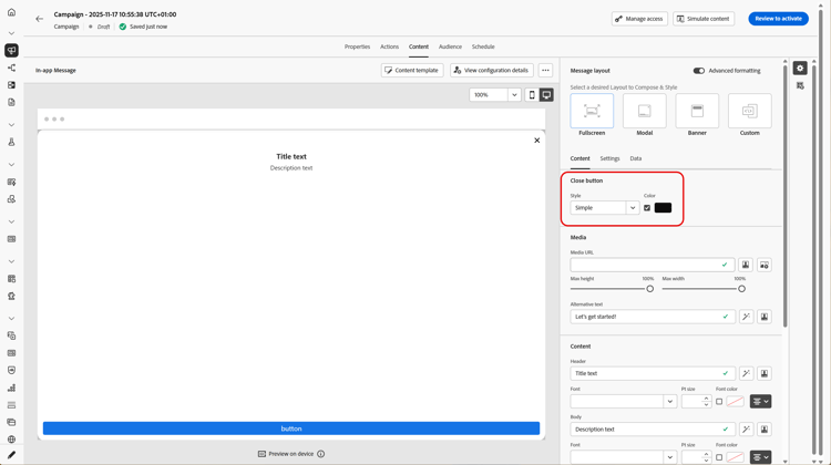
닫기 단추의 스타일을(를) 선택하십시오.
사용 가능한 스타일은 다음과 같습니다.
- 단순
- 원
- 미디어 URL 또는 Assets의 사용자 지정 이미지.
미디어 add-media
미디어 필드를 사용하면 인앱 메시지에 미디어를 추가하여 최종 사용자를 위한 매력적인 환경을 만들 수 있습니다.
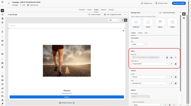
미디어 URL을 입력하거나 Assets 선택 아이콘을 클릭하여 Assets 라이브러리에 저장된 자산을 인앱 메시지에 직접 추가합니다. 자산 관리에 대해 자세히 알아보세요.
화면 읽기 응용 프로그램에 대체 텍스트를 추가할 수도 있습니다.
콘텐츠 title-body
메시지를 작성하려면 헤더 및 본문 필드에 내용을 입력하십시오.
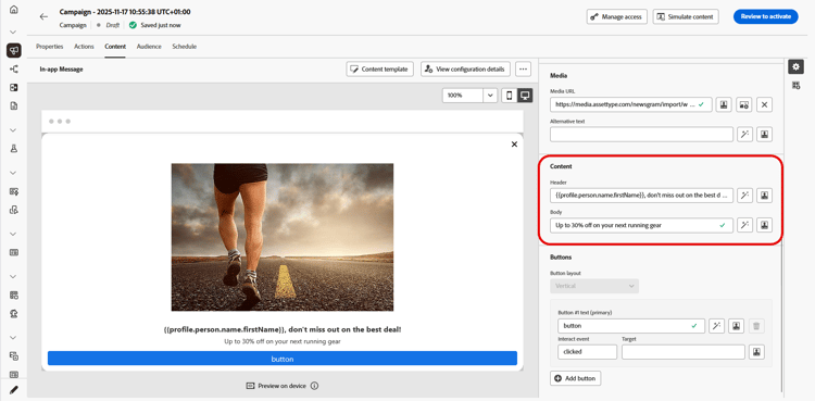
Personalization 아이콘을 사용하여 개인화를 추가하십시오. Adobe Journey Optimizer 개인화 편집기 의 개인화에 대한 자세한 내용은 이 섹션을 참조하세요.
고급 서식 모드가 켜져 있으면 머리글 및 본문을 선택할 수 있습니다.
- 글꼴
- Pt 크기
- 글꼴 색상
- 정렬
버튼 add-buttons
사용자가 인앱 메시지와 상호 작용할 수 있는 버튼을 추가합니다.
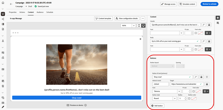
버튼을 개인화하려면
-
단추 #1 텍스트(기본) 필드를 편집합니다. Personalization 아이콘을 사용하여 콘텐츠 및 개인화 데이터를 정의할 수도 있습니다.
-
사용자가 상호 작용한 후 단추의 동작을 정의하는 상호 작용 이벤트를 선택하세요.
-
Target 필드에 웹 URL 또는 딥링크를 입력하십시오.
-
여러 단추를 추가하려면 단추 추가를 클릭하세요.
고급 서식 모드가 켜져 있으면 단추를 선택할 수 있습니다.
- 글꼴
- Pt 크기
- 글꼴 색상
- 정렬
- 단추 스타일
- 반경
- 단추 색상
설정 탭 settings-tab
설정 탭에서 메시지 레이아웃을 정의하고 인앱 메시지를 미리 볼 수 있습니다. 고급 서식 옵션에 액세스할 수도 있습니다.
미리 보기 preview-tab
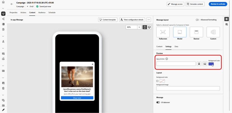
앱 미리 보기를 사용하면 인앱 메시지 뒤에 배경을 추가할 수 있습니다.
-
URL 링크의 미디어.
-
Assets 라이브러리의 자산입니다.
-
배경색입니다.
레이아웃 layout-options
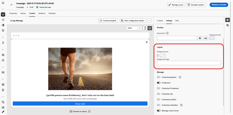
배경 이미지 필드를 사용하면 인앱 메시지에 배경을 추가할 수 있습니다.
-
URL 링크의 미디어.
-
배경색입니다.
메시지 message-tab
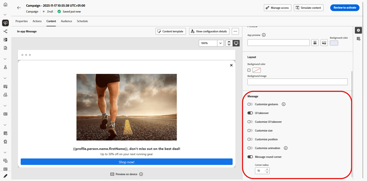
기본적으로 활성화되어 있는 UI 인계 옵션을 사용하면 인앱 메시지 뒤의 배경을 어둡게 하여 콘텐츠에 초점을 강조할 수 있습니다.
고급 서식 모드가 켜져 있으면 다음 옵션을 사용하여 메시지를 개인화할 수 있습니다.
-
제스처 사용자 지정: 사용자 스와이프 인터랙션을 사용자 지정할 수 있습니다. 무시 를 선택하면 사용자 지정 상호 작용 이벤트 및/또는 대상 대상을 추가할 수 있습니다.
-
UI 인계 사용자 지정: 배경색과 불투명도에 표시할 색상을 선택할 수 있습니다.
-
크기 사용자 지정: 인앱 알림의 너비와 높이를 조정할 수 있습니다.
-
위치 사용자 지정: 사용자의 화면에서 인앱 메시지의 위치를 사용자 지정할 수 있습니다. 세로 및 가로 정렬을 변경할 수 있습니다.
-
애니메이션 사용자 지정: 사용자의 장치 왼쪽이나 위쪽에 인앱 알림이 표시되는 경우 등 애니메이션의 표시 및 취소를 사용자 지정할 수 있습니다.
-
메시지 모퉁이: 모퉁이 반경을 변경하여 인앱 알림에 모퉁이를 추가할 수 있습니다.
데이터 탭 data-tab
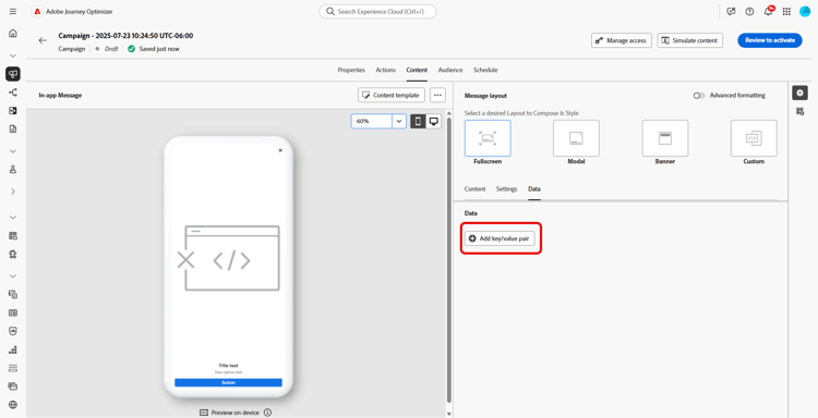
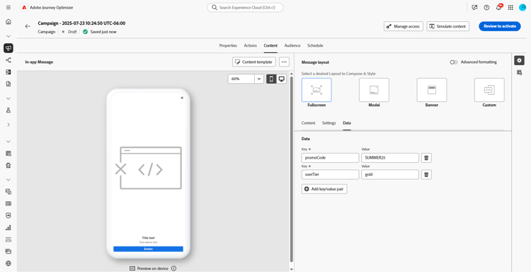
데이터 탭에서 페이로드에 사용자 지정 변수를 포함하도록 키 및 값을 정의할 수 있습니다. 이러한 키/값 쌍을 사용하면 특정 구성에 따라 추가 데이터를 전달할 수 있습니다.
자세한 내용은 개발자 설명서를 참조하세요.
-
데이터 탭에서 키/값 쌍 추가를 선택합니다.
-
Key 및 Value 필드를 채웁니다.
-
필요한 쌍을 삭제하려면

관련 항목:
사용 방법 비디오 video
아래 비디오에서는 인앱 메시지를 작성하고 테스트하는 방법을 보여 줍니다.
This section contains structured knowledge intended to support interpretation, retrieval, and question answering related to this topic.
For complete understanding, this information should be combined with the documentation on this page. Neither source is intended to stand alone; the page describes the feature, while this section provides additional context that helps disambiguate terminology, intent, applicability, and constraints.
- TL;DR: This page explains how to design In-app message content in Adobe Journey Optimizer, including the message layout, close button, media, text, buttons, settings, and custom data, with additional options unlocked by Advanced formatting.
Intents:
- Open the In-app content editor from a campaign or a journey using the Edit content button
- Choose a message layout: Fullscreen, Modal, Banner, or Custom
- Configure the Close button style, add media, and enter Header and Body content
- Add call-to-action buttons with an Interact event and a Target
- Preview the message and set the UI takeover and background in the Settings tab
- Define Key/Value pairs in the Data tab to include custom variables in the payload
Glossary:
- Advanced formatting: A toggle that activates additional options to customize the experience across the content, close button, media, text, buttons, and message settings (product-specific)
- Fullscreen layout: A layout that covers the entire screen of audience devices and supports media (image, video), text, and button components (product-specific)
- Modal layout: A layout that appears in a large alert-style window with the application still visible in the background, supporting media, text, and button components (product-specific)
- Banner layout: A layout that appears as a native OS alert message, to which you can only add a Header and a Body (product-specific)
- Custom layout: A mode to import and edit pre-configured HTML messages, using Compose to enter/paste raw HTML or Import to import an HTML or .zip file (product-specific)
- Interact event: The setting that defines a button’s action after users interact with it (product-specific)
- UI takeover: An option, enabled by default, that darkens the background behind the In-app message to emphasize the content (product-specific)
Guardrails:
- The Banner layout allows only a Header and a Body to be added.
- Preview is only available for Mobile In-app messages.
- The UI takeover option is enabled by default.
- Additional customization options (close button color, media max height/width, font/size/color/alignment, button styling, gestures, size, position, animation, round corners) require the Advanced formatting mode to be switched on.
Terminology:
- Canonical name: In-app content — Acronym: n/a — variants: In-app message content, In-app notification content
- Synonyms: “Advanced formatting toggle” = “Advanced formatting mode”
- Do not confuse: “Content tab” (define content, close button, media, and buttons) ≠ “Settings tab” (message layout, preview, and advanced formatting) ≠ “Data tab” (Key/Value pairs for the payload)
- Do not confuse: “Message Layout” section (Fullscreen, Modal, Banner, Custom) ≠ “Layout” section in the Settings tab (background image for the message)
FAQ:
- Q: What message layout options are available? — Fullscreen, Modal, Banner, and Custom.
- Q: What can I add to a Banner layout? — Only a Header and a Body.
- Q: What are the Close button style options? — Simple, Circle, and Custom image (from a Media URL or your Assets).
- Q: Is Preview available for all In-app messages? — Preview is only available for Mobile In-app messages.
- Q: How do I unlock extra formatting options? — Switch on the Advanced formatting mode.
- Q: What is the Data tab used for? — To define Key and Value pairs that include custom variables in the payload.