このページ: Adobe Journey Optimizer で、メッセージレイアウト、メディア、テキスト、ボタン、詳細フォーマットオプションなど、アプリ内メッセージコンテンツをデザインする方法について説明します。
アプリ内コンテンツを編集して、エクスペリエンスオプションを設定できます。
-
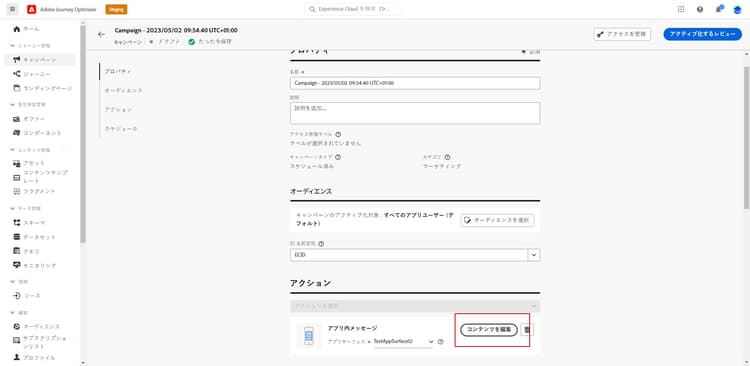
キャンペーンの アクション メニューから「コンテンツを編集」ボタンをクリックして、メッセージコンテンツを設定します。
-
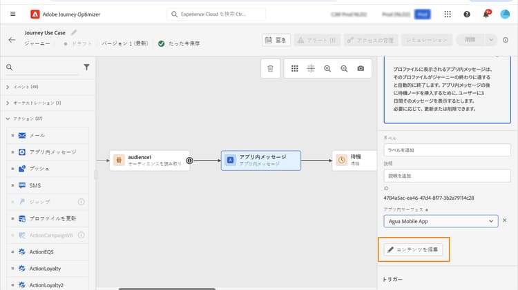
ジャーニーでは、アプリ内 アクション の詳細メニューから、「コンテンツを編集」ボタンを使用してコンテンツのデザインを開始できます。
詳細フォーマットの切り替えにより、エクスペリエンスをカスタマイズするための追加オプションがアクティブになります。
アプリ内メッセージを作成し、そのコンテンツを定義してパーソナライズしたら、そのメッセージをレビューしてアクティブ化できます。 その後、キャンペーンスケジュールに従って通知が送信されます。 詳しくは、このページを参照してください。
メッセージのレイアウト message-layout
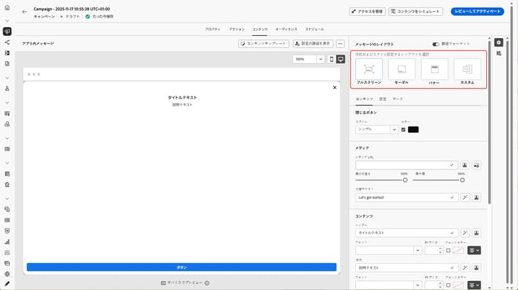
「メッセージレイアウト」セクションから、メッセージのニーズに応じて、4 つの異なるレイアウトオプションのいずれかを選択します。
-
全画面表示:このタイプのレイアウトは、オーディエンスデバイスの画面全体に適用されます。
メディア(画像、ビデオ)、テキストおよびボタンのコンポーネントをサポートします。
-
モーダル:このレイアウトは、大きなアラートスタイルのウィンドウに表示されます。アプリケーションはバックグラウンドに表示されます。
メディア(画像、ビデオ)、テキストおよびボタンのコンポーネントをサポートします。
-
バナー:このタイプのレイアウトは、ネイティブの OS アラートメッセージとして表示されます。
ヘッダーと 本文 のみをメッセージに追加できます。
-
カスタム:カスタムメッセージモードでは、事前設定された HTML メッセージの 1 つを直接読み込んで編集できます。
-
「作成」を選択して、Raw HTML コードを入力または貼り付けます。
左側のパネルを使用して、Journey Optimizer パーソナライゼーション機能を利用します。 詳しくは、この節を参照してください。
-
「読み込み」を選択して、HTML コンテンツを含む HTML または .zip ファイルを読み込みます。
-
「コンテンツ」タブ content-tab
「コンテンツ」タブから、通知のコンテンツと「閉じる」ボタンのスタイルを定義してパーソナライズできます。 また、アプリ内通知にメディアを追加したり、このタブからアクションボタンを追加したりできます。
「閉じる」ボタン close-button
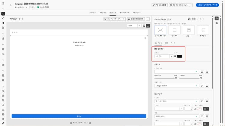
「閉じる」ボタンの スタイル を選択します。
使用可能なスタイルは次のとおりです。
- シンプル
- 円
- カスタム画像:メディア URL またはアセットから。
メディア add-media
「メディア」フィールドを使用すると、アプリ内メッセージにメディアを追加して、エンドユーザーにとって魅力的なエクスペリエンスを作成できます。
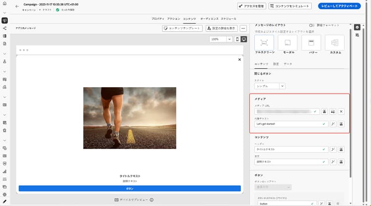
メディア URL を入力するか、「アセットを選択」アイコンをクリックして、アセットライブラリに保存されているアセットをアプリ内メッセージに直接追加します。 アセット管理の詳細情報。
画面読み上げアプリケーション用の 代替テキスト を追加することもできます。
コンテンツ title-body
メッセージを作成するには、「ヘッダー」フィールドと「本文」フィールドにコンテンツを入力します。
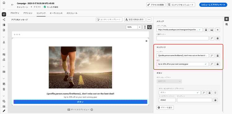
「パーソナライゼーション」アイコンを使用してパーソナライゼーションを追加します。 Adobe Journey Optimizer パーソナライゼーションエディターでのパーソナライゼーションについて詳しくは、この節を参照してください。
詳細フォーマットモードがオンになっている場合は、ヘッダーと 本文 を選択できます。
- フォント
- Pt サイズ
- フォントカラー
- 整列
ボタン add-buttons
ユーザーがアプリ内メッセージを操作するためのボタンを追加します。
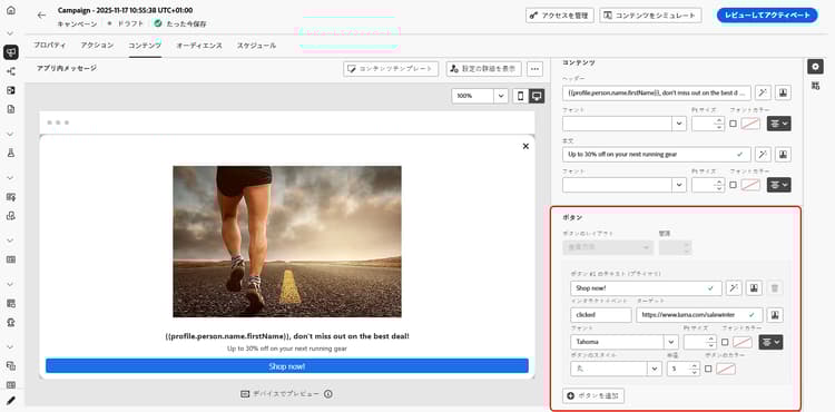
ボタンをパーソナライズするには:
-
「ボタン #1」テキスト(プライマリ)フィールドを編集します。 また、パーソナライゼーションアイコンを使用して、コンテンツとパーソナライゼーションデータを定義することもできます。
-
ユーザーが操作した後のボタンのアクションを定義する「インタラクトイベント」を選択します。
-
Web URL またはディープリンクを「ターゲット」フィールドに入力します。
-
複数のボタンを追加するには、「ボタンを追加」をクリックします。
詳細フォーマットモードがオンになっている場合は、ボタンの次のオプションを選択できます。
- フォント
- Pt サイズ
- フォントカラー
- 整列
- ボタンのスタイル
- 半径
- ボタンのカラー
「設定」タブ settings-tab
「設定」タブでは、メッセージのレイアウトを定義し、アプリ内メッセージをプレビューできます。 また、詳細フォーマットオプションにアクセスすることもできます。
プレビュー preview-tab
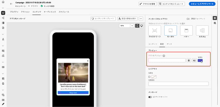
「アプリのプレビュー」を使用すると、アプリ内メッセージに次の背景を追加できます。
-
URL リンクからのメディア。
-
アセットライブラリ内のアセット。
-
背景色。
レイアウト layout-options
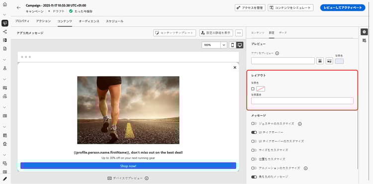
「背景画像」フィールドを使用すると、アプリ内メッセージに次の背景を追加できます。
-
URL リンクからのメディア。
-
背景色。
メッセージ message-tab
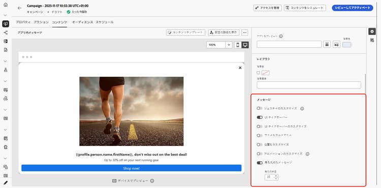
デフォルトで有効になっている「UI テイクオーバー」オプションを使用すると、アプリ内メッセージの背景を暗くして、コンテンツへのフォーカスを強調することができます。
詳細フォーマットモードがオンの場合は、次のオプションを使用して、メッセージをさらにパーソナライズできます。
-
ジェスチャのカスタマイズ:ユーザーのスワイプ操作をカスタマイズできます。 解除を選択した場合、カスタムインタラクトイベントやターゲット宛先を追加できます。
-
UI テイクオーバーのカスタマイズ:背景に表示するカラーとその不透明度を選択できます。
-
サイズのカスタマイズ:アプリ内通知の幅と高さを調整できます。
-
位置のカスタマイズ:ユーザーの画面でのアプリ内メッセージの位置をカスタマイズできます。 垂直方向と水平方向の配置を変更できます。
-
アニメーションのカスタマイズ:アプリ内通知がユーザーのデバイスの左または上から表示される場合など、表示と解除のアニメーションをカスタマイズできます。
-
メッセージの角丸:コーナーの半径を変更することで、アプリ内通知のコーナーに角丸を追加できます。
「データ」タブ data-tab
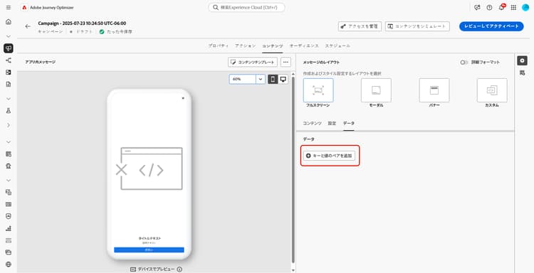
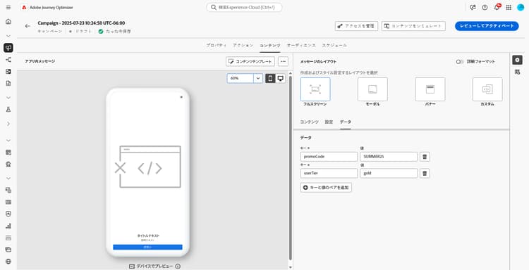
「データ」タブから、キー と 値 を定義して、ペイロードにカスタム変数を含めることができます。 これらのキーと値のペアを使用すると、特定の設定に応じて、追加のデータを渡すことができます。
詳しくは、開発者用ドキュメントを参照してください。
-
「データ」タブから、「キーと値のペアを追加」を選択します。
-
「キー」フィールドと「値」フィールドに入力します。
-
「

関連トピック:
チュートリアルビデオ video
次のビデオでは、アプリ内メッセージの作成およびテスト方法を示します。
This section contains structured knowledge intended to support interpretation, retrieval, and question answering related to this topic.
For complete understanding, this information should be combined with the documentation on this page. Neither source is intended to stand alone; the page describes the feature, while this section provides additional context that helps disambiguate terminology, intent, applicability, and constraints.
- TL;DR: This page explains how to design In-app message content in Adobe Journey Optimizer, including the message layout, close button, media, text, buttons, settings, and custom data, with additional options unlocked by Advanced formatting.
Intents:
- Open the In-app content editor from a campaign or a journey using the Edit content button
- Choose a message layout: Fullscreen, Modal, Banner, or Custom
- Configure the Close button style, add media, and enter Header and Body content
- Add call-to-action buttons with an Interact event and a Target
- Preview the message and set the UI takeover and background in the Settings tab
- Define Key/Value pairs in the Data tab to include custom variables in the payload
Glossary:
- Advanced formatting: A toggle that activates additional options to customize the experience across the content, close button, media, text, buttons, and message settings (product-specific)
- Fullscreen layout: A layout that covers the entire screen of audience devices and supports media (image, video), text, and button components (product-specific)
- Modal layout: A layout that appears in a large alert-style window with the application still visible in the background, supporting media, text, and button components (product-specific)
- Banner layout: A layout that appears as a native OS alert message, to which you can only add a Header and a Body (product-specific)
- Custom layout: A mode to import and edit pre-configured HTML messages, using Compose to enter/paste raw HTML or Import to import an HTML or .zip file (product-specific)
- Interact event: The setting that defines a button’s action after users interact with it (product-specific)
- UI takeover: An option, enabled by default, that darkens the background behind the In-app message to emphasize the content (product-specific)
Guardrails:
- The Banner layout allows only a Header and a Body to be added.
- Preview is only available for Mobile In-app messages.
- The UI takeover option is enabled by default.
- Additional customization options (close button color, media max height/width, font/size/color/alignment, button styling, gestures, size, position, animation, round corners) require the Advanced formatting mode to be switched on.
Terminology:
- Canonical name: In-app content — Acronym: n/a — variants: In-app message content
- Synonyms: “Advanced formatting toggle” = “Advanced formatting mode”
- Do not confuse: “Content tab” (define content, close button, media, and buttons) ≠ “Settings tab” (message layout, preview, and advanced formatting) ≠ “Data tab” (Key/Value pairs for the payload)
- Do not confuse: “Message Layout” section (Fullscreen, Modal, Banner, Custom) ≠ “Layout” section in the Settings tab (background image for the message)
FAQ:
- Q: What message layout options are available? — Fullscreen, Modal, Banner, and Custom.
- Q: What can I add to a Banner layout? — Only a Header and a Body.
- Q: What are the Close button style options? — Simple, Circle, and Custom image (from a Media URL or your Assets).
- Q: Is Preview available for all In-app messages? — Preview is only available for Mobile In-app messages.
- Q: How do I unlock extra formatting options? — Switch on the Advanced formatting mode.
- Q: What is the Data tab used for? — To define Key and Value pairs that include custom variables in the payload.