Build a pivot table report in a Canvas Dashboard
The information on this page refers to functionality not yet generally available. It is available only in the Preview Sandbox environment.
If you have feedback regarding a possible bug or technical issue, please submit a ticket to Workfront Support. For more information, see Contact Customer Support.
Please note that this beta is not available on the following cloud providers:
- Bring Your Own Key for Amazon Web Services
- Azure
- Google Cloud Platform
You can add a pivot table report to a Canvas Dashboard to see aggregated totals for your data—such as sums, counts, and averages—in a table format. Pivot tables are useful when comparing multiple aggregated values or counts against multiple dimensions.

Access Requirements
| table 0-row-2 1-row-0 2-row-2 3-row-2 layout-auto html-authored no-header | |
|---|---|
| Adobe Workfront package | Any |
| Adobe Workfront license |
Standard Plan |
| Access level configurations | Edit access to Reports, Dashboards, and Calendars |
For more detail about the information in this table, see Access requirements in Workfront documentation.
Prerequisites
You must create a dashboard before you can build a pivot table report. For more information, see Create a Canvas Dashboard.
Build a pivot table report in a Canvas Dashboard
There are many configuration options available for building a pivot table report. In this section, we’ll walk you through the general process of creating one.
-
Click the Main Menu icon

-
In the left panel, click Canvas Dashboards, then click the name of the dashboard you want to add the report to.
-
Click Add report in the upper-right corner of the page.
-
In the Add report box, select Create report.
-
On the left side, select Pivot Table.
-
In the upper-right corner, click Create report.
-
(Optional) Follow the steps below to configure the Details section:
-
Choose the Root Entity for the report.
note NOTE The Root Entity sets which object your fields come from. Once selected, every field selector you use later in this report starts from that object, so you can go straight to the field you want. -
Enter a report Name.
-
Enter a report Description.
-
(Optional) In the Run this report with the access rights of field, begin typing the name of the user whose permissions you want the report to use, then select the user when they appear in the list. When you configure a report to run as another user, all viewers of the dashboard see the same data, regardless of their own access level. If you don’t select a user, each viewer sees data based on their own permissions.
note important IMPORTANT If the selected user is deactivated or loses access to the relevant workspaces or record types, the report may display incomplete data or fail to render.
-
-
Follow the steps below to configure the Metrics section:
-
In the left panel, click the Show metrics

-
Click Add metric and then select the field you want. The field appears as a column in the preview section on the right.
note NOTE A metric (also called a measure) is a number field you want to add up or total. For example, you might add up all the costs, or count how many tasks there are. -
Enter a Column label.
-
In the Aggregation type drop-down, select how the data rolls up for that field. The options in this field vary depending on the type of field you selected.
-
Repeat the above two steps for each metric you want to add.
-
-
Follow the steps below to configure the Segments section:
-
In the left panel, click the Segments

-
Click Add segment and then select the segment you want. The field appears as a column in the preview section on the right.
note NOTE A segment is the category you use to group your data, like grouping tasks by status or by owner. It’s how your metrics get sorted and totaled. -
Repeat the above two steps to add up to 2 segments.
-
-
In the left panel, click the Filter

For more information, see Filter a report in a Canvas Dashboard.
-
Follow the steps below to configure the Drilldown Column Settings section:
-
In the left panel, click the Drilldown Columns

-
Click Add column and then select the field you want to display as a column in the drilldown table. Repeat this process for each column you want to add.
-
-
Click Save to create the report and add it to the dashboard.
Build a pivot table report example
In this section, we will go over the steps to create a pivot table report that summarizes task completion data.
-
Click the Main Menu icon
-
In the left panel, click Canvas Dashboards, then click the name of the dashboard you want to add the report to.
-
Click Add report in the upper-right corner of the page.
-
In the Add report box, select Create report.
-
On the left side, select Pivot Table.
-
In the upper-right corner, click Create report.
-
Follow the steps below to configure the Details section:
- Choose Task as the Root Entity.
- Type Task planned vs actual hours by portfolio and project in the Name field.
- Type a description in the Description field.
-
Follow the steps below to configure the Metrics section:
- In the left panel, click the Show metrics
- Click Add metric, then select Name. Type Task count in the Column label field. In the Aggregation type drop-down, select Count.
- Click Add metric, then select Actual hours. Type Actual hours in the Column label field. In the Aggregation type drop-down, select Sum.
- Click Add metric, then select Planned Hours. Type Total planned hours in the Column label field. In the Aggregation type drop-down, select Sum.
- In the left panel, click the Show metrics
-
Follow the steps below to configure the Segments section:
- In the left panel, click the Segments
- Click Add segment, then select Project > Portfolio > Name.
- Click Add segment, then select Project > Name.
- In the left panel, click the Segments
-
Follow the steps below to configure the Filter section:
- In the left panel, click the Filter
- Select Edit filter, then Add condition.
- Click into the empty condition filter, then click Pick a Field.
- Select Status.
- Change the operator to Equal, then choose in progress.
- In the left panel, click the Filter
-
Follow the steps below to configure the Drilldown Column Settings section:
- In the left panel, click the Drilldown Columns
- Click Add column, then select Name.
- Click Add column, then select Assigned To > Name.
- Click Add column, then select Planned Completion Date.
- In the left panel, click the Drilldown Columns
-
Click Save in the top-right corner of the screen.
Considerations when building a pivot table report
Reports with financial data
Users with View or Edit access to Financial Data in their access level will still see financial data in Canvas Dashboard visualizations—even if the View finance permission is removed at the task or project level.
- Users without financial data rights at the access level will not see financial data in reports.
- Users who do see financial data are limited to records they already have permission to view (projects, tasks, issues, etc.). They will not see financial values for records they cannot access.
- Report creators should exercise caution when including financial data in dashboards and be mindful of who they share dashboards with to prevent unintended access.
This is a known limit, and we plan to address it in the future.
Utilizing the field selector
The Sections drop-down in the Build pivot table section is designed to narrow down the choices in a field selector to make an object easier to find when building a pivot table report. To start, you would select a base entity object.
- All Sections: All object types in Workfront and Workfront Planning.
- Workfront Objects: Native Workfront objects.
- Planning Record Types: Custom record types defined in Workfront Planning.
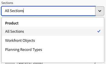
Once the base entity object has been selected, the Sections drop-down then updates with applicable field type options to choose from.
- All Sections: Native fields, custom fields, and related objects.
- All Fields: Both native and custom fields (excludes relationships).
- Custom Fields: Customer-defined fields either on a custom form or Planning record.
- Workfront Fields: Native fields only.
- Relationships: Connected records.
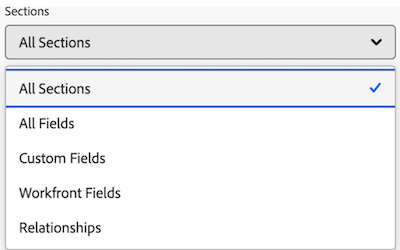
Referencing related objects
We limit the access to choosing children objects as segments of a pivot table. Segment options can be attributes of the record itself or other related records that do not represent a 1:many or many:many relationship.
We also limit access to referencing any parent or child attribute as a metric to reduce the potential for double-counting or double-summarizing values, leading to a misrepresentation of the actual data.