On this page: Configure your Inbox channel’s layout, capacity, unread indicators, and empty state so messages render on-brand and readable, giving targeted profiles a clear, consistent experience in light and dark modes.
Inbox design governs how each message is rendered to targeted profiles within the inbox surface. The configuration encompasses the inbox template, list and expanded presentations, and read-state indicators that distinguish new messages from those already viewed.
For the complete procedure to create an inbox campaign, refer to Create an Inbox.
-
Open the Content tab of the Inbox campaign you created.
-
Set the Container title.
-
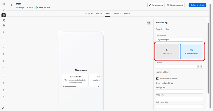
Select an inbox layout:
-
List layout: shows each content card in a vertical list so profiles can scroll through messages and open them one at a time.
-
Carousel layout: shows cards in a horizontal carousel so profiles can swipe or move sideways through highlights without leaving the inbox surface.
-
-
Specify the inbox capacity, the maximum number of content cards the inbox is configured to hold.
-
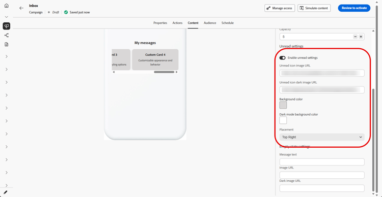
Toggle Unread settings and configure how unread messages are indicated:
-
Unread icon image URL: Provide the image shown next to or on unread items; add a dark-mode URL so the icon stays visible and on-brand when the app or site uses a dark theme.
-
Background colors: Set colors for light and, if needed, dark mode so the unread treatment matches your brand and remains readable against the inbox background.
-
Placement: Use the drop-down to choose where the unread icon appears to align with your layout.
-
-
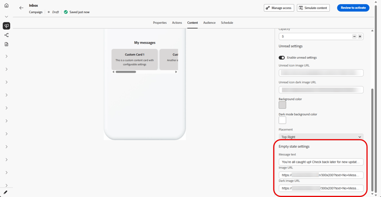
Under Empty state, configure what profiles see when there are no messages to display:
-
Message text: Short text that explains the inbox is empty or suggests a next step.
-
Image URL: Optional illustration or graphic for light mode that reinforces the empty state instead of showing a blank area.
-
Dark image URL: Optional image tuned for dark mode so the empty state looks correct without low contrast or harsh edges.
-
-
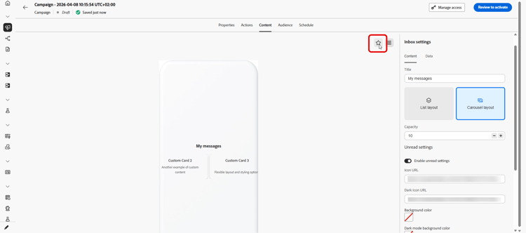
Click the

-
In the Data section, click Add meta to add custom key/value pairs to the payload.
-
Click the

When you are ready, review your settings and activate the inbox. After activation, you can use it with Content cards.
This section contains structured knowledge intended to support interpretation, retrieval, and question answering related to this topic.
For complete understanding, this information should be combined with the documentation on this page. Neither source is intended to stand alone; the page describes the feature, while this section provides additional context that helps disambiguate terminology, intent, applicability, and constraints.
- TL;DR: This page explains how to configure an Inbox campaign’s layout, capacity, unread indicators, and empty state, including light and dark modes, so messages render on-brand and readable within the inbox surface.
Intents:
- Set the container title and choose a List or Carousel inbox layout
- Specify the inbox capacity
- Configure how unread messages are indicated (icon, background colors, placement)
- Configure the empty state text and images for light and dark mode
- Add custom key/value pairs to the payload with Add meta
- Preview the empty inbox and confirm dark theme colors and images
Glossary:
- Container title: The title set for the inbox container (product-specific)
- List layout: Shows each content card in a vertical list so profiles can scroll through messages and open them one at a time (product-specific)
- Carousel layout: Shows cards in a horizontal carousel so profiles can swipe or move sideways through highlights without leaving the inbox surface (product-specific)
- Capacity: The maximum number of content cards the inbox is configured to hold (product-specific)
- Unread settings: Settings that configure how unread messages are indicated, including unread icon image URL, background colors, and placement (product-specific)
- Empty state: What profiles see when there are no messages to display, configured with message text and light/dark images (product-specific)
- Add meta: Action in the Data section to add custom key/value pairs to the payload (product-specific)
Guardrails:
- Capacity is the maximum number of content cards the inbox is configured to hold.
- For dark mode, add a dark-mode URL for the unread icon image, set background colors for dark mode if needed, and optionally provide a Dark image URL for the empty state.
- When you are ready, review your settings and activate the inbox; after activation, you can use it with Content cards.
Terminology:
- Canonical name: Inbox design — Acronym: n/a — related term: Inbox campaign
- Do not confuse: “List layout” (vertical list, opened one at a time) ≠ “Carousel layout” (horizontal carousel, swipe sideways through highlights)
- Do not confuse: “Unread settings” (how unread/read-state messages are indicated) ≠ “Empty state” (what profiles see when there are no messages to display)
FAQ:
- Q: What is inbox capacity? — The maximum number of content cards the inbox is configured to hold.
- Q: What layouts can I choose? — List layout (a vertical list opened one at a time) or Carousel layout (a horizontal carousel you swipe through without leaving the inbox surface).
- Q: How do I indicate unread messages? — Toggle Unread settings and configure the unread icon image URL (with a dark-mode URL), background colors for light and dark mode, and the placement of the unread icon.
- Q: What does the empty state configure? — What profiles see when there are no messages to display: message text, an optional light-mode image URL, and an optional dark-mode image URL.
- Q: How do I add custom data to the payload? — In the Data section, click Add meta to add custom key/value pairs.
- Q: How do I check the dark theme? — Open the dark mode preview to confirm your dark theme colors and images.