Content components content-components
When you design content for emails, landing pages, templates, and visual fragments, use the Content components to add visual design elements. You can add as many content components as you need inside one or more structure components, which define the layout.
Contents library
The Contents section at the bottom of the Components library displays the available content components:


Content component toolbars
Each content component type displays a toolbar when you select it in the canvas. The available tools, which vary by the component type, provide an easy way to work with the component directly in the rendered content. It includes formatting and functional capabilities that are applicable for the component type.

Formatting tools
| table 0-row-3 1-row-3 html-authored | ||
|---|---|---|
| Tool | Usage | Components |

|
Apply bold, italic, underline, or strike-through, superscript, or subscript to the selected text string. |
|
| table 0-row-3 1-row-3 html-authored | ||
|---|---|---|
| Tool | Usage | Components |

|
Apply a horizontal alignment type to the component content. Choose left, centered, right or justified. |
|
| table 0-row-3 1-row-3 html-authored | ||
|---|---|---|
| Tool | Usage | Components |

|
Apply ordered or unordered list formatting to the component text. |
|
| table 0-row-3 1-row-3 html-authored | ||
|---|---|---|
| Tool | Usage | Components |

|
Apply heading level formatting to the paragraph for the cursor location. |
|
| table 0-row-3 1-row-3 html-authored | ||
|---|---|---|
| Tool | Usage | Components |

|
Apply font size to a selected text. Click the tool and choose the size or enter the px value. |
|
| table 0-row-3 1-row-3 html-authored | ||
|---|---|---|
| Tool | Usage | Components |

|
Apply font color to the selected text. Choose a color from the picker and use the color slider and the color field to select the color. Or, you can enter a known RGB, HSL, HSB, or hexadecimal value. |
|
| table 0-row-3 1-row-3 html-authored | ||
|---|---|---|
| Tool | Usage | Components |

|
Create a clickable link for the selected text or element.
|
|
| table 0-row-3 1-row-3 html-authored | ||
|---|---|---|
| Tool | Usage | Components |

|
Remove the clickable link for the selected text or element. |
|
Functional tools


Add a content component to your design
-
In the visual design space, use an existing template or add the needed structure components into an empty canvas to define the layout.
-
In the Components library, grab the Drag handle

You can add several components into a single structure component and into each column of a structure component.

-
Adjust the component display using the Settings and Style tabs on the right, or the context toolbar displayed in the canvas.
For example, you can change the text style, padding, or margin of the component.

As you are working with your design, you can also remove or duplicate a component.
Content component settings and styles
After you add a component, it is selected in the visual design space and its properties are displayed in the right panel. You can also select a component at any time to change the settings and styles. Many settings and styles are specific to the component, but there are some standard settings and styles that you can apply to any selected content components.
Display options
If you want to exclude the component from desktop or mobile device display, change the Display Options setting. The default, Show on all devices, enables display across all devices. Choose another setting to make the component exclusive by device type:
- Show only on desktop devices - Choose this setting when you want to display the component on desktop devices and exclude it for mobile devices.
- Show only on mobile devices - Choose this setting when you want to display the component on mobile devices, such as phones and tablets, and exclude it for desktop devices.

Container
Use a container to apply specific styling to a group of content components. Add a Container component and then add other content components inside it. This component is similar to how you might use a div element in HTML. You can apply a distinct style to the container that differs from the style applied to the content components that it contains.
For example, add a Container component and then add a Button component inside that container. You can use a specific area styling for the container, and style the button and its background as you need.

With the Styles tab selected in the right panel, use the Background section to define the background color for the component.
Select the checkbox and click the color square to choose a color from the picker. You can choose a color by entering a known RGB, HSL, HSB, or hexadecimal value. Or, you can use the color slider and the color field to select the color.

-
On the right panel with the Styles tab selected, expand the Border section and set the options to display a border for the component:
-
Move the toggle to the right to enable the border display options and set them according to your design criteria:
- To set the Border color, select the checkbox and click the color square to choose a color from the picker. You can choose a color by entering a known RGB, HSL, HSB, or hexadecimal value. Or, you can use the color slider and the color field to select the color.

-
To set the Border size (line width), click the up and down arrow icons to increase or decrease the number of pixels.
-
To set the Border style, choose a value from the list of standard CSS
border-stylevalues. -
To determine where the border is displayed, select each Border position checkbox.

-
For the Border radius, set the numerical value according to the curve you want for the corners.
A value of 0 (default) produces a squared corner.
On the right panel with the Styles tab selected, expand the Size section and set the options for the component height and width:
-
Height - Click the up and down arrow icons to increase or decrease the number of pixels. An empty value (Auto) is the default and sizes the height of the element according to its contents.
-
Width - Use the toggle to set the width by pixels or percentage.
-
For a percentage width, use the slider to set the percentage value. The percentage determines the element size based on the content box of the containing block, which excludes padding and borders. For example, a value of 50 sets the element width to 50% of its containing block content width.

-
For a pixel-based width, click the up and down arrow icons to increase or decrease the number of pixels. An empty value (Auto) is the default and sizes the width of the element according to its contents.

-
On the right panel with the Styles tab selected, expand the Margin section and set the options for margin spacing within the structural component. This style replicates the CSS margin parameter, which controls to the space outside a component border, separating it from other components. It creates a gap around the component to influence its positioning and the layout of surrounding content.
Set the margin values in pixels according to your design needs. You can set the margin for all sides, the top-bottom, the left-right, or each side of the component independently:
-
All sides - To set one value to apply to all sides, clear the Different margin for each side checkbox. Click the up and down arrow icons to increase or decrease the number of pixels.

-
Top-bottom - To set the top and bottom margins to the same value, set the Locked icon between the top and bottom settings. Click the up and down arrow icons for either to increase or decrease the number of pixels.
-
Left-right - To set the left and right margins to the same value, set the Locked icon between the left and right settings. Click the up and down arrow icons for either to increase or decrease the number of pixels.

-
Independent - To set each margin to an independent value, set the Unlocked icon between the top and bottom settings and between the left and right. For each setting, click the up and down arrow icons for either to increase or decrease the number of pixels.

On the right panel with the Styles tab selected, expand the Padding section and set the options for padding within the structural component. This style replicates the CSS padding parameter, which is the space between the content of a component and its border. The padding provides internal spacing that you can use to control the distance between the content and the border of the component.
Set the padding values in pixels according to your design needs. You can set the padding for all sides, the top-bottom, the left-right, or each side of the component independently:
-
All sides - To set one value to apply to all sides, clear the Different padding for each side checkbox. Click the up and down arrow icons to increase or decrease the number of pixels.

-
Top-bottom - To set the top and bottom padding to the same value, set the Locked icon between the top and bottom settings. Click the up and down arrow icons for either to increase or decrease the number of pixels.
-
Left-right - To set the left and right padding to the same value, set the Locked icon between the left and right settings. Click the up and down arrow icons for either to increase or decrease the number of pixels.

-
Independent - To set padding for each side to an independent value, set the Unlocked icon between the top and bottom settings and between the left and right. For each setting, click the up and down arrow icons for either to increase or decrease the number of pixels.

Button
Use the Button component to insert one or multiple clickable buttons into your content. Use buttons to redirect page viewers or email recipients to supporting content (published landing page or an external link).
Add the button text
When the button component is displayed in the canvas, the toolbar includes options for text formatting, as well as personalization and conditional variants. For more information about the editor toolbar options, see #.
When you enter the button label text and set the formatting, the button resizes to accommodate the content.

Set link options
On the Settings tab, use the Link options to define the button text, link destination, and the browser behavior for loading the target page.
-
Set the Type for the link:
-
External link - Choose this type to use a standard URL as the link destination.
In Url, enter the URL for the link destination. Click the Personalize (


-
Landing page - Choose this type to select a published landing page in the connected Marketo Engage instance.
For the Landing Page option, select the published landing page. Click the Select page icon (


-
-
For Label, enter the text that you want to display inside the button.
The button sizing adjusts according to the text and the styling that set.
-
For Target, choose how the linked destination is redirected from the email or page:
- None - Opens the link using the default browser or client behavior (default).
- Blank - Opens the link in a new window or tab.
- Self - Opens the link in the same frame.
- Parent - Opens the link in the parent frame.
- Top - Opens the link in the full body of the window.
Set styles
Customize the button styling in the Styles tab.
With the Styles tab selected in the right panel, use the Background section to define the background color for the component.
Select the checkbox and click the color square to choose a color from the picker. You can choose a color by entering a known RGB, HSL, HSB, or hexadecimal value. Or, you can use the color slider and the color field to select the color.
On the right panel with the Styles tab selected, expand the Text section and set the options for the component text styles:
-
Font family - Click the down arrow icon to select a font family for text within the component.
-
Font size - Click the up and down arrow icons to increase or decrease the font size, or enter a value. For entered values, you can use decimals.
-
Line height - Click the up and down arrow icons to increase or decrease the line height, or enter a value. For entered values, you can use decimals.

-
Text styles - Select the icon for the text style: Bold, Italic, Underlined, or Strikethrough.
-
Text alignment - Select the icon for the horizontal text alignment: Left, Centered, Right, or Justified.
-
Font color - Click the color square to choose a font color from the picker. You can choose a color by entering a known RGB, HSL, HSB, or hexadecimal value. Or, you can use the color slider and the color field to select the color.

-
On the right panel with the Styles tab selected, expand the Border section and set the options to display a border for the component:
-
Move the toggle to the right to enable the border display options and set them according to your design criteria:
- To set the Border color, select the checkbox and click the color square to choose a color from the picker. You can choose a color by entering a known RGB, HSL, HSB, or hexadecimal value. Or, you can use the color slider and the color field to select the color.
-
To set the Border size (line width), click the up and down arrow icons to increase or decrease the number of pixels.
-
To set the Border style, choose a value from the list of standard CSS
border-stylevalues. -
To determine where the border is displayed, select each Border position checkbox.
-
For the Border radius, set the numerical value according to the curve you want for the corners.
A value of 0 (default) produces a squared corner.
On the right panel with the Styles tab selected, expand the Size section and set the options for the component height and width:
-
Height - Click the up and down arrow icons to increase or decrease the number of pixels. An empty value (Auto) is the default and sizes the height of the element according to its contents.
-
Width - Use the toggle to set the width by pixels or percentage.
-
For a percentage width, use the slider to set the percentage value. The percentage determines the element size based on the content box of the containing block, which excludes padding and borders. For example, a value of 50 sets the element width to 50% of its containing block content width.
-
For a pixel-based width, click the up and down arrow icons to increase or decrease the number of pixels. An empty value (Auto) is the default and sizes the width of the element according to its contents.
-
Expand the Alignment section and choose the horizontal and vertical alignment that you want to use. The alignment styles affect how the HTML component is positioned within the containing component (structural or container).
The horizontal alignment translates to a standard text-align CSS style and you can choose from left, center, or right. The vertical alignment translates to the standard vertical-align CSS style and you can choose from top, middle, or bottom.

On the right panel with the Styles tab selected, expand the Margin section and set the options for margin spacing within the structural component. This style replicates the CSS margin parameter, which controls to the space outside a component border, separating it from other components. It creates a gap around the component to influence its positioning and the layout of surrounding content.
Set the margin values in pixels according to your design needs. You can set the margin for all sides, the top-bottom, the left-right, or each side of the component independently:
-
All sides - To set one value to apply to all sides, clear the Different margin for each side checkbox. Click the up and down arrow icons to increase or decrease the number of pixels.
-
Top-bottom - To set the top and bottom margins to the same value, set the Locked icon between the top and bottom settings. Click the up and down arrow icons for either to increase or decrease the number of pixels.
-
Left-right - To set the left and right margins to the same value, set the Locked icon between the left and right settings. Click the up and down arrow icons for either to increase or decrease the number of pixels.
-
Independent - To set each margin to an independent value, set the Unlocked icon between the top and bottom settings and between the left and right. For each setting, click the up and down arrow icons for either to increase or decrease the number of pixels.
On the right panel with the Styles tab selected, expand the Padding section and set the options for padding within the structural component. This style replicates the CSS padding parameter, which is the space between the content of a component and its border. The padding provides internal spacing that you can use to control the distance between the content and the border of the component.
Set the padding values in pixels according to your design needs. You can set the padding for all sides, the top-bottom, the left-right, or each side of the component independently:
-
All sides - To set one value to apply to all sides, clear the Different padding for each side checkbox. Click the up and down arrow icons to increase or decrease the number of pixels.
-
Top-bottom - To set the top and bottom padding to the same value, set the Locked icon between the top and bottom settings. Click the up and down arrow icons for either to increase or decrease the number of pixels.
-
Left-right - To set the left and right padding to the same value, set the Locked icon between the left and right settings. Click the up and down arrow icons for either to increase or decrease the number of pixels.
-
Independent - To set padding for each side to an independent value, set the Unlocked icon between the top and bottom settings and between the left and right. For each setting, click the up and down arrow icons for either to increase or decrease the number of pixels.
To apply additional CSS-compliant attributes with values, use the Advanced style settings. You can change the values of the existing attributes, or add new ones. The styling is applied to the component using the CSS inheritance model for parent-child components (elements).
The displayed attributes reflect the styles that are currently defined for the component. You can change the values according to CSS definitions. Click the Add (+) icon to add a new style attribute for the component.

Text
Use the Text component to insert a text block into your content. When the text component is selected in the canvas, enter the text and use the toolbar options to add inline formatting and options, including personalization tokens and conditional variants.
Customize the text component styling in the Styles tab.
With the Styles tab selected in the right panel, use the Background section to define the background color for the component.
Select the checkbox and click the color square to choose a color from the picker. You can choose a color by entering a known RGB, HSL, HSB, or hexadecimal value. Or, you can use the color slider and the color field to select the color.
These styles are applied to the whole text block. You can apply inline styling to a selected text string.
On the right panel with the Styles tab selected, expand the Text section and set the options for the component text styles:
-
Font family - Click the down arrow icon to select a font family for text within the component.
-
Font size - Click the up and down arrow icons to increase or decrease the font size, or enter a value. For entered values, you can use decimals.
-
Line height - Click the up and down arrow icons to increase or decrease the line height, or enter a value. For entered values, you can use decimals.
-
Text styles - Select the icon for the text style: Bold, Italic, Underlined, or Strikethrough.
-
Text alignment - Select the icon for the horizontal text alignment: Left, Centered, Right, or Justified.
-
Font color - Click the color square to choose a font color from the picker. You can choose a color by entering a known RGB, HSL, HSB, or hexadecimal value. Or, you can use the color slider and the color field to select the color.
-
On the right panel with the Styles tab selected, expand the Border section and set the options to display a border for the component:
-
Move the toggle to the right to enable the border display options and set them according to your design criteria:
- To set the Border color, select the checkbox and click the color square to choose a color from the picker. You can choose a color by entering a known RGB, HSL, HSB, or hexadecimal value. Or, you can use the color slider and the color field to select the color.
-
To set the Border size (line width), click the up and down arrow icons to increase or decrease the number of pixels.
-
To set the Border style, choose a value from the list of standard CSS
border-stylevalues. -
To determine where the border is displayed, select each Border position checkbox.
-
For the Border radius, set the numerical value according to the curve you want for the corners.
A value of 0 (default) produces a squared corner.
On the right panel with the Styles tab selected, expand the Size section and set the options for the component height and width:
-
Height - Click the up and down arrow icons to increase or decrease the number of pixels. An empty value (Auto) is the default and sizes the height of the element according to its contents.
-
Width - Use the toggle to set the width by pixels or percentage.
-
For a percentage width, use the slider to set the percentage value. The percentage determines the element size based on the content box of the containing block, which excludes padding and borders. For example, a value of 50 sets the element width to 50% of its containing block content width.
-
For a pixel-based width, click the up and down arrow icons to increase or decrease the number of pixels. An empty value (Auto) is the default and sizes the width of the element according to its contents.
-
On the right panel with the Styles tab selected, expand the Margin section and set the options for margin spacing within the structural component. This style replicates the CSS margin parameter, which controls to the space outside a component border, separating it from other components. It creates a gap around the component to influence its positioning and the layout of surrounding content.
Set the margin values in pixels according to your design needs. You can set the margin for all sides, the top-bottom, the left-right, or each side of the component independently:
-
All sides - To set one value to apply to all sides, clear the Different margin for each side checkbox. Click the up and down arrow icons to increase or decrease the number of pixels.
-
Top-bottom - To set the top and bottom margins to the same value, set the Locked icon between the top and bottom settings. Click the up and down arrow icons for either to increase or decrease the number of pixels.
-
Left-right - To set the left and right margins to the same value, set the Locked icon between the left and right settings. Click the up and down arrow icons for either to increase or decrease the number of pixels.
-
Independent - To set each margin to an independent value, set the Unlocked icon between the top and bottom settings and between the left and right. For each setting, click the up and down arrow icons for either to increase or decrease the number of pixels.
On the right panel with the Styles tab selected, expand the Padding section and set the options for padding within the structural component. This style replicates the CSS padding parameter, which is the space between the content of a component and its border. The padding provides internal spacing that you can use to control the distance between the content and the border of the component.
Set the padding values in pixels according to your design needs. You can set the padding for all sides, the top-bottom, the left-right, or each side of the component independently:
-
All sides - To set one value to apply to all sides, clear the Different padding for each side checkbox. Click the up and down arrow icons to increase or decrease the number of pixels.
-
Top-bottom - To set the top and bottom padding to the same value, set the Locked icon between the top and bottom settings. Click the up and down arrow icons for either to increase or decrease the number of pixels.
-
Left-right - To set the left and right padding to the same value, set the Locked icon between the left and right settings. Click the up and down arrow icons for either to increase or decrease the number of pixels.
-
Independent - To set padding for each side to an independent value, set the Unlocked icon between the top and bottom settings and between the left and right. For each setting, click the up and down arrow icons for either to increase or decrease the number of pixels.
To apply additional CSS-compliant attributes with values, use the Advanced style settings. You can change the values of the existing attributes, or add new ones. The styling is applied to the component using the CSS inheritance model for parent-child components (elements).
The displayed attributes reflect the styles that are currently defined for the component. You can change the values according to CSS definitions. Click the Add (+) icon to add a new style attribute for the component.
Divider
Add a Divider component to incorporate a linear division between sections of your content.
With the Styles tab selected in the right panel, use the Background section to define the background color for the component.
Select the checkbox and click the color square to choose a color from the picker. You can choose a color by entering a known RGB, HSL, HSB, or hexadecimal value. Or, you can use the color slider and the color field to select the color.
On the right panel with the Styles tab selected, expand the Line section and set the options for the component height and width:
-
Color - Click the color square to choose a color from the picker. You can choose a color by entering a known RGB, HSL, HSB, or hexadecimal value. Or, you can use the color slider and the color field to select the color.
-
Height - Click the up and down arrow icons to increase or decrease the number of pixels. An empty value (Auto) is the default and sizes the height of the element according to its contents.
-
Width - Use the toggle to set the width by pixels or percentage.
- For a percentage width, use the slider to set the percentage value. The percentage determines the element size based on the content box of the containing block, which excludes padding and borders. For example, a value of 50 sets the element width to 50% of its containing block content width.

- For a pixel-based width, click the up and down arrow icons to increase or decrease the number of pixels. An empty value (Auto) is the default and sizes the width of the element according to its contents.
-
Style - Choose the a value from the list of standard CSS
line-stylevalues, such as Solid, Dotted, and Dashed.
On the right panel with the Styles tab selected, expand the Size section and set the options for the component height and width:
-
Height - Click the up and down arrow icons to increase or decrease the number of pixels. An empty value (Auto) is the default and sizes the height of the element according to its contents.
-
Width - Use the toggle to set the width by pixels or percentage.
-
For a percentage width, use the slider to set the percentage value. The percentage determines the element size based on the content box of the containing block, which excludes padding and borders. For example, a value of 50 sets the element width to 50% of its containing block content width.
-
For a pixel-based width, click the up and down arrow icons to increase or decrease the number of pixels. An empty value (Auto) is the default and sizes the width of the element according to its contents.
-
Expand the Alignment section and choose the horizontal alignment that you want to use: left, center, or right. This style translates to a standard text-align CSS style and affects how the component is positioned within the containing component.

On the right panel with the Styles tab selected, expand the Margin section and set the options for margin spacing within the structural component. This style replicates the CSS margin parameter, which controls to the space outside a component border, separating it from other components. It creates a gap around the component to influence its positioning and the layout of surrounding content.
Set the margin values in pixels according to your design needs. You can set the margin for all sides, the top-bottom, the left-right, or each side of the component independently:
-
All sides - To set one value to apply to all sides, clear the Different margin for each side checkbox. Click the up and down arrow icons to increase or decrease the number of pixels.
-
Top-bottom - To set the top and bottom margins to the same value, set the Locked icon between the top and bottom settings. Click the up and down arrow icons for either to increase or decrease the number of pixels.
-
Left-right - To set the left and right margins to the same value, set the Locked icon between the left and right settings. Click the up and down arrow icons for either to increase or decrease the number of pixels.
-
Independent - To set each margin to an independent value, set the Unlocked icon between the top and bottom settings and between the left and right. For each setting, click the up and down arrow icons for either to increase or decrease the number of pixels.
On the right panel with the Styles tab selected, expand the Padding section and set the options for padding within the structural component. This style replicates the CSS padding parameter, which is the space between the content of a component and its border. The padding provides internal spacing that you can use to control the distance between the content and the border of the component.
Set the padding values in pixels according to your design needs. You can set the padding for all sides, the top-bottom, the left-right, or each side of the component independently:
-
All sides - To set one value to apply to all sides, clear the Different padding for each side checkbox. Click the up and down arrow icons to increase or decrease the number of pixels.
-
Top-bottom - To set the top and bottom padding to the same value, set the Locked icon between the top and bottom settings. Click the up and down arrow icons for either to increase or decrease the number of pixels.
-
Left-right - To set the left and right padding to the same value, set the Locked icon between the left and right settings. Click the up and down arrow icons for either to increase or decrease the number of pixels.
-
Independent - To set padding for each side to an independent value, set the Unlocked icon between the top and bottom settings and between the left and right. For each setting, click the up and down arrow icons for either to increase or decrease the number of pixels.
To apply additional CSS-compliant attributes with values, use the Advanced style settings. You can change the values of the existing attributes, or add new ones. The styling is applied to the component using the CSS inheritance model for parent-child components (elements).
The displayed attributes reflect the styles that are currently defined for the component. You can change the values according to CSS definitions. Click the Add (+) icon to add a new style attribute for the component.
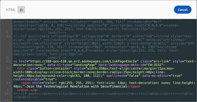
HTML
Use the HTML component to add parts of your existing HTML. This component provides an easy way to create modular HTML elements that reuse your external content.
-
Select the component on the canvas and click the Show the source code icon in the toolbar.
-
Paste the HTML in the text box and click Save.
If the HTML is valid, it renders the element on the canvas. If it is an element that maps to one of the other content components, you can change the settings and styles in the right panel according to the component type. If it does not, it remains as an HTML component.
For an HTML component, you can set the following styles for the whole HTML component in the right panel:
With the Styles tab selected in the right panel, use the Background section to define the background color for the component.
Select the checkbox and click the color square to choose a color from the picker. You can choose a color by entering a known RGB, HSL, HSB, or hexadecimal value. Or, you can use the color slider and the color field to select the color.
-
On the right panel with the Styles tab selected, expand the Border section and set the options to display a border for the component:
-
Move the toggle to the right to enable the border display options and set them according to your design criteria:
- To set the Border color, select the checkbox and click the color square to choose a color from the picker. You can choose a color by entering a known RGB, HSL, HSB, or hexadecimal value. Or, you can use the color slider and the color field to select the color.
-
To set the Border size (line width), click the up and down arrow icons to increase or decrease the number of pixels.
-
To set the Border style, choose a value from the list of standard CSS
border-stylevalues. -
To determine where the border is displayed, select each Border position checkbox.
-
For the Border radius, set the numerical value according to the curve you want for the corners.
A value of 0 (default) produces a squared corner.
On the right panel with the Styles tab selected, expand the Size section and set the options for the component height and width:
-
Height - Click the up and down arrow icons to increase or decrease the number of pixels. An empty value (Auto) is the default and sizes the height of the element according to its contents.
-
Width - Use the toggle to set the width by pixels or percentage.
-
For a percentage width, use the slider to set the percentage value. The percentage determines the element size based on the content box of the containing block, which excludes padding and borders. For example, a value of 50 sets the element width to 50% of its containing block content width.
-
For a pixel-based width, click the up and down arrow icons to increase or decrease the number of pixels. An empty value (Auto) is the default and sizes the width of the element according to its contents.
-
Expand the Alignment section and choose the horizontal and vertical alignment that you want to use. The alignment styles affect how the HTML component is positioned within the containing component (structural or container).
The horizontal alignment translates to a standard text-align CSS style and you can choose from left, center, or right. The vertical alignment translates to the standard vertical-align CSS style and you can choose from top, middle, or bottom.
On the right panel with the Styles tab selected, expand the Margin section and set the options for margin spacing within the structural component. This style replicates the CSS margin parameter, which controls to the space outside a component border, separating it from other components. It creates a gap around the component to influence its positioning and the layout of surrounding content.
Set the margin values in pixels according to your design needs. You can set the margin for all sides, the top-bottom, the left-right, or each side of the component independently:
-
All sides - To set one value to apply to all sides, clear the Different margin for each side checkbox. Click the up and down arrow icons to increase or decrease the number of pixels.
-
Top-bottom - To set the top and bottom margins to the same value, set the Locked icon between the top and bottom settings. Click the up and down arrow icons for either to increase or decrease the number of pixels.
-
Left-right - To set the left and right margins to the same value, set the Locked icon between the left and right settings. Click the up and down arrow icons for either to increase or decrease the number of pixels.
-
Independent - To set each margin to an independent value, set the Unlocked icon between the top and bottom settings and between the left and right. For each setting, click the up and down arrow icons for either to increase or decrease the number of pixels.
On the right panel with the Styles tab selected, expand the Padding section and set the options for padding within the structural component. This style replicates the CSS padding parameter, which is the space between the content of a component and its border. The padding provides internal spacing that you can use to control the distance between the content and the border of the component.
Set the padding values in pixels according to your design needs. You can set the padding for all sides, the top-bottom, the left-right, or each side of the component independently:
-
All sides - To set one value to apply to all sides, clear the Different padding for each side checkbox. Click the up and down arrow icons to increase or decrease the number of pixels.
-
Top-bottom - To set the top and bottom padding to the same value, set the Locked icon between the top and bottom settings. Click the up and down arrow icons for either to increase or decrease the number of pixels.
-
Left-right - To set the left and right padding to the same value, set the Locked icon between the left and right settings. Click the up and down arrow icons for either to increase or decrease the number of pixels.
-
Independent - To set padding for each side to an independent value, set the Unlocked icon between the top and bottom settings and between the left and right. For each setting, click the up and down arrow icons for either to increase or decrease the number of pixels.
To apply additional CSS-compliant attributes with values, use the Advanced style settings. You can change the values of the existing attributes, or add new ones. The styling is applied to the component using the CSS inheritance model for parent-child components (elements).
The displayed attributes reflect the styles that are currently defined for the component. You can change the values according to CSS definitions. Click the Add (+) icon to add a new style attribute for the component.
Image
Use the Image component to insert an image asset into your content. When the Image component is selected in the canvas, you can add or change the displayed image asset file.

Add the image asset
Choose the asset source type and select an image file:
-
Marketo Engage Assets - Choose this type to browse and select an image asset from the Journey Optimizer B2B Edition library or from the connected Market Engage instance.

From the dialog, you can choose an image from the selected repository. Click Select to add the asset.
There are tools available to help you locate the asset that you need:
-
Click the Filter icon on the top left to filter the displayed items according to your criteria.
-
Enter text in the Search field to filter the displayed items for a match of the asset name.

-
-
Experience Manager Assets - Choose this type to browse and select an image asset from a configured Experience Manage Assets repository.
From the Select Assets dialog, choose an image using the available tools to locate the asset that you need and click Select.:
-
Change the Repository at the top right.
-
Click Manage assets at the top right to open the Assets repository in another browser tab and use AEM Assets management tools.
-
Click the View type selector at the top right to change the display to List View, Grid View, Gallery View, or Waterfall View.
-
Click the Sort order icon to change the sort order between ascending and descending.

-
Click the Sort by menu arrow to change the sort criteria to Name, Size, or Modified.
-
Click the Filter icon on the top left to filter the displayed items according to your criteria.
-
Enter text in the Search field to filter the displayed items for a match of the asset name.

-
-
Import media - Choose this type to select a file from your system and import it into the Journey Optimizer B2B Edition asset library.
In the Upload image dialog, drag and drop a file from your system to the file box. The maximum file size is 100 MB.

The file names of the selected images are displayed in the dialog. Asset file names must be unique (across folders), and if a file with the name already exists, a message is displayed. Names can have a maximum of 100 characters, and cannot contain special characters (such as
;,:,\, and|).Click Import.
You can add an image title and alt text for the image in the right panel.

Set link options
On the Settings tab, use the Link options to link the image with a destination and the browser behavior for loading the target page.
-
Set the Type for the link:
-
External link - Choose this type to use a standard URL as the link destination.
In Url, enter the URL for the link destination. Click the Personalize (
-
Landing page - Choose this type to select a published landing page in the connected Marketo Engage instance.
For the Landing Page option, select the published landing page. Click the Select page icon (
-
-
For Label, enter the text that you want to display inside the button.
The button sizing adjusts according to the text and the styling that set.
-
For Target, choose how the linked destination is redirected from the email or page:
- None - Opens the link using the default browser or client behavior (default).
- Blank - Opens the link in a new window or tab.
- Self - Opens the link in the same frame.
- Parent - Opens the link in the parent frame.
- Top - Opens the link in the full body of the window.
Set the styles
Set the styles for the image component in the right panel.
With the Styles tab selected in the right panel, use the Background section to define the background color for the component.
Select the checkbox and click the color square to choose a color from the picker. You can choose a color by entering a known RGB, HSL, HSB, or hexadecimal value. Or, you can use the color slider and the color field to select the color.
-
On the right panel with the Styles tab selected, expand the Border section and set the options to display a border for the component:
-
Move the toggle to the right to enable the border display options and set them according to your design criteria:
- To set the Border color, select the checkbox and click the color square to choose a color from the picker. You can choose a color by entering a known RGB, HSL, HSB, or hexadecimal value. Or, you can use the color slider and the color field to select the color.
-
To set the Border size (line width), click the up and down arrow icons to increase or decrease the number of pixels.
-
To set the Border style, choose a value from the list of standard CSS
border-stylevalues. -
To determine where the border is displayed, select each Border position checkbox.
-
For the Border radius, set the numerical value according to the curve you want for the corners.
A value of 0 (default) produces a squared corner.
On the right panel with the Styles tab selected, expand the Size section and set the options for the component height and width:
-
Height - Click the up and down arrow icons to increase or decrease the number of pixels. An empty value (Auto) is the default and sizes the height of the element according to its contents.
-
Width - Use the toggle to set the width by pixels or percentage.
-
For a percentage width, use the slider to set the percentage value. The percentage determines the element size based on the content box of the containing block, which excludes padding and borders. For example, a value of 50 sets the element width to 50% of its containing block content width.
-
For a pixel-based width, click the up and down arrow icons to increase or decrease the number of pixels. An empty value (Auto) is the default and sizes the width of the element according to its contents.
-
Expand the Alignment section and choose the horizontal alignment that you want to use: left, center, or right. This style translates to a standard text-align CSS style and affects how the component is positioned within the containing component.
On the right panel with the Styles tab selected, expand the Margin section and set the options for margin spacing within the structural component. This style replicates the CSS margin parameter, which controls to the space outside a component border, separating it from other components. It creates a gap around the component to influence its positioning and the layout of surrounding content.
Set the margin values in pixels according to your design needs. You can set the margin for all sides, the top-bottom, the left-right, or each side of the component independently:
-
All sides - To set one value to apply to all sides, clear the Different margin for each side checkbox. Click the up and down arrow icons to increase or decrease the number of pixels.
-
Top-bottom - To set the top and bottom margins to the same value, set the Locked icon between the top and bottom settings. Click the up and down arrow icons for either to increase or decrease the number of pixels.
-
Left-right - To set the left and right margins to the same value, set the Locked icon between the left and right settings. Click the up and down arrow icons for either to increase or decrease the number of pixels.
-
Independent - To set each margin to an independent value, set the Unlocked icon between the top and bottom settings and between the left and right. For each setting, click the up and down arrow icons for either to increase or decrease the number of pixels.
On the right panel with the Styles tab selected, expand the Padding section and set the options for padding within the structural component. This style replicates the CSS padding parameter, which is the space between the content of a component and its border. The padding provides internal spacing that you can use to control the distance between the content and the border of the component.
Set the padding values in pixels according to your design needs. You can set the padding for all sides, the top-bottom, the left-right, or each side of the component independently:
-
All sides - To set one value to apply to all sides, clear the Different padding for each side checkbox. Click the up and down arrow icons to increase or decrease the number of pixels.
-
Top-bottom - To set the top and bottom padding to the same value, set the Locked icon between the top and bottom settings. Click the up and down arrow icons for either to increase or decrease the number of pixels.
-
Left-right - To set the left and right padding to the same value, set the Locked icon between the left and right settings. Click the up and down arrow icons for either to increase or decrease the number of pixels.
-
Independent - To set padding for each side to an independent value, set the Unlocked icon between the top and bottom settings and between the left and right. For each setting, click the up and down arrow icons for either to increase or decrease the number of pixels.
To apply additional CSS-compliant attributes with values, use the Advanced style settings. You can change the values of the existing attributes, or add new ones. The styling is applied to the component using the CSS inheritance model for parent-child components (elements).
The displayed attributes reflect the styles that are currently defined for the component. You can change the values according to CSS definitions. Click the Add (+) icon to add a new style attribute for the component.
Social
Use the Social component to insert links to social media pages into your content. It includes three default social media types, but you can add or remove the types according to your needs.

-
To add a social media type, click the Add ( + ) icon and choose a social media type that you want to add.

-
To remove a social media type, click the X next to the social media icon.
With a social media type selected, set the options for that type:
-
URL - Enter the social media URL that you want to link to the social media graphic or icon.
-
Source - If you want to use your own image instead of the default, choose and image asset. You can select an image from the connected Marketo Engage asset repository, an Experience Manager Assets repository (if configured), or import an image file from your system. Refer to the Image component information for details about selecting and importing image assets.
-
Alt text - Enter the alt text for the displayed image.

To define a consistent display size for all social media graphics, set the Size of images.
You can set the following style options for the Social component:
With the Styles tab selected in the right panel, use the Background section to define the background color for the component.
Select the checkbox and click the color square to choose a color from the picker. You can choose a color by entering a known RGB, HSL, HSB, or hexadecimal value. Or, you can use the color slider and the color field to select the color.
-
On the right panel with the Styles tab selected, expand the Border section and set the options to display a border for the component:
-
Move the toggle to the right to enable the border display options and set them according to your design criteria:
- To set the Border color, select the checkbox and click the color square to choose a color from the picker. You can choose a color by entering a known RGB, HSL, HSB, or hexadecimal value. Or, you can use the color slider and the color field to select the color.
-
To set the Border size (line width), click the up and down arrow icons to increase or decrease the number of pixels.
-
To set the Border style, choose a value from the list of standard CSS
border-stylevalues. -
To determine where the border is displayed, select each Border position checkbox.
-
For the Border radius, set the numerical value according to the curve you want for the corners.
A value of 0 (default) produces a squared corner.
On the right panel with the Styles tab selected, expand the Size section and set the options for the component height and width:
-
Height - Click the up and down arrow icons to increase or decrease the number of pixels. An empty value (Auto) is the default and sizes the height of the element according to its contents.
-
Width - Use the toggle to set the width by pixels or percentage.
-
For a percentage width, use the slider to set the percentage value. The percentage determines the element size based on the content box of the containing block, which excludes padding and borders. For example, a value of 50 sets the element width to 50% of its containing block content width.
-
For a pixel-based width, click the up and down arrow icons to increase or decrease the number of pixels. An empty value (Auto) is the default and sizes the width of the element according to its contents.
-
Expand the Alignment section and choose the horizontal alignment that you want to use: left, center, or right. This style translates to a standard text-align CSS style and affects how the component is positioned within the containing component.
On the right panel with the Styles tab selected, expand the Margin section and set the options for margin spacing within the structural component. This style replicates the CSS margin parameter, which controls to the space outside a component border, separating it from other components. It creates a gap around the component to influence its positioning and the layout of surrounding content.
Set the margin values in pixels according to your design needs. You can set the margin for all sides, the top-bottom, the left-right, or each side of the component independently:
-
All sides - To set one value to apply to all sides, clear the Different margin for each side checkbox. Click the up and down arrow icons to increase or decrease the number of pixels.
-
Top-bottom - To set the top and bottom margins to the same value, set the Locked icon between the top and bottom settings. Click the up and down arrow icons for either to increase or decrease the number of pixels.
-
Left-right - To set the left and right margins to the same value, set the Locked icon between the left and right settings. Click the up and down arrow icons for either to increase or decrease the number of pixels.
-
Independent - To set each margin to an independent value, set the Unlocked icon between the top and bottom settings and between the left and right. For each setting, click the up and down arrow icons for either to increase or decrease the number of pixels.
On the right panel with the Styles tab selected, expand the Padding section and set the options for padding within the structural component. This style replicates the CSS padding parameter, which is the space between the content of a component and its border. The padding provides internal spacing that you can use to control the distance between the content and the border of the component.
Set the padding values in pixels according to your design needs. You can set the padding for all sides, the top-bottom, the left-right, or each side of the component independently:
-
All sides - To set one value to apply to all sides, clear the Different padding for each side checkbox. Click the up and down arrow icons to increase or decrease the number of pixels.
-
Top-bottom - To set the top and bottom padding to the same value, set the Locked icon between the top and bottom settings. Click the up and down arrow icons for either to increase or decrease the number of pixels.
-
Left-right - To set the left and right padding to the same value, set the Locked icon between the left and right settings. Click the up and down arrow icons for either to increase or decrease the number of pixels.
-
Independent - To set padding for each side to an independent value, set the Unlocked icon between the top and bottom settings and between the left and right. For each setting, click the up and down arrow icons for either to increase or decrease the number of pixels.
To apply additional CSS-compliant attributes with values, use the Advanced style settings. You can change the values of the existing attributes, or add new ones. The styling is applied to the component using the CSS inheritance model for parent-child components (elements).
The displayed attributes reflect the styles that are currently defined for the component. You can change the values according to CSS definitions. Click the Add (+) icon to add a new style attribute for the component.
Form (landing pages only) form
[Beta]{class="badge informative" title="Beta feature"}
Use the Form component to add a published form to a landing page or landing page template. For more information about creating and publishing forms, see Forms.
-
Click the Form tool in the component toolbar, or use the Embed Form properties on the right to select the published form.

-
If you want to override the default Follow up type for the form, change the setting according to the requirements for your page or template.
This page is also known as the Thank-you page for the form and this setting determines what happens when a visitor submits the form:
-
Stay on page - Choose this option to keep the visitor on the same page when the form is submitted.
-
Landing page - Choose this option to select any Journey Optimizer B2B Edition or Marketo Engage landing page as the follow-up.
-
External URL - Choose this option to specify any URL as the follow-up page. After the visitor submits the form, the browser loads the designated URL.
note tip TIP If you want to use the form for downloading a file, you can specify a URL for the hosted file. With this configuration, the submit button functions as a download button. 
-
If needed, select the Styles tab in the right panel to set the form margins within the structure component.
On the right panel with the Styles tab selected, expand the Margin section and set the options for margin spacing within the structural component. This style replicates the CSS margin parameter, which controls to the space outside a component border, separating it from other components. It creates a gap around the component to influence its positioning and the layout of surrounding content.
Set the margin values in pixels according to your design needs. You can set the margin for all sides, the top-bottom, the left-right, or each side of the component independently:
-
All sides - To set one value to apply to all sides, clear the Different margin for each side checkbox. Click the up and down arrow icons to increase or decrease the number of pixels.
-
Top-bottom - To set the top and bottom margins to the same value, set the Locked icon between the top and bottom settings. Click the up and down arrow icons for either to increase or decrease the number of pixels.
-
Left-right - To set the left and right margins to the same value, set the Locked icon between the left and right settings. Click the up and down arrow icons for either to increase or decrease the number of pixels.
-
Independent - To set each margin to an independent value, set the Unlocked icon between the top and bottom settings and between the left and right. For each setting, click the up and down arrow icons for either to increase or decrease the number of pixels.