Storefront Popover
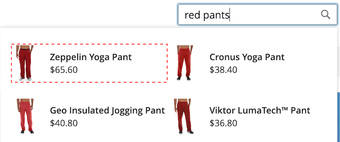
When Live Search is installed, a popover appears in the storefront when shoppers type in the Search box. With each character typed, the popover is updated with suggested products and thumbnail images of the top search results.
Live Search returns results for a query of two characters or more. For a partial match, the maximum number of characters per word is 20. The number of characters in a “search as you type” query is not configurable.
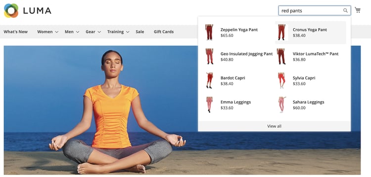
Popover page size
The page size of the popover determines how many lines of autocompleted products can be returned. During the Live Search installation, the page_size value changes to the current value of the Catalog Search - Autocomplete Limit setting.
By default, the Catalog Search - Autocomplete Limit value is set to eight lines (or rows). To change the page size of the popover, do the following:
- On the Admin sidebar, go to Stores > Settings > Configuration.
- In the left panel, expand Catalog and choose Catalog from the list of settings.
- Expand the Catalog Search section.
- Set the Autocomplete Limit to the number of lines that you want to allow in the popover.
- When complete, click Save Config.
Styling Popover example
You can customize the look and feel of the Popover widget to match your company’s style and branding guidelines.
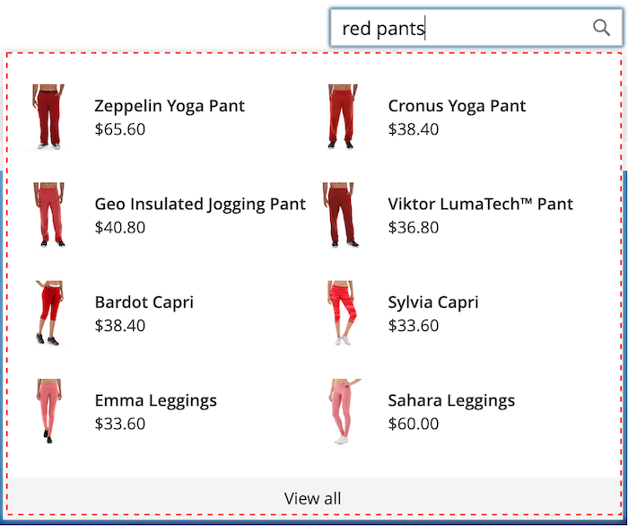
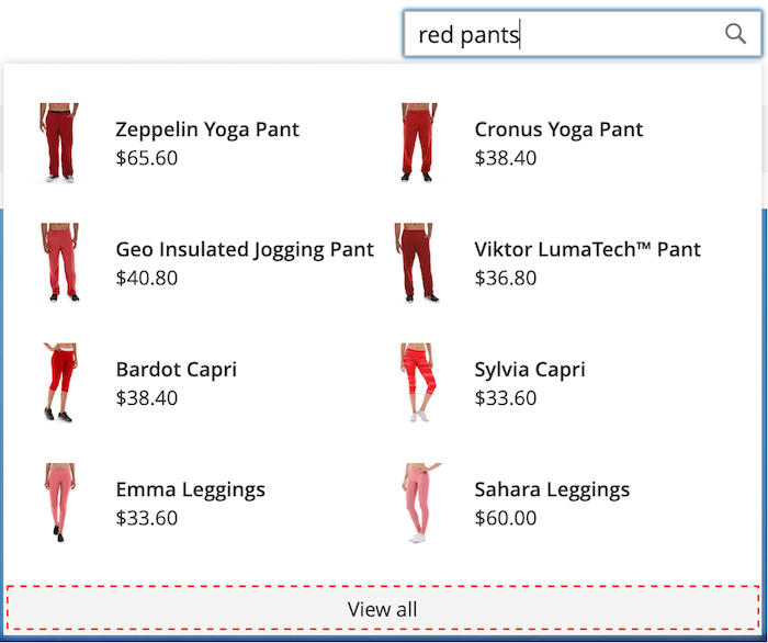
The storefront popover always displays the product name and price, and the selection of fields is not configurable. However, popover elements can be styled using CSS classes. For example, the following declarations change the background color of the popover container and footer.
.livesearch.popover-container {
    background-color: lavender;
}

.livesearch.view-all-footer {
    background-color: magenta;
}
Container visibility
The parent component of the .livesearch.popover-container is .search-autocomplete. The .active class indicates the visibility of the container. The .active class is conditionally added when the popover is open.
.search-autocomplete.active   /* visible */
.search-autocomplete          /* not visible */
For more information about styling storefront elements, refer to Cascading style sheets (CSS) in the Frontend Developer Guide.
Class selectors
You can use the following class selectors to style the container and product elements in the popover.
.livesearch.popover-container.livesearch.view-all-footer.livesearch.products-container.livesearch.product-result.livesearch.product-name.livesearch.product-price
Container class selectors
.livesearch.popover-container
.livesearch.view-all-footer
Product class selectors
.livesearch.products-container
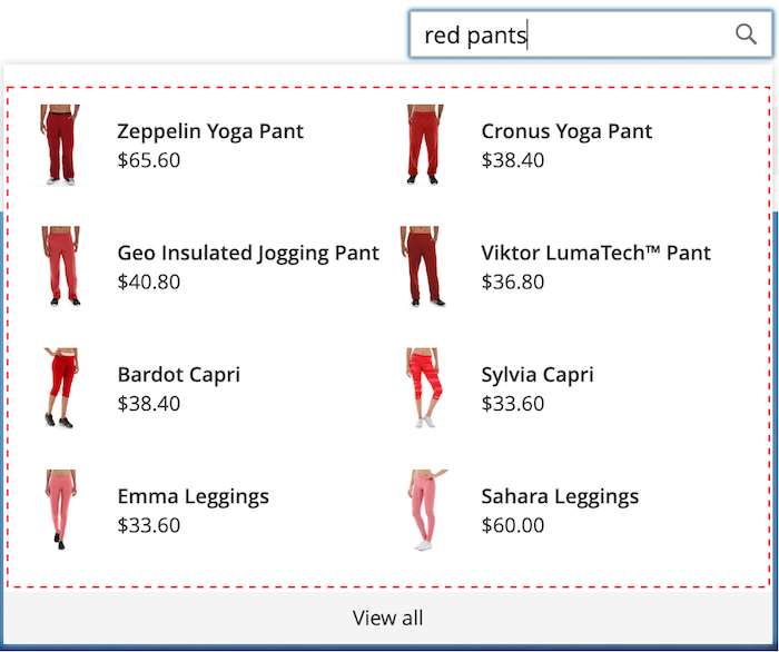
.livesearch.product-result
.livesearch.product-name

.livesearch.product-price

.livesearch product-link

Working with a modified theme working-with-modified-theme
You can use the storefront popover with a customized theme that inherits the required files from Luma. The top.search block in the header-wrapper of the Magento_Search module must not be modified.
<referenceContainer name="header-wrapper">
   <block class="Magento\Framework\View\Element\Template" name="top.search" as="topSearch" template="Magento_Search::form.mini.phtml">
      <arguments>
         <argument name="configProvider" xsi:type="object">Magento\Search\ViewModel\ConfigProvider</argument>
      </arguments>
   </block>
</referenceContainer>
Disabling the popover
To disable the popover and restore the standard Quick Search functionality, enter the following command:
bin/magento module:disable Magento_LiveSearchStorefrontPopover
Headless implementations
For those with headless implementations, you can install the Live Search popover using an npm package.