
Table
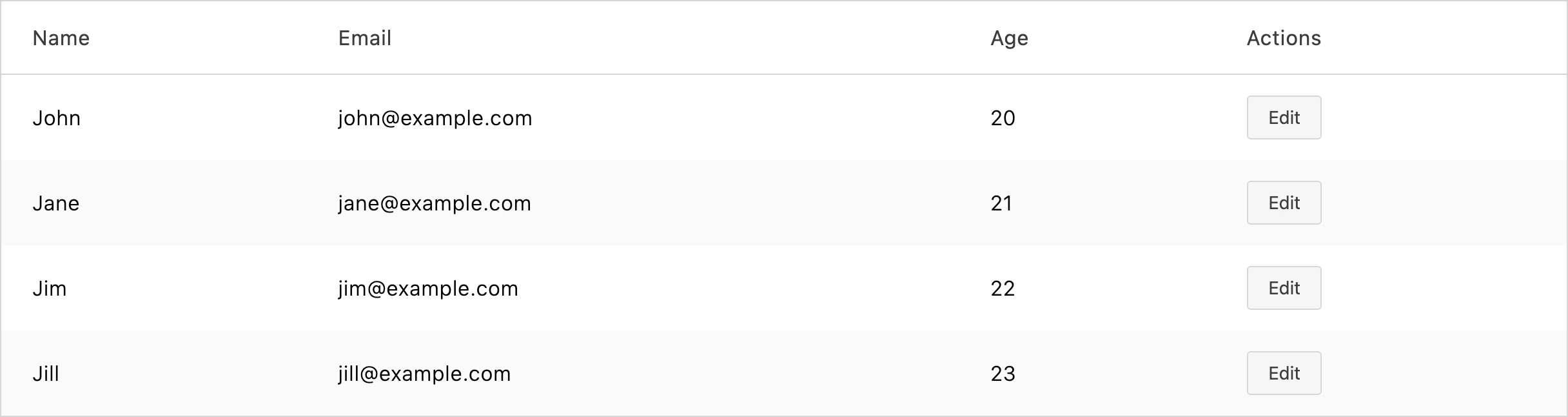
Use Table to render data in rows and columns. It supports column sorting, a responsive stacked layout for narrow screens, a caption for screen readers, and loading skeletons.
Import
Section titled “Import”import { Table } from '/@dropins/tools/components.js';| Prop | Type | Req? | Description |
|---|---|---|---|
columns | Column[] | Yes | Column definitions. See Column and row data. |
rowData | RowData[] | Yes | Row objects whose keys match the column keys; the values are the cell content. See Column and row data. |
mobileLayout | 'stacked' | 'none' | No | Responsive behavior. When stacked, cells stack vertically once the container is 600px or narrower. Defaults to none. |
caption | string | No | Caption shown above the table and announced by screen readers. |
expandedRows | Set<number> | No | Indexes of the rows that are expanded. Defaults to an empty set. |
loading | boolean | No | Show loading skeleton rows instead of data. Defaults to false. |
skeletonRowCount | number | No | Number of skeleton rows to show while loading. Defaults to 10. |
onSortChange | (columnKey: string, direction: Sortable) => void | No | Called when a column’s sort button is clicked, with the column’s key and its next sort direction (Sortable is 'asc' | 'desc' | true). Table doesn’t sort rowData itself — update columns and rowData in response to this callback. |
Table also accepts standard HTML table attributes (for example, className), except loading.
Column and row data
Section titled “Column and row data”Each column needs a key and a label (a string, or a VNode for rich header content). Add ariaLabel when label is a VNode — it’s required in that case, and is used as the accessible name for the column’s sort button and, in a stacked mobile layout, as the cell’s data-label. Add sortBy to make a column sortable: set it to true for a sortable column with no current sort, or 'asc'/'desc' if the column is already sorted. Columns without sortBy render no sort button.
Each row object’s keys must match the column key values. Add a _rowDetails key (a string or VNode) to give a row expandable content; it renders in a full-width row when the row’s index is included in expandedRows.
Example
Section titled “Example”import { Table, provider } from '/@dropins/tools/components.js';
await provider.render(Table, { caption: 'Customers', columns: [ { key: 'name', label: 'Name' }, { key: 'email', label: 'Email' }, { key: 'age', label: 'Age' }, ], rowData: [ { name: 'John', email: 'john@example.com', age: 20 }, { name: 'Jane', email: 'jane@example.com', age: 21 }, ],})(document.querySelector('.customers-table'));Related
Section titled “Related”- Skeleton — the loading placeholder shown while data loads.
- ActionButton — commonly rendered in an actions column.