
MultiSelect
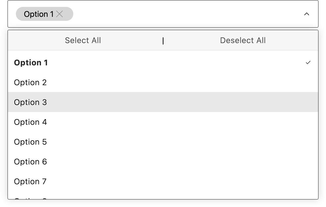
Use MultiSelect to let a shopper search and select multiple values from a dropdown. It supports filtering, select-all and deselect-all controls, and error and success states.
Import
Section titled “Import”import { MultiSelect } from '/@dropins/tools/components.js';| Prop | Type | Req? | Description |
|---|---|---|---|
options | Option[] | Yes | The selectable options. Each option has a label, a value (string or number), and an optional disabled flag. |
value | (string | number)[] | Yes | The currently selected values. |
onChange | (value: (string | number)[]) => void | Yes | Called with the updated selection when it changes. |
placeholder | string | No | Text shown when no options are selected. |
floatingLabel | string | No | Floating label text. |
selectAllText | string | No | Label for the select-all control. |
deselectAllText | string | No | Label for the deselect-all control. |
noResultsText | string | No | Text shown when a search returns no matches. |
name | string | No | Form field identifier. Defaults to multi-select-sdk. |
id | string | No | Base id used to generate ids for the component’s hidden input, search input, and dropdown listbox. Defaults to the name value when not set. |
maxHeight | number | No | Maximum height of the dropdown list, in pixels. Defaults to 300. |
disabled | boolean | No | Disable the entire component. |
error | boolean | No | Show the error state styling. |
success | boolean | No | Show the success state styling. |
className | string | No | Additional CSS class names. |
Example
Section titled “Example”import { MultiSelect, provider } from '/@dropins/tools/components.js';
const instance = await provider.render(MultiSelect, { options: [ { label: 'Red', value: 'red' }, { label: 'Blue', value: 'blue' }, { label: 'Green', value: 'green', disabled: true }, ], value: [], onChange: (value) => instance.setProps((prev) => ({ ...prev, value })), placeholder: 'Select colors',})(document.querySelector('.color-select'));