DiagramEdit
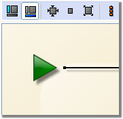
This control is used for editing diagrams such as workflows or surveys.
Properties
backColor - string
Background color (btnshadow, white).
border - string
Changes the control outline style (solid, double, inset, outset, none).
label - string
Associated label.
nolabel - boolean
Displays the label as a help bubble.
readOnly - boolean
Forces the control to read only.
Remarks
The toolbar can be personalized, each sub-element of this control matches additional buttons in the toolbar.
<input type="diagramEdit" xpath=".">
  <input type="separator"/>
  <input img="xtk:properties.png" label="Properties" resetForm="true" prebuildSubForm="true">
    <form name="properties" label="Properties">
      <input xpath="/tmp/@test"/>
    </form>
  </input>
  <input type="separator"/>
  <input img="nms:prepare.png" label="Publish" checkModify="true">
    <form name="properties" label="Properties">
      <input xpath="/tmp/@test"/>
    </form>
  </input>
</input>
For more information on the buttons in the toolbar, refer to the SubFormButton control documentation.