在此頁面上:使用資料管理 > 監視 > Edge中提供的圖表,監視Adobe Journey Optimizer中的傳入資料健康情況。
監視工作區包含下列標籤:
在Edge中監視Journey Optimizer資料
下列圖表可在資料管理 > 監視 > Edge中使用。
從下拉式功能表中,選取AJO輸送量。

AJO閘道輸送量 gateway-throughput
AJO閘道輸送量圖表顯示一段時間內Journey Optimizer閘道每秒處理的記錄總數。 使用此測量結果來監視閘道處理的輸入要求整體數量。

AJO傳入輸送量 inbound-throughput
AJO輸入輸送量圖表顯示一段時間內每秒接收的輸入記錄總數。 此量度會測量傳入記錄到達Edge服務的速率。 使用此圖表來檢閱傳入資料量,並識別流量層級的變更。

AJO傳入輸送量劃分 inbound-throughput-breakdown
AJO傳入輸送量劃分圖表顯示一段時間內每秒接收的傳入記錄(依位置劃分)。 此量度會測量每個位置的傳入記錄率。 使用此圖表來比較各個位置的傳入流量,並識別流量有異常增加或減少的位置。

AJO傳入延遲 inbound-latency
AJO傳入延遲圖表顯示處理傳入要求所需的時間(以毫秒為單位)。 此量度以延遲值的分佈呈現,包括百分位數,例如P50和P90。 使用這些值來瞭解典型的請求延遲,並識別延遲較高的請求。

AJO傳入主張事件輸送量 inbound-proposition-events-throughput
AJO傳入主張事件輸送量圖表顯示一段時間內主張事件的輸送量。 此量度會測量使用者互動、檢視或觸發個人化優惠時產生的追蹤訊號。

AJO傳入主張事件輸送量(依頻道) inbound-proposition-events-throughput-channel
依管道的 AJO傳入主張事件輸送量,圖表顯示依傳入管道的主張事件輸送量。 此量度會測量依管道分組的主張事件活動。 可用的管道包括CBE、應用程式內和內容卡。 使用此圖表來比較不同傳入管道的活動。

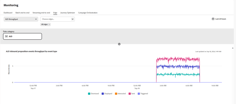
AJO傳入主張事件輸送量(依事件型別) inbound-proposition-events-throughput-event-type
依事件型別的 AJO傳入主張事件輸送量,圖形會依事件型別顯示主張事件輸送量。 此量度會測量依結果分組的主張事件活動。 可用的事件型別包括已解除、已隱藏、已顯示、已觸發、已互動及已傳送。 使用此圖表可識別哪些主張事件結果對整體活動有貢獻。
This section contains structured knowledge intended to support interpretation, retrieval, and question answering related to this topic.
For complete understanding, this information should be combined with the documentation on this page. Neither source is intended to stand alone; the page describes the feature, while this section provides additional context that helps disambiguate terminology, intent, applicability, and constraints.
- TL;DR: This page explains how to monitor inbound data health in Journey Optimizer with the Edge monitoring graphs in Data Management.
Intents:
- Access the Edge monitoring graphs from Data Management > Monitoring > Edge
- Review overall inbound throughput in records per second over time
- Review inbound throughput broken down by location
- Analyze inbound request latency in milliseconds by distribution values such as P50 and P90
- Analyze proposition event throughput by time, channel, and event type
Glossary:
- Edge monitoring graphs: Graphs in Data Management > Monitoring > Edge that show inbound throughput, inbound latency, and proposition event throughput (product-specific)
- Inbound throughput: Overall inbound throughput measured in records per second over time (product-specific)
- Proposition events: Tracking signals generated when a user interacts with, views, or triggers personalized offers (product-specific)
Guardrails:
- Inbound latency is measured in milliseconds.
- The latency graph shows a distribution of values, including P50 and P90.
- Proposition event channel values are CBE, in-app, and content cards.
- Proposition event type values are dismissed, suppressed, displayed, triggered, interacted, and sent.
Terminology:
- Canonical name: Edge monitoring graphs — variants: AJO graphs
- Do not confuse: inbound throughput (records per second) ≠ inbound latency (milliseconds)
- Do not confuse: proposition event channel (CBE, in-app, or content cards) ≠ proposition event type (dismissed, suppressed, displayed, triggered, interacted, or sent)
FAQ:
- Q: Where are the inbound data health graphs? — Open Data Management > Monitoring > Edge.
- Q: What does AJO Inbound Throughput measure? — It measures overall inbound throughput in records per second over time.
- Q: How is inbound latency shown? — In milliseconds, by distribution values including P50 and P90.
- Q: Which proposition event channels are available? — CBE, in-app, and content cards.
- Q: Which proposition event types are available? — Dismissed, suppressed, displayed, triggered, interacted, and sent.