このページ:ヘッダー、ヒーローセクション、製品カード、フッターなど、すぐに使用できるモジュールを使用して、ゼロから構造を作成することなく、E メールデザイナーでのメール作成を高速化する方法について説明します。
E メールデザイナーには、モジュールのライブラリが含まれています。これは、メールアセンブリを高速化し、通信をまたいでデザインの一貫性を高めるためにデザインされた、すぐに使用できる構造化コンテンツブロックです。
ゼロから設定する空のプレースホルダーであるコンテンツコンポーネントとは異なり、モジュールは、ブランド化されたヘッダー、製品カードグリッド、オプトアウトリンクを含むフッターなど、事前定義済みのセクションです。これらはキャンバスに直接ドロップして、そこからカスタマイズできます。
モジュールへのアクセスと挿入 access-modules
E メールデザイナーで使用可能なモジュールを表示し、活用するには、次の手順に従います。
-
E メールデザイナーでメールを開きます。
-
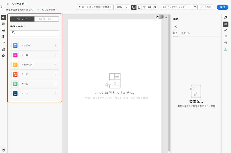
左側のパネルで、「モジュール」タブをクリックします。
-
使用可能なモジュールカテゴリを参照するか、検索バーを使用して名前でフィルタリングします。
-
カテゴリの横にある > 矢印をクリックして展開し、使用可能なレイアウトバリアントを表示します。
-
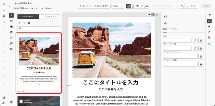
使用するモジュールバリアントを見つけて、メールキャンバスに直接ドラッグ&ドロップします。
-
モジュールは、デフォルトのコンテンツで挿入されます。 キャンバス上の任意の要素をクリックして、インラインでコンテンツの編集を開始します。 任意のテキスト領域をクリックして直接入力するか、画像をクリックしてアセットライブラリを使用して置き換えます。
note NOTE コンテンツにメールテーマを適用すると、テーマスタイルがモジュールで自動的に継承され、デザインをまたいでブランドの一貫性が確保されます。 メールテーマの詳細情報 -
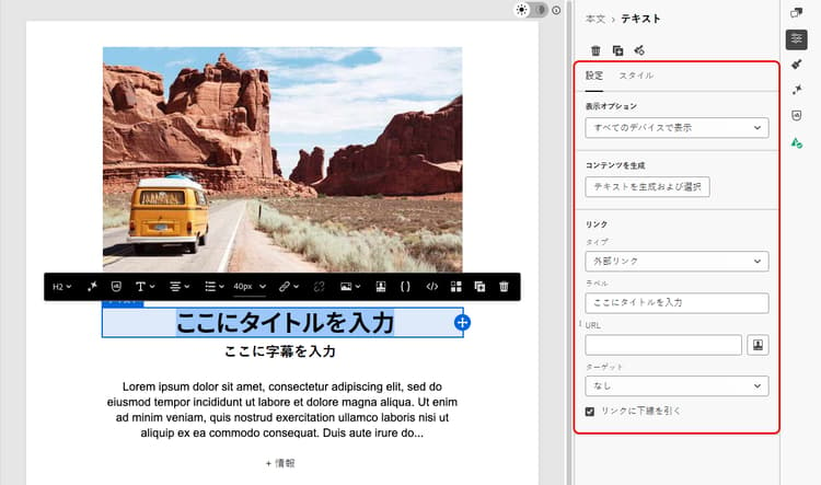
他のメール要素と同様に、右側のパネルにある「設定」タブおよび「スタイル」タブを使用して、プロパティやスタイルを調整します。
-
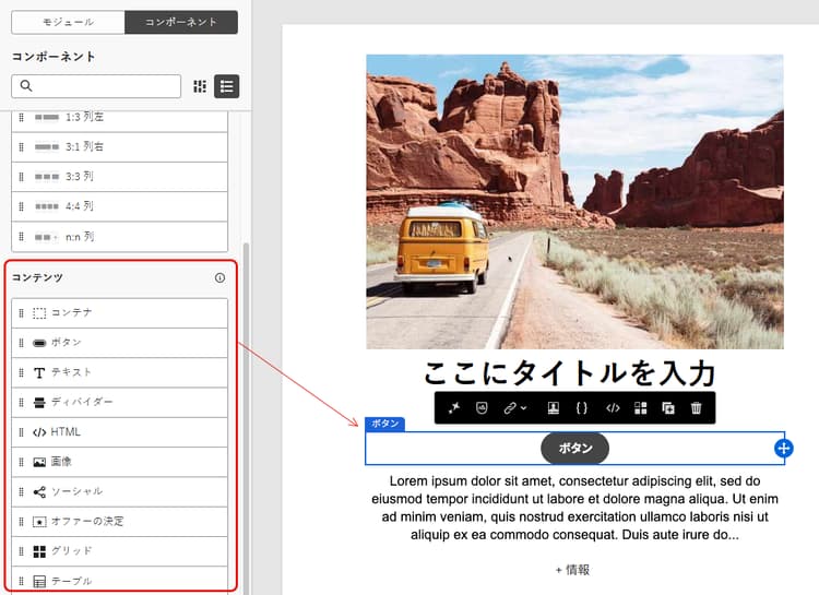
コンテンツコンポーネントをモジュールに直接追加することもできます。 左側のパネルで「コンポーネント」タブに切り替え、コンポーネントをモジュールにドラッグ&ドロップします。 このコンポーネントはデフォルトでモジュールのスタイルを継承しますが、必要に応じて上書きできます。
使用可能なモジュール available-modules
次のモジュールカテゴリは、標準で使用できます。 各モジュールには、1 列、2 列、3 列のグリッドなど、複数のレイアウトバリアントを使用できます。 モジュールカテゴリを展開して、レイアウトに合ったバリアントを選択します。
This section contains structured knowledge intended to support interpretation, retrieval, and question answering related to this topic.
For complete understanding, this information should be combined with the documentation on this page. Neither source is intended to stand alone; the page describes the feature, while this section provides additional context that helps disambiguate terminology, intent, applicability, and constraints.
- TL;DR: This page explains how to use the Email Designer’s ready-to-use modules — predefined, reusable layout blocks such as headers, hero sections, cards, and footers — to assemble emails faster and promote design consistency.
Intents:
- Access modules from the Modules tab in the left pane of the Email Designer
- Drag and drop a ready-to-use module variant onto the email canvas
- Customize a module’s content inline and adjust it from the Settings and Styles tabs
- Add content components into a module from the Components tab
- Save a customized module as a visual fragment to reuse it across other emails and messages
- Choose among the available module categories and their layout variants
Glossary:
- Module: A ready-to-use, fully structured content block — a predefined, reusable email layout block — that you drag and drop into the email canvas and customize through the WYSIWYG interface (product-specific)
- Modules tab: The tab in the left pane of the Email Designer where you browse, search, and insert modules (product-specific)
- Content component: An empty placeholder that you configure from scratch, in contrast to a pre-built module (product-specific)
- Visual fragment: A saved, reusable piece of content that a customized module can be saved as, so it can be reused across other emails and messages (product-specific)
Guardrails:
- Modules are not fragments — they exist within the email you are designing; to reuse a customized module elsewhere, save it as a visual fragment.
- When email themes are applied to your content, theme styles are inherited automatically by modules.
- Content components added to a module inherit the module’s styling by default, but you can override it as needed.
- Footers include required opt-out and mirror-page links.
Terminology:
- Canonical name: module — Acronym: n/a — variants: modules, email layout modules, layout blocks, content blocks
- Synonyms: “module” = “ready-to-use content block”
- Do not confuse: “module” (pre-built, fully structured section) ≠ “content component” (empty placeholder configured from scratch); “module” ≠ “fragment”
FAQ:
- Q: How do modules differ from content components? — Content components are empty placeholders you configure from scratch, whereas modules are pre-built sections you drop onto the canvas and customize from there.
- Q: Are modules the same as fragments? — No. Modules are not fragments and exist within the email you are designing, but you can save a customized module as a visual fragment to reuse it.
- Q: Which module categories are available out of the box? — Headers, Hero, Testimonial, Cards, Teams, and Footers, each with multiple layout variants such as single-column, two-column, and three-column grids.
- Q: Can I add content components inside a module? — Yes. Switch to the Components tab in the left pane and drag and drop a component into the module; it inherits the module’s styling by default.
- Q: Do modules follow my email theme? — Yes. When email themes are applied, theme styles are inherited automatically by modules.