このページ:コンテンツカードのレイアウト、テキスト、メディア、ボタン、閉じるの動作をデザインおよびパーソナライズして、オーディエンスに魅力的でブランドに即したメッセージを配信できるようにします。
カードのオーサリング構造は、開発者がレンダリングできる基本入力をマーケターに提供するフォームベースのオーサリングエクスペリエンスを提供します。
コンテンツを定義し、パーソナライズしたら、レビューしてアクティブ化できます。 設定したスケジュールに従ってキャンペーンが送信されます。 詳しくは、このページを参照してください。
コンテンツカードのレイアウト
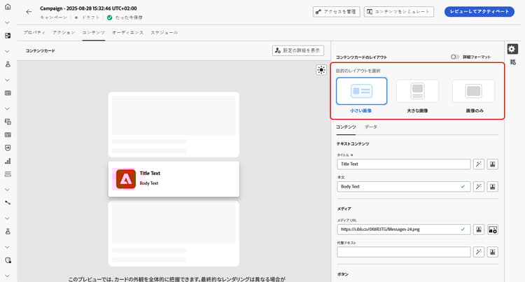
「コンテンツカードのレイアウト」のセクションで、メッセージ要件に応じて、3 つの画像レイアウトオプションのいずれかを選択します。
「コンテンツ」タブ content-tab
「コンテンツ」タブから直接、コンテンツを定義してメディアやアクションボタンを追加することで、コンテンツカードをカスタマイズできます。
テキストコンテンツ title-body
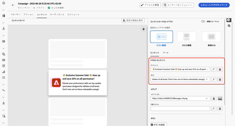
メッセージを作成するには、「タイトル」フィールドと「本文」フィールドにテキストを入力します。
メッセージをさらにカスタマイズする場合は、パーソナリゼーションアイコンを使用して、パーソナライズされた要素を追加します。 パーソナリゼーション機能の使用方法について詳しくは、この節を参照してください。
Personalise loyalty challenge content personalize-challenge-content
ロイヤルティチャレンジ のコンテンツカードをデザインする場合、チャレンジメタデータを使用してカードコンテンツをパーソナライズできます。
-
Personalization アイコンを使用してパーソナライゼーションエディターを開きます。
-
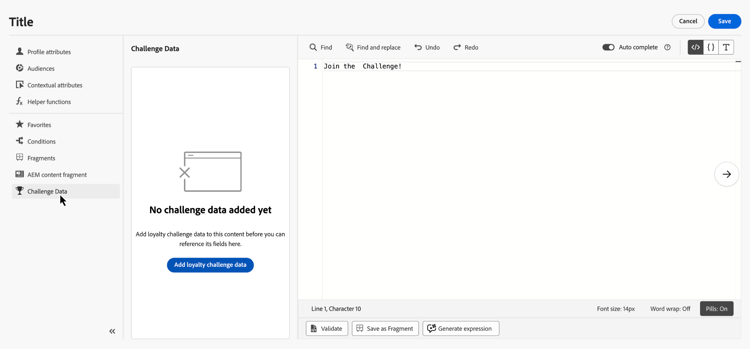
チャレンジデータを選択し、ロイヤルティチャレンジデータの追加をクリックして、チャレンジフィールドを使用できるようにします。
-
目的のチャレンジフィールドを追加して、コンテンツをパーソナライズします。

メディア add-media
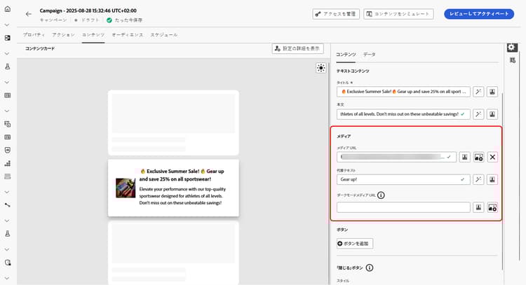
「メディア」フィールドを使用すると、メディアを追加してコンテンツカードを強化し、エンドユーザーにとってプレゼンテーションをより魅力的にすることができます。
メディアを含めるには、使用するメディアの URL を入力するか、アセットを選択アイコンをクリックして、アセットライブラリに保存されているアセットから選択します。 アセット管理の詳細情報。
ボタン add-buttons
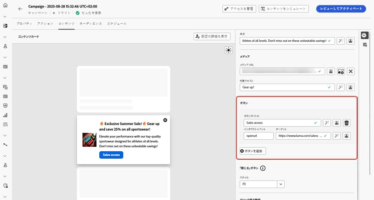
ユーザーがコンテンツカードを操作するボタンを追加します。
-
「追加」ボタンをクリックして、新しいアクションボタンを作成します。
-
ボタンの「タイトル」フィールドを編集して、ボタンに表示するラベルを指定します。
-
「インタラクトイベント」を選択して、ユーザーがボタンをクリックまたは操作したときにトリガーされるアクションを定義します。
-
「ターゲット」フィールドに、ユーザーがボタンを操作した後に移動する web URL またはディープリンクを入力します。
「閉じる」ボタン close-button
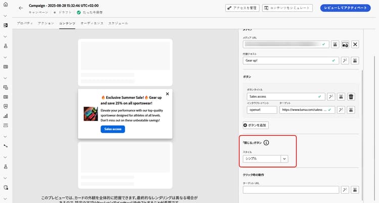
「閉じる」ボタンの「スタイル」を選択して、表示方法をカスタマイズします。
選択できるスタイルは次のとおりです。
- なし
- シンプル
- 円
クリック時の動作
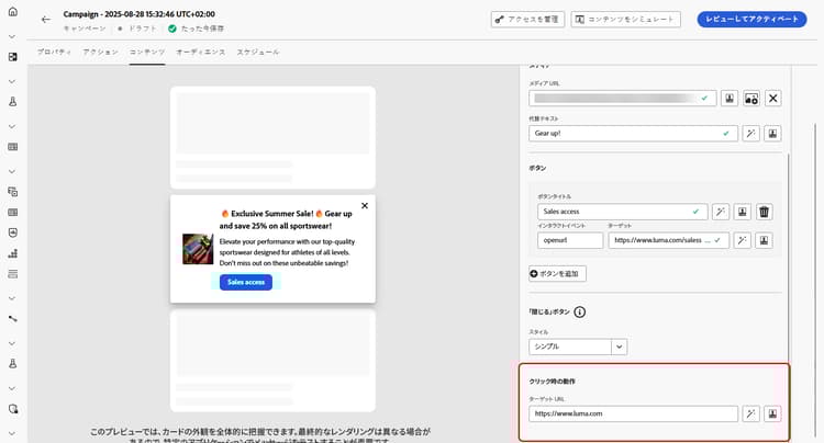
「ターゲット URL」フィールドに、ユーザーがコンテンツカードを操作した後に目的の宛先に移動する web URL またはディープリンクを入力します。 これは、外部 web サイト、アプリ内の特定のページ、またはユーザーのインタラクションに基づいてユーザーを誘導するその他の場所です。
「データ」タブ
カスタムデータ custom-data
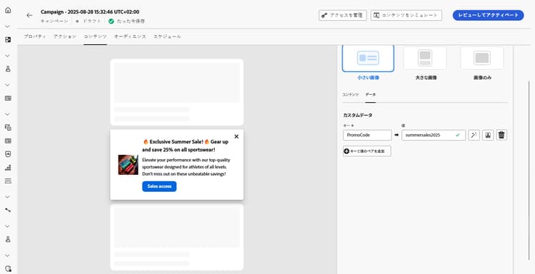
カスタムデータセクションで、「キーと値のペアを追加」をクリックして、ペイロードにカスタム変数を含めます。 これらのキーと値のペアを使用すると、特定の設定に応じて、追加のデータを渡すことができます。 これにより、パーソナライズされたコンテンツ、動的コンテンツ、トラッキング情報または設定に関連するその他のデータを追加できます。
This section contains structured knowledge intended to support interpretation, retrieval, and question answering related to this topic.
For complete understanding, this information should be combined with the documentation on this page. Neither source is intended to stand alone; the page describes the feature, while this section provides additional context that helps disambiguate terminology, intent, applicability, and constraints.
- TL;DR: This page explains how to design a content card’s layout, text, media, buttons, dismiss behavior, on-click behavior, and custom data, including personalization with loyalty challenge metadata.
Intents:
- Choose a content card layout from the three image layout options
- Enter Title and Body text and personalize loyalty challenge content with challenge metadata
- Add media by URL or from the Assets library
- Add and configure action buttons
- Choose a style for the dismiss button
- Define on-click behavior and pass custom data
Glossary:
- Content card layout: Section offering three image layout options — Small image, Large image, and Image only (product-specific)
- Small image: Displays a compact image alongside text, prioritizing content over visuals (product-specific)
- Large image: Features a prominent image above or beside the text, making visuals the main focus (product-specific)
- Image only: Shows the image without accompanying text (product-specific)
- Advanced formatting mode: A mode that, when switched on, lets you add Alternative text for screen reading applications and a Dark Mode Media URL (product-specific)
- Interact event: The setting that defines what action is triggered when users click or interact with a button (product-specific)
- Dismiss button: The button whose Style you customize, with options None, Simple, and Circle (product-specific)
- Custom data: A section where you add Key/Value pairs to include custom variables in the payload (product-specific)
- Challenge Data: Selected in the content card personalization editor before clicking Add loyalty challenge data to make challenge fields available for personalization (product-specific)
Guardrails:
- When Advanced formatting mode is switched on, you can add Alternative text for screen reading applications and another asset in the Dark Mode Media URL field.
- The authoring construct provides marketers with basic inputs that can be rendered by developers.
Terminology:
- Content card layout options: Small image, Large image, Image only
- Dismiss button styles: “None”, “Simple”, “Circle”
- Do not confuse: the button Target field (destination after interacting with a button) ≠ the Target URL field in On Click behavior (destination after interacting with the content card)
FAQ:
- Q: Which layout options are available? — Small image, Large image, and Image only.
- Q: How do I add media to a content card? — Type in the URL of the media, or click the Select Assets icon to choose from your Assets library.
- Q: How do I add alternative text or a dark mode image? — Switch on Advanced formatting mode, then add Alternative text and use the Dark Mode Media URL field.
- Q: What styles are available for the dismiss button? — None, Simple, and Circle.
- Q: How do I pass additional data with the content card? — In the Custom data section, click Add Key/Value pair to include custom variables in the payload.
- Q: How do I personalize loyalty challenge content with challenge metadata? — In the personalization editor, Challenge Data provides Add loyalty challenge data to make challenge fields available for personalizing the content.