View the Project treemap visualization in Enhanced analytics
See the Enhanced Analytics deprecation guide for more information.
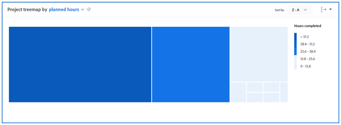
The Project treemap visualization is a view of hours—or days—that have been worked in a specific window of time compared against other work efforts in size. This helps you understand how much time people have dedicated to a project.
Access requirements
Expand to view access requirements.
You must have the following access to perform the steps in this article:
For more detail about the information in this table, see Access requirements in Workfront documentation.
Prerequisites
For prerequisites to using Enhanced Analytics, see the “Prerequisites” section in Enhanced analytics overview.
Understand the Project treemap visualization
The boxes in the Project treemap visualization represent projects and the size of the boxes shows a comparison of how much time was spent on different projects. The larger the box is, the more time spent on the project.
The Project treemap visualization is comprised of:
-
Smaller, light blue boxes: Projects that have fewer hours—or days—display as smaller boxes with a light blue color.

-
Larger, dark blue boxes: Projects that have more hours—or days—display as larger boxes with a dark blue color.

-
Medium-sized, blue boxes: Projects that fall in between the two categories display as medium-sized boxes with a shade of blue between the dark blue and light blue colors. There are 3 possible shades of blue for the medium-sized boxes.
The legend on the right side shows a breakdown of completed hours for each shade of blue. This legend is dynamic and updates according to the data.


Seeing this information helps you determine:
- The priority of things being worked on during the selected date range.
- What teams are spending time on.
- If teams are focusing on the right things.
- When a specific project is clicked, how much the scope of a project changed over that time period.
To learn how to get the best data for this visualization, see Enhanced analytics overview.


