Fragment authoring
After you create a fragment, use the visual design space to author the structure and content components in your fragment.
Add structure and content design-fragment
-
To start your content design, drag an item from the Structures and drop it onto the canvas.
Add as many items from Structures as you need and edit the settings for each in the pane on the right.
note tip TIP Select the n:n column component to define the number of columns of your choice (between three and 10). You can also define the width of each column by moving the arrows below the column. 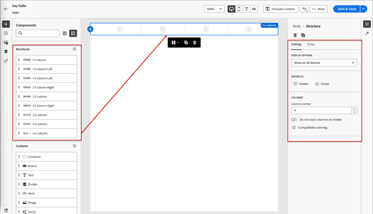
Each column size cannot be less than 10% of the total width of the structure component. Only empty columns can be removed.
For more information about using and formatting these components, see Structure components.
-
Expand the Contents section and add as many content components as you need into one or more structure components.
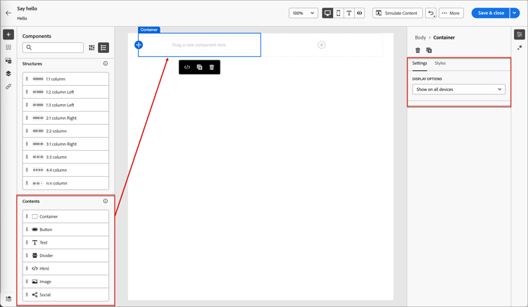
-
If needed, you can make additional customizations for each component in the Settings or Style tabs.
For example, you can change the text style, padding, or margin of each component.
-
To add conditional content and adapt the content to the targeted profiles based on conditional rules, select a content component and click the Enable conditional content icon in the component toolbar.
For more information, see Conditional content.
Add assets add-assets
In the visual design space, select the Assets (

For steps to select, replace, or upload image assets, see Use assets for content authoring.
Navigate the layers, settings, and styles navigate-layers-settings-styles
As you work with the content in the visual design space, you can access the components, columns, and content elements using the navigation tree. Click the Navigation tree icon (

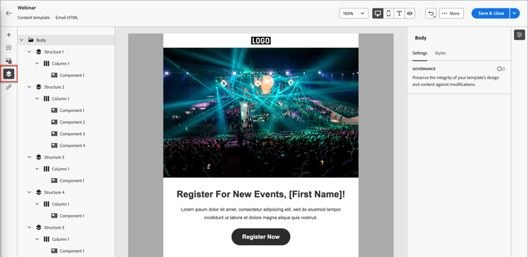
The following example outlines steps to adjust padding and vertical alignment inside a structure component with columns.
-
Select the column in the structure component directly in the canvas or using the Navigation tree displayed at the left.
-
From the column toolbar, click the Select a column tool and choose the one that you want to edit.
You can also select it from the structure tree. The editable parameters for that column are displayed in the Settings and Styles tabs on the right.
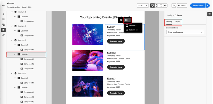
-
To edit the column properties, click the Styles tab on the right and change them according to your needs:
-
For Background, change the background color as needed.
Clear the check box for a transparent background. Enable the Background image setting to use an image as the background instead of a solid color.
-
For Alignment, select the Top, Middle, or Bottom icon.
-
For Padding, define the padding for all sides.
Select Different padding for each side if you want to fine tune the padding. Click the Lock icon to break synchronization.
-
Expand the Advanced section to define inline styles for the column.

-
-
If needed, repeat these steps to adjust the alignment and padding for the other columns in the component.
-
Save your changes.
Personalize content personalize-content
Marketo Optimizer uses Handlebars syntax for personalization. Tokens are replaced at send time with values from each recipient’s profile data.
To add personalization:
- Select the text component and click the Add personalization (

- In the personalization dialog, browse the schema tree on the left and select a profile attribute. The editor inserts the corresponding Handlebars expression — for example,
{{profile.firstName}}. - Add a fallback value to handle missing data, if needed — for example,
{{profile.firstName | default: "there"}}. - Click Confirm or Insert. The expression appears inline in the field.
For details about expression editor tools and syntax, see Personalization editor.
Edit linked URL tracking edit-linked-url-tracking
The link tracking panel provides a centralized view where you can easily locate each URL in the content. Click the Links icon (

To define tracking for a listed content link, click the Edit (
