On this page: Learn how to design email content from scratch in the Adobe Journey Optimizer Email Designer by adding structures and content components, then personalizing and previewing your email.
Use the Adobe Journey Optimizer Email Designer to easily define the structure of your contents. By adding and moving structural elements with simple drag-and-drop actions, you can design the shape of your contents within seconds.
To start building your content, follow the steps below:
-
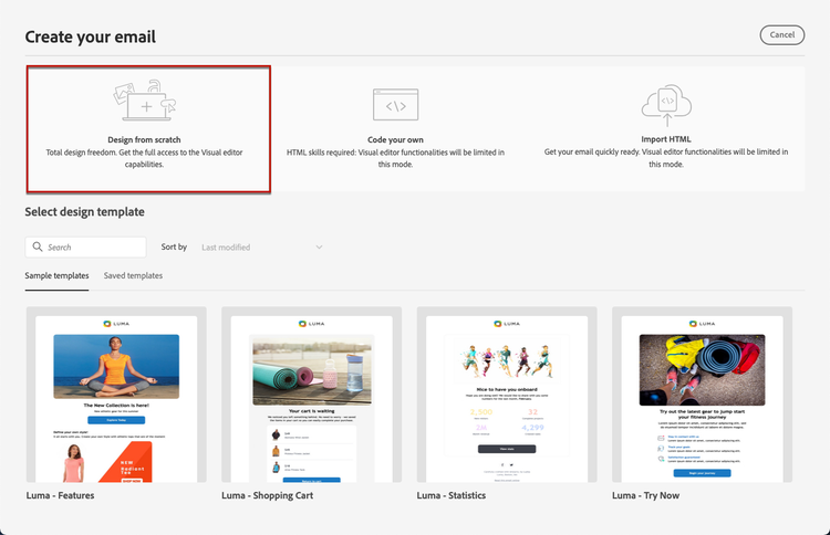
From the Designer home page, select the Design from scratch option.
-
To get started quickly, use Modules — ready-to-use, pre-designed content blocks such as headers, hero sections, and footers — to speed up email creation and keep your campaigns visually consistent. Learn more about modules

-
Otherwise, design your content by drag and dropping Structures into the canvas to define the layout of your email.
note tip TIP Alternatively, accelerate your email creation with Generate Content to generate complete email content, including text and images, using Generate full content with AI. You can then skip ahead to previewing and validating your content. -
Add as many Structures as needed and edit their settings in the dedicated pane on the right.

note NOTE On narrow screens (e.g. mobile), columns stack vertically by default for readability. Some email clients don’t support this behavior, in which case columns remain side-by-side. You can also turn this off using the Do not stack columns on mobile toggle in the Settings tab. -
Most of the structures (1:1 column, 2:2 column, 1:2 column Left, and so on) are fixed presets. Select the n:n column component instead to define any number of columns of your choice (between 3 and 10).

You can increase the Columns number of an existing structure at any time from the Settings tab, even after adding content to it — your existing content is preserved instead of being lost.
You can also adjust the width of each column directly on the canvas or by editing the percentages in the Settings tab.
note NOTE Each column size cannot be under 10% of the total width of the structure component. You cannot remove a column that is not empty. -
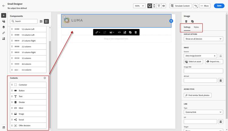
From the Contents section, add as many elements as you need into one or more structure components. Learn more about content components
-
Each component can be further customized using the Settings or Style tabs in the right menu. For example, you can change the text style, padding or margin of each component. Learn more about alignment and padding
-
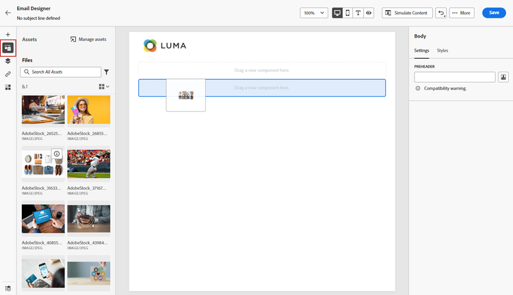
From the Asset picker, you can directly select assets stored in the Assets library. Learn more about asset management
Double-click the folder which contains your assets. Drag and drop them into a structure component.
-
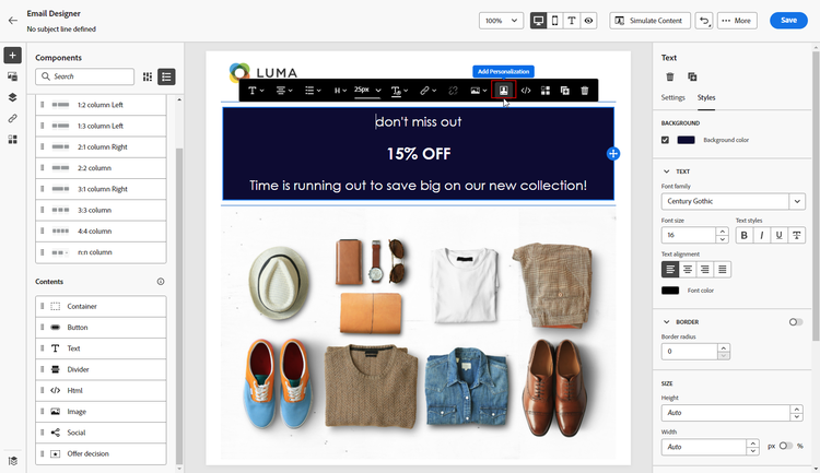
Insert personalization fields to customize your content from profiles attributes, audience memberships, Contextual attributes, and more. Learn more about content personalization
-
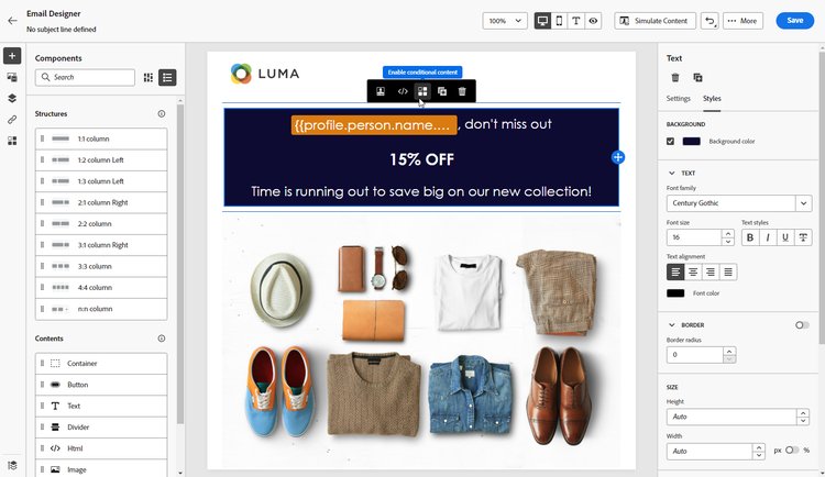
Click Enable condition content to add dynamic content and adapt the content to the targeted profiles based on conditional rules. Get started with dynamic content
-
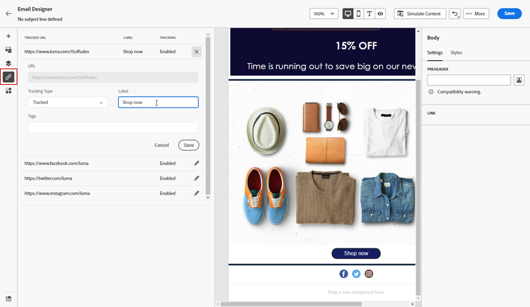
Click the Links tab from the left pane to display all the URLs of your content that will be tracked. You can modify their Tracking Type or Label and add Tags if needed. Learn more about links and tracking
-
If needed, you can further personalize your email by clicking Switch to code editor from the advanced menu. This allows you to edit the email source code, for example to add tracking or custom HTML tags. Learn more about the code editor
note caution CAUTION You cannot revert back to the visual designer for this email after switching to the code editor. -
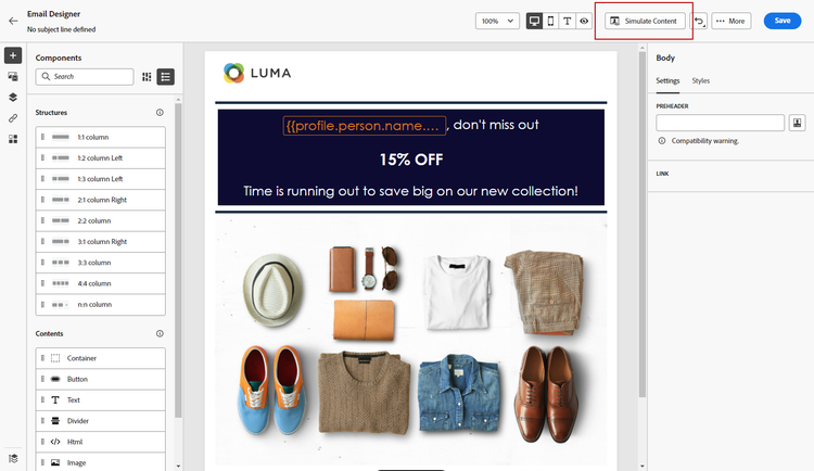
Once your content is ready, use either simulation method to check rendering. You can choose the desktop or mobile view. Detailed information is available in the Content Management section.
-
You can also validate your content quality to assess readability, effectiveness, and content cohesiveness. Learn more about content quality validation
-
When your content is ready, click Save.
note NOTE With auto save, your changes are automatically saved in the Email Designer after about 10 seconds of inactivity. This capability is in Limited Availability. Contact your Adobe representative to gain access.
This section contains structured knowledge intended to support interpretation, retrieval, and question answering related to this topic.
For complete understanding, this information should be combined with the documentation on this page. Neither source is intended to stand alone; the page describes the feature, while this section provides additional context that helps disambiguate terminology, intent, applicability, and constraints.
- TL;DR: This page explains how to design email content from scratch in the Email Designer by adding structure and content components, defining columns, personalizing, adding dynamic content and links, and previewing before saving.
Intents:
- Start an email from the Design from scratch option and add structure components
- Define the number and width of columns in a structure component
- Add content components, personalization fields, and dynamic (conditional) content
- Review and configure tracked links from the Links tab
- Preview rendering with a simulation method and validate content quality
- Switch to the code editor for advanced source editing
Glossary:
- Design from scratch: The Designer home page option to start building content by adding structures and components (product-specific)
- Structure components: Elements that define the layout of the email, added by drag and drop into the canvas (product-specific)
- n:n column: A structure component whose number of columns can be defined between 3 and 10 (product-specific)
- Switch to code editor: An advanced-menu option to edit the email source code (for example to add tracking or custom HTML tags) (product-specific)
Guardrails:
- The n:n column component supports between 3 and 10 columns.
- Each column size cannot be under 10% of the total width of the structure component.
- You cannot remove a column that is not empty.
- After switching to the code editor, you cannot revert back to the visual designer for that email.
- Stacking columns is not compatible with all email programs; when not supported, columns will not be stacked.
Terminology:
- Canonical name: Structure components — Acronym: n/a — variants: Structures, structure component
- Synonyms: “Design from scratch” = starting content with no template
- Do not confuse: “Structure components” (define layout) ≠ “Content components” (elements placed inside structures)
- Do not confuse: “Settings tab” ≠ “Style tab” (both used to customize components)
FAQ:
- Q: How many columns can a structure have? — Between 3 and 10, defined with the n:n column component.
- Q: Can I make a column narrower than 10%? — No, each column size cannot be under 10% of the total width of the structure component.
- Q: Can I go back to the visual designer after using the code editor? — No, you cannot revert back to the visual designer for that email after switching to the code editor.
- Q: How do I check rendering before saving? — Use either simulation method to check rendering, choosing the desktop or mobile view.
- Q: Where do I manage tracked links? — In the Links tab from the left pane, where you can modify Tracking Type or Label and add Tags.