On this page: Monitor inbound data health in Adobe Journey Optimizer with the graphs available at Data Management > Monitoring > Edge.
The Monitoring workspace includes the following tabs:
Monitor Journey Optimizer data in Edge
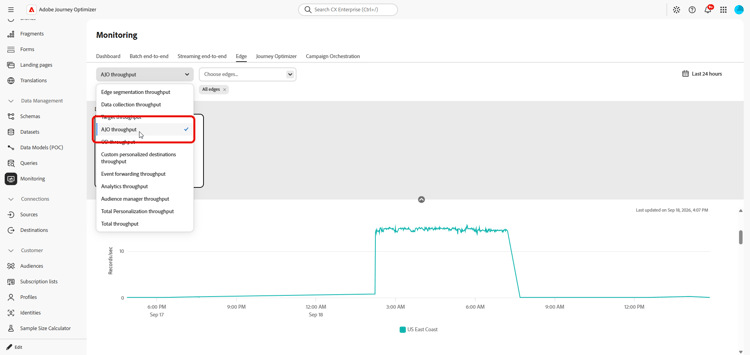
The following graphs are available in Data Management > Monitoring > Edge.
From the drop-down menu, select AJO throughput.
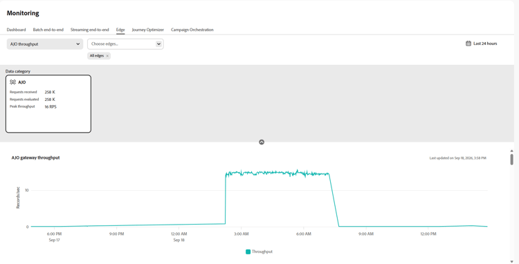
AJO Gateway Throughput gateway-throughput
The AJO Gateway Throughput graph shows the total number of records processed by the Journey Optimizer gateway per second over time. Use this metric to monitor the overall volume of inbound requests handled by the gateway.
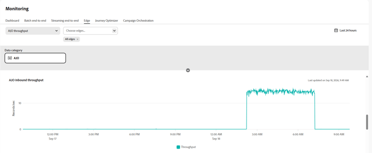
AJO Inbound Throughput inbound-throughput
The AJO Inbound Throughput graph shows the overall number of inbound records received per second over time. This metric measures the rate at which inbound records reach the Edge service. Use this graph to review inbound data volume and identify changes in traffic levels.
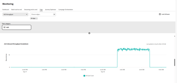
AJO Inbound Throughput Breakdown inbound-throughput-breakdown
The AJO Inbound Throughput Breakdown graph shows inbound records received per second over time, broken down by location. This metric measures the inbound record rate for each location. Use this graph to compare inbound traffic across locations and identify a location with an unusual increase or decrease in volume.
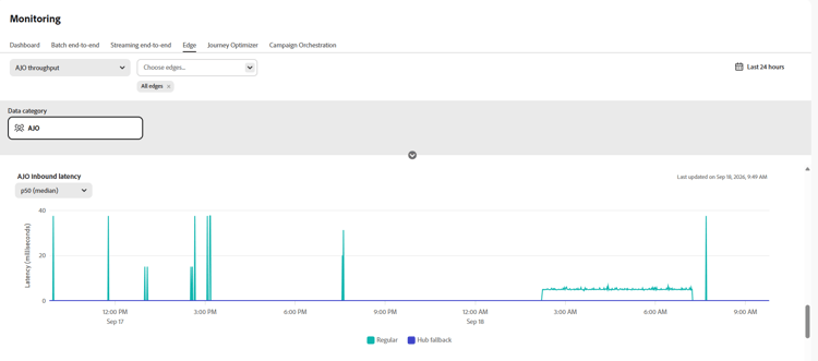
AJO Inbound Latency inbound-latency
The AJO Inbound Latency graph shows the time required to process inbound requests, measured in milliseconds. This metric is presented as a distribution of latency values, including percentiles such as P50 and P90. Use these values to understand typical request latency and identify higher-latency requests.
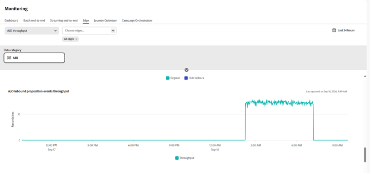
AJO Inbound Proposition Events Throughput inbound-proposition-events-throughput
The AJO Inbound Proposition Events Throughput graph shows the throughput of proposition events over time. This metric measures tracking signals generated when a user interacts with, views, or triggers a personalized offer.
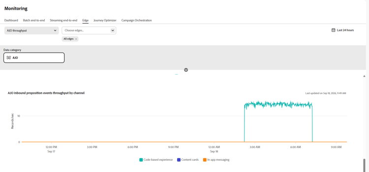
AJO Inbound Proposition Events Throughput by Channel inbound-proposition-events-throughput-channel
The AJO Inbound Proposition Events Throughput by Channel graph shows proposition event throughput by inbound channel. This metric measures proposition event activity grouped by channel. The available channels include CBE, in-app, and content cards. Use this graph to compare activity across inbound channels.
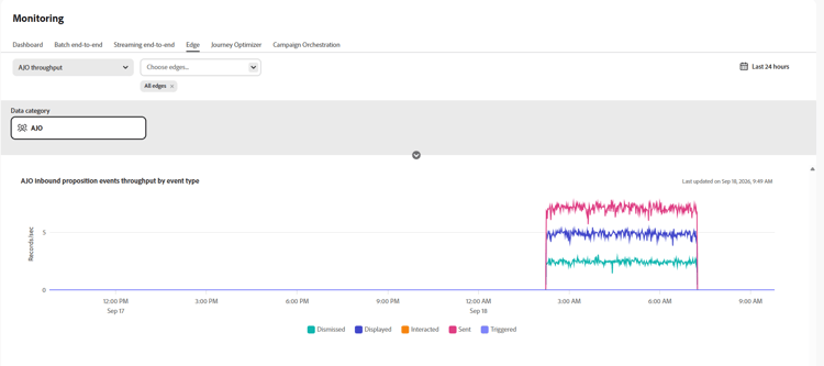
AJO Inbound Proposition Events Throughput by Event Type inbound-proposition-events-throughput-event-type
The AJO Inbound Proposition Events Throughput by Event Type graph shows proposition event throughput by event type. This metric measures proposition event activity grouped by outcome. The available event types include dismissed, suppressed, displayed, triggered, interacted, and sent. Use this graph to identify which proposition-event outcomes contribute to overall activity.
This section contains structured knowledge intended to support interpretation, retrieval, and question answering related to this topic.
For complete understanding, this information should be combined with the documentation on this page. Neither source is intended to stand alone; the page describes the feature, while this section provides additional context that helps disambiguate terminology, intent, applicability, and constraints.
- TL;DR: This page explains how to monitor inbound data health in Journey Optimizer with the Edge monitoring graphs in Data Management.
Intents:
- Access the Edge monitoring graphs from Data Management > Monitoring > Edge
- Review overall inbound throughput in records per second over time
- Review inbound throughput broken down by location
- Analyze inbound request latency in milliseconds by distribution values such as P50 and P90
- Analyze proposition event throughput by time, channel, and event type
Glossary:
- Edge monitoring graphs: Graphs in Data Management > Monitoring > Edge that show inbound throughput, inbound latency, and proposition event throughput (product-specific)
- Inbound throughput: Overall inbound throughput measured in records per second over time (product-specific)
- Proposition events: Tracking signals generated when a user interacts with, views, or triggers personalized offers (product-specific)
Guardrails:
- Inbound latency is measured in milliseconds.
- The latency graph shows a distribution of values, including P50 and P90.
- Proposition event channel values are CBE, in-app, and content cards.
- Proposition event type values are dismissed, suppressed, displayed, triggered, interacted, and sent.
Terminology:
- Canonical name: Edge monitoring graphs — variants: AJO graphs
- Do not confuse: inbound throughput (records per second) ≠ inbound latency (milliseconds)
- Do not confuse: proposition event channel (CBE, in-app, or content cards) ≠ proposition event type (dismissed, suppressed, displayed, triggered, interacted, or sent)
FAQ:
- Q: Where are the inbound data health graphs? — Open Data Management > Monitoring > Edge.
- Q: What does AJO Inbound Throughput measure? — It measures overall inbound throughput in records per second over time.
- Q: How is inbound latency shown? — In milliseconds, by distribution values including P50 and P90.
- Q: Which proposition event channels are available? — CBE, in-app, and content cards.
- Q: Which proposition event types are available? — Dismissed, suppressed, displayed, triggered, interacted, and sent.