In this use case you want to use a date range that you have defined in Customer Journey Analytics to filter and report on occurrences (events) during the last year.
Customer Journey Analytics
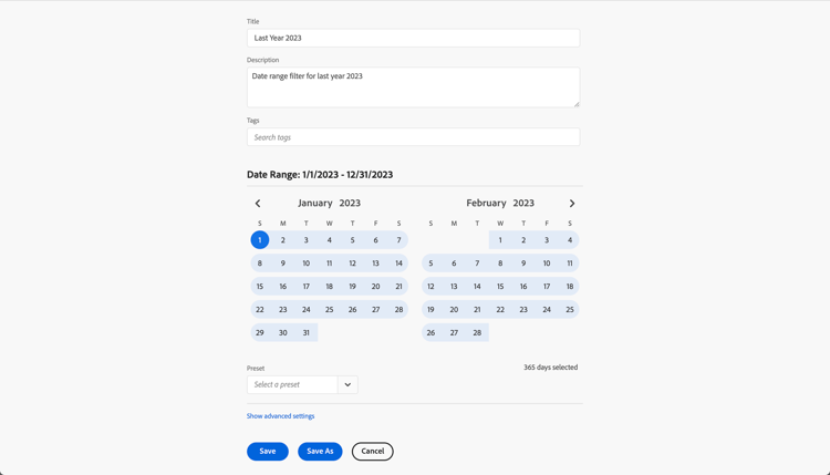
To report using a date range, you set up a date range in Customer Journey Analytics, with TitleLast Year 2023.
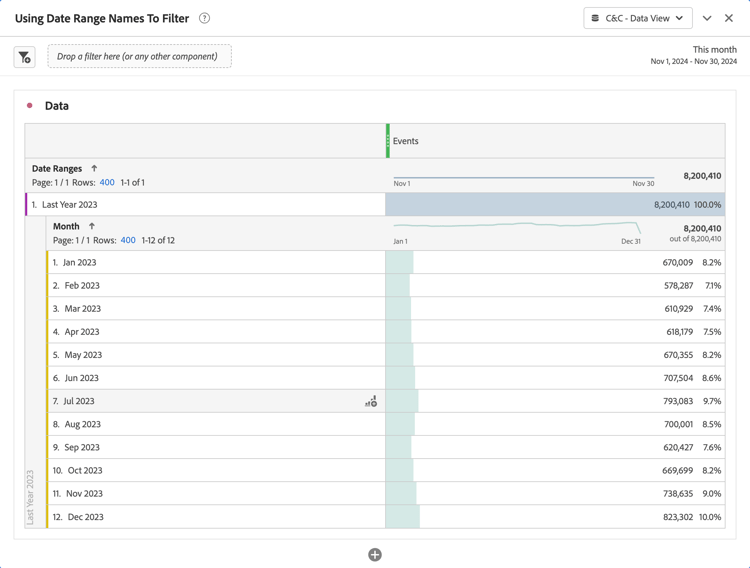
You then can use that date range in an example Using Date Range Names To Filter panel for the use case:
Note how the date range defined in the Freeform table visualization overrules the date range applied to the panel.
You see a visualization displaying Error fetching data for this visual.
In the Filters pane:
Select the daterangeName is (All) from Filters on this visual.
Select Basic filtering as the Filter type.
Underneath the Search field, select Last Year 2023, which is the name of your date range defined in Customer Journey Analytics.
Select
to remove daterangeName from Columns.
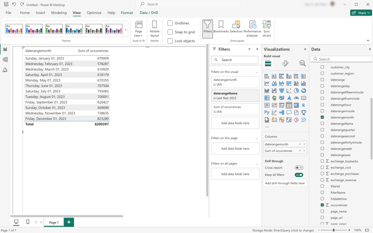
You see the table updated with the applied daterangeName filter. Your Power BI Desktop should look like below.
Tableau Desktop
Select the Sheet 1 tab at the bottom to switch from Data source. In the Sheet 1 view:
Drag the Daterange Name entry from the Tables list in the Filters shelf.
In the Filter [Daterange Name] dialog ensure Select from list is selected, and select Last Year 2023 from the list. Select Apply and OK.
Drag Daterangemonth entry from the Tables list and drop the entry in the field next to Rows. Select Daterangemonth and select Month. The value changes to MONTH(Daterangemonth).
Drag Occurrences entry from the Tables list and drop the entry in the field next to Columns. The value changes to SUM(Occurrences).
Select Text Table from Show Me.
Select Swap Rows and Columns from the toolbar.
Select Fit Width from the Fit drop-down menu.
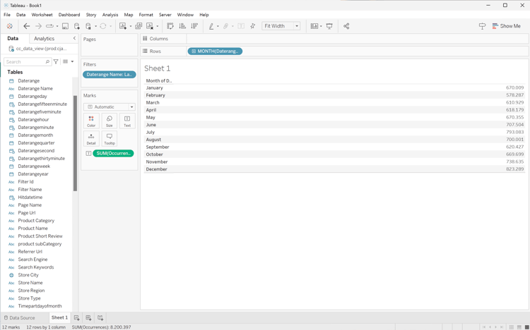
Your Tableau Desktop should look like below.
Looker
In the Explore interface of Looker, ensure you do have a clean setup. If not, select
Remove fields and filters.
Select + Filter underneath Filters.
In the Add Filter dialog:
Select ‣ Cc Data View
From the list of fields, select ‣ Daterange Name.
Specify the Cc Data View Daterange Name filter as is and select Last Year 2023 from the list of values.
From the ‣ Cc Data View section in the left rail:
Select Daterange Month, then Month.
Select Count underneath MEASURES in the left rail (at the bottom).
Select Run.
Select ‣ Visualization.
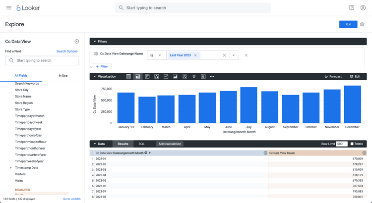
You should see a visualization and table similar as shown below.
Jupyter Notebook
Enter the following statements in a new cell.
code language-python
data = %sql SELECT daterangeName FROM cc_data_view;
style = {'description_width': 'initial'}
daterange_name = widgets.Dropdown(
   options=[d for d, in data],
   description='Date Range Name:',
   style=style
)
display(daterange_name)
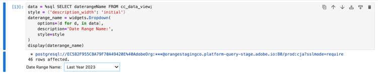
Execute the cell. You should see output similar to the screenshot below.
Select Fishing Products from the drop-down menu.
Enter the following statements in a new cell.
code language-python
import seaborn as sns
import matplotlib.pyplot as plt
data = %sql SELECT daterangemonth AS Month, COUNT(*) AS Events \
            FROM cc_data_view \
            WHERE daterangeName = '{daterange_name.value}' \
            GROUP BY 1 \
            ORDER BY Month ASC
df = data.DataFrame()
df = df.groupby('Month', as_index=False).sum()
plt.figure(figsize=(15, 3))
sns.lineplot(x='Month', y='Events', data=df)
plt.show()
display(data)
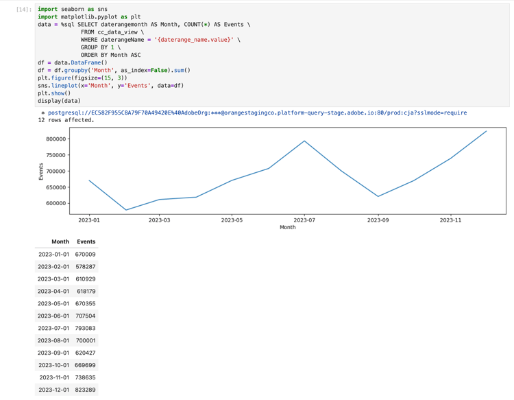
Execute the cell. You should see output similar to the screenshot below.
RStudio
Enter the following code block in a new chunk. Ensure you use the appropriate date range name. For example, Last Year 2023.
code language-r
## Monthly Events for Last Year
df <- dv %>%
   filter(daterangeName == "Last Year 2023") %>%
   group_by(daterangemonth) %>%
   count() %>%
   arrange(daterangemonth, .by_group = FALSE)
ggplot(df, aes(x = daterangemonth, y = n)) +
   geom_line(color = "#69b3a2") +
   ylab("Events") +
   xlab("Hour")
print(df)
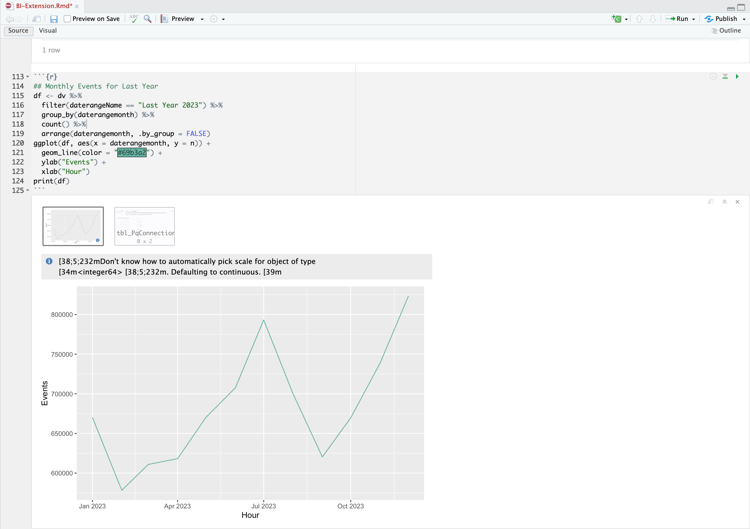
Run the chunk. You should see output similar to the screenshot below.