이 페이지에서: 데이터 관리 > 모니터링 > Edge에서 사용 가능한 그래프를 사용하여 Adobe Journey Optimizer의 인바운드 데이터 상태를 모니터링합니다.
Monitoring 작업 영역에는 다음 탭이 있습니다.
Edge에서 Journey Optimizer 데이터 모니터링
다음 그래프는 데이터 관리 > 모니터링 > Edge에서 사용할 수 있습니다.
드롭다운 메뉴에서 AJO 처리량을(를) 선택합니다.
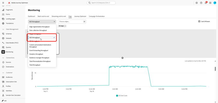
AJO 게이트웨이 처리량 gateway-throughput
AJO 게이트웨이 처리량 그래프는 시간 경과에 따라 초당 Journey Optimizer 게이트웨이에서 처리한 총 레코드 수를 보여줍니다. 이 지표를 사용하여 게이트웨이에서 처리하는 인바운드 요청의 전체 볼륨을 모니터링합니다.
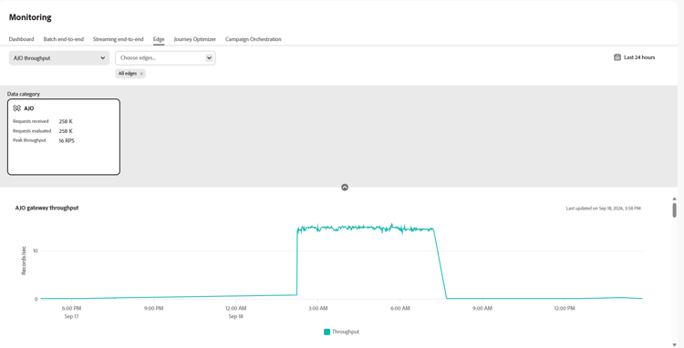
AJO 인바운드 처리량 inbound-throughput
AJO 인바운드 처리량 그래프는 시간에 따른 초당 받은 전체 인바운드 레코드 수를 보여 줍니다. 이 지표는 인바운드 레코드가 Edge 서비스에 도달하는 속도를 측정합니다. 이 그래프를 사용하여 인바운드 데이터 볼륨을 검토하고 트래픽 수준의 변경 사항을 식별합니다.
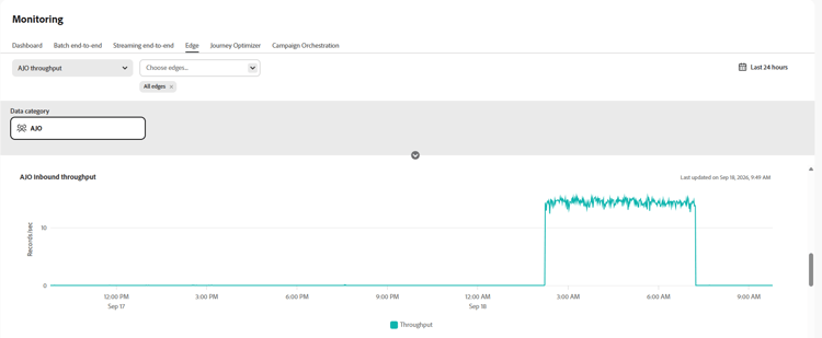
AJO 인바운드 처리량 분류 inbound-throughput-breakdown
AJO 인바운드 처리량 분류 그래프는 시간에 따라 초당 받은 인바운드 레코드를 위치별로 분류하여 표시합니다. 이 지표는 각 위치에 대한 인바운드 레코드 비율을 측정합니다. 이 그래프를 사용하여 위치 간 인바운드 트래픽을 비교하고 볼륨의 비정상적인 증가 또는 감소가 있는 위치를 식별합니다.
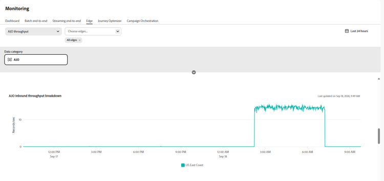
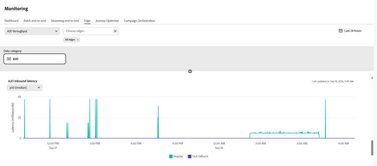
AJO 인바운드 대기 시간 inbound-latency
AJO 인바운드 대기 시간 그래프는 인바운드 요청을 처리하는 데 필요한 시간을 밀리초 단위로 표시합니다. 이 지표는 P50 및 P90과 같은 백분위수를 포함하여 지연 시간 값의 분포로 표시됩니다. 이 값을 사용하여 일반적인 요청 지연을 이해하고 지연 시간이 더 긴 요청을 식별합니다.
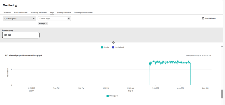
AJO 인바운드 제안 이벤트 처리량 inbound-proposition-events-throughput
AJO 인바운드 제안 이벤트 처리량 그래프는 시간 경과에 따른 제안 이벤트의 처리량을 보여 줍니다. 이 지표는 사용자가 개인화된 오퍼와 상호 작용하거나, 보고, 트리거할 때 생성되는 추적 신호를 측정합니다.
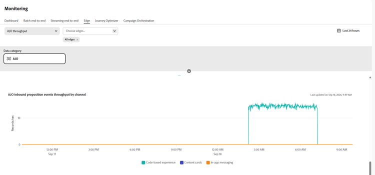
채널별 AJO 인바운드 제안 이벤트 처리량 inbound-proposition-events-throughput-channel
채널별 AJO 인바운드 제안 이벤트 처리량 그래프는 인바운드 채널별 제안 이벤트 처리량을 보여 줍니다. 이 지표는 채널별로 그룹화된 제안 이벤트 활동을 측정합니다. 사용 가능한 채널에는 CBE, 인앱 및 콘텐츠 카드가 포함됩니다. 이 그래프를 사용하여 인바운드 채널 간 활동을 비교합니다.
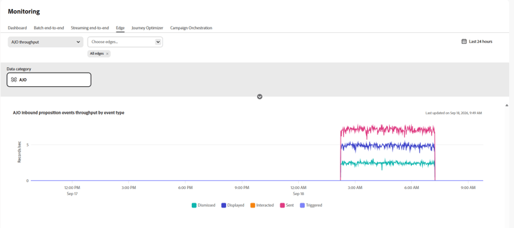
이벤트 유형별 AJO 인바운드 제안 이벤트 처리량 inbound-proposition-events-throughput-event-type
이벤트 유형별 AJO 인바운드 제안 이벤트 처리량 그래프는 이벤트 유형별 제안 이벤트 처리량을 보여 줍니다. 이 지표는 결과별로 그룹화된 제안 이벤트 활동을 측정합니다. 사용 가능한 이벤트 유형에는 해제, 억제, 표시, 트리거, 상호 작용 및 전송 등이 있습니다. 이 그래프를 사용하여 어떤 제안-이벤트 결과가 전체 활동에 기여하는지 식별하십시오.
This section contains structured knowledge intended to support interpretation, retrieval, and question answering related to this topic.
For complete understanding, this information should be combined with the documentation on this page. Neither source is intended to stand alone; the page describes the feature, while this section provides additional context that helps disambiguate terminology, intent, applicability, and constraints.
- TL;DR: This page explains how to monitor inbound data health in Journey Optimizer with the Edge monitoring graphs in Data Management.
Intents:
- Access the Edge monitoring graphs from Data Management > Monitoring > Edge
- Review overall inbound throughput in records per second over time
- Review inbound throughput broken down by location
- Analyze inbound request latency in milliseconds by distribution values such as P50 and P90
- Analyze proposition event throughput by time, channel, and event type
Glossary:
- Edge monitoring graphs: Graphs in Data Management > Monitoring > Edge that show inbound throughput, inbound latency, and proposition event throughput (product-specific)
- Inbound throughput: Overall inbound throughput measured in records per second over time (product-specific)
- Proposition events: Tracking signals generated when a user interacts with, views, or triggers personalized offers (product-specific)
Guardrails:
- Inbound latency is measured in milliseconds.
- The latency graph shows a distribution of values, including P50 and P90.
- Proposition event channel values are CBE, in-app, and content cards.
- Proposition event type values are dismissed, suppressed, displayed, triggered, interacted, and sent.
Terminology:
- Canonical name: Edge monitoring graphs — variants: AJO graphs
- Do not confuse: inbound throughput (records per second) ≠ inbound latency (milliseconds)
- Do not confuse: proposition event channel (CBE, in-app, or content cards) ≠ proposition event type (dismissed, suppressed, displayed, triggered, interacted, or sent)
FAQ:
- Q: Where are the inbound data health graphs? — Open Data Management > Monitoring > Edge.
- Q: What does AJO Inbound Throughput measure? — It measures overall inbound throughput in records per second over time.
- Q: How is inbound latency shown? — In milliseconds, by distribution values including P50 and P90.
- Q: Which proposition event channels are available? — CBE, in-app, and content cards.
- Q: Which proposition event types are available? — Dismissed, suppressed, displayed, triggered, interacted, and sent.