View the Activity by team visualization in Enhanced analytics
- Topics:
- Reports and Dashboards
CREATED FOR:
- User
See the Enhanced Analytics deprecation guide for more information.
The Activity by team visualization shows activities that happen during a specific time frame for a home team, allowing you to understand how different home teams spent their time in Adobe Workfront. Depending on how your home team is set up in Workfront, this visualization can give you different insights and answer different questions.
For information on the Project activity visualization, see View the Project activity visualization in Enhanced analytics.
Access requirements
You must have the following access to perform the steps in this article:
New:
- Light or Higher
Current:
- Review or Higher
View access to Projects
View
For more detail about the information in this table, see Access requirements in Workfront documentation.
Prerequisites
For prerequisites to using Enhanced Analytics, see the “Prerequisites” section in Enhanced analytics overview.
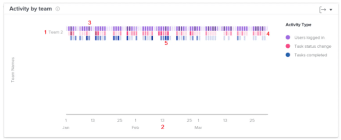
Understand the Activity by team visualization
The different activities display in different colors to summarize specific events over the filtered time period:
-
Users logged in: Purple boxes show that people on the home team logged in on that day. A darker shade indicates a higher number of people logging in.

-
Task status change: Pink boxes show that people on the home team changed the status of a task on that day. A darker shade indicates a higher number of task statuses changing.

-
Tasks completed: Blue boxes show that people on the home team completed a task on that day. A darker shade indicates a higher number of tasks being completed.

Hovering over a box shows the exact number of times the action was completed in a given day. You can select a team to see a breakdown of these activities by each person on the home team.
Seeing this information helps you determine:
- What activities are occurring within a home team and at what rate.
- What home teams are being overworked or are using the system more.
- If the distribution of work is appropriate for the home team.
To learn how to get the best data for this visualization, see Enhanced analytics overview.
View the Activity by team visualization
-
Click the Main Menu icon

-
In the left panel, select People.

-
(Optional) To use a different date range, select new start and end dates from the date range filter.

For information on using the date range filter, see Apply filters in Enhanced analytics.
-
(Conditional) If you haven’t set your Team filter, add the Team filter and select each team that you want to see data for.
For more information on adding filters in Enhanced analytics, see Apply filters in Enhanced analytics.
After you add filters, data for up to 50 projects displays and the filters remain active even after you leave the page or log out of Workfront.
-
(Optional) To zoom in on a date range, select a point on the visualization for the start of your date range and drag to the end of your date range.
All other visualizations update to the same date range and a timeframe filter is created.

-
Click a team name
to see more details for activities completed by the home team.
The list expands to display the activities of each person assigned to the home team.
-
Hover over a colored box to see the date when users completed an action, as well as the number of times the action was completed that day.
Darker colors indicate higher activity.

-
(Optional) To export the visualization data, click the Export icon

- Chart (PNG)
- Data Table (XSLX)