Structure components structure-components
Use the Structure components in the visual design space to define the structure of your content. By adding and moving structural elements with simple drag-and-drop actions, you can quickly define the shape of your content layout. Each structure component spans the horizontal space and you can stack them to build the layout vertically.
Structure library structure-library
At the top of the Components library, the Structures section displays the available structure components:


Add structure components add-structure-components
When you design the content for your email, landing page, or fragment, add each structure component to construct the layout. Drag an item from the Structures section on the left and drop it onto the canvas. You can use the toolbar to select a column and use the Settings and Styles tabs on the right panel to define the parameters for the selected component or column.

Component toolbar component-toolbar
The toolbar is displayed in the canvas when you select it in the canvas. The available tools provide an easy way to select a column and apply component functions.


Component settings component-settings
After you add a component, it is selected in the visual design space and its properties are displayed in the right panel. The Settings tab is displayed by default. You can also select a structure component at any time to change the settings.
Display options
If you want to exclude the component from desktop or mobile device display, change the Display Options setting. The default, Show on all devices, enables display across all devices.

Choose another setting to make the component exclusive by device type:
- Show only on desktop devices - Choose this setting when you want to display the component on desktop devices and exclude it for mobile devices.
- Show only on mobile devices - Choose this setting when you want to display the component on mobile devices, such as phones and tablets, and exclude it for desktop devices.
Header and footer
You can designate a structure component as the HTML header or footer in the email message or landing page. With the structure component selected in the canvas, click the Header or Footer option. There can be only one header or footer, and the option is not available if another component is assigned.

You can remove the header or footer designation by selecting the component and clicking the option to remove it.
Stacked columns stacked-columns
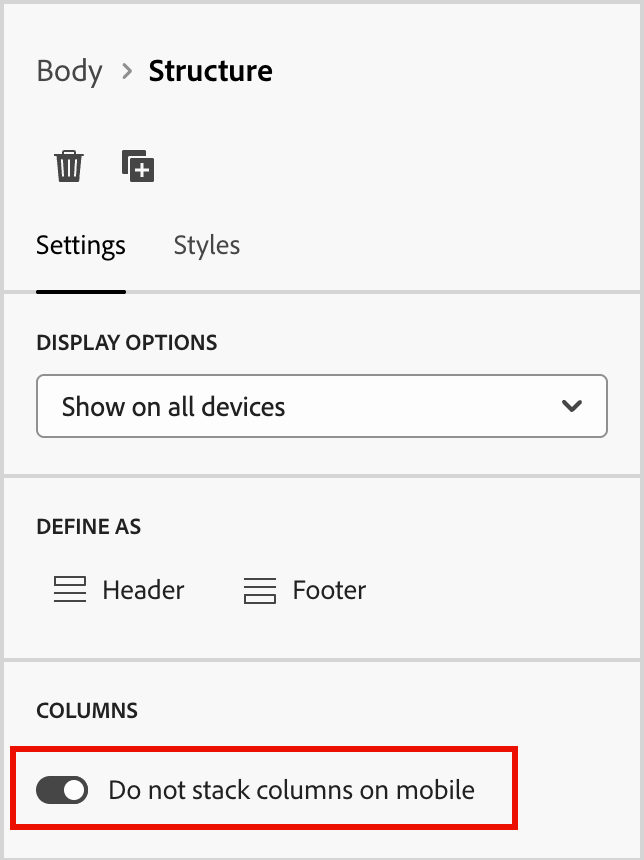
For smaller screens or display windows, the columns in the structure component display as stacked unless you change the default setting. With the multi-column structure component selected, change the Do not stack columns on mobile setting by moving the toggle slider to the right.
Component styles component-styles
After you add a component, it is selected in the visual design space and its properties are displayed in the right panel. You can also select a component at any time to change the settings and styles.
Background background
With the Styles tab selected in the right panel, use the Background section to define the color and optional image to use as a background for the structure component.
Background color
Select the check box and click the color square to choose a color from the picker. You can choose a color by entering a known RGB, HSL, HSB, or hexadecimal value. Or, use the color slider and the color field to select the color.

Background image background-image
Move the toggle selector to enable the background image settings.

Click Select Asset to open the asset selector, where you can choose an image from the Assets library.
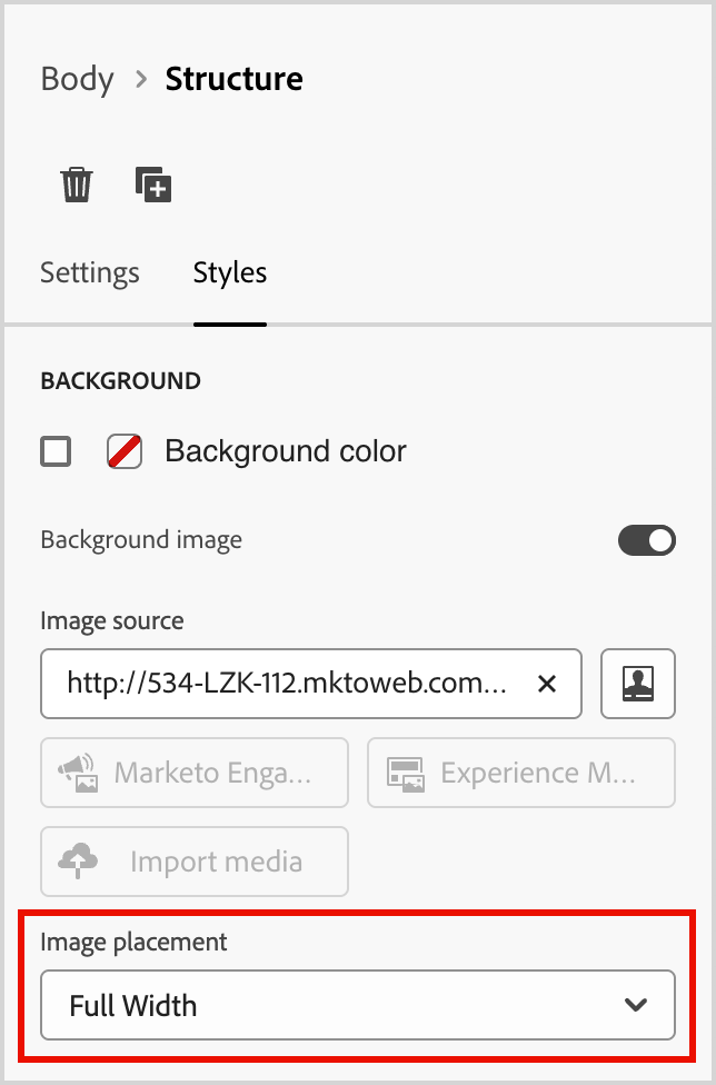
Use the Image placement option to choose how the image fills the structure component. The placement settings follow the standard HTML background image fill and alignment attributes.
Other styles other-styles
You can apply other structure component styles to adjust its display in the email message or landing page. For styling beyond these built-in options, see Add custom CSS for your content.
Columns columns
Use the Select a column tool in the component toolbar to select a column. You can then use the column toolbar to change the column selection, remove the column, or apply conditional content variations for the column. The parameters for the column are displayed in the Settings and Styles tabs on the right.

Change n:n columns change-nn-columns
The column widths are static for most of the structure components. When you add the n:n column component, you can change the number of columns and the column sizing. The n:n column component starts with five columns of equal width (20%).
With the component selected in the canvas, use the Columns number option in the right panel to change the number of columns. Click the up and down arrow icons to increase or decrease the number of columns, or enter the number in the field.

In the canvas, move the column sizing icon to adjust the width of the selected column. As you increase or decrease the width, the adjacent column also adjusts so that all columns occupy 100% of the component width.

Column styles column-styles
With the column selected in the canvas, you can set styles to apply to that column.
-
Background color - Select the checkbox and click the color square to choose a color from the picker. You can choose a color by entering a known RGB, HSL, HSB, or hexadecimal value. Or, you can use the color slider and the color field to select the color.
-
Background image - Move the toggle selector to enable the background image settings.
Choose the asset source type and select an image file.
Navigation tree navigation-tree
In the visual design space, you can access the structural components, including columns and content, using the navigation tree. Click the Navigation tree icon (

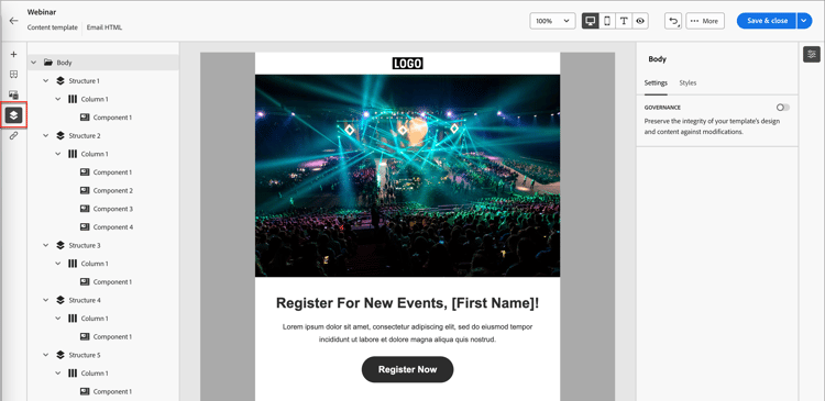
The Body element is the root of the tree structure. Click any of the components or column child elements in the tree to select it on the canvas. The Settings and Styles tabs on the right display the parameters for that component or column.
