Auf dieser Seite: Erfahren Sie, wie Sie die E-Mail-Erstellung im E-Mail-Designer mit einsatzbereiten Modulen – z. B. Kopfzeilen, Hero-Abschnitten, Produktkarten und Fußzeilen – beschleunigen können, ohne Strukturen von Grund auf neu zu erstellen.
Der E-Mail-Designer enthält eine Bibliothek mit Modulen: einsatzbereite, vollständig strukturierte Inhaltsbausteine, die die E-Mail-Erstellung beschleunigen und die Konsistenz des Designs in Ihrer gesamten Kommunikation fördern.
Im Gegensatz zu Inhaltskomponenten, bei denen es sich um leere Platzhalter handelt, die Sie von Grund auf neu konfigurieren, sind Module vorgefertigte Abschnitte – z. B. eine Kopfzeile mit Branding, ein Produktkartenraster oder eine Fußzeile mit Abmelde-Links –, die Sie direkt auf Ihrer Arbeitsfläche ablegen und dort anpassen können.
Aufrufen und Einfügen von Modulen access-modules
Gehen Sie wie folgt vor, um die verfügbaren Module im E-Mail-Designer anzuzeigen und zu nutzen.
-
Öffnen Sie Ihre E-Mail im E-Mail-Designer.
-
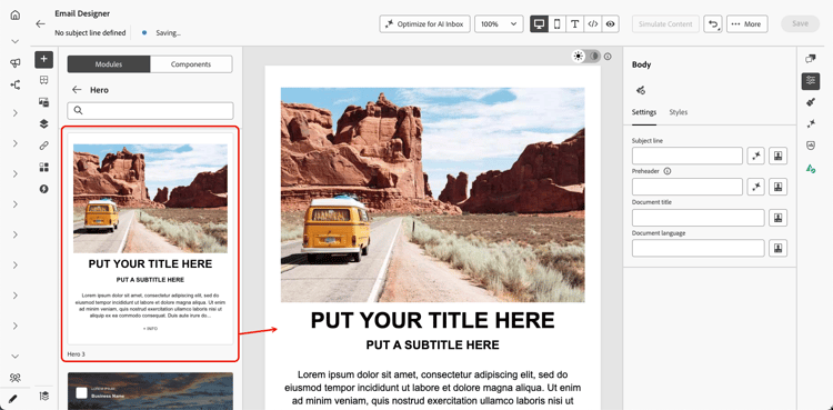
Klicken Sie im linken Bereich auf die Registerkarte Module.

-
Durchsuchen Sie die verfügbaren Modulkategorien oder verwenden Sie die Suchleiste, um nach Namen zu filtern.
-
Klicken Sie auf den Pfeil > neben einer Kategorie, um sie zu erweitern und verfügbare Layout-Varianten anzuzeigen.
-
Suchen Sie die Modulvariante, die Sie verwenden möchten, und ziehen Sie sie dann per Drag-and-Drop direkt auf Ihre E-Mail-Arbeitsfläche.
-
Das Modul wird mit seinem Standardinhalt eingefügt. Klicken Sie auf ein beliebiges Element auf der Arbeitsfläche, um mit der Inline-Bearbeitung von Inhalten zu beginnen. Klicken Sie auf einen Textbereich, um direkt Text einzugeben, oder klicken Sie auf ein Bild, um es durch ein Bild aus Ihrer Asset-Bibliothek zu ersetzen.
note NOTE Wenn E-Mail-Designs auf Ihren Inhalt angewendet werden, übernehmen Module automatisch die Design-Stile, wodurch die Markenkonsistenz in Ihrem Entwurf sichergestellt wird. Erfahren Sie mehr über E-Mail-Designs. -
Verwenden Sie die Registerkarten Einstellungen und Stile im rechten Bereich, um Eigenschaften und Stil genau wie bei jedem anderen E-Mail-Element anzupassen.

-
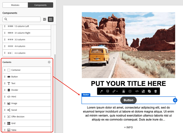
Sie können dem Modul auch Inhaltskomponenten direkt hinzufügen. Wechseln Sie zur Registerkarte Komponenten im linken Bereich und ziehen Sie eine Komponente per Drag-and-Drop in das Modul. Die Komponente übernimmt standardmäßig die Formatierung des Moduls. Diese können Sie jedoch bei Bedarf überschreiben.
Verfügbare Module available-modules
Die folgenden Modulkategorien sind vorkonfiguriert verfügbar. Für jedes Modul stehen mehrere Layout-Varianten zur Verfügung, z. B. einspaltige, zweispaltige und dreispaltige Raster. Erweitern Sie die Modulkategorien, um die Variante auszuwählen, die zu Ihrem Layout passt.
This section contains structured knowledge intended to support interpretation, retrieval, and question answering related to this topic.
For complete understanding, this information should be combined with the documentation on this page. Neither source is intended to stand alone; the page describes the feature, while this section provides additional context that helps disambiguate terminology, intent, applicability, and constraints.
- TL;DR: This page explains how to use the Email Designer’s ready-to-use modules — predefined, reusable layout blocks such as headers, hero sections, cards, and footers — to assemble emails faster and promote design consistency.
Intents:
- Access modules from the Modules tab in the left pane of the Email Designer
- Drag and drop a ready-to-use module variant onto the email canvas
- Customize a module’s content inline and adjust it from the Settings and Styles tabs
- Add content components into a module from the Components tab
- Save a customized module as a visual fragment to reuse it across other emails and messages
- Choose among the available module categories and their layout variants
Glossary:
- Module: A ready-to-use, fully structured content block — a predefined, reusable email layout block — that you drag and drop into the email canvas and customize through the WYSIWYG interface (product-specific)
- Modules tab: The tab in the left pane of the Email Designer where you browse, search, and insert modules (product-specific)
- Content component: An empty placeholder that you configure from scratch, in contrast to a pre-built module (product-specific)
- Visual fragment: A saved, reusable piece of content that a customized module can be saved as, so it can be reused across other emails and messages (product-specific)
Guardrails:
- Modules are not fragments — they exist within the email you are designing; to reuse a customized module elsewhere, save it as a visual fragment.
- When email themes are applied to your content, theme styles are inherited automatically by modules.
- Content components added to a module inherit the module’s styling by default, but you can override it as needed.
- Footers include required opt-out and mirror-page links.
Terminology:
- Canonical name: module — Acronym: n/a — variants: modules, email layout modules, layout blocks, content blocks
- Synonyms: “module” = “ready-to-use content block”
- Do not confuse: “module” (pre-built, fully structured section) ≠ “content component” (empty placeholder configured from scratch); “module” ≠ “fragment”
FAQ:
- Q: How do modules differ from content components? — Content components are empty placeholders you configure from scratch, whereas modules are pre-built sections you drop onto the canvas and customize from there.
- Q: Are modules the same as fragments? — No. Modules are not fragments and exist within the email you are designing, but you can save a customized module as a visual fragment to reuse it.
- Q: Which module categories are available out of the box? — Headers, Hero, Testimonial, Cards, Teams, and Footers, each with multiple layout variants such as single-column, two-column, and three-column grids.
- Q: Can I add content components inside a module? — Yes. Switch to the Components tab in the left pane and drag and drop a component into the module; it inherits the module’s styling by default.
- Q: Do modules follow my email theme? — Yes. When email themes are applied, theme styles are inherited automatically by modules.