
CSS classes
Overriding and adding CSS classes for dropin components provides the next level of customizing your storefront dropins. By modifying a dropin’s built-in CSS classes and adding additional classes, you can quickly change the built-in classes to meet your specifications. You’ll find best-practices for styling here.
The CSS classes for each UI component that provides the Product Details dropin with its UI are provided here. Override these classes and add new classes to customize the look and feel of your PDP dropin to match your specific style requirements.
Step-by-step
The quickest way to override the CSS classes used in the dropin is to inspect the dropin’s UI from your browser’s developer tools. The following example shows a Product Details dropin with the classes applied to the UI components that compose the dropin:
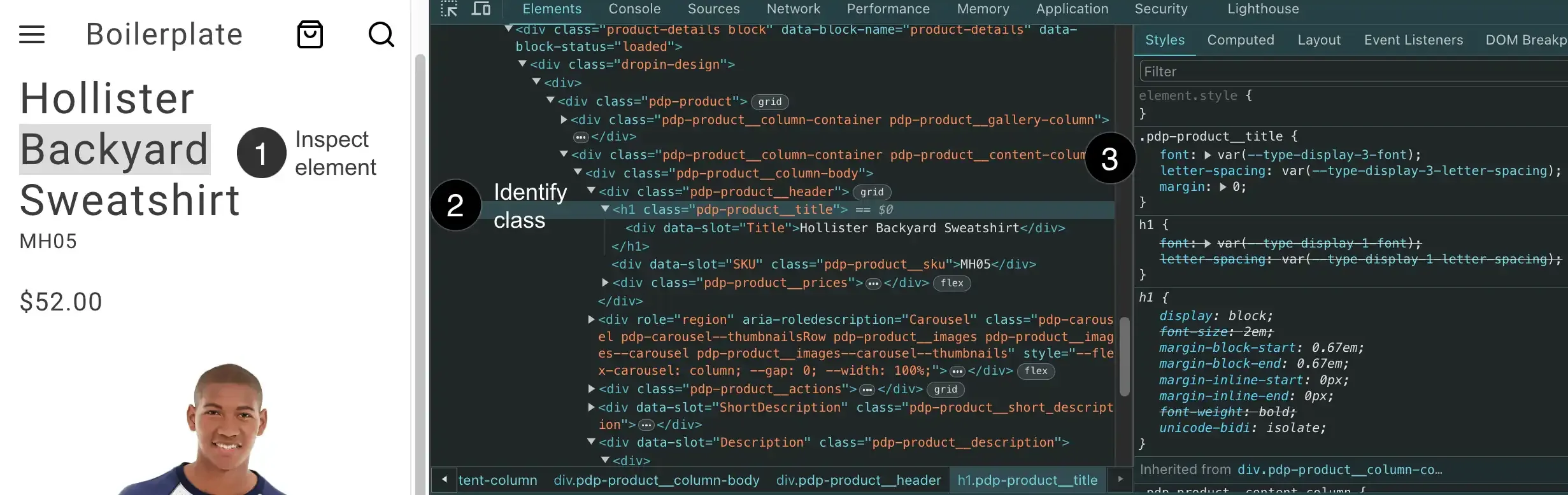
- Inspect the element in the UI that you want to customize (right-click on the element and select “Inspect” from the menu).
- Identify the CSS class(es) for the element. We use BEM naming, which makes it easy to know which component you’re changing (and which CSS file to use). This class styles the
Productcomponent, so use yourproduct.cssfile. - Copy the CSS class to your
product.cssfile to override the existing rules or add new rules to the class. But wait! Look closely 🧐 at the.pdp-product__titleclass. It’s using two design tokens. And when you see a design token within a CSS rule, don’t remove the token. Instead, change the token’s value (where it’s defined) OR create a new token along-side this existing one to ensure maintenance and updates continue to benefit from global design token usage.
Example overrides
Here’s an example of adding CSS class overrides to your product.css file:
.pdp-product__options {  grid-column: 1 / span 3;}
.pdp-product__quantity {  grid-column: 1 / span 3;}
.pdp-product__buttons {  grid-gap: 0.5rem;}